blissful design studio
I'm brittany Krupnik!
I'm a real estate investor, designer and home stager. I have staged over 500 homes and designed over 250 homes. When I'm not designing, you can find me reading, traveling or trying out a new restaurant. I'm based in Tempe, Arizona where I live with my husband and 3 kiddos!
top posts
Project Reveal: See my home!
shop blissful
Home Decor
shop now
keep reading
Our Favorite Cookbooks
Girl's Bedroom Makeover
How to Host the Perfect Gathering
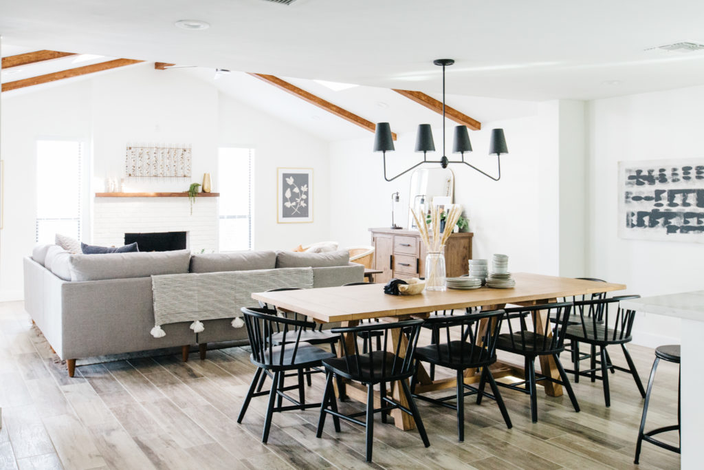
This warm, neutral Scottsdale, AZ vacation rental is remodeled vacation rental is so good and ready for its closeup!
I think this is my favorite remodel we have done to date. There is something about the overall look and feel if this home that really makes me happy! I have a tendency to lean towards a neutral color palette anyway, but I wanted this one to feel a little different. And can I be honest with you…I didn’t want to use white cabinets in this home. BUT for the sake of the budget I needed to use cabinets from a local vendor and our choices are limited to white, gray and espresso for the most part, unless we wanted honey wood, which I did not. So, with my choices limited, I chose gray cabinets which are definitely cooler in color. To balance that, I wanted to bring in warm whites and plenty of wood. And you know?? I think we made it work! Take a look! I hope you love it as much as I do!
The kitchen
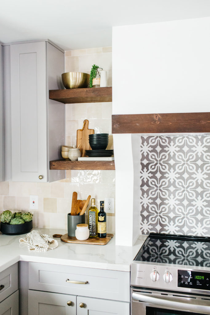
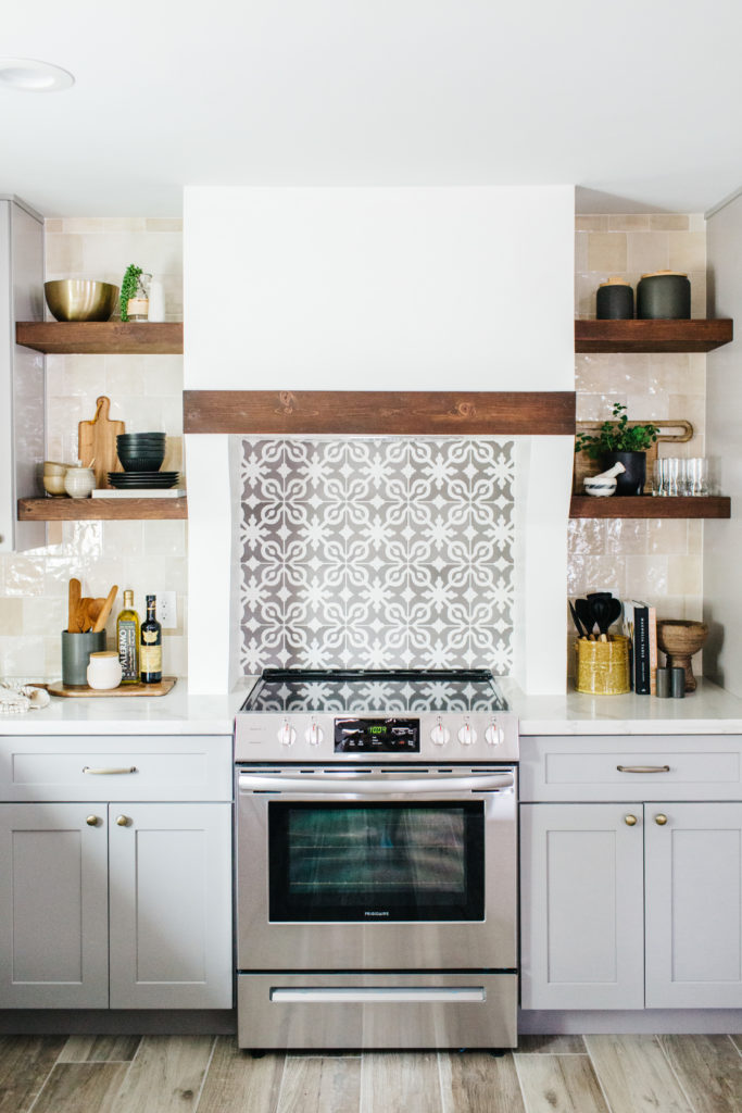
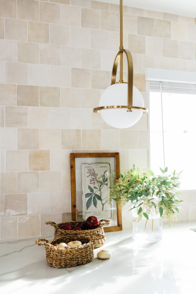
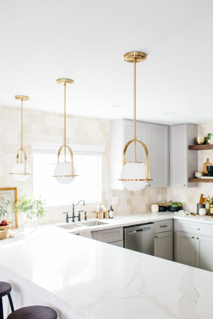
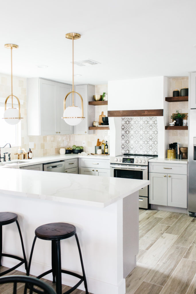
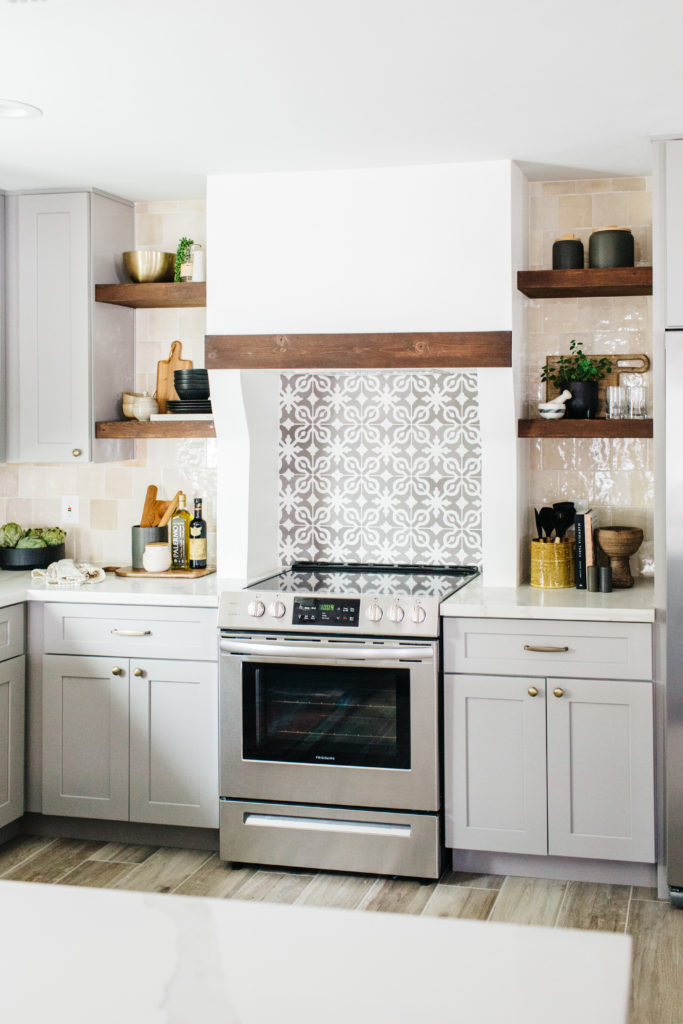
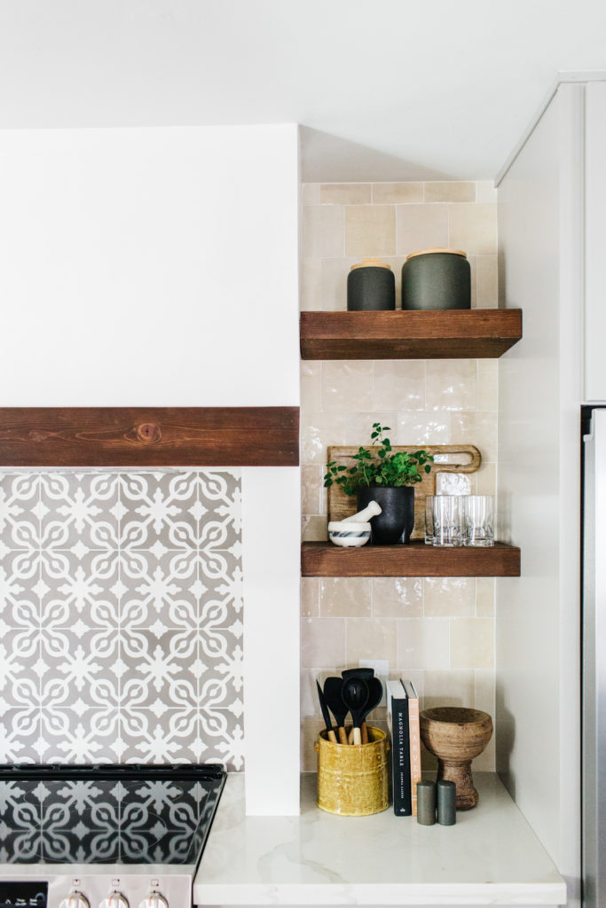


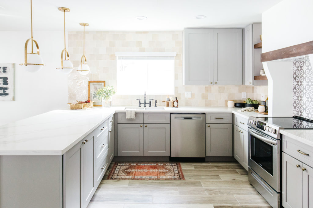
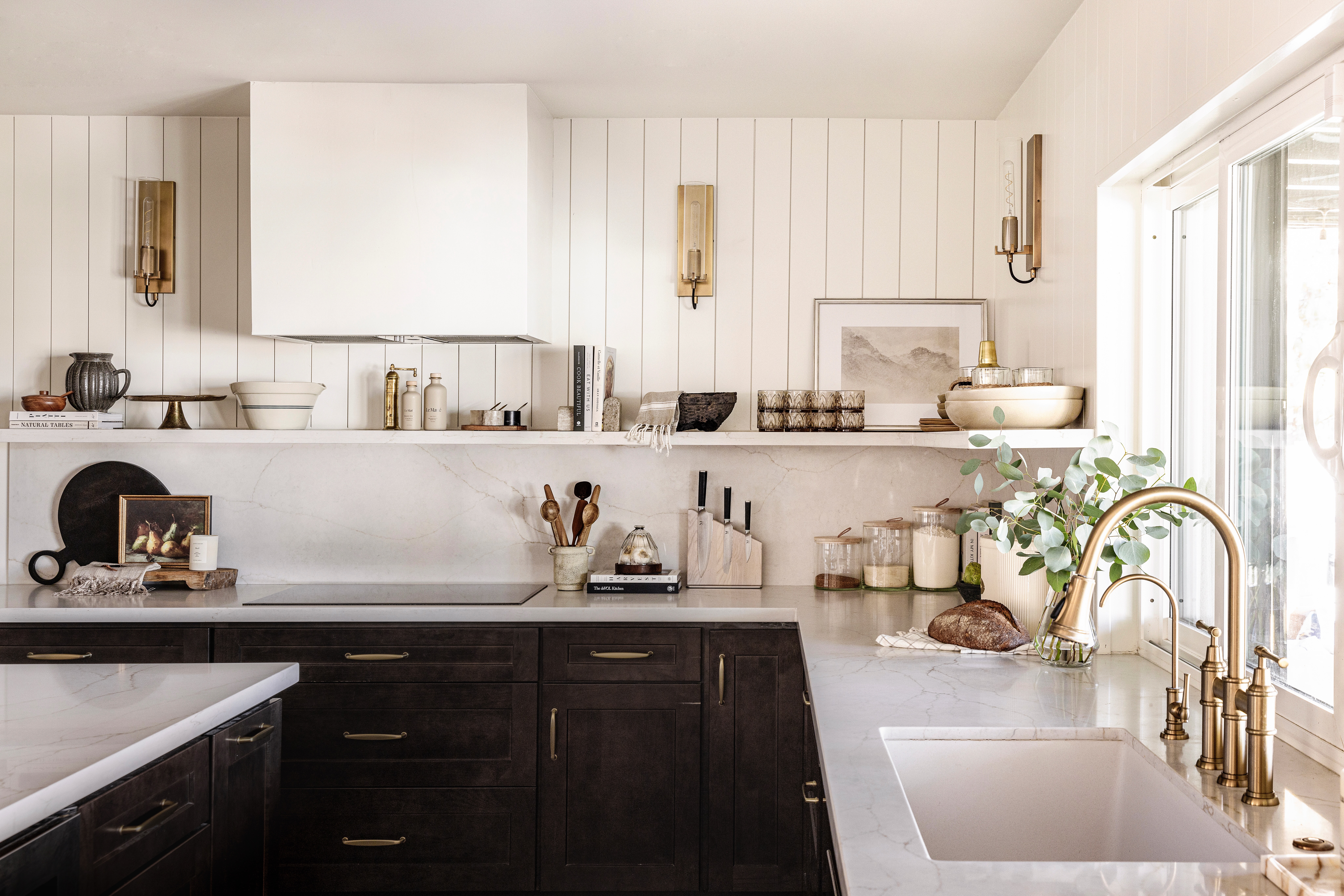
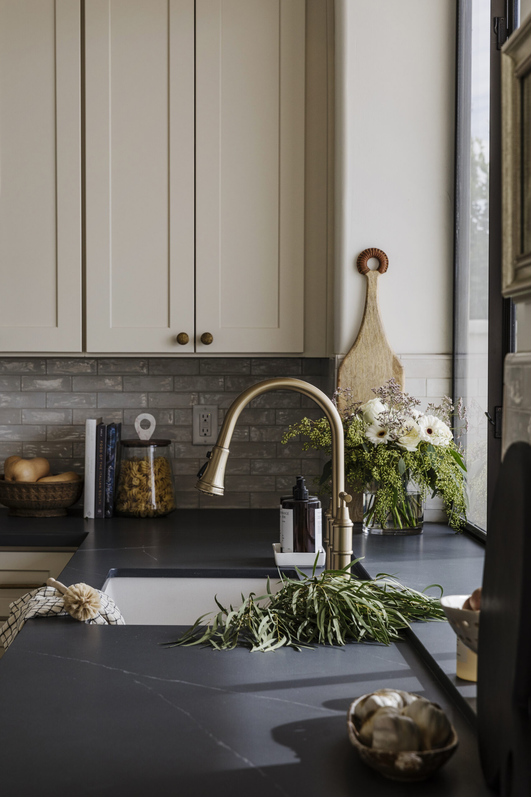
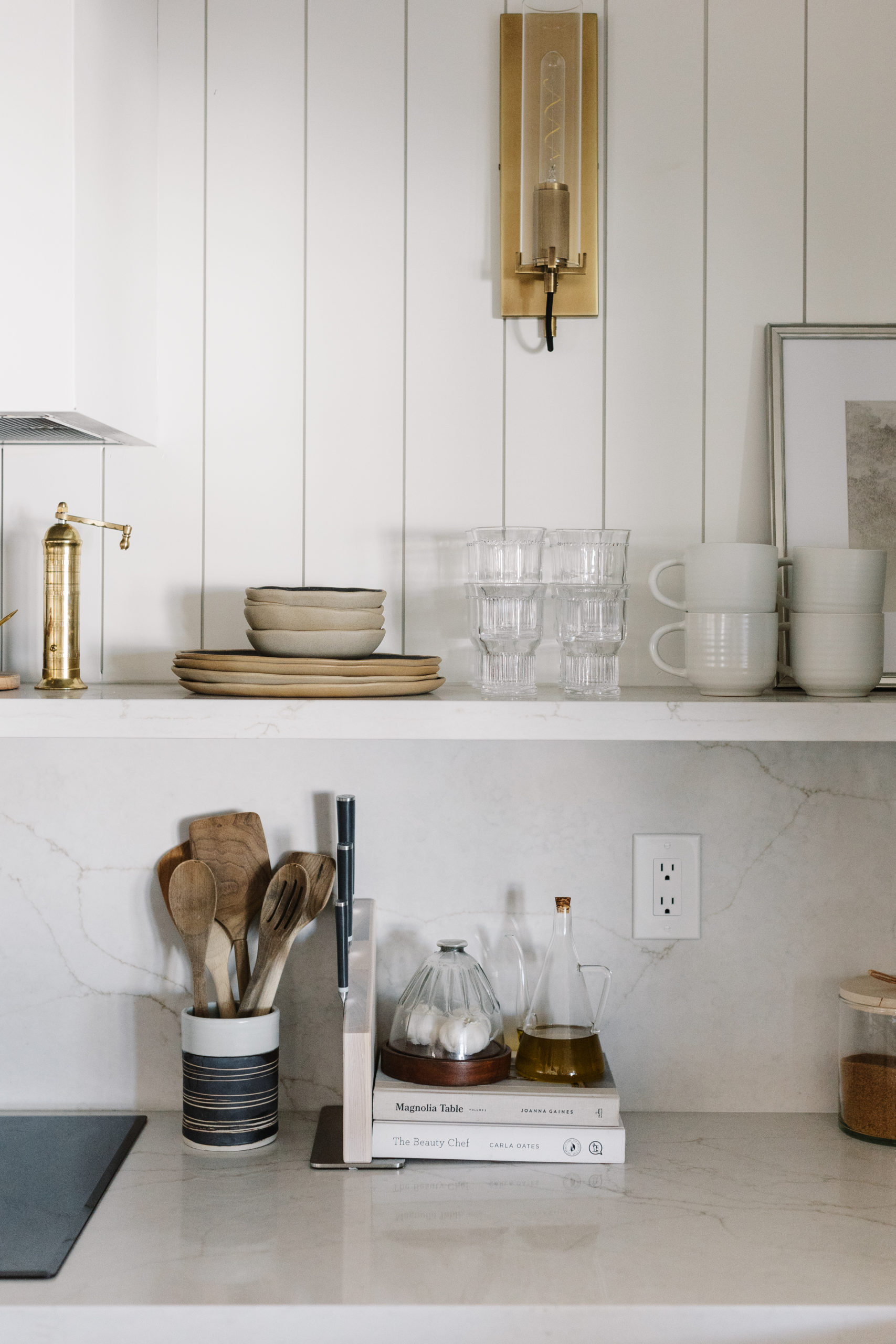
I don’t know if I could pick a favorite room in the house…but if you were going to make me then I guess I would have to say that it’s the kitchen. I was pretty nervous about using this cream backsplash from Bedrosians because I did not want it to feel too dated and yellow and I got really nervous when it first was installed, once the grout was done I just fell in love. I really like all of the different shades of white, cream, gold and tan that are in these tiles. The tile behind the range is also from Bedrosians and it added that little bit of Mediterranean feel that we wanted to add based on the exterior architecture. The countertops are Calacutta quartz countertop has shades of white, gold and gray in it, which really helps pull everything together. These pendant lights are so good, right? We went back and forth between hanging 2 or 3 and I’m really glad we decided on 3. I think that they make an awesome visual statement in here. The range hood is custom, but not super hard to do. We used an inexpensive vent hood that was framed out and drywalled. Then we added the stained beam. Not too hard and makes it feel so much more custom. We had fun styling the open shelves with pieces that are pretty and decorative, but also super functional.
Shop the Kitchen
The Living Rooms
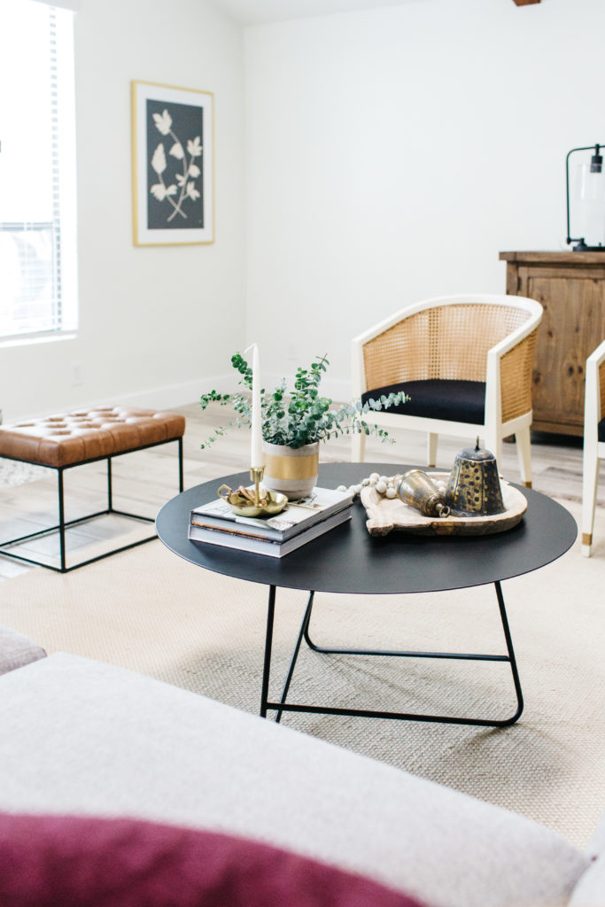
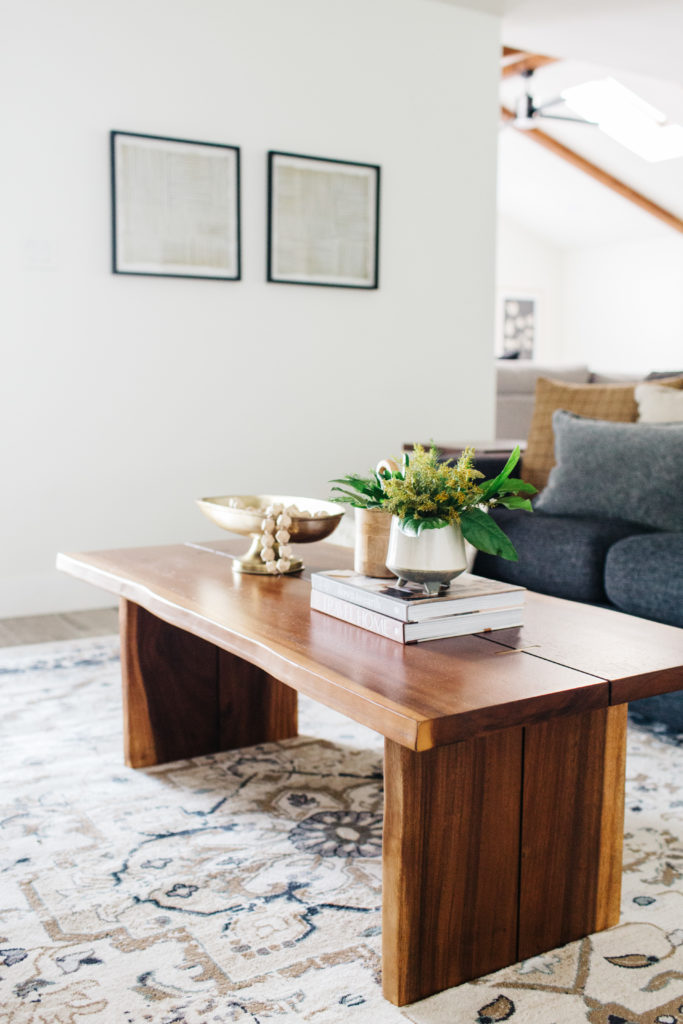
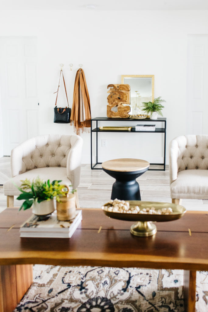
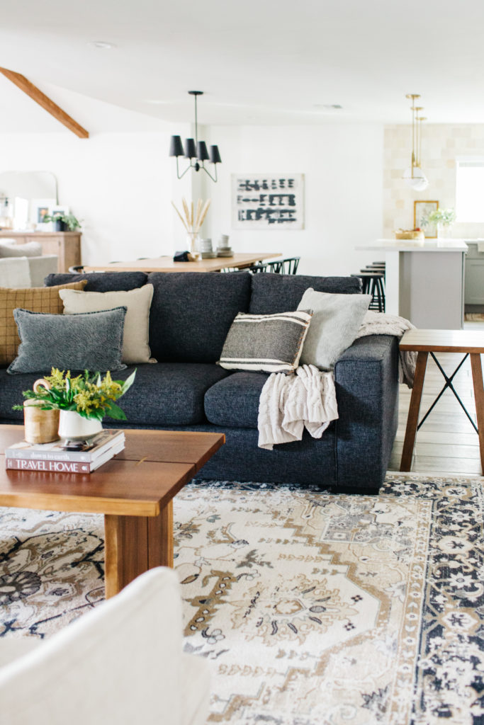
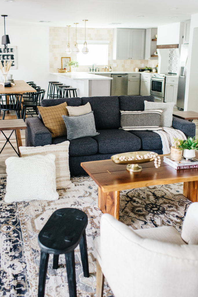
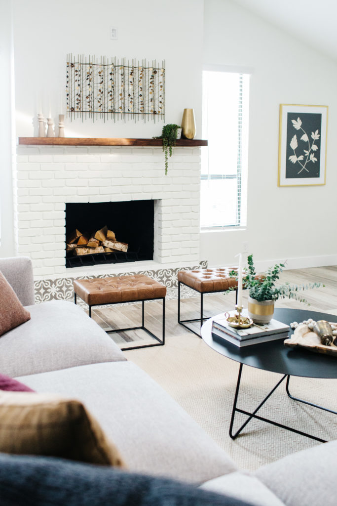


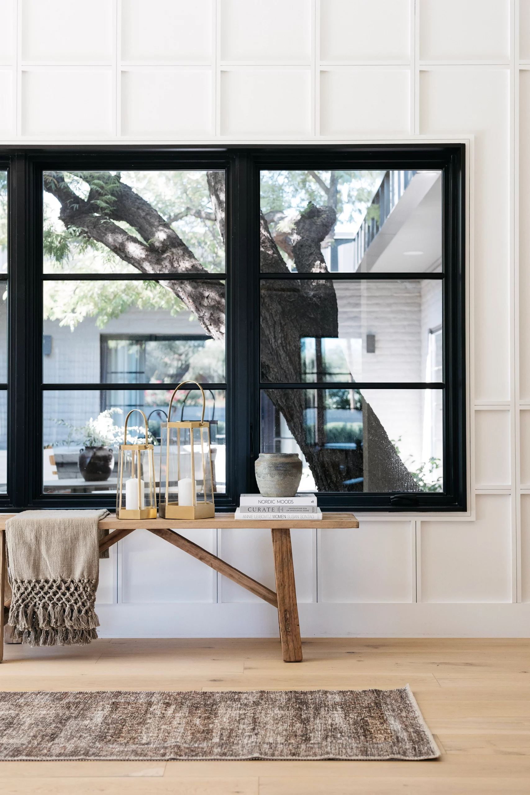
We have 2 living areas very near each other in this space, so the goal was to make them their own spaces while making sure that they coordinated with each other. The first living space is right when you walk in the front door, so we decided to add an entry table and hooks to define this space and make it functional. The sofa is a pull out sofa for sleeping extra guests. I love the pattern in the rug. Originally, I wanted this rug layered in the family room, but the pattern in the rug was too busy right next to the fireplace tile. But in this room, it adds visual interest, especially when paired with solid, neutral pieces like the sofa and accent chairs. I liked using this coffee table in this space to add a natural element and you can’t really go wrong with a live edge table, can you?
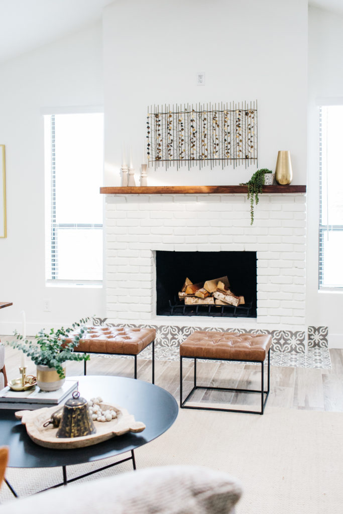
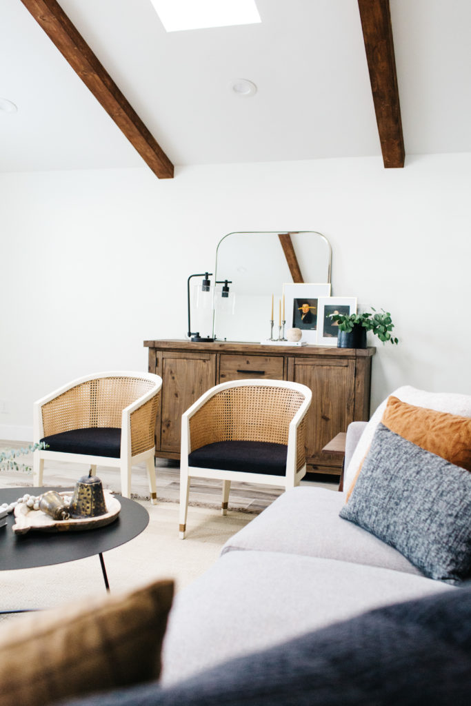
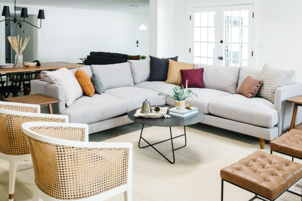
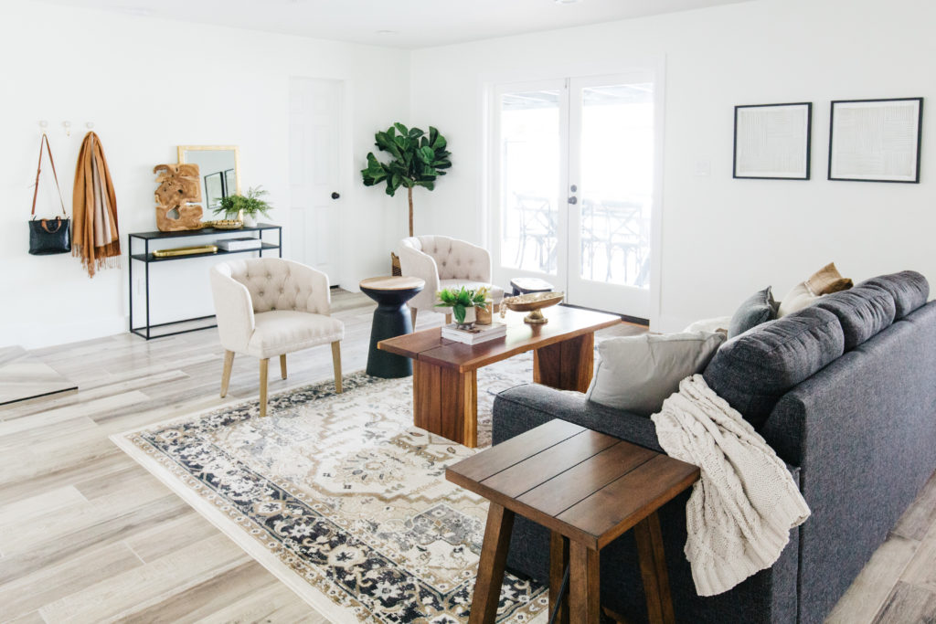
The family room was where imagined guests spending a lot time in. It would be the main television room and it’s right next to the dining room and kitchen as well. I wanted to large and comfy sofa in the family room and this one from Living Spaces was so perfect. The legs are tapered and the arms are clean and modern. The cushions are so comfortable, but this doesn’t feel like a shapeless and oversized sofa. The accent chairs are also from Living Spaces and I love the cain detail. The black cushions are especially practical in a vacation rental for chairs that will get a lot of use. When guests use this room, the TV will be mounted over the fireplace, but we still wanted a great console in the space to be able to house extra bedding the pull out sofa and also allow for storing games as well. One of the other things we did was to add benches in front of the fireplace. Not only does it look good, but it allows for extra seating that can easily be moved around.
Shop the Living Rooms
The Dining ROOM
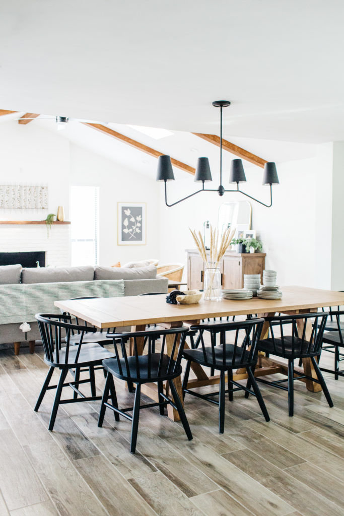
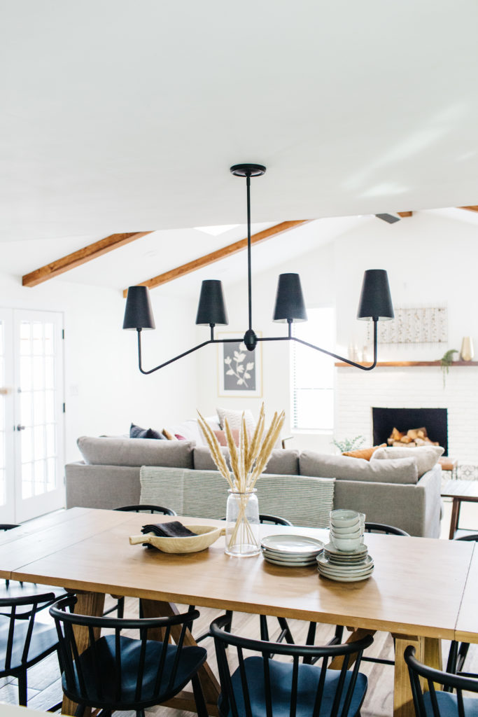
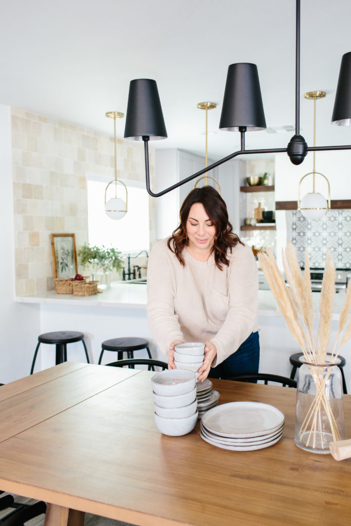
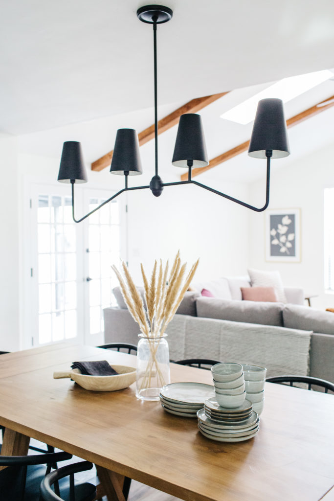
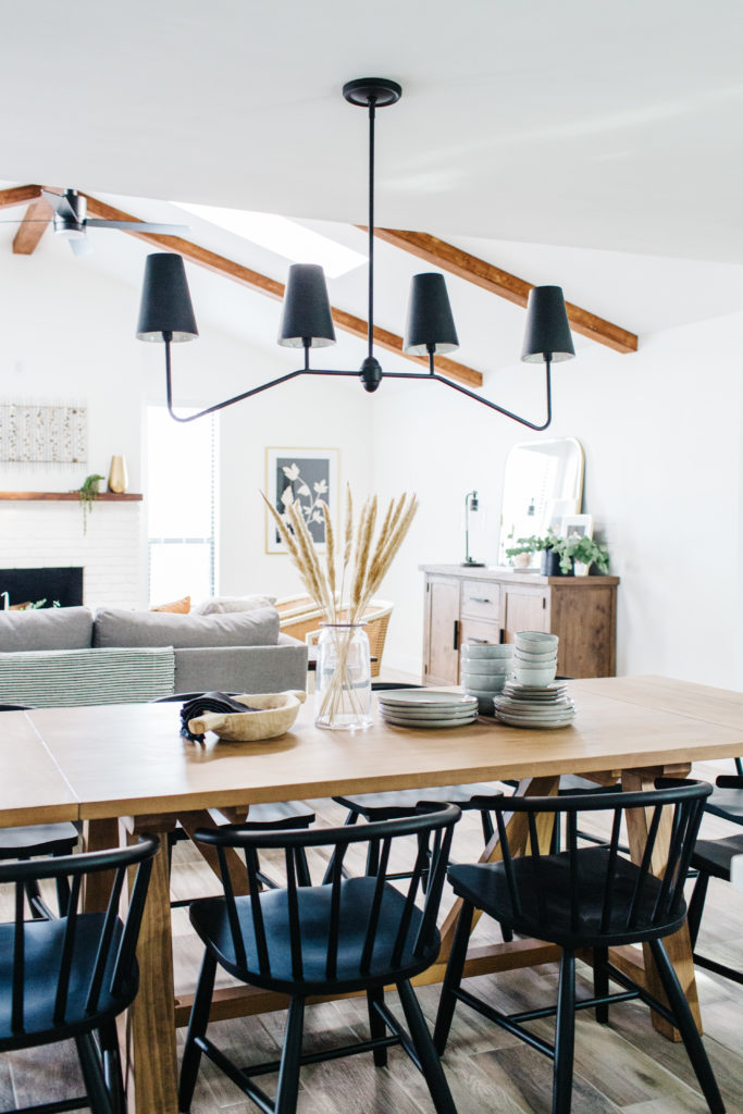


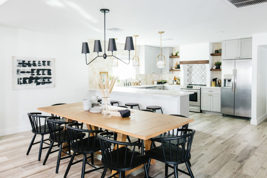
Remember when I said the kitchen was my favorite was my room in the house? Can I have a really close second? The dining chandelier was the first item I chose to go in this house and I am OBSESSED with it!! The shades are metal too and I think that is what makes this light so cool. As with all of the vacation rentals, we make sure that we can seat 10 around the table and this table from World Market was the perfect size for this space. I especially love the wood tone paired with the black chairs. These chairs look like they should be expensive, but they are so reasonably priced and actually comfortable to sit in. The art is from Minted and I love the cream and black, especially being so near the kitchen. We styled the table with stacked dishes and these gorgeous pampas grass in a clear vase. It’s simple and feels comfortable and casual.
Shop the Dining Room
The bedrooms
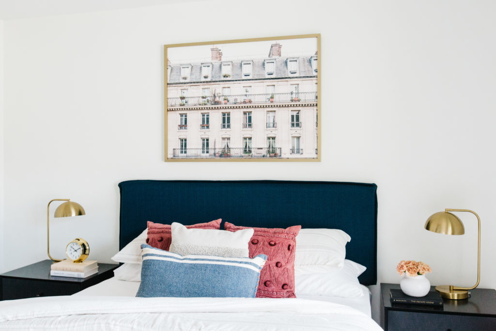
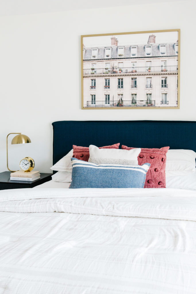
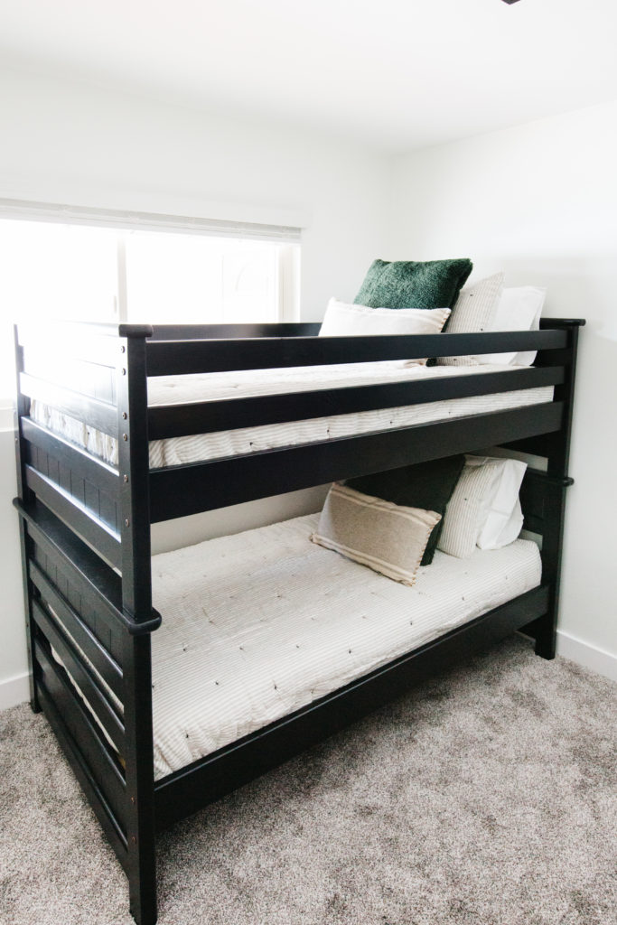
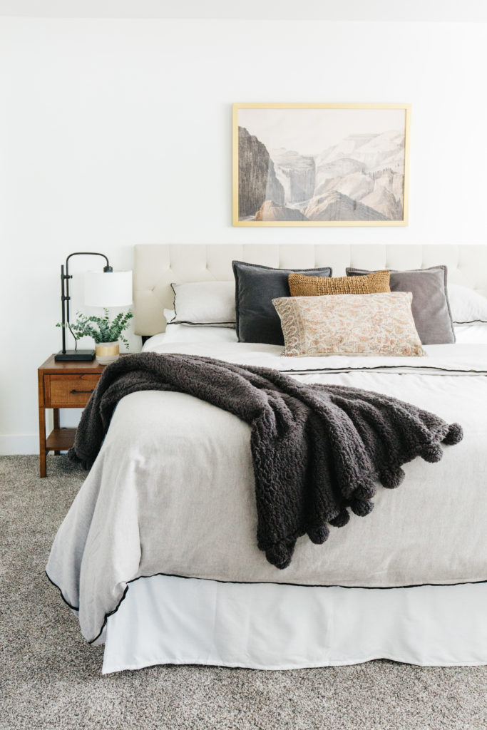
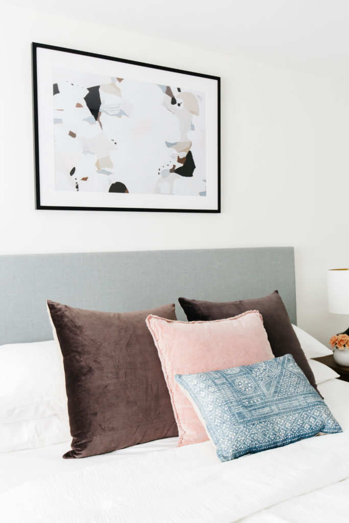
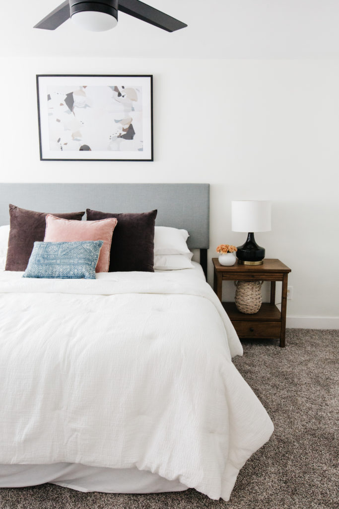


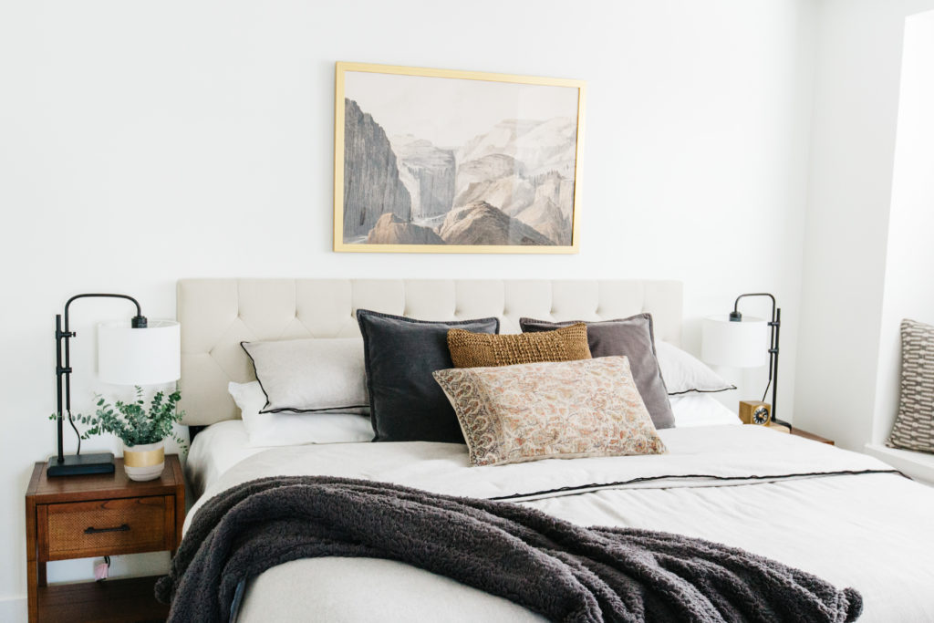
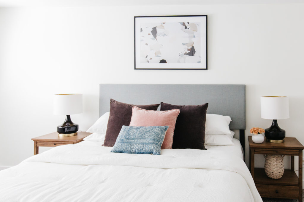
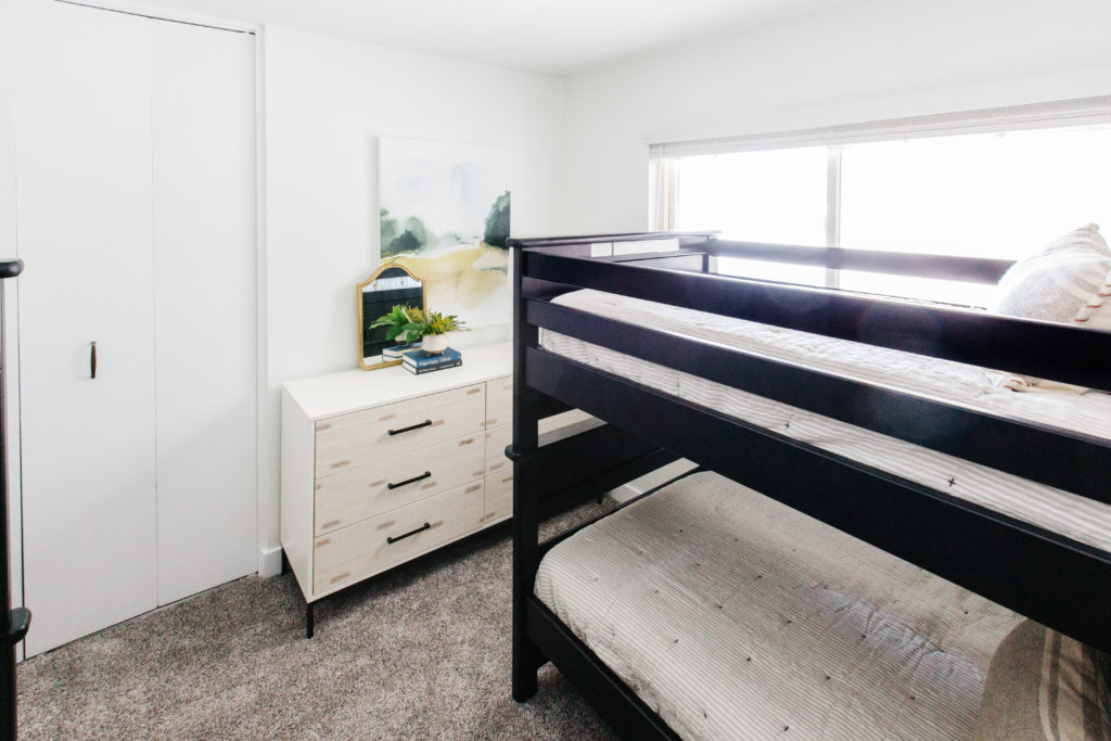
This vacation home has 4 bedrooms. There is one king bedroom with an en suite bathroom, another king bedroom, a queen bedroom and a bedroom with a 2 twin over twin bunkbeds. The master bedroom is my favorite room. I love all of the neutral tone. The canyon art above the bed is what inspired the color palette and this room just feels soothing and sophisticated to me. The art played a huge role in these rooms and really served as the jumping off points for the color palette in each space. As with the master bedroom, the art really played a huge jumping off point for the color palettes of each room.
Shop the Bedrooms

the bathrooms
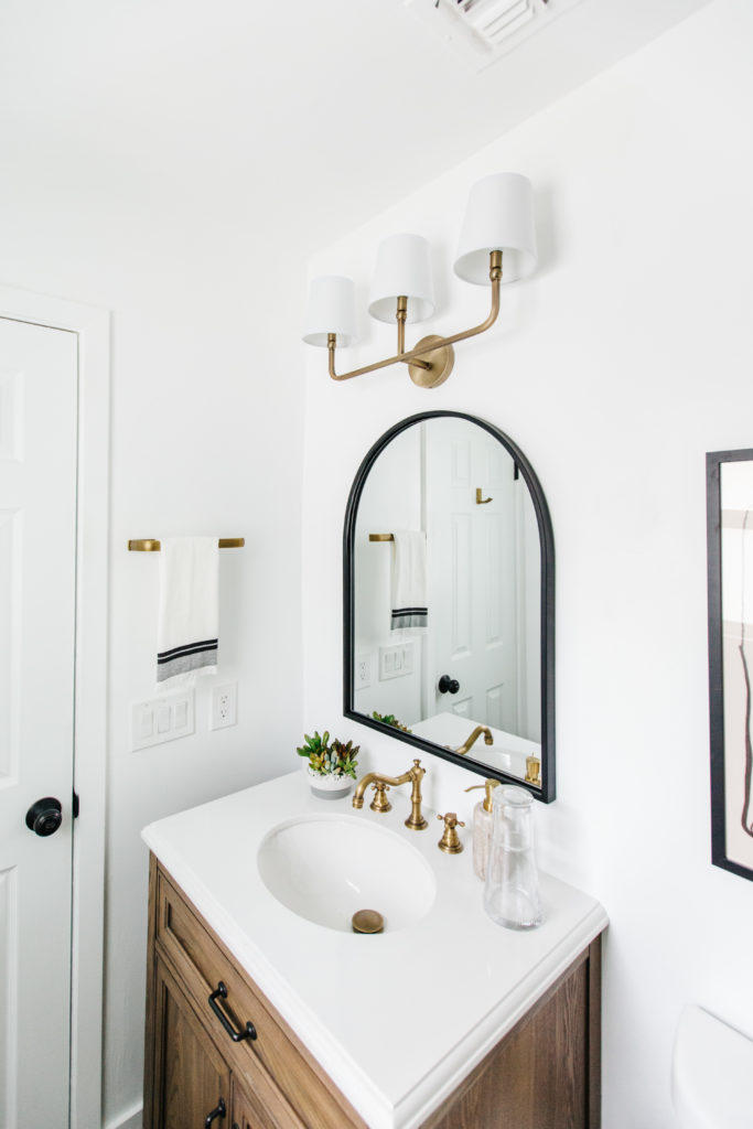
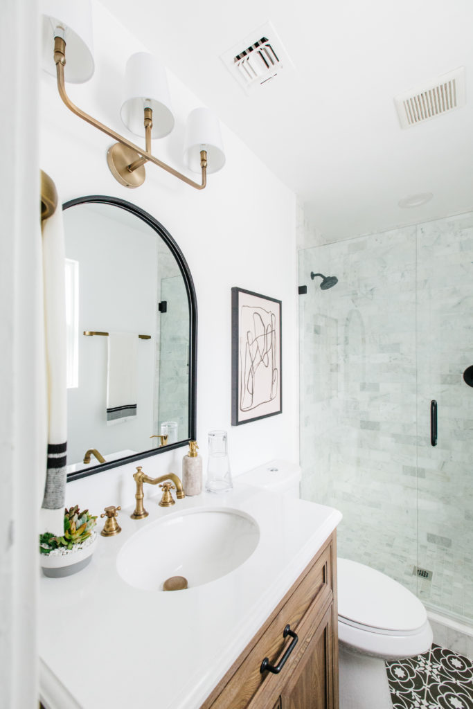
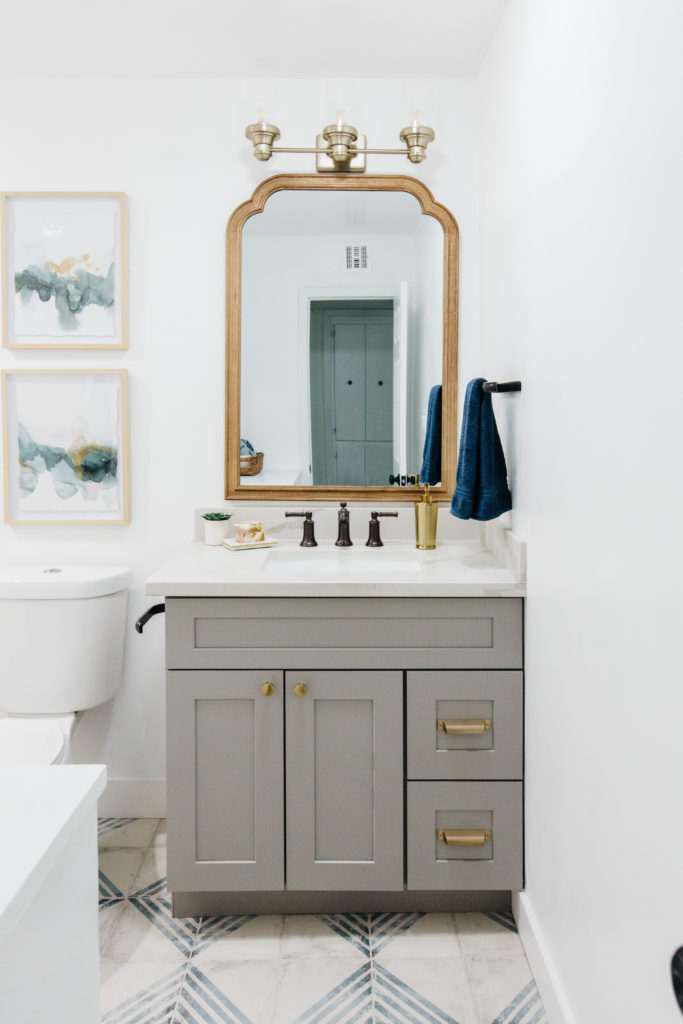
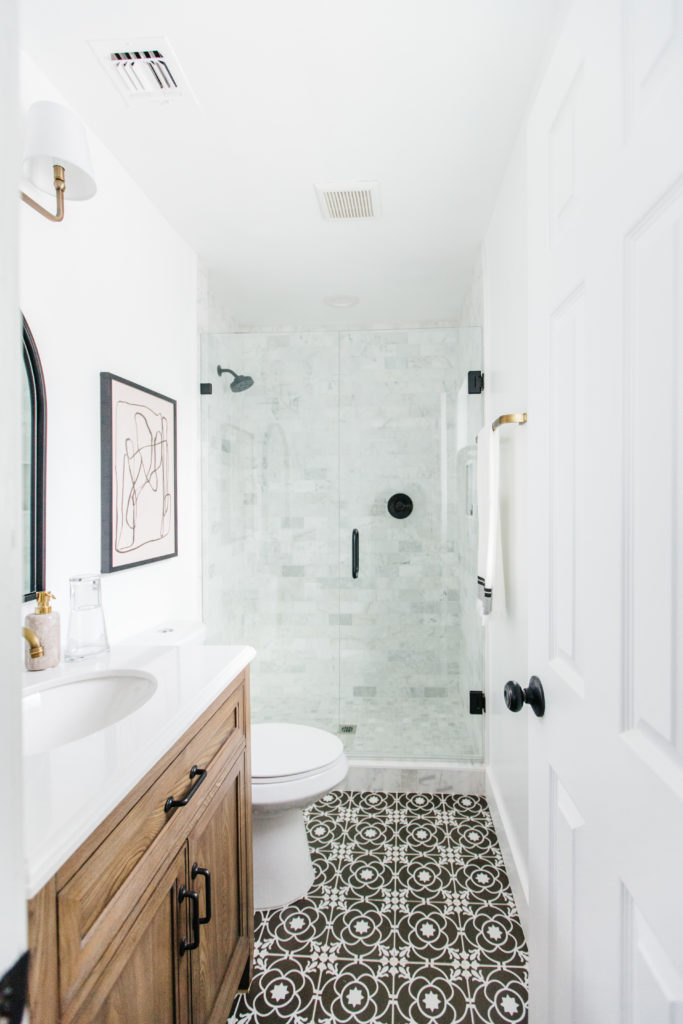


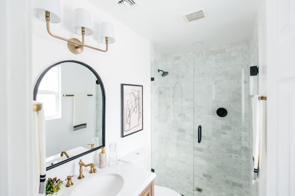
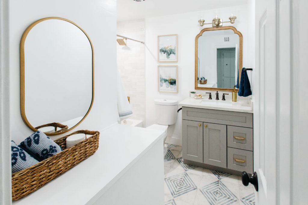
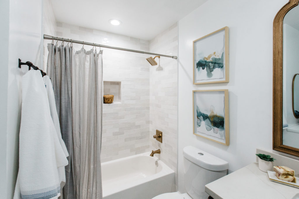
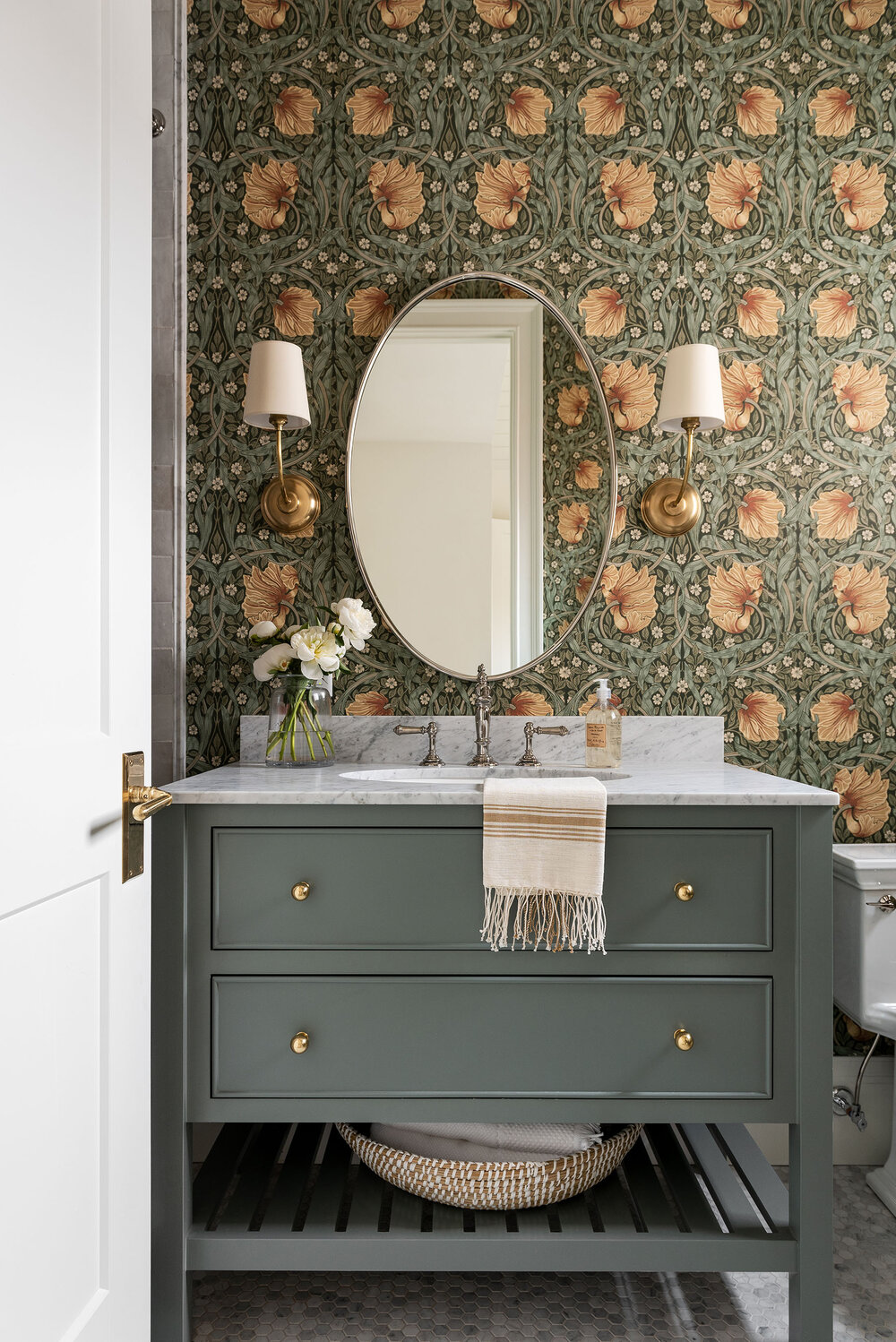
Believe it or not, these bathrooms were designed based off of eye shadow color palettes. The master was bathroom was meant to be an extension of the neutral master bedroom. The floor tile from Bedrosians has such a beautiful pattern and paired with the wood vanity and the marble shower, it’s just a show stopper! The hall bathroom is so much fun! I love the soft white and blue floors paired with the gray cabinets, especially with the shower tile with the varying shades of white. The hall bathroom has a strange “shelf” that comes into the bathroom that houses additional mechanics from the hall closet. We decided to make it another vanity area since it’s a vacation rental with only 2 bathrooms. It will allow for someone else to get ready, while someone is using their blow dryer or curling iron at the sink.
Shop the Bathrooms
I hope you love this house! It’s warm and cozy and it’s also available to rent out for your next vacation, so if you are heading to Scottsdale or just need a staycation with girlfriends, you can book it here at Stay Blissful Vacation Homes. We hope that if you are looking for a Scottsdale, AZ vacation rental, that you find what you are looking for with us! If you want to see more design inspiration, head over to our latest post Our Favorite: Barstools Under $200.
Let's be
friends!
Get exclusive design tips and blog updates sent to your inbox!
Keep reading
I'm brittany Krupnik!
I'm a real estate investor, designer and home stager. I have staged over 500 homes and designed over 250 homes. When I'm not designing, you can find me reading, traveling or trying out a new restaurant. I'm based in Tempe, Arizona where I live with my husband and 3 kiddos!
top posts
Project Reveal: See my home!
shop blissful
Home Decor
shop now
keep reading
Our Favorite Cookbooks
Girl's Bedroom Makeover
How to Host the Perfect Gathering
follow along with Brittany's instagram
Go behind the scenes
join us on
follow along with blissful's instagram
blissful
browse the blog
Services
Arizona
Creating beautiful spaces where life can be enjoyed
Learn

read comments or leave a comment...