Finally sharing the atrium house flip with you!!
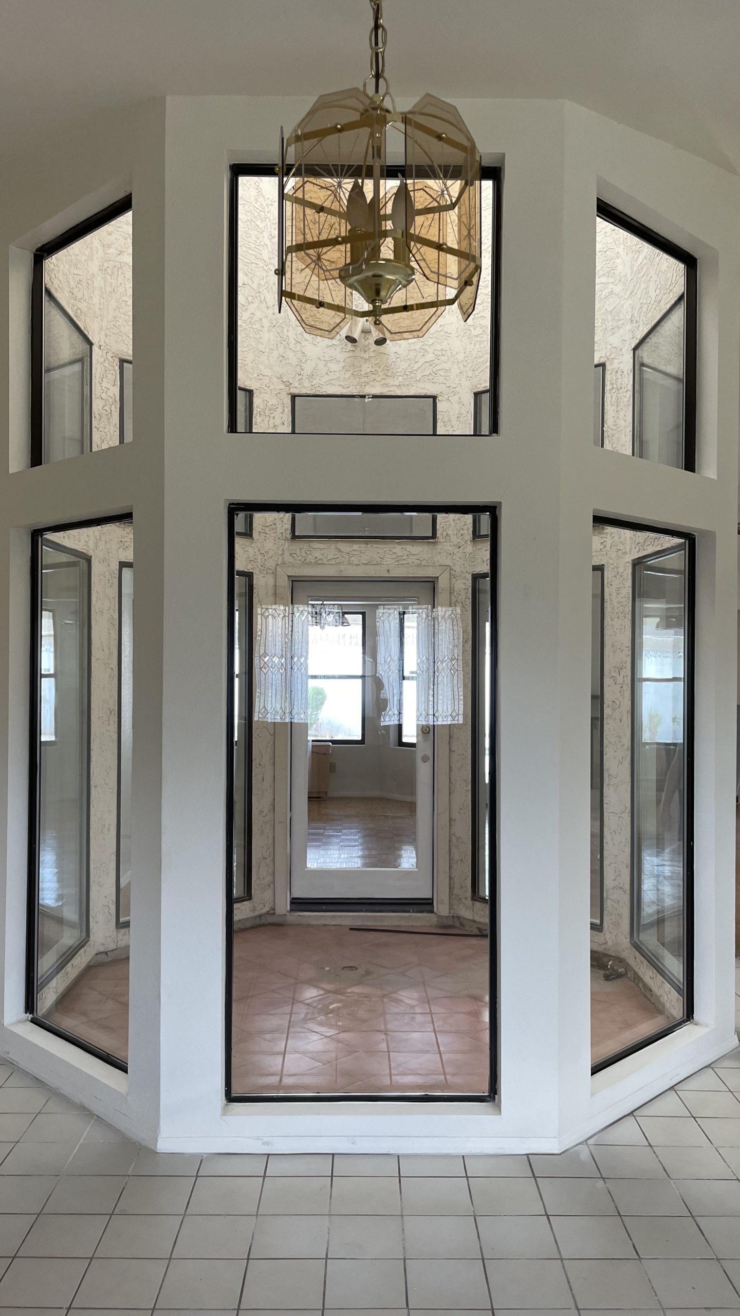
I started sharing this project with you all on Instagram last September. I remember when I first walked it with my husband and my cousin who was going to be the project manager and finding out that we were going to keep the atrium...in the middle of the entry way. We had done a floor plan like this one before years ago in Gilbert and we removed the atrium...it look us months longer to complete and we did not get more for the flip than we would have without the atrium, so I got why we were keeping it. But I just didn't know what I was going to do with the space. However, it's become a really fun moment in the home and mostly everyone on Instagram was super into the final result. But now I'm excited to share the rest of the house with you.
the design elements
black, gray, brass and beautiful warm tones
The atrium
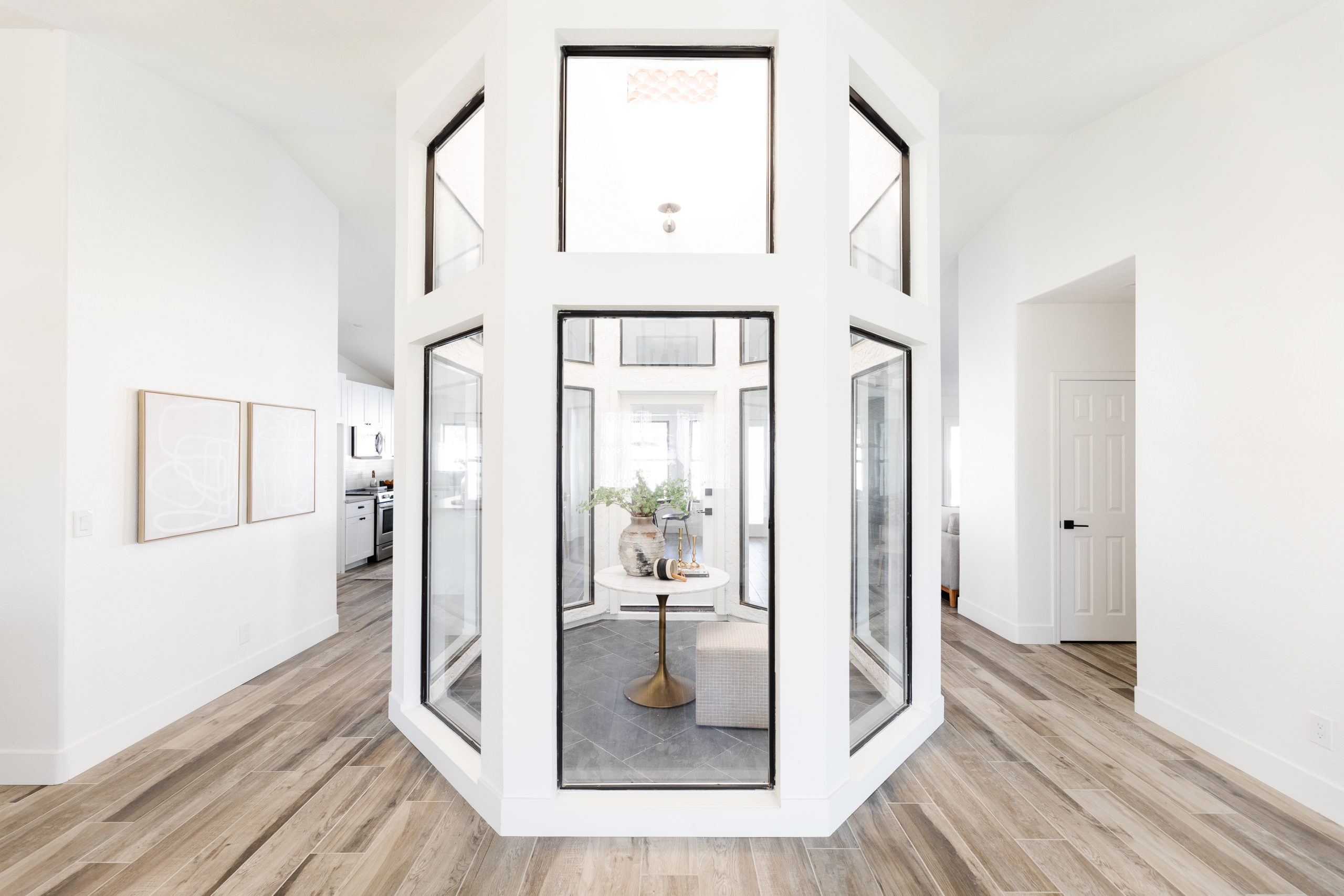
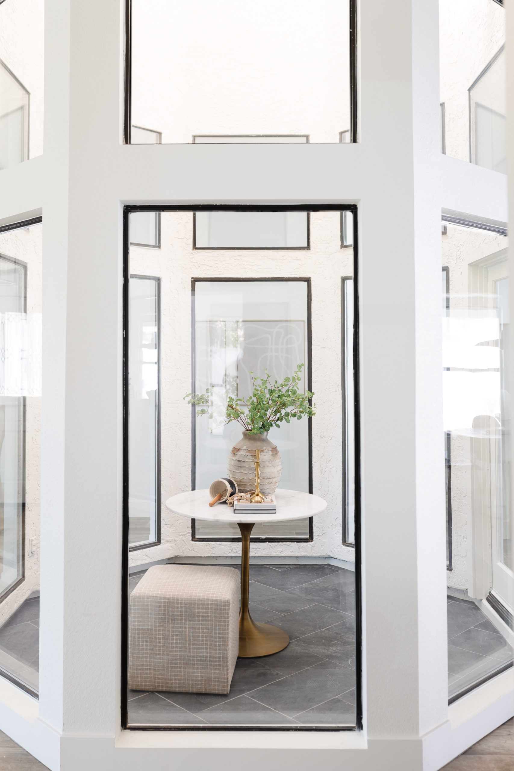
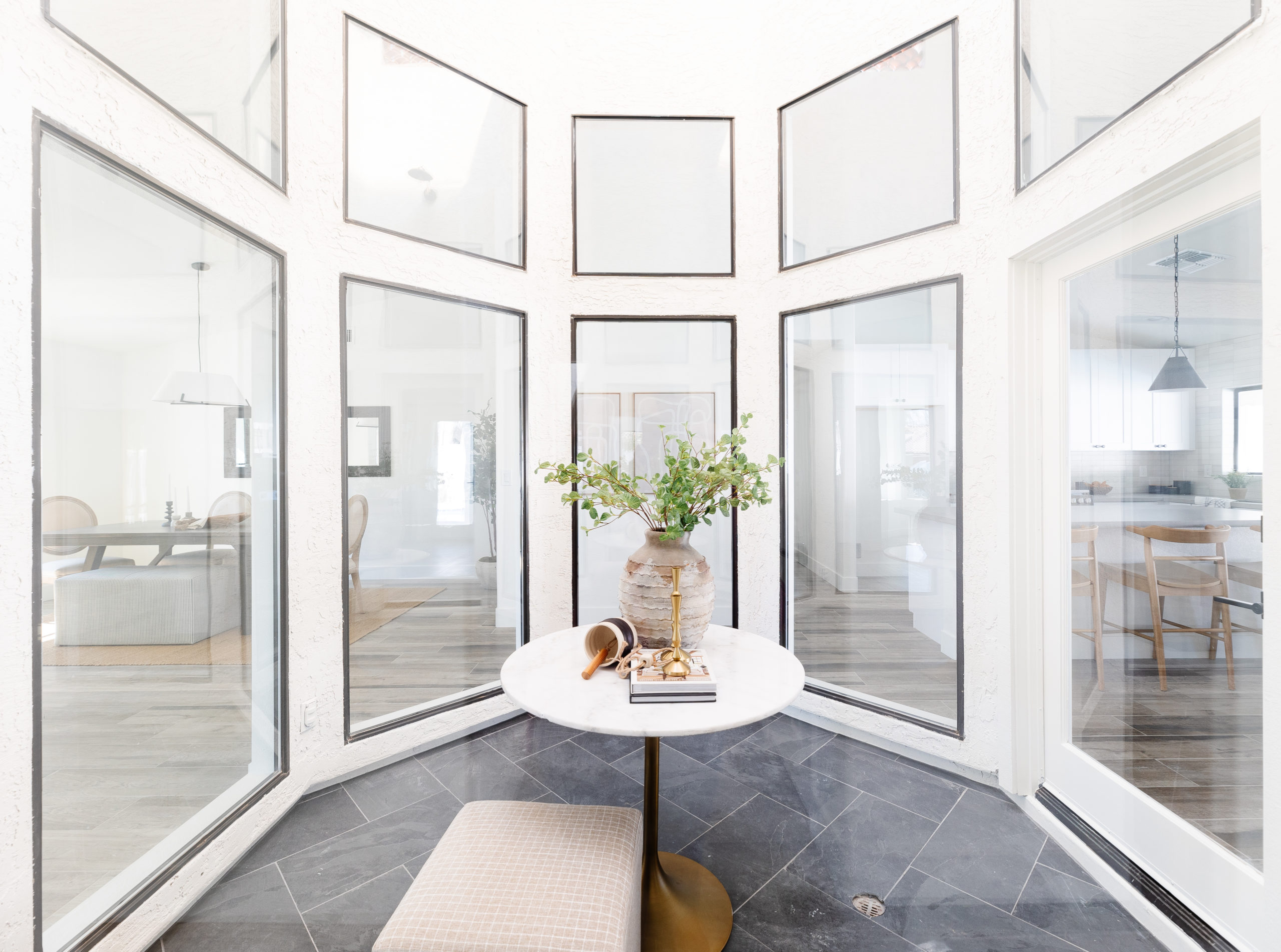
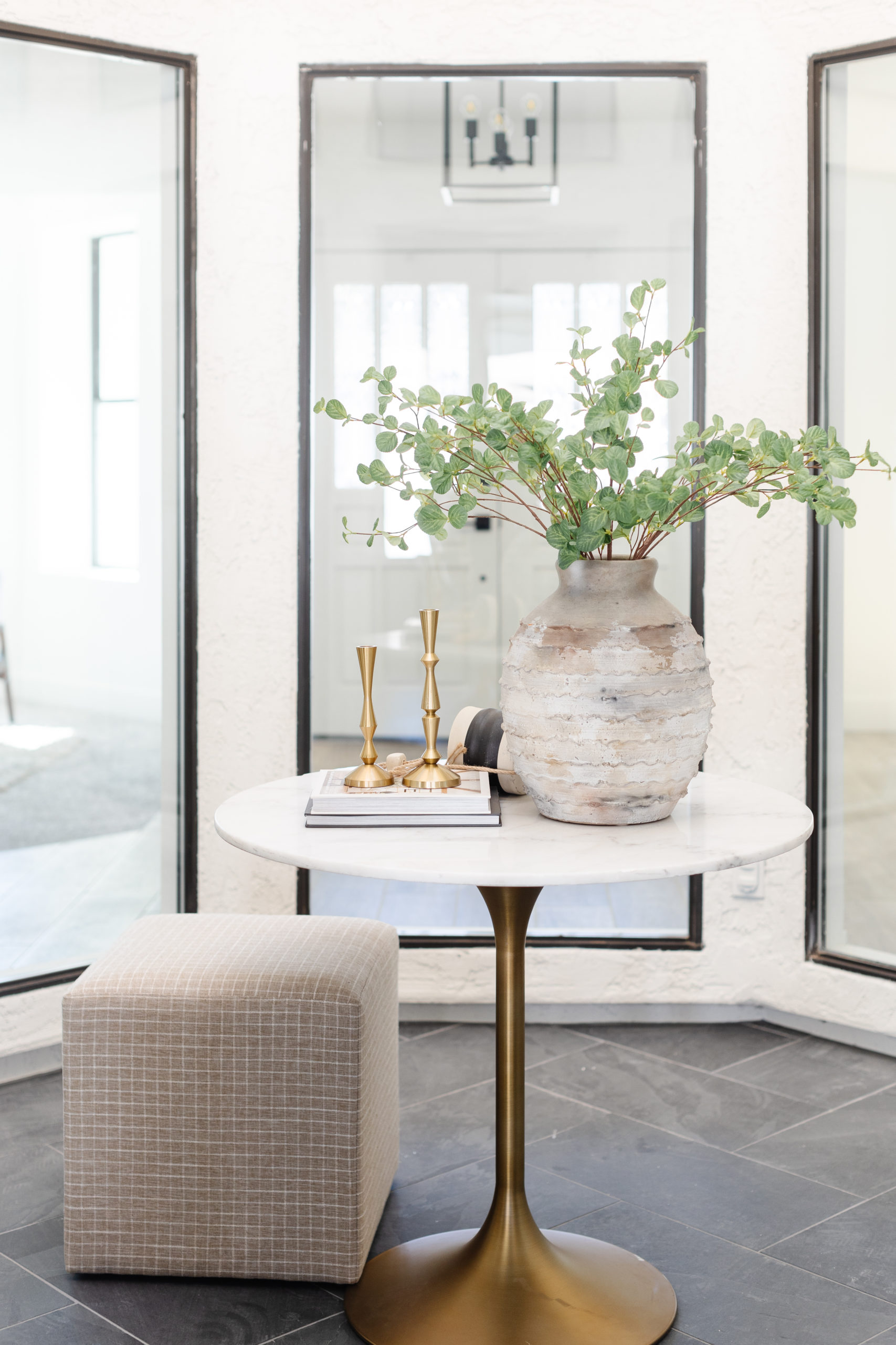
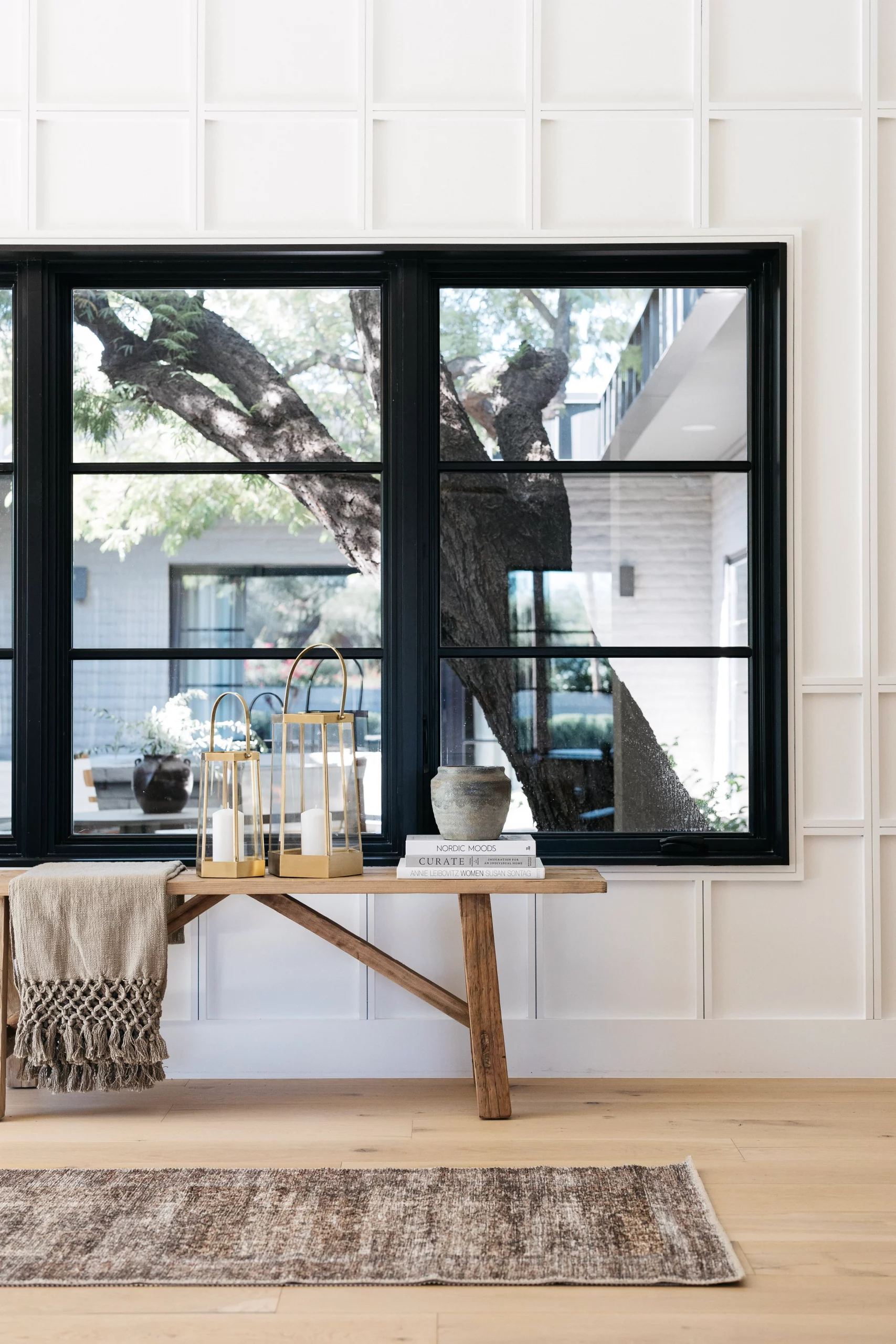
It only makes sense to start the blog about the atrium house with the atrium. As you all know, I didn't want to keep it. But once that decision was final, it became more of a "how do we make this cool and functional and pretty even though we don't want it?" problem solving. We opted to make it function as pretty foyer moment, with the option of it still being used an area to for plants.The first thing I decided was to choose a flooring that was different from the rest of the house. We used a black slate floor in a herringbone pattern, but we kept the drain and the water in there as well. We also added a new sconce light.
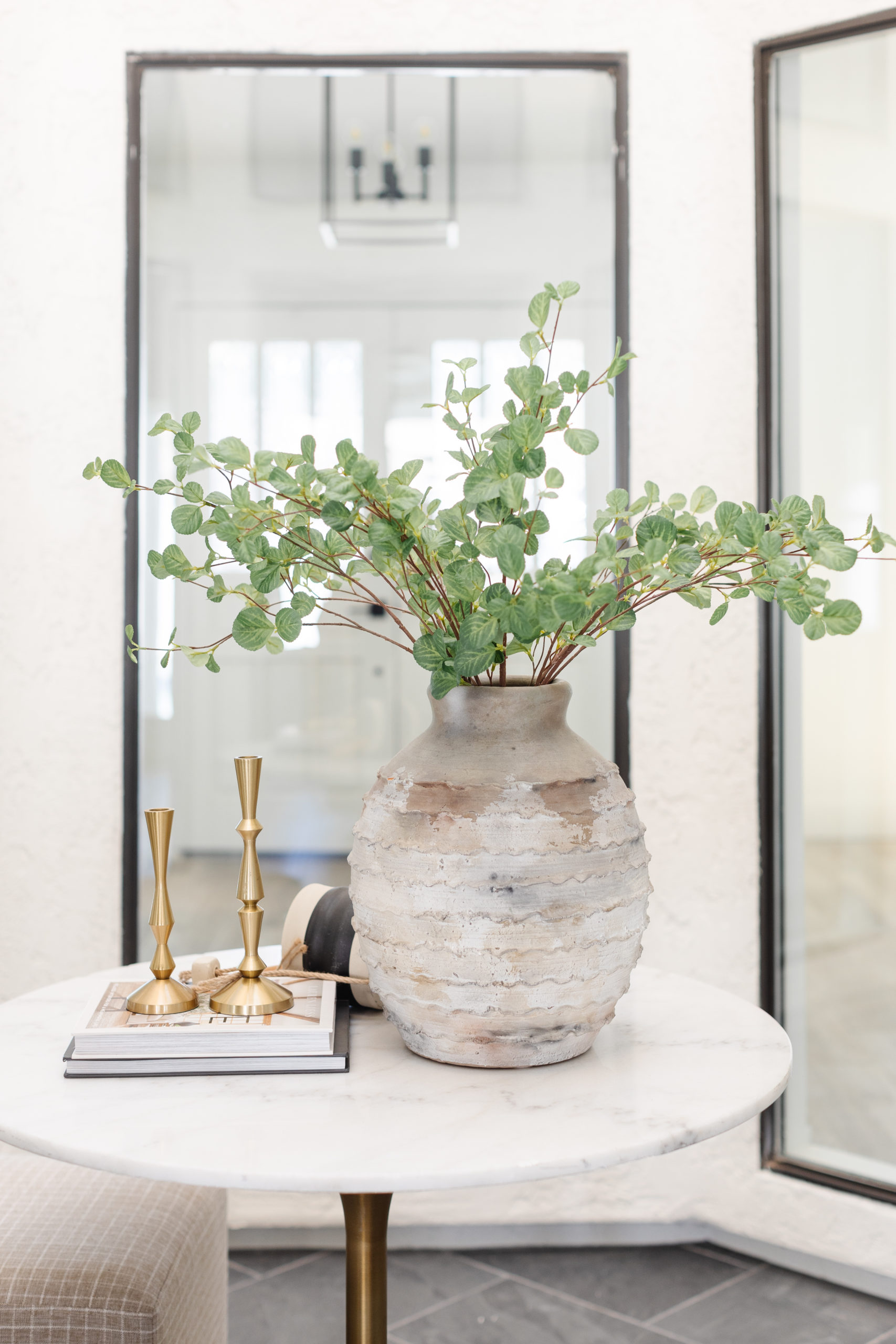
For the staging of our foyer moment, we chose a round marble table and paired it with an ottoman. We used a vintage looking vase with faux greenery and styled the rest of the table books and accessories. I feel like it's the perfect place for a pretty moment that your kids can't mess up.
shop the atrium
Living Rooms
There are two living spaces in this home. One formal living room one to the right when you walk in and one family room near the kitchen with a fireplace.
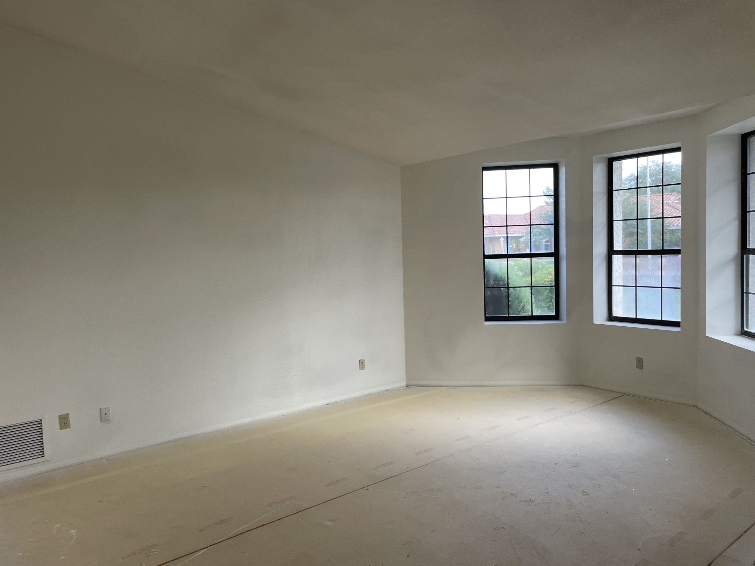
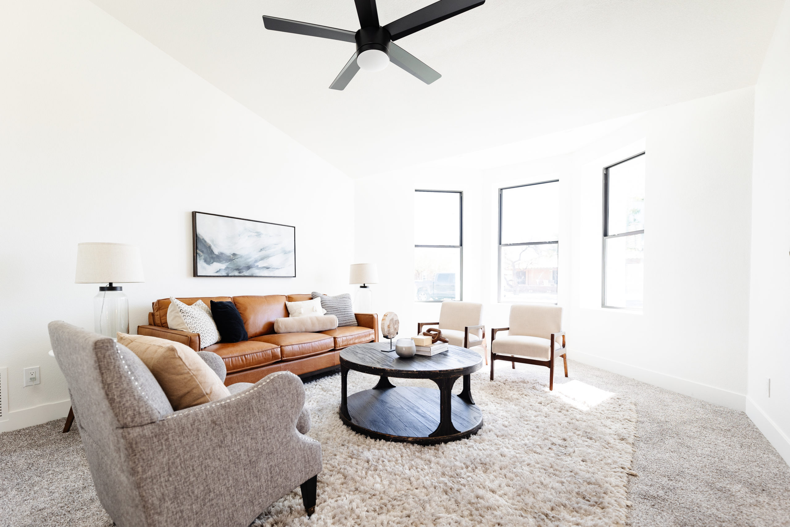
Honestly, besides new flooring and updating the fireplace in the family room we didn't do much of anything. All of the wow factors come through the staging.
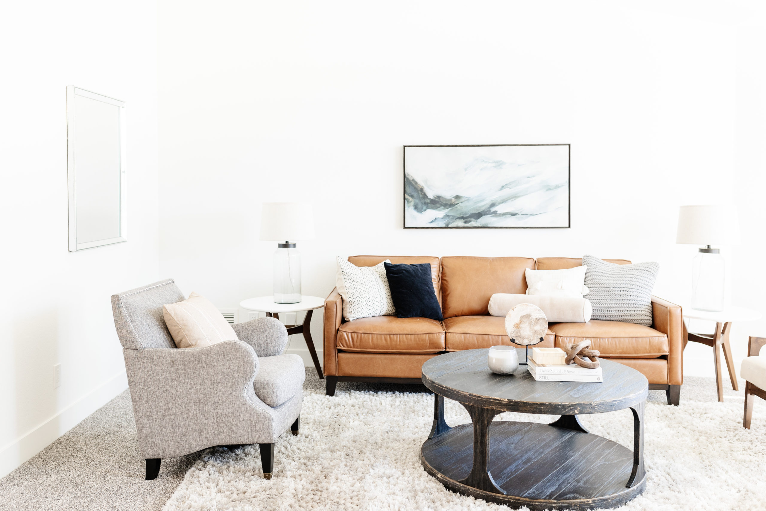
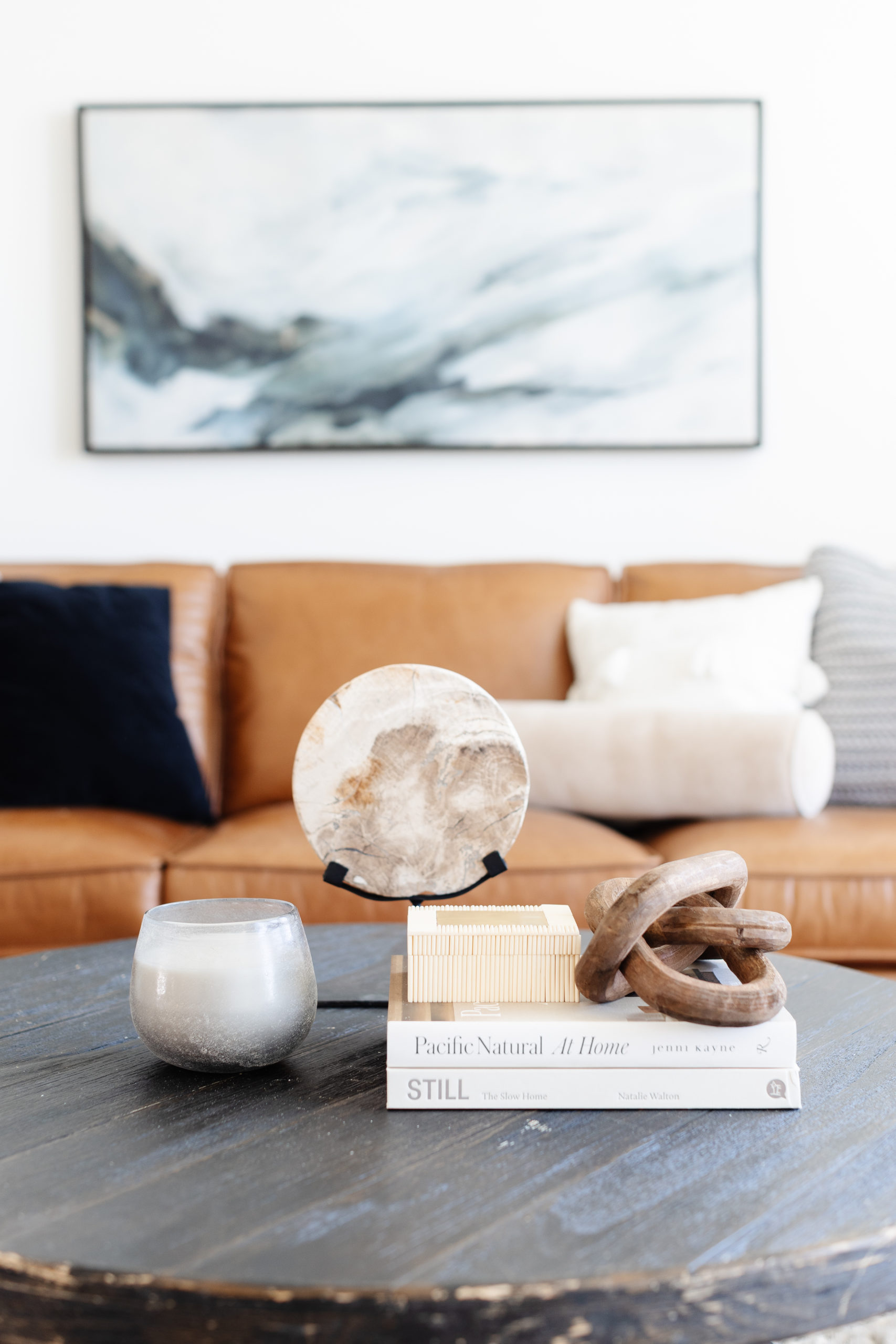
In the front living room, we kept the step down and added carpet for a cozy feel. For the staging, we chose warmer pieces in very neutral tones and added a pop of color in the art above the sofa. The accessories were textural and sculptural, but we kept it pretty simple.
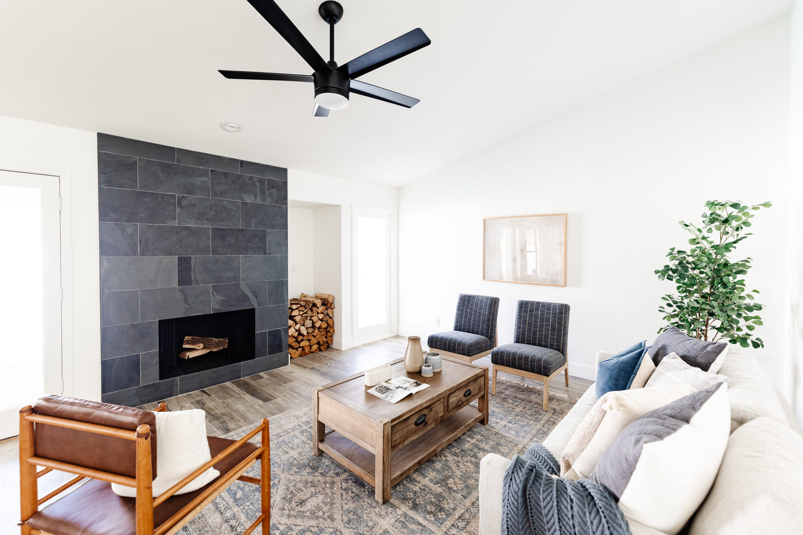
For the family room, we updated the fireplace with a black slate surround. I cannot find any before photos, so we are all gonna have to pretend that it was old and dated. And it was. I loved the niche to the side of the fireplace to use for stacked firewood.
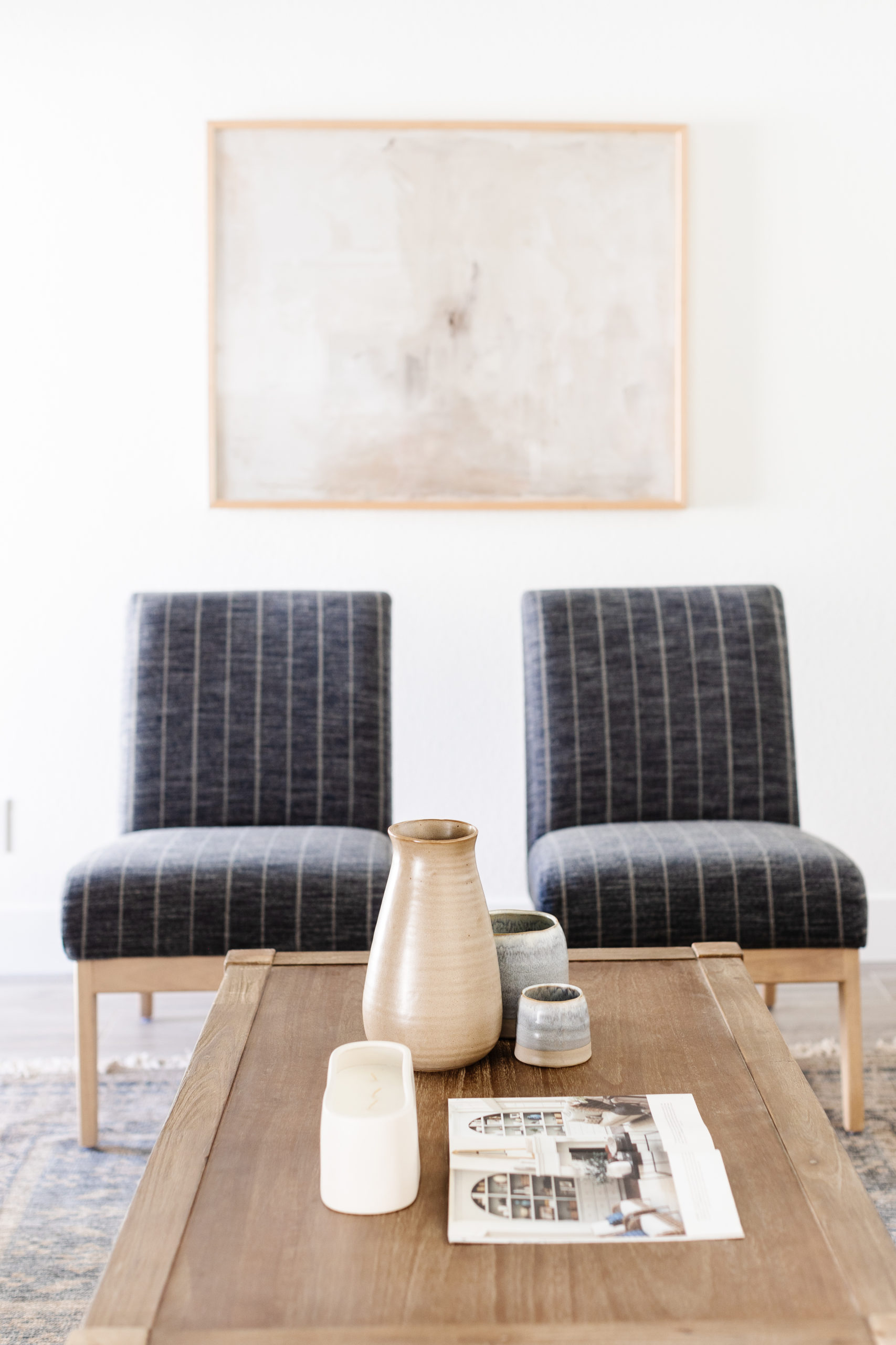
For the staging, this space got tricky. Normally, we would put the art on the fireplace to show that the TV would go there, but we loved the look of the fireplace uninterrupted. We chose to take a chance and use art behind the sofas and still orient the room facing toward the fireplace. It felt much more open, but it didn't show as much seating space as we usually like to do in the main family room. We didn't have a sectional in inventory and the wall facing the fireplace was smaller. We centered the sofa on the fireplace, added 2 smaller accent chairs and used a tree for additional visual space in the empty corner. We also chose to not hang anything above the sofa since the sofa wasn't centered on the wall. Overall, it's a really cozy and cute space and I think it still allowed buyers to visualize how they would use the space for themselves.
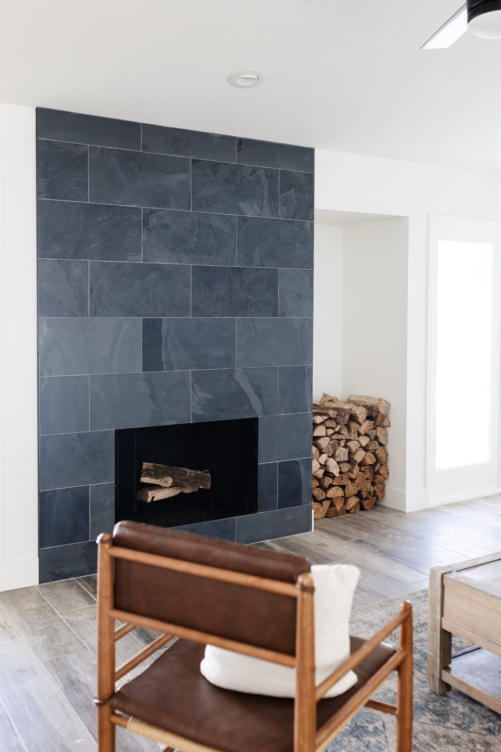
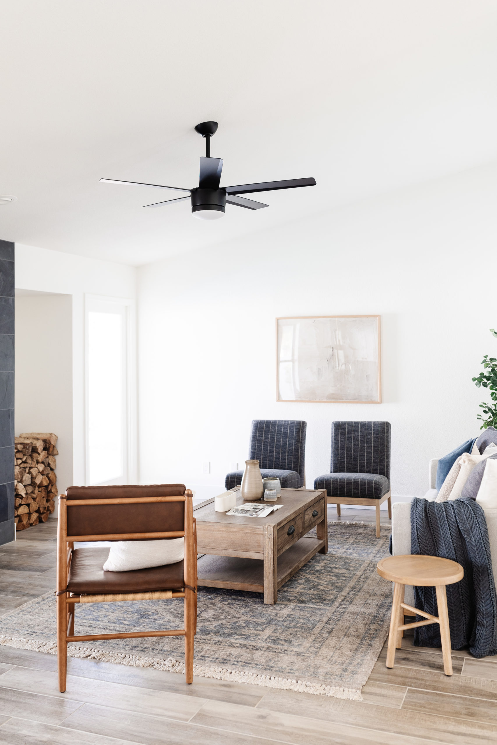
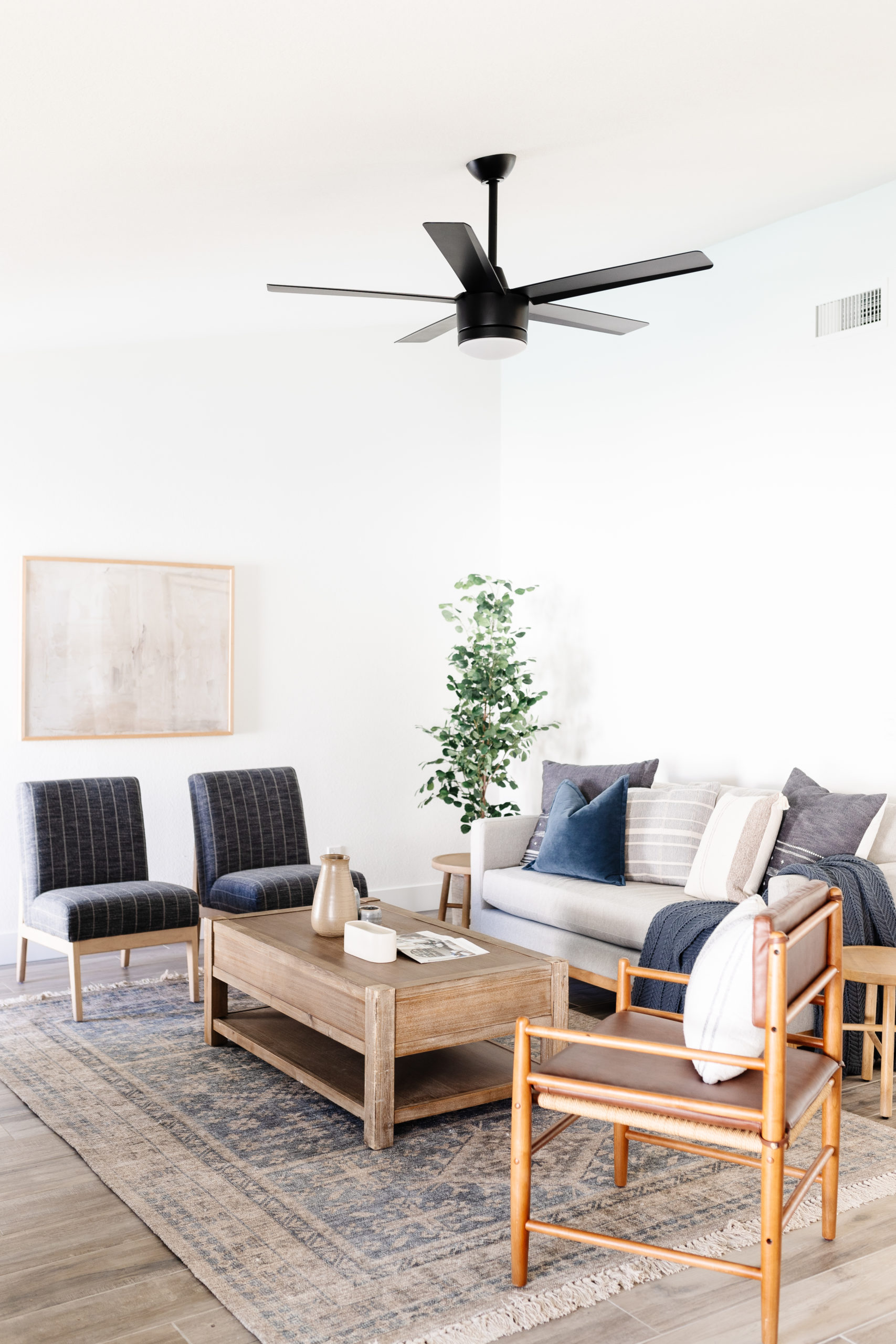
shop the living room
Dining room
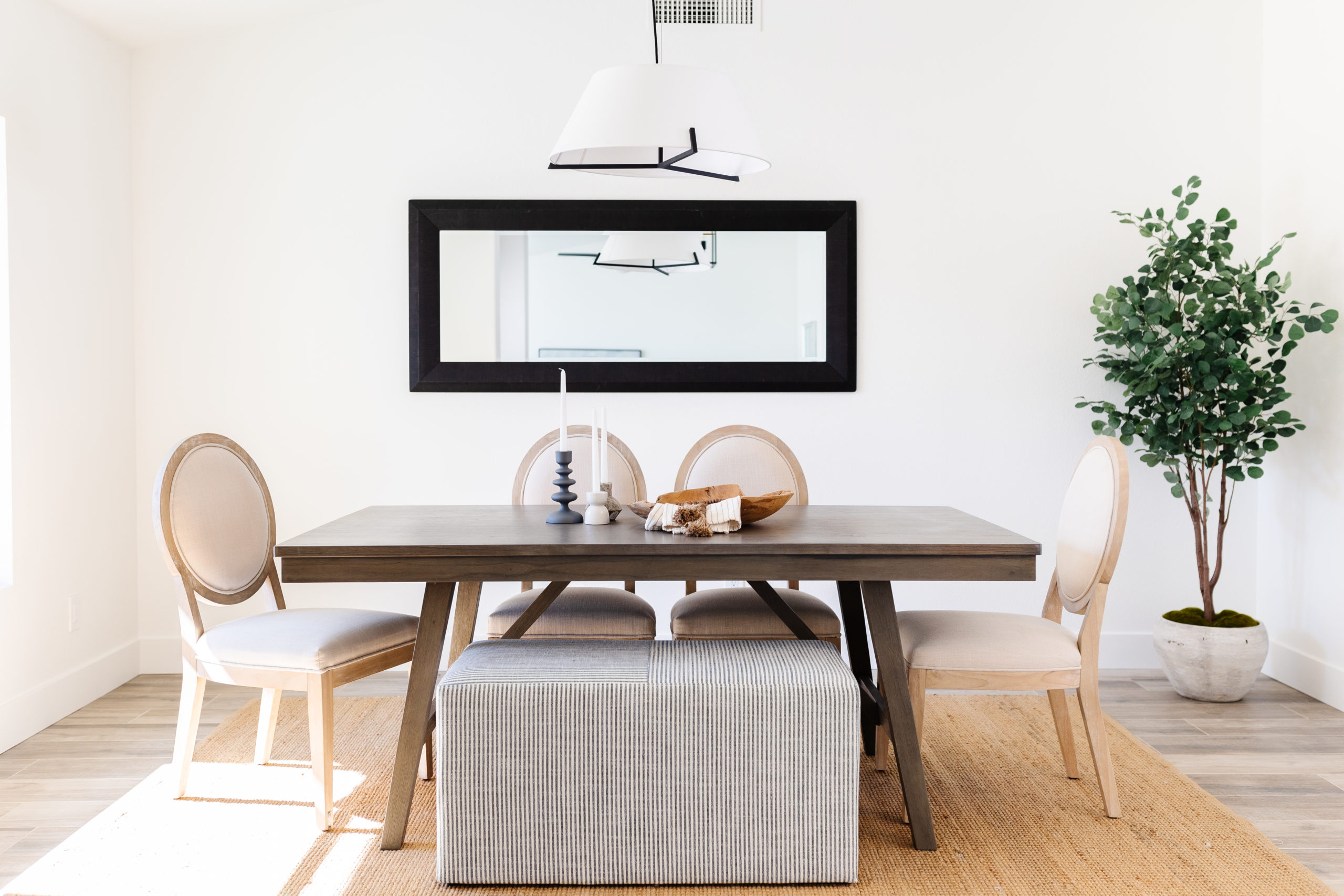
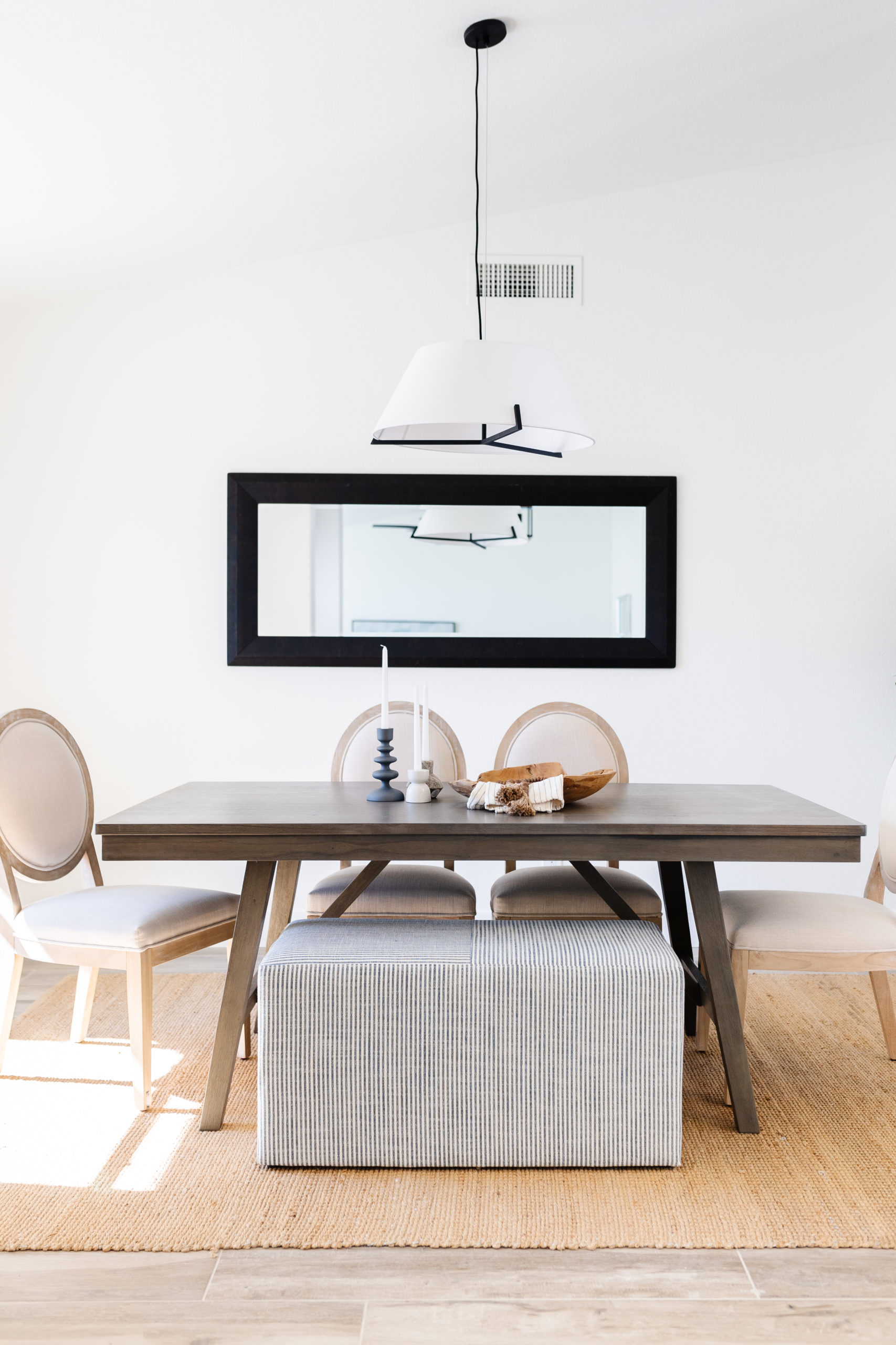
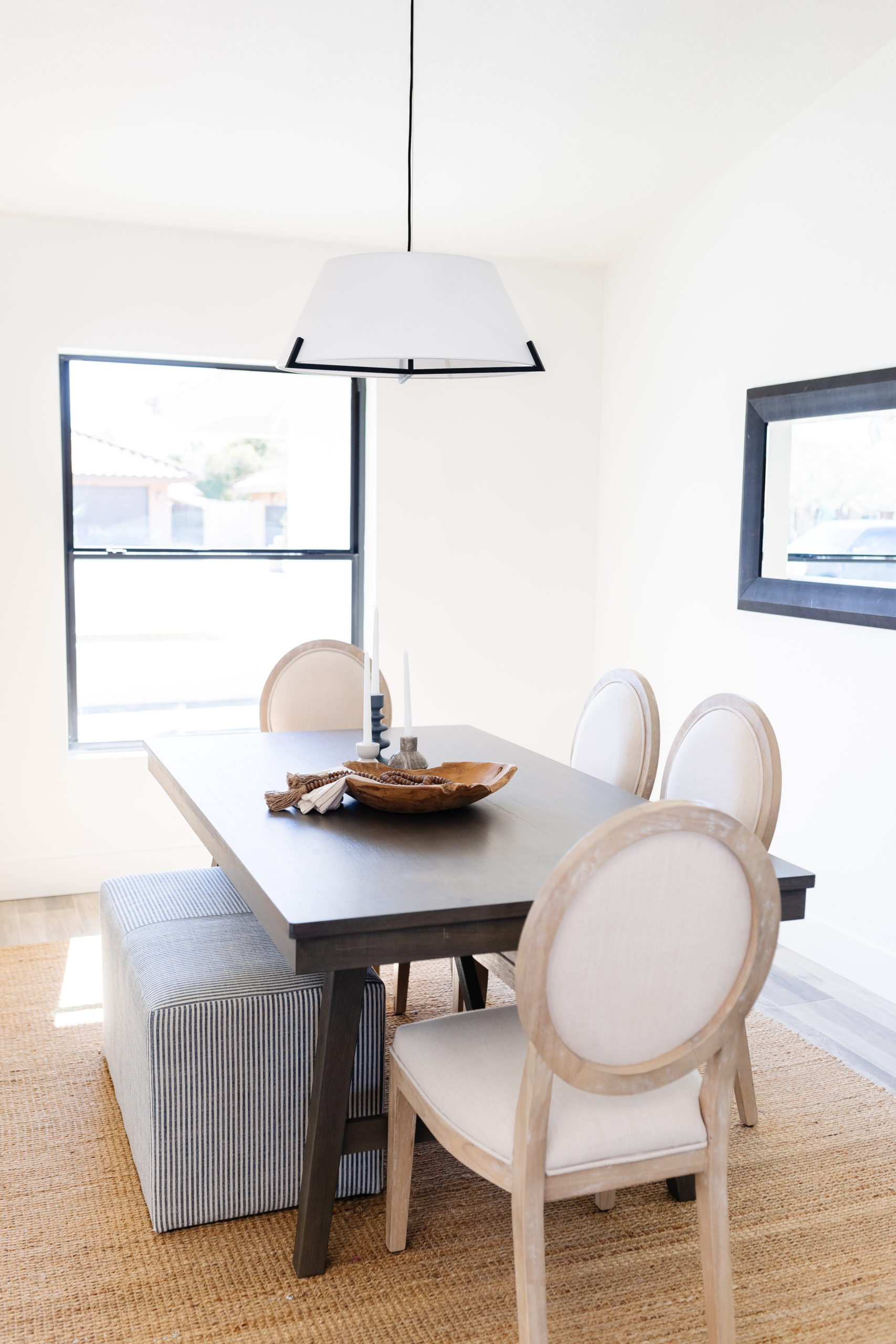
The dining room also got a minimal, but beautiful makeover. We painted and added a new light fixture along with the flooring and then let the staging do its thing.
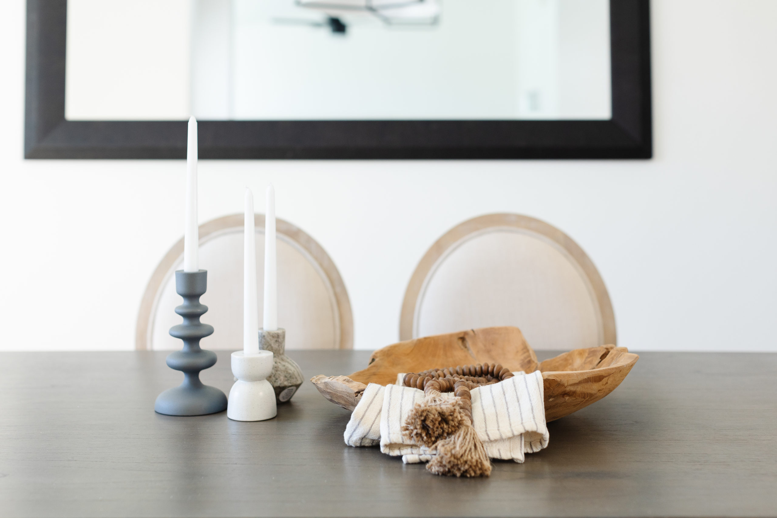
I love the combination of dining chairs and benches and these ottomans from Target are really pretty and super light. I love having them in inventory because they really are multi use.
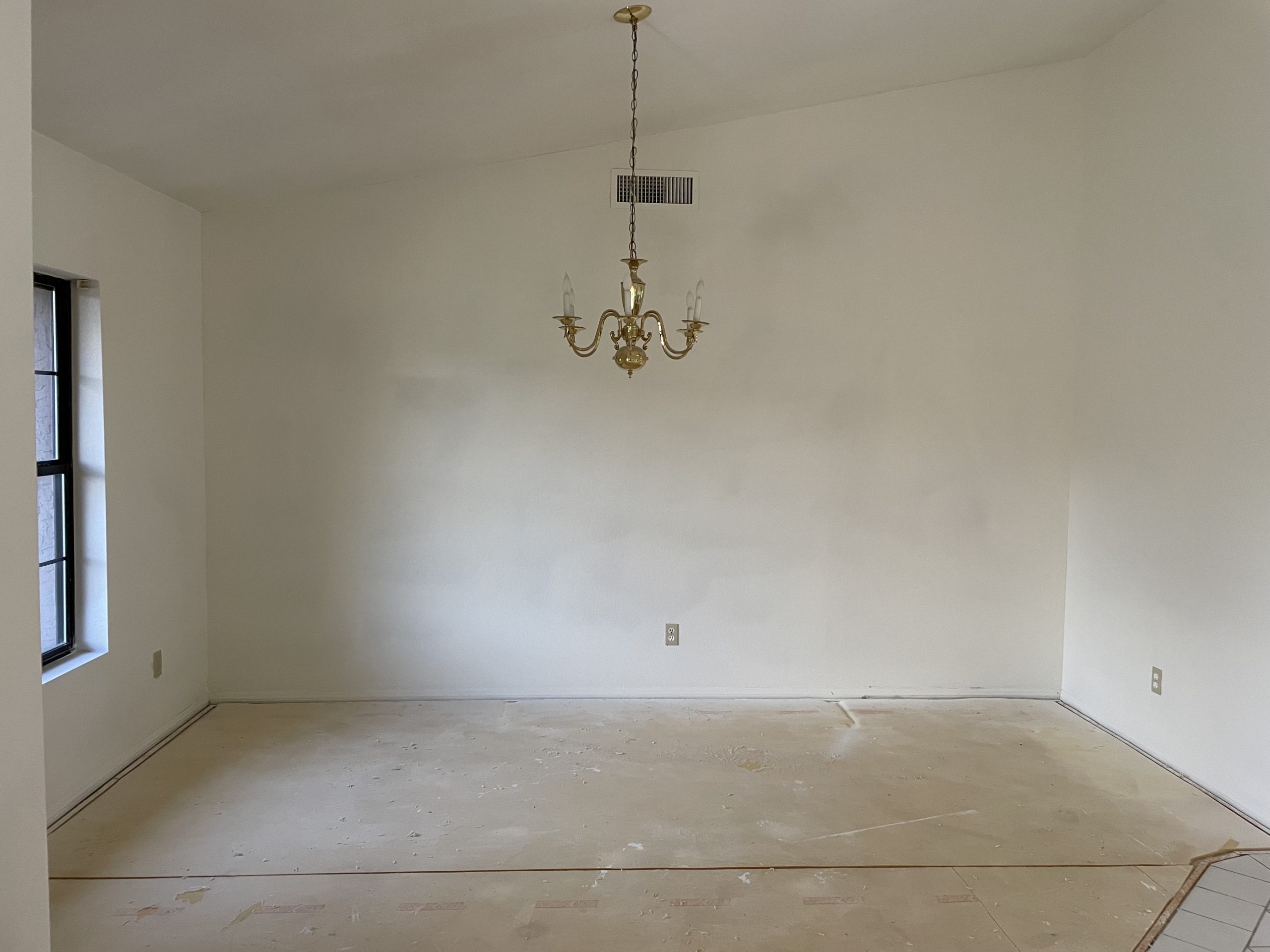
shop the dining room
KITCHEN & BREAKFAST NOOK
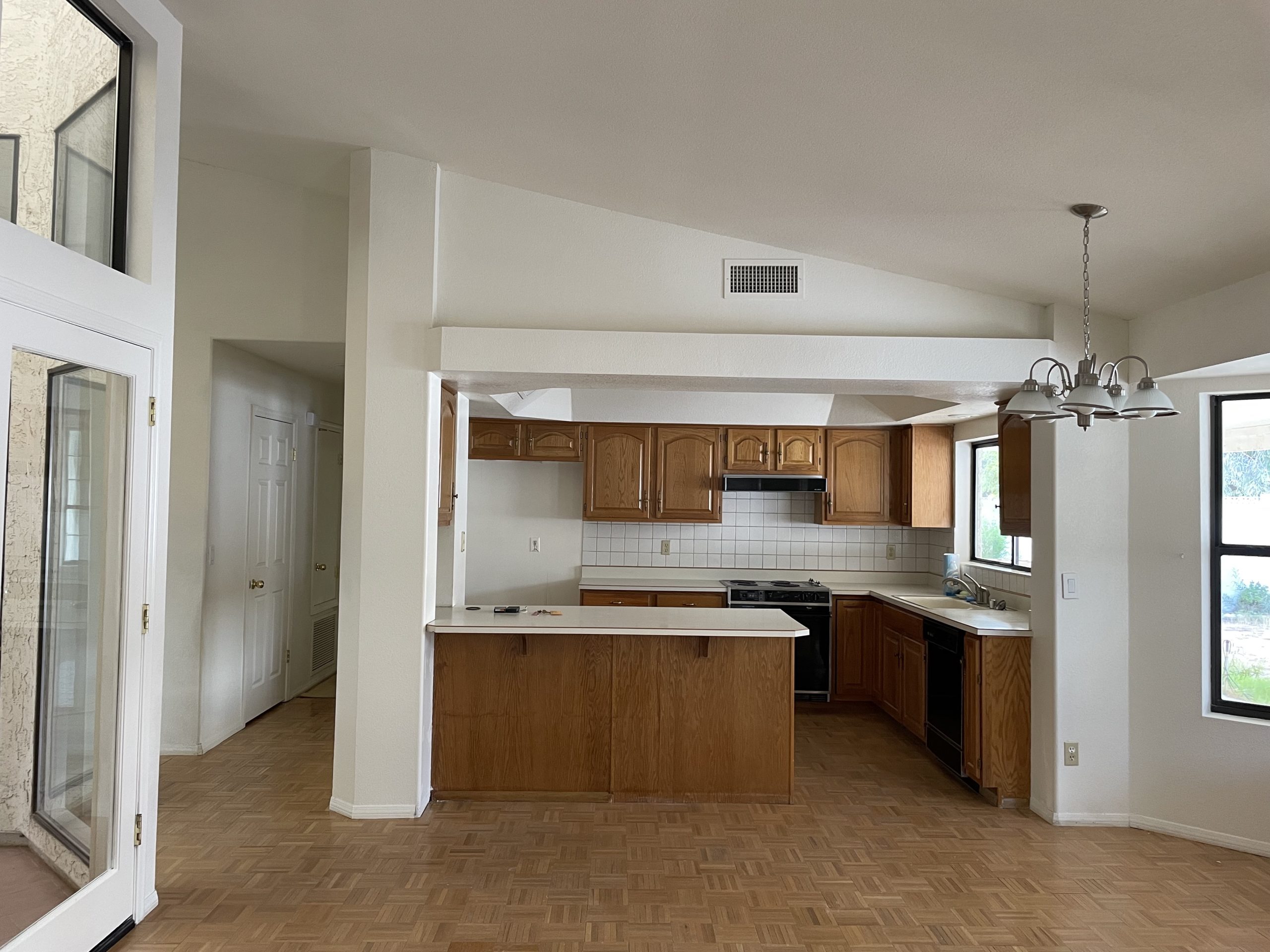
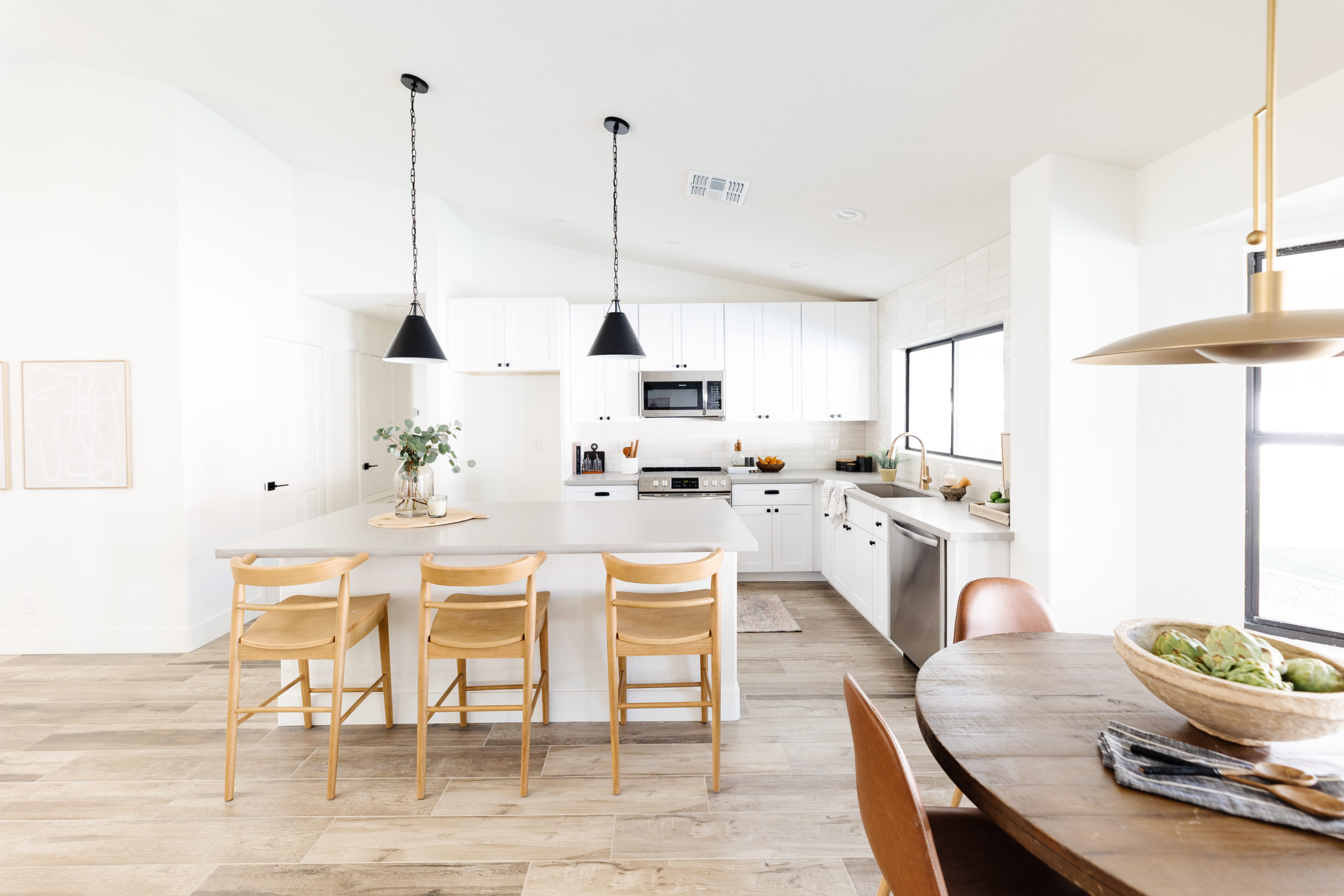
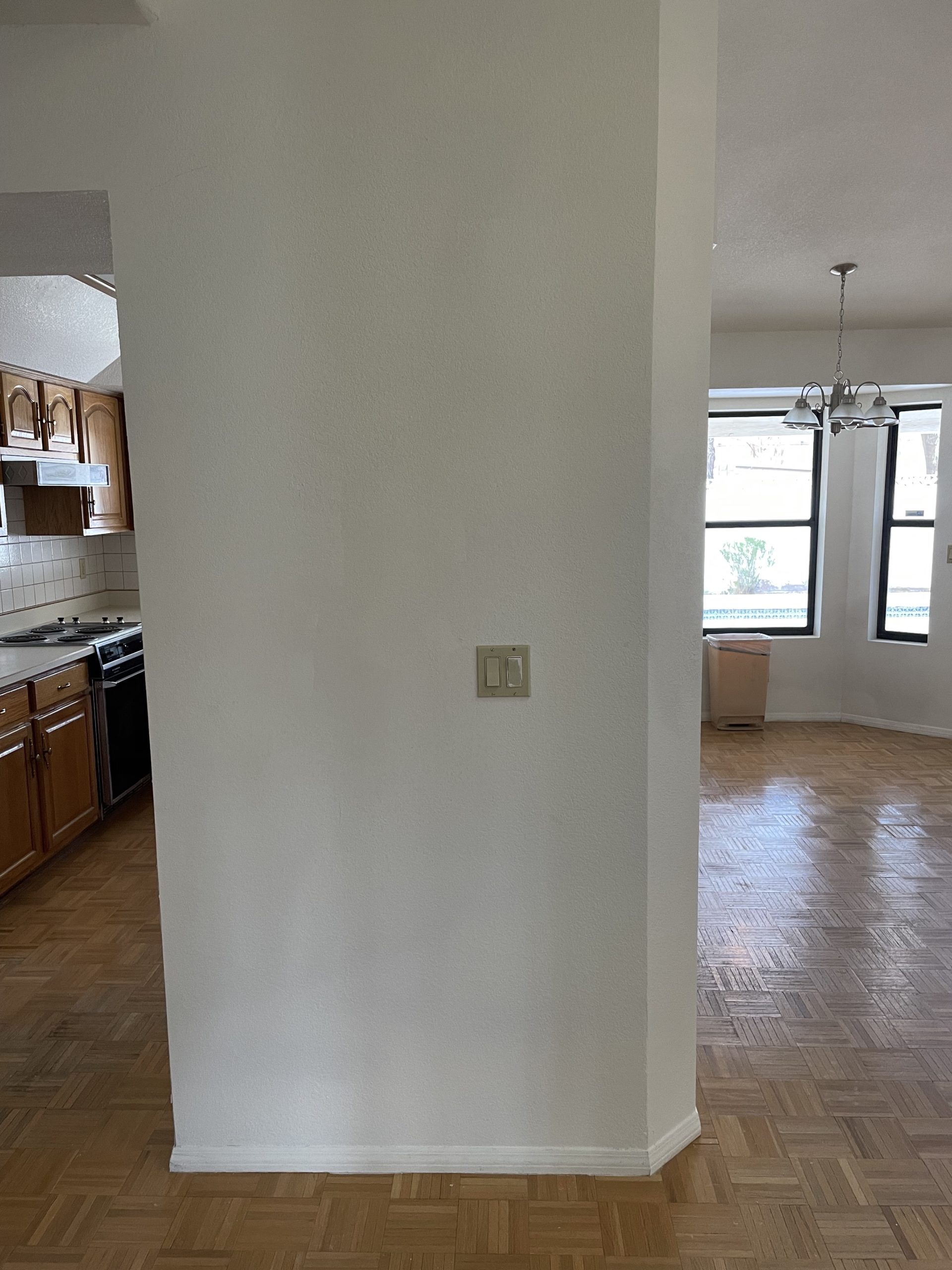
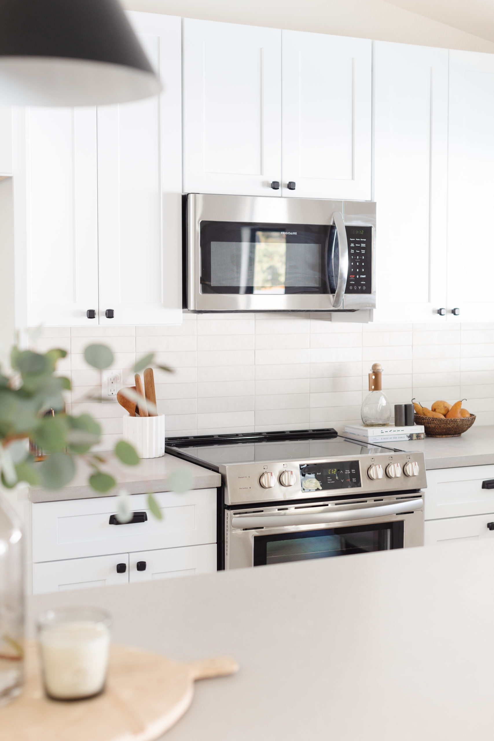
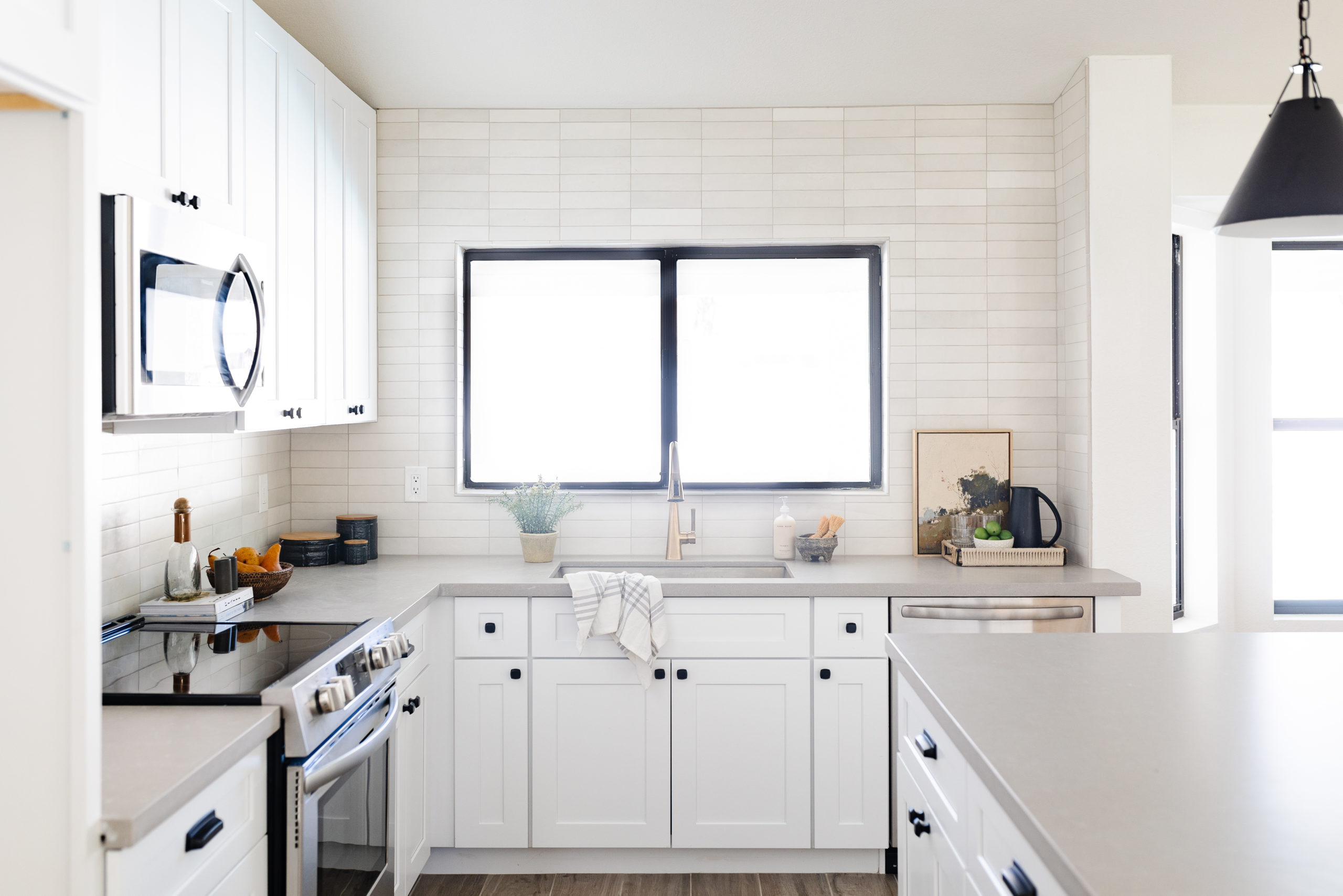
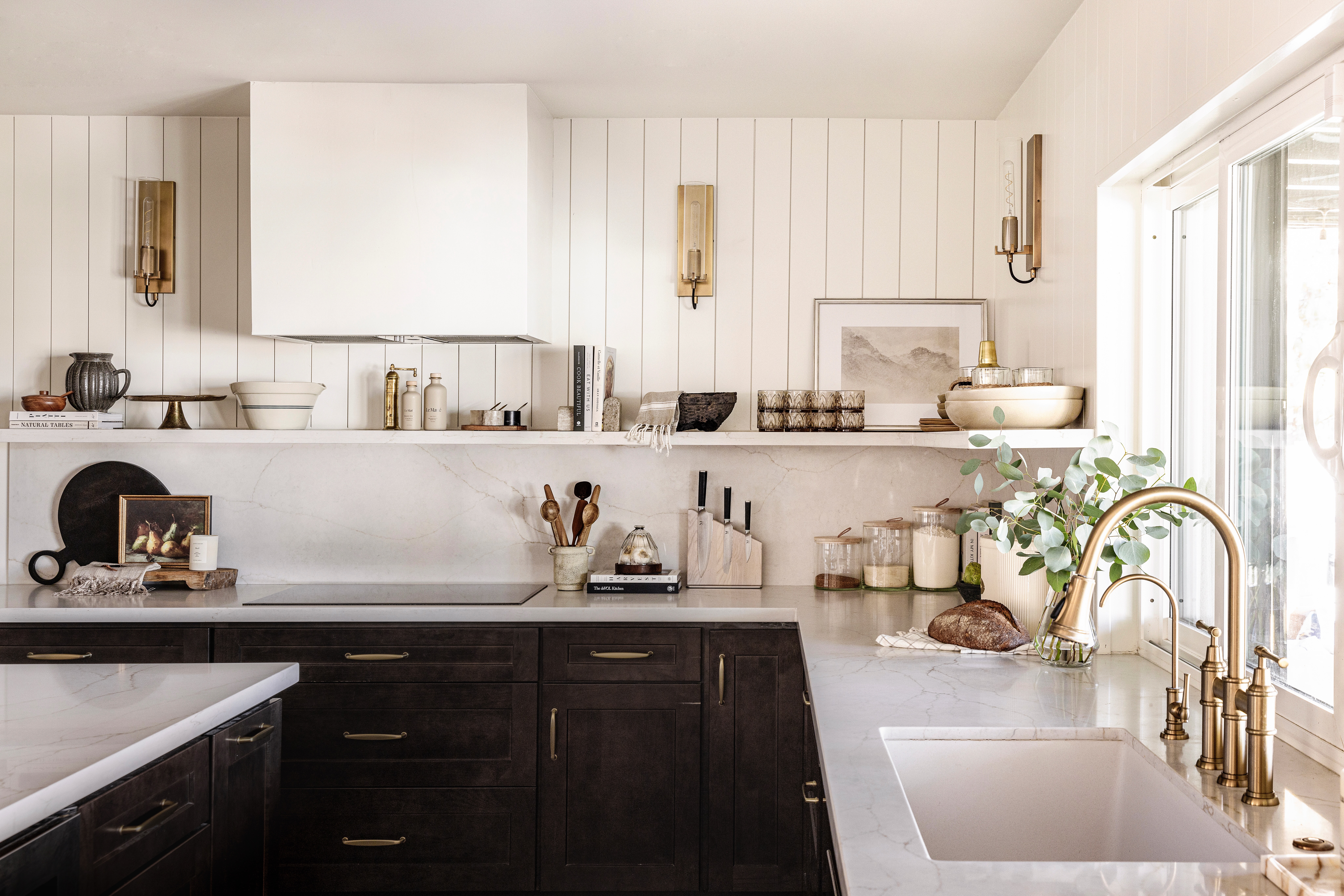
This kitchen got nice little upgrade, but we didn't enlarge the kitchen's size. It's amazing what removing a wall and a soffit will do, isn't it?
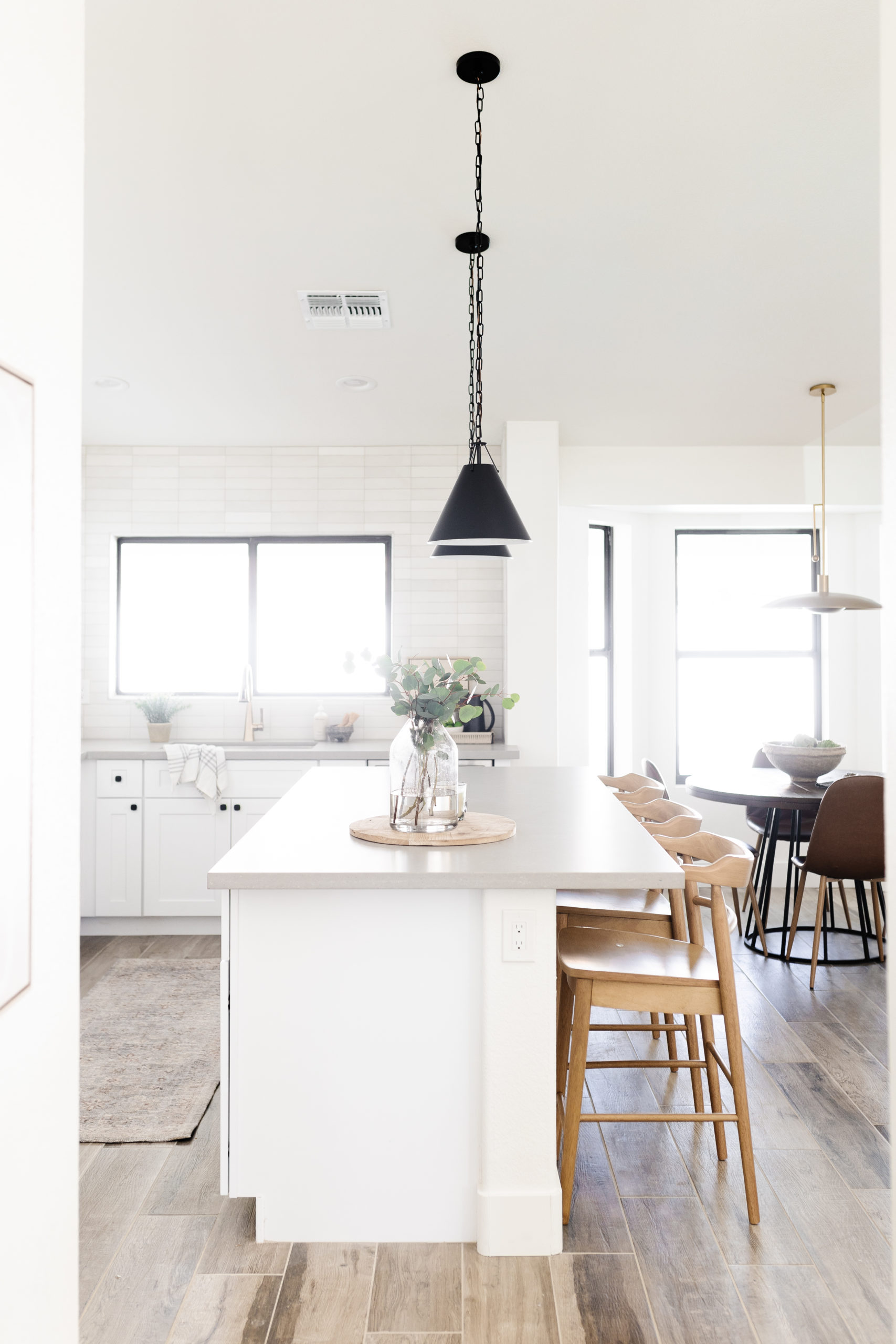
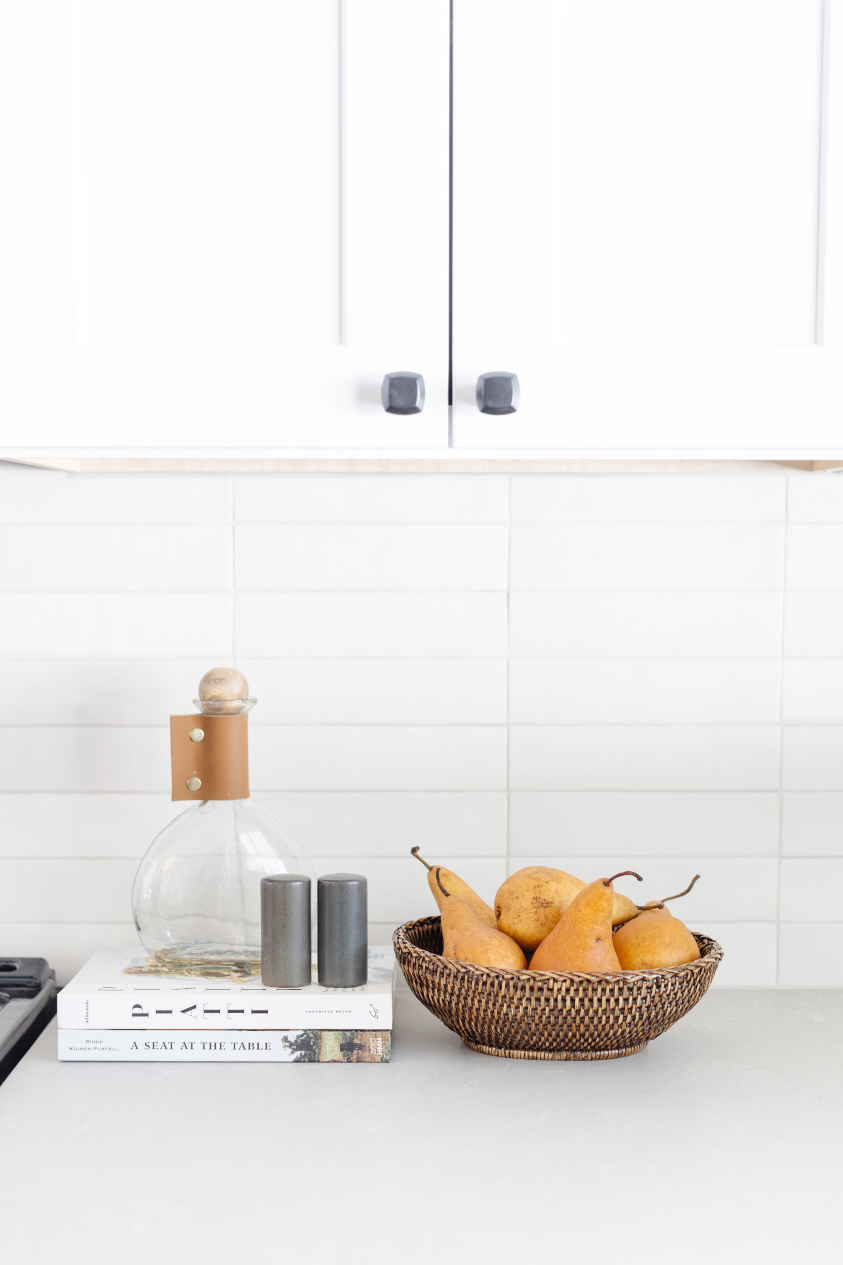
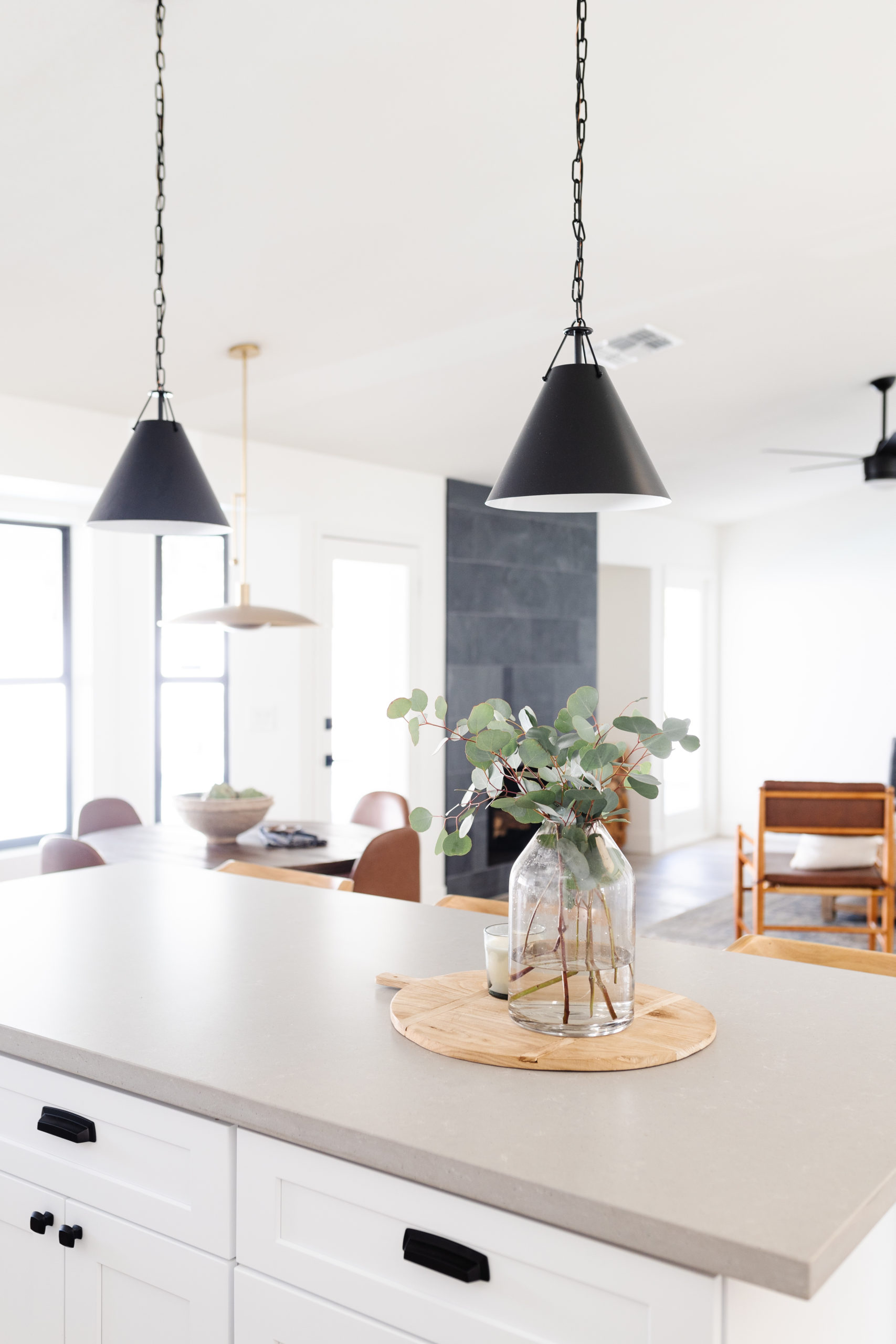
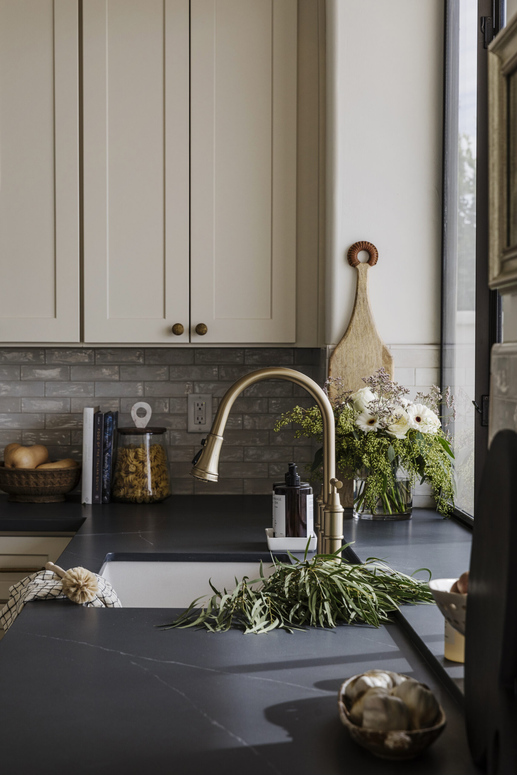
We used stock white cabinets, but chose honed quartz countertop in a warm gray that looked like it could be concrete or limestone. It had really beautiful texture and made this kitchen feel more modern, especially with black hardware and the straight laid tile.
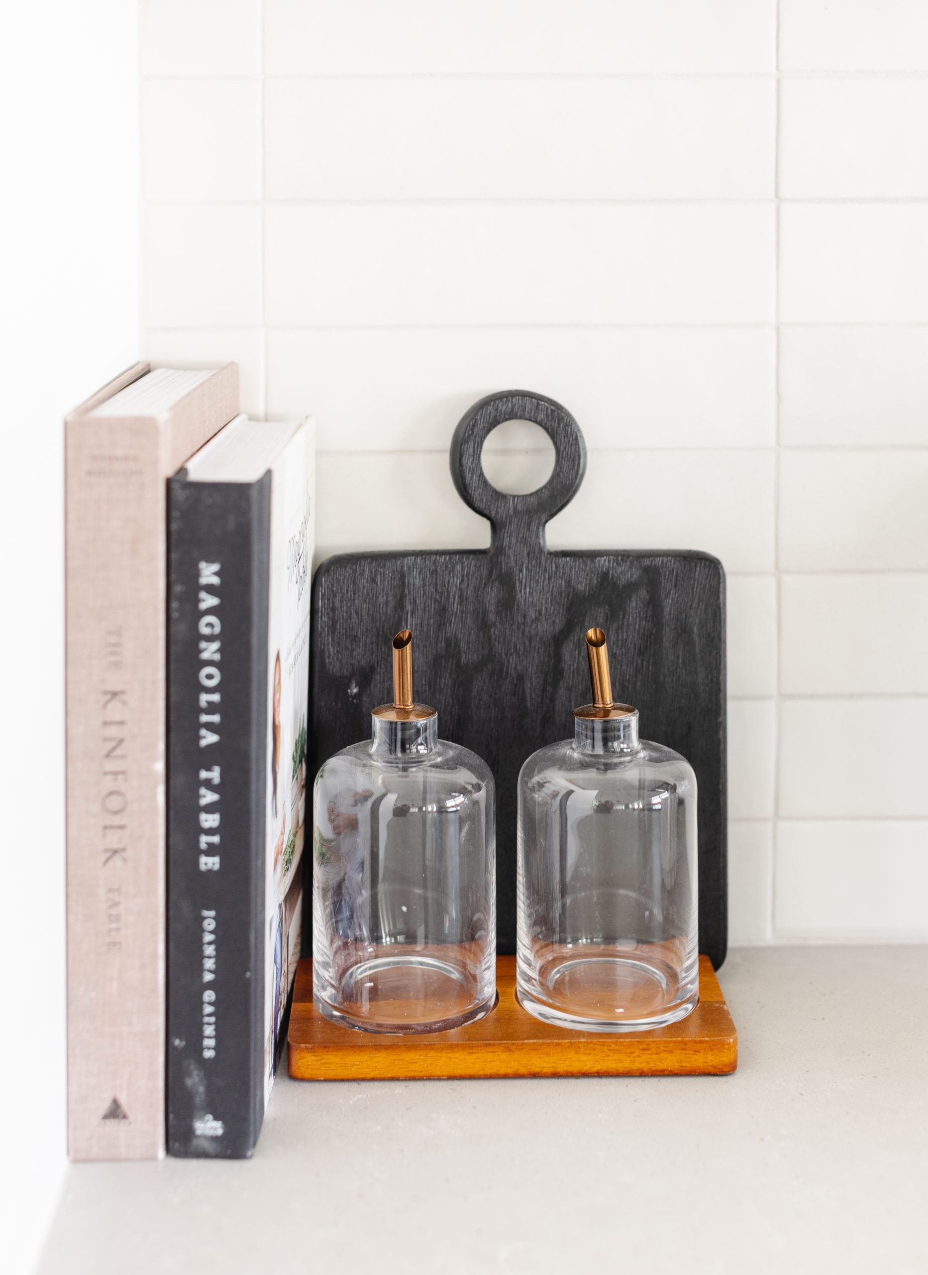
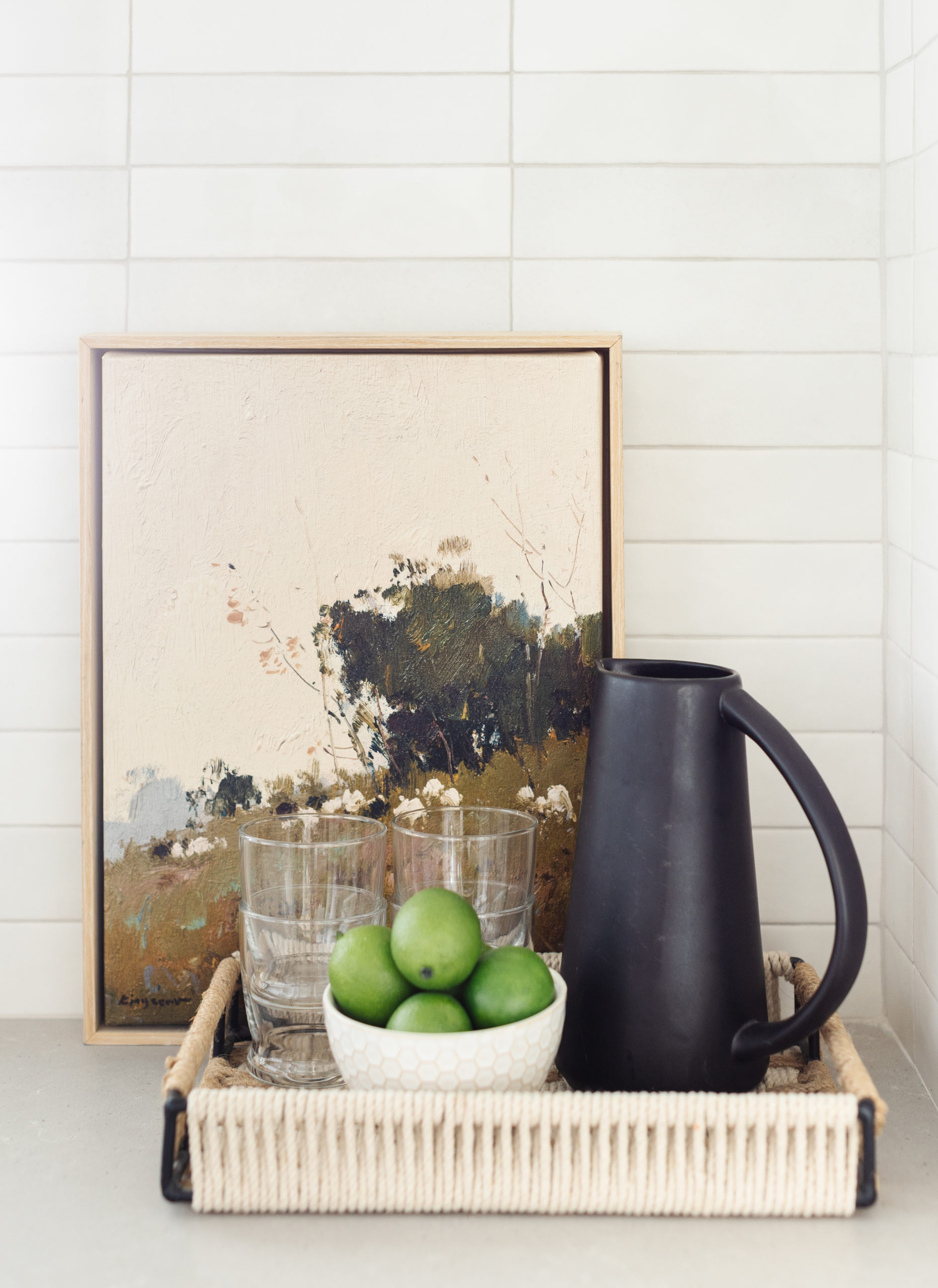
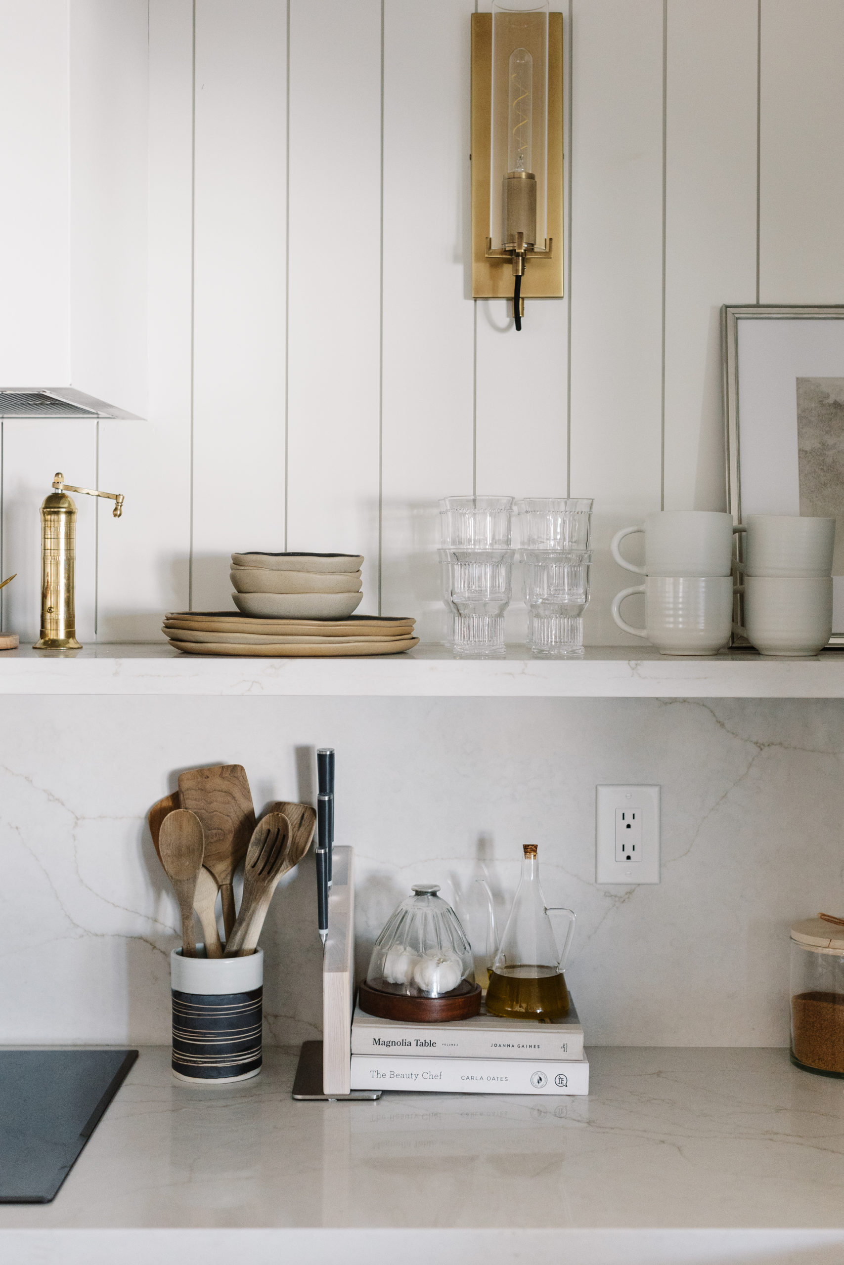
We kept the staging and styling minimal, but added wood elements to make the space feel cozier since the kitchen was leaning more modern in its finishes.
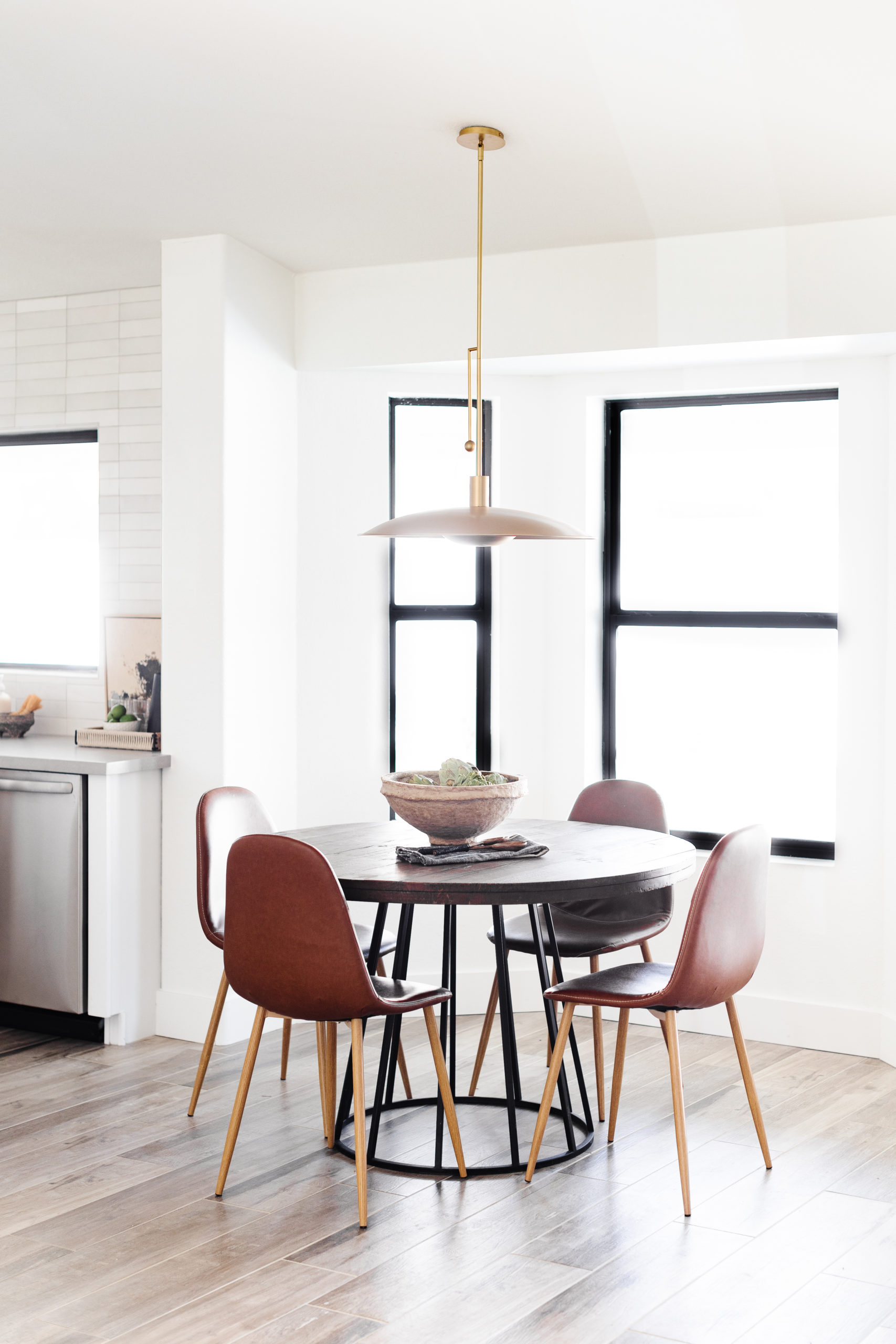
The eat-in nook came together with staging and a pretty light that almost didn't make it. It wasn't meant to be installed on an angled ceiling and I didn't realize that or realize that the ceiling was angled. It's so slight. But we luckily found an angled adapter that we attached to the top and it allowed us to hang it. Thank goodness! I really wanted to finally be able to use this light in a project.

shop the kitchen
Primary bedroom & bathroom
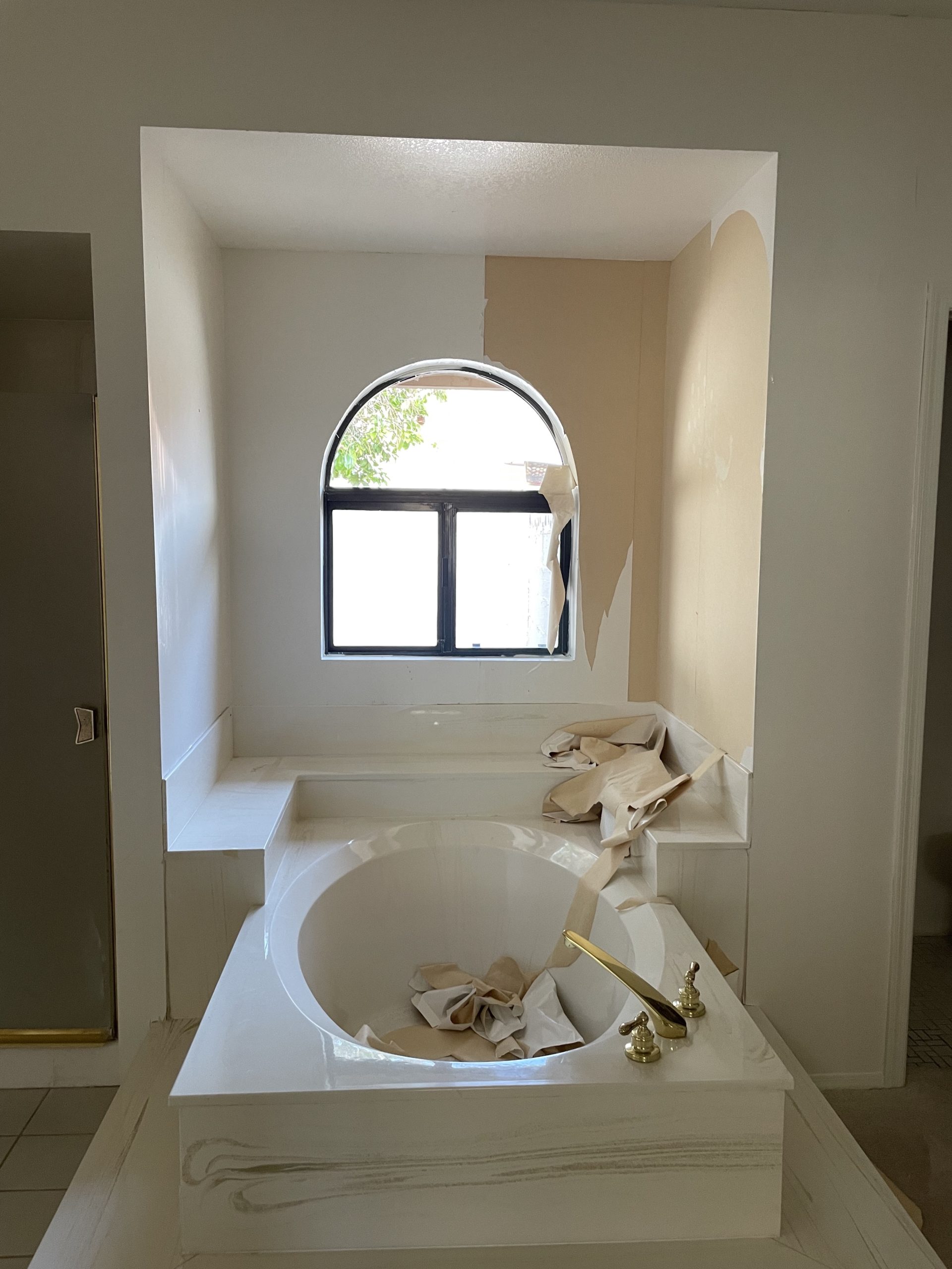
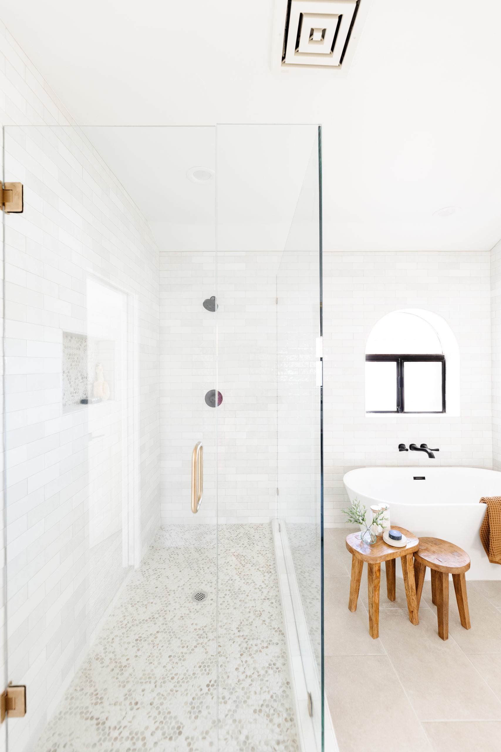
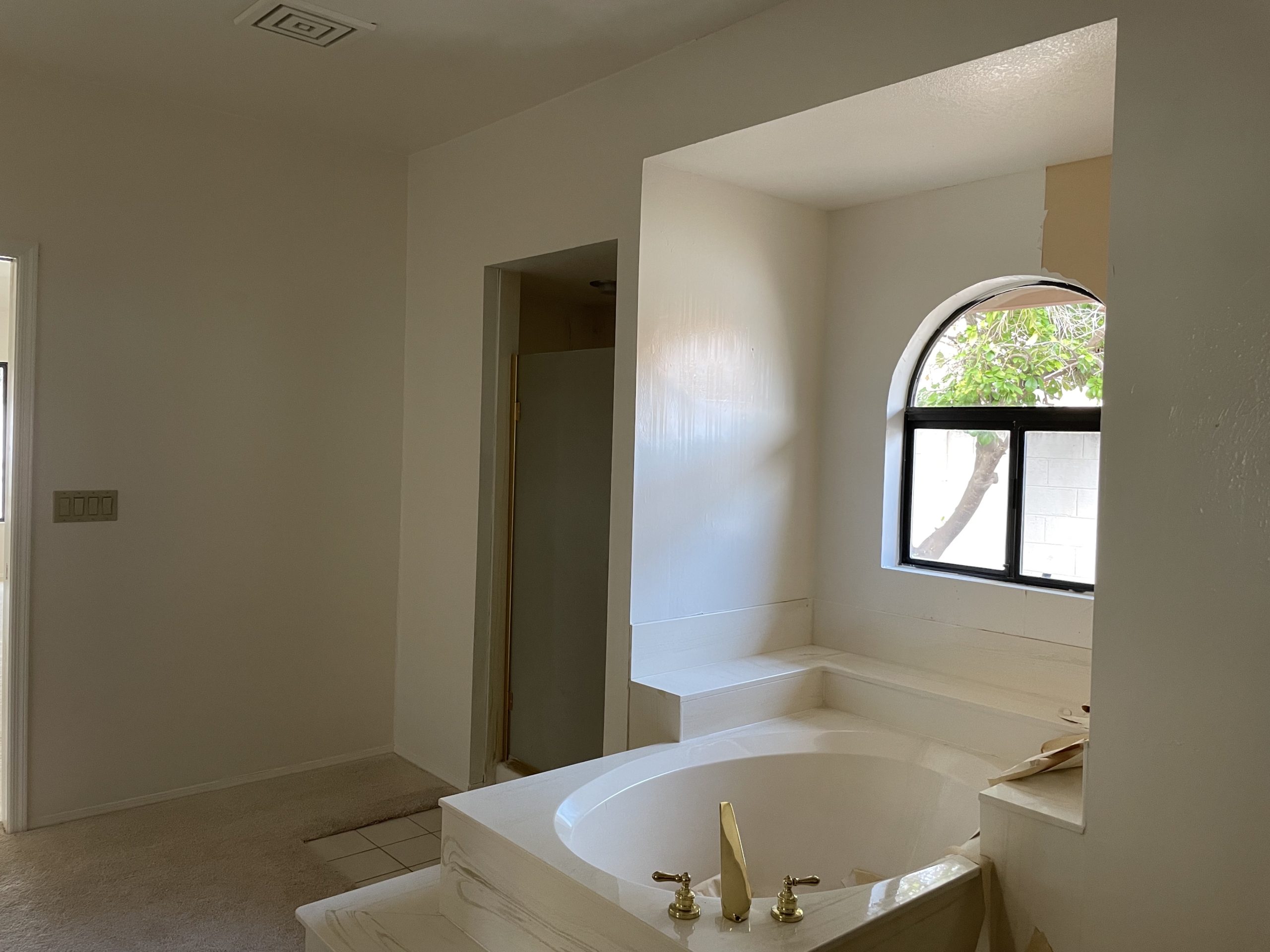
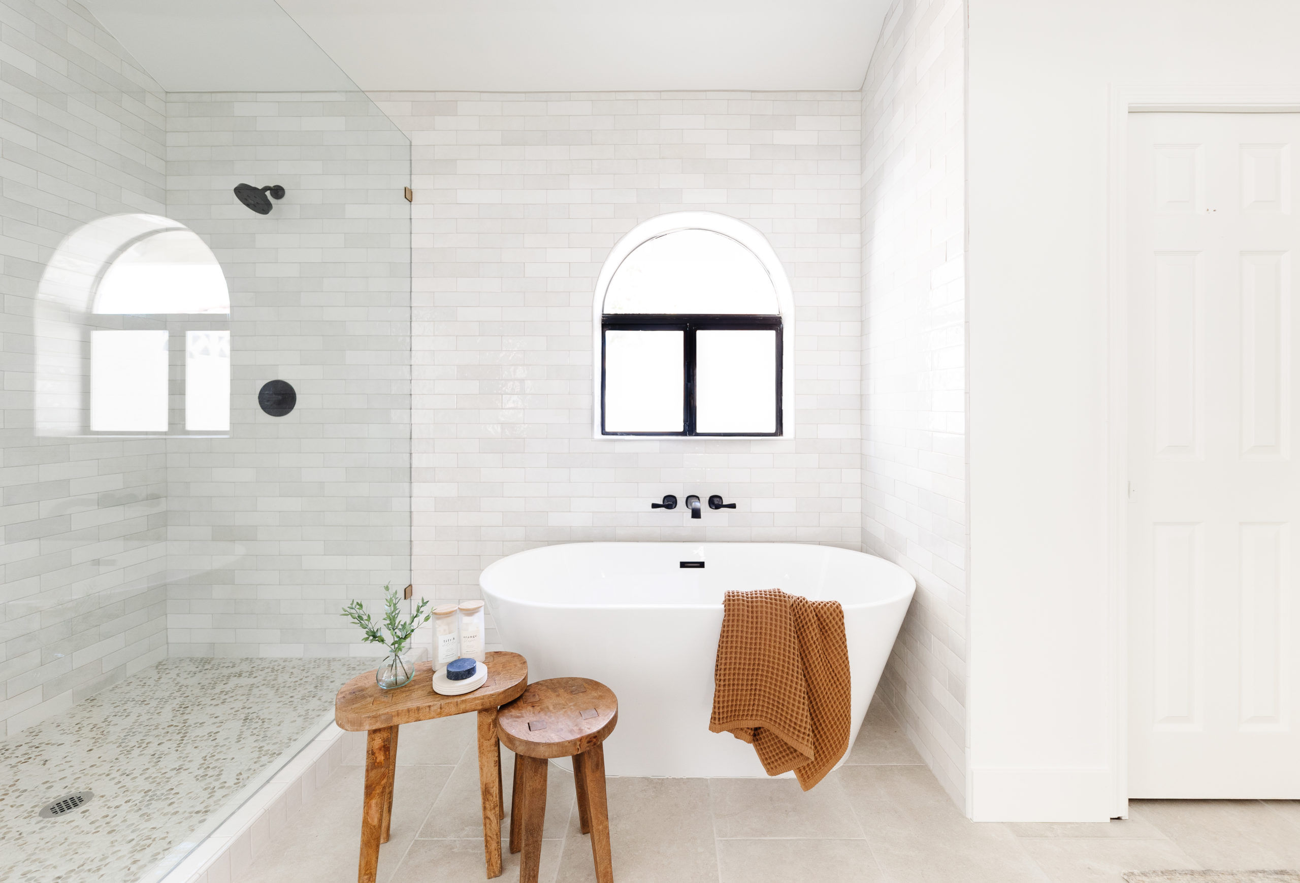
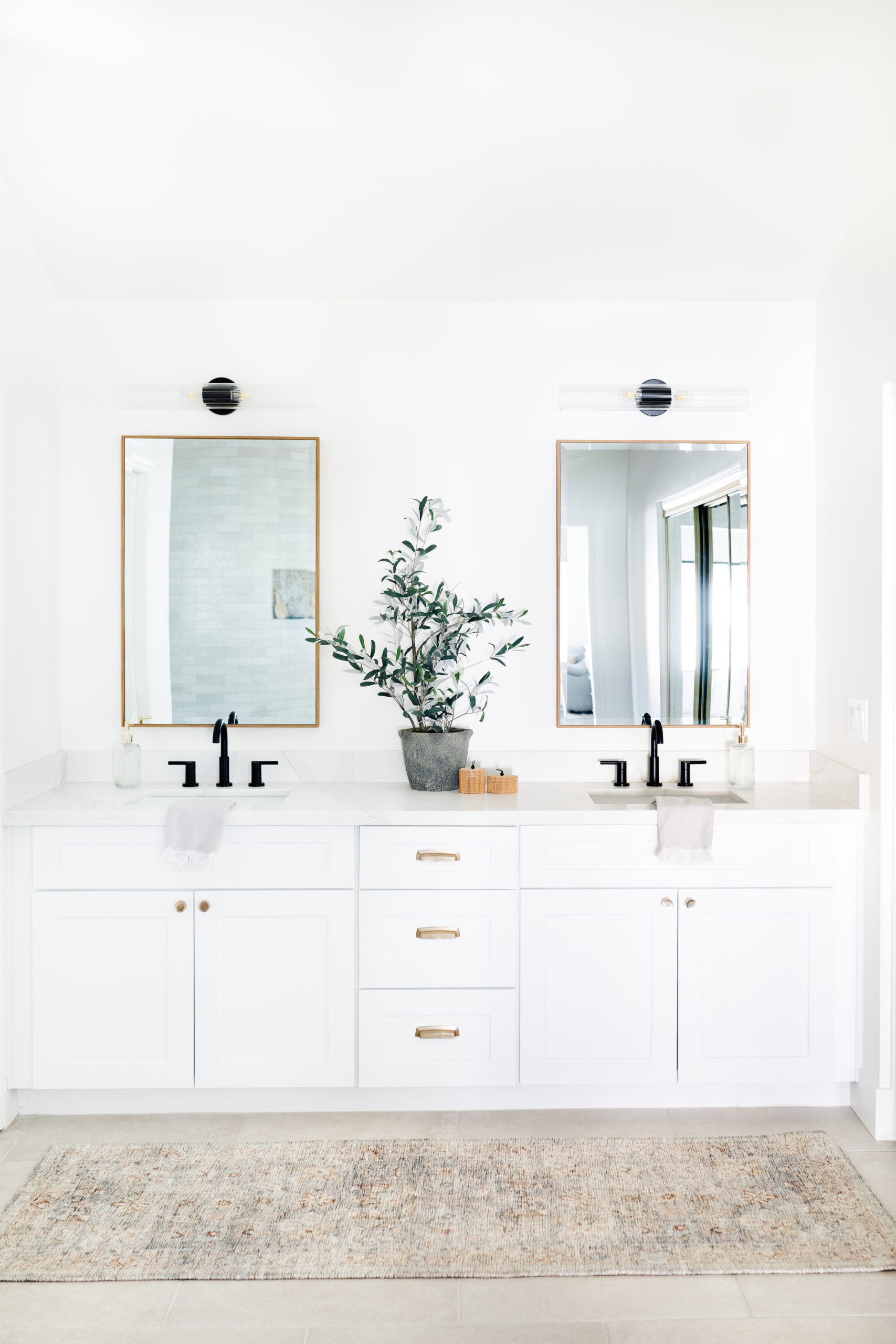
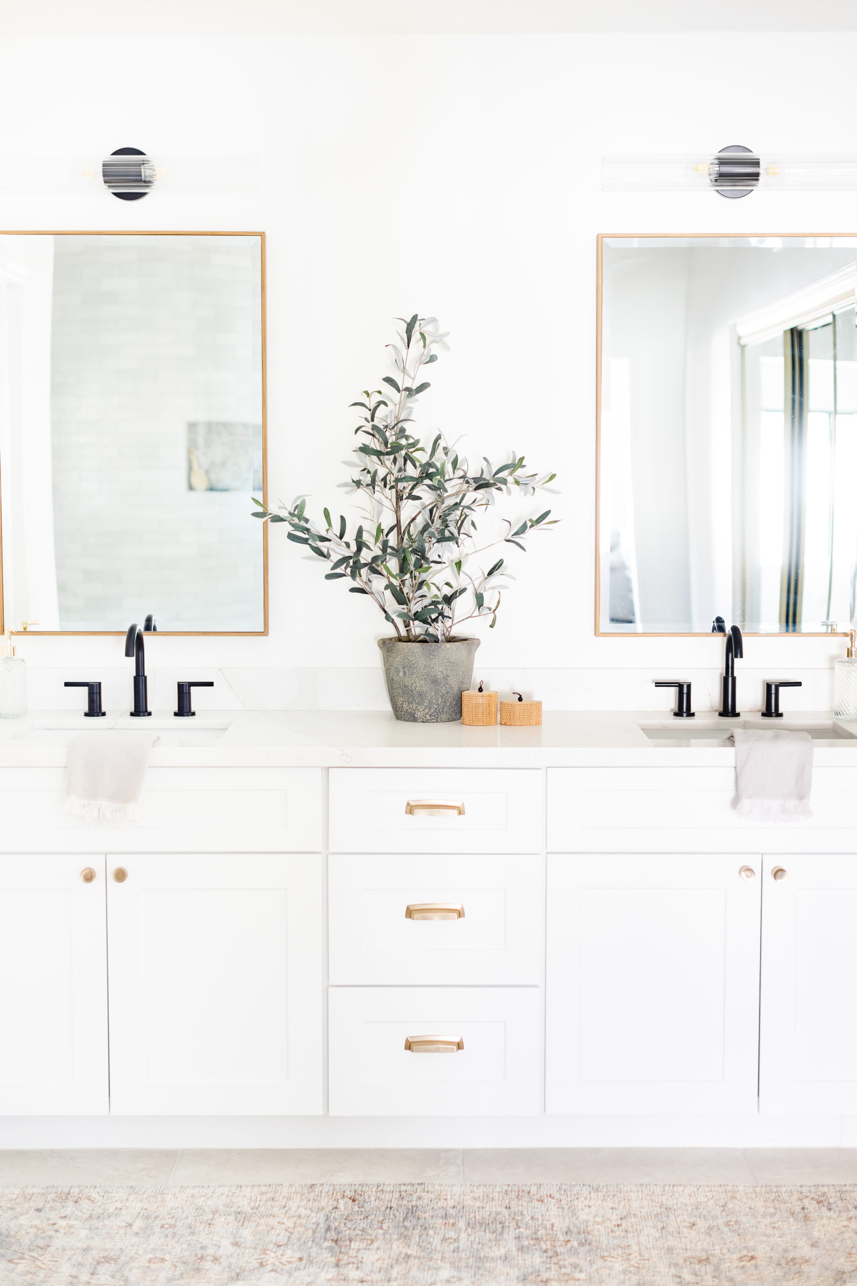
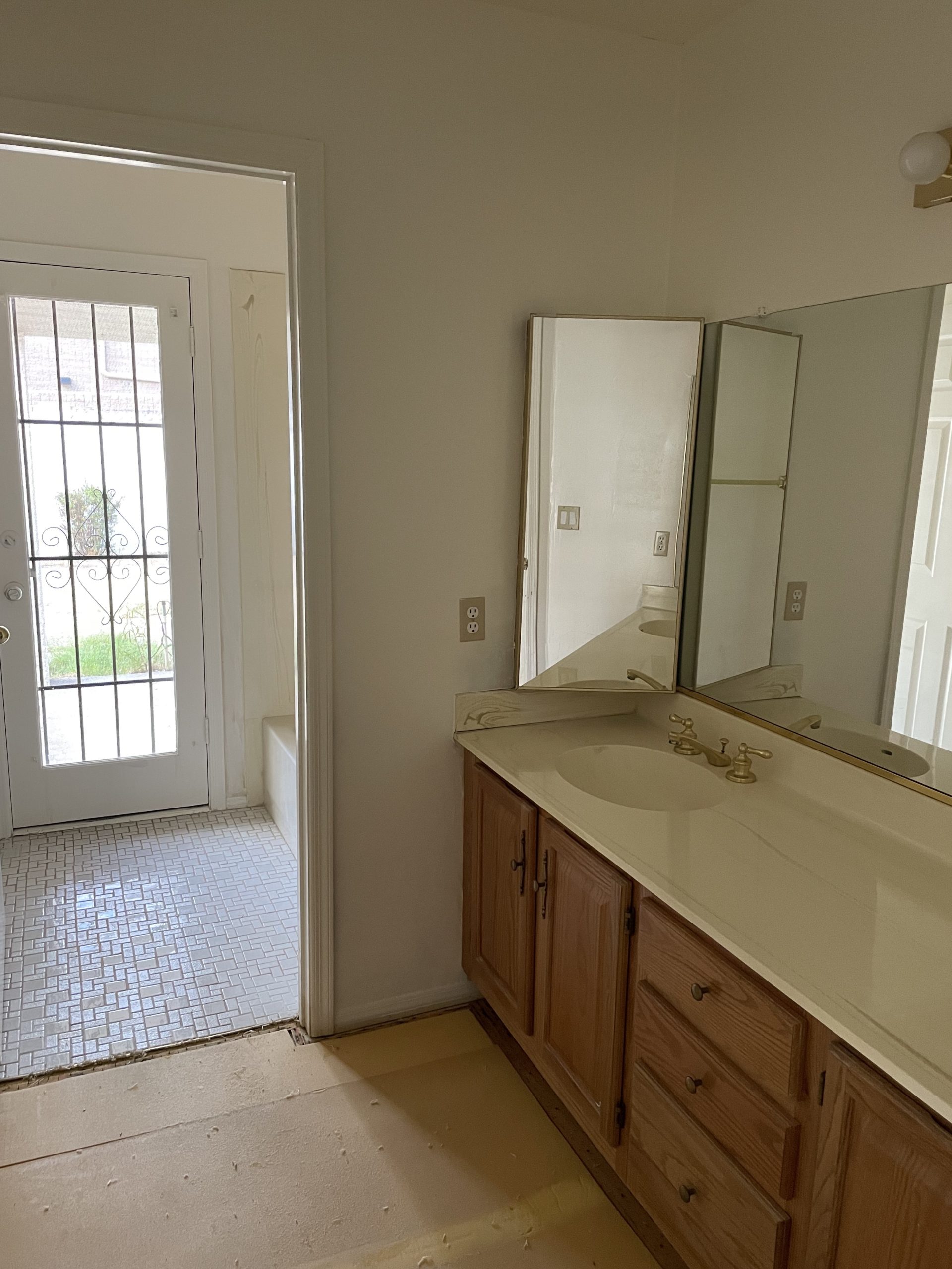
This is one of my favorite bathrooms that we have completed in a while. I love the marble shower tile and the taupe cabinet color. We made the shower much larger and added a double sink by taking over a hall closet and also a second closet in the bedroom. Now it's a large walk-in shower and the bathroom is much more spacious. I love the texture in this bathroom from the slate herringbone floors. I feel like it adds character to the brand new bathroom. We kept the bathroom feeling warm with arched mirrors and brass vanity lights.
One of things we debated about during the remodel, that some of you voted on in my stories, was whether or not we should enclose the toilet into a separate room or leave it as is and therefore keep the natrual light in the whole bathroom. The majority voted the way that I was leaning and that was to not enclose the toilet and keep the natural light in the space. I'm glad we did that. You can't beat natural light in a bathroom and I love how it turned out!
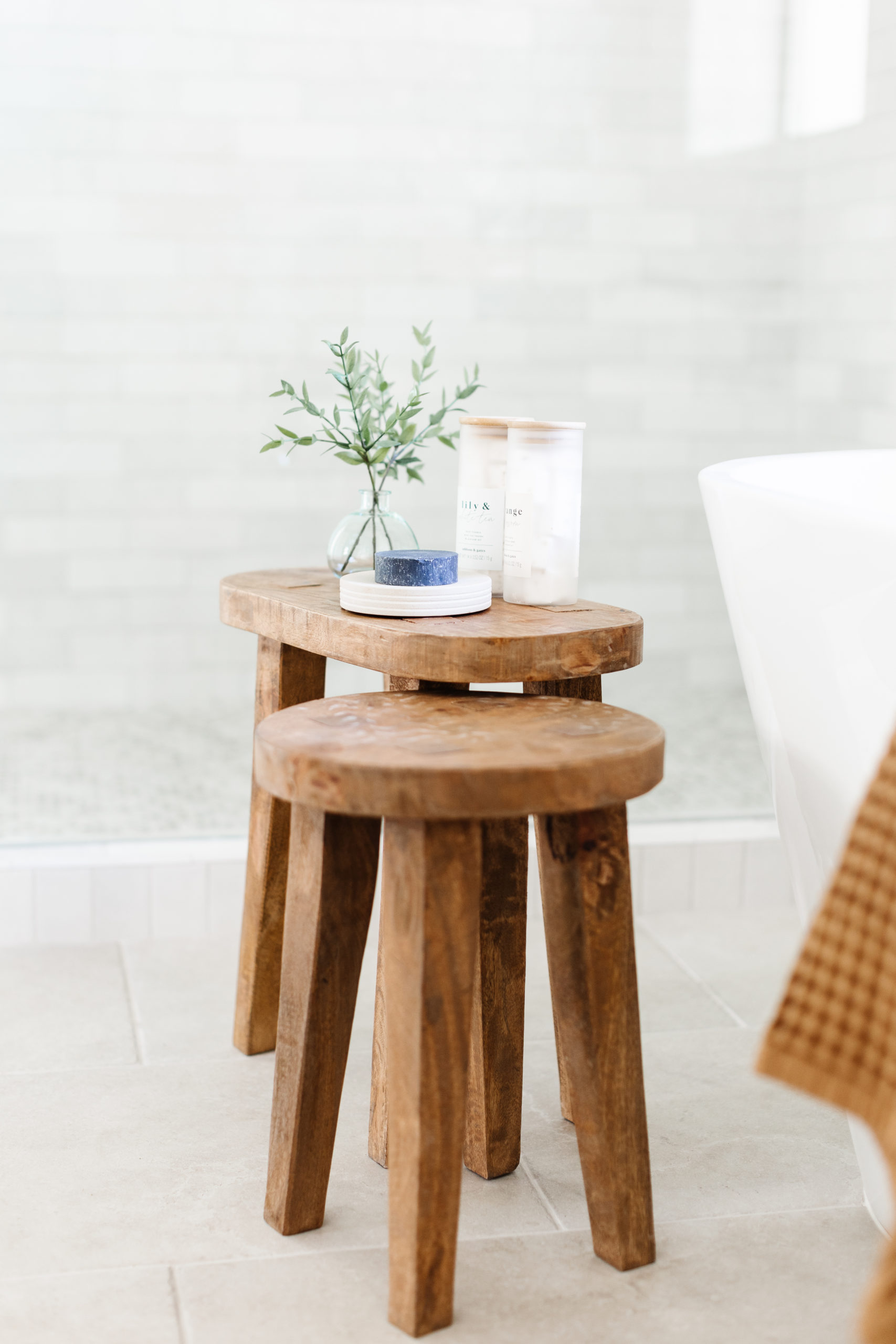
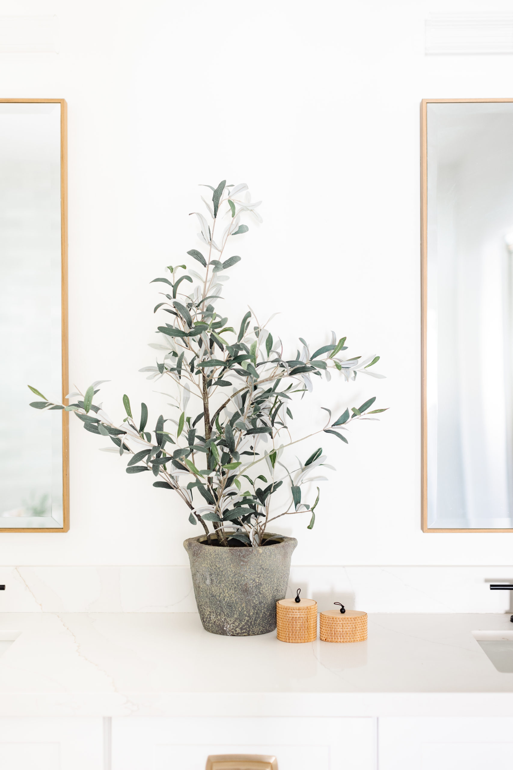
We kept the staging simple with a faux olive plant, hand towels and soap dispensers. I feel like this bathroom was already so beautiful and I didn't want to compete with the slate and the marble. I think everything in there adds enough without taking away from the finishes.

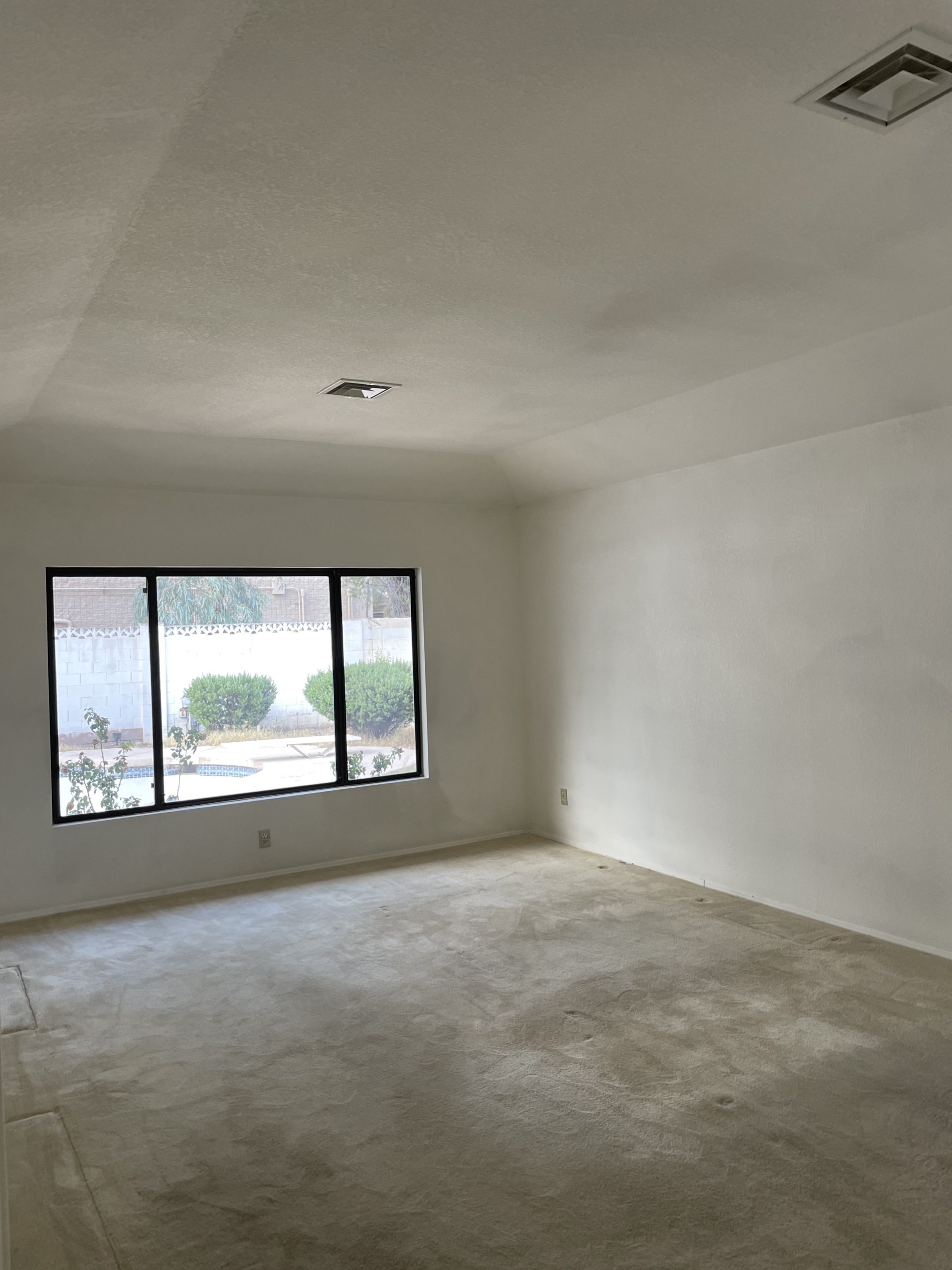
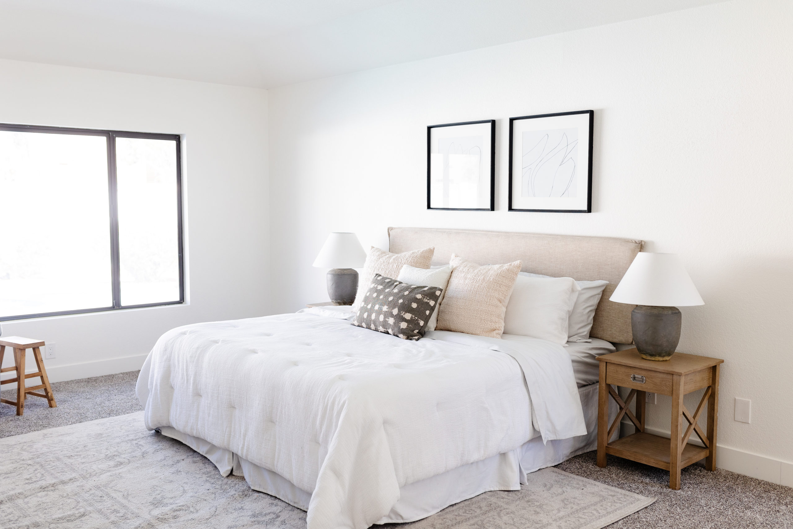
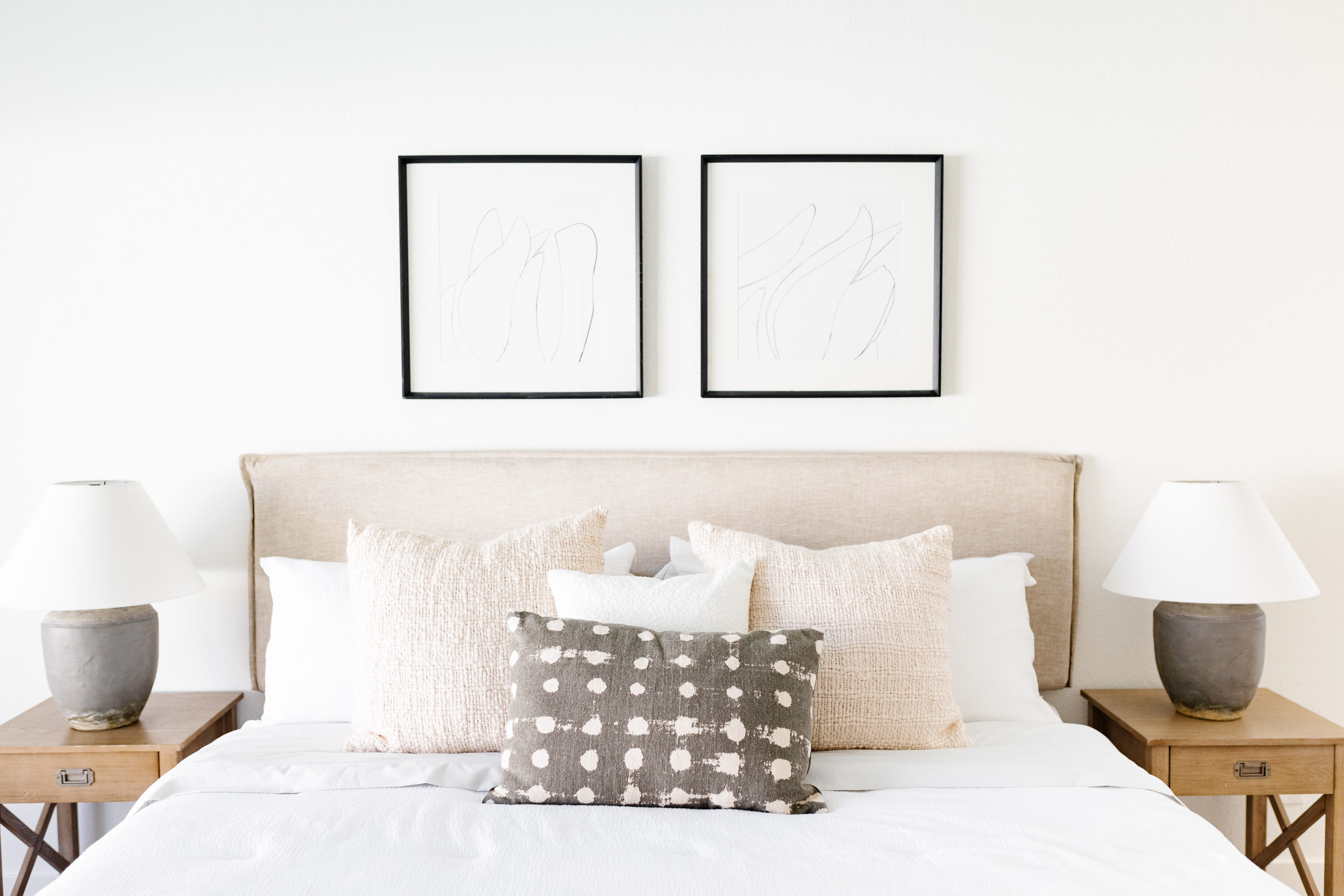
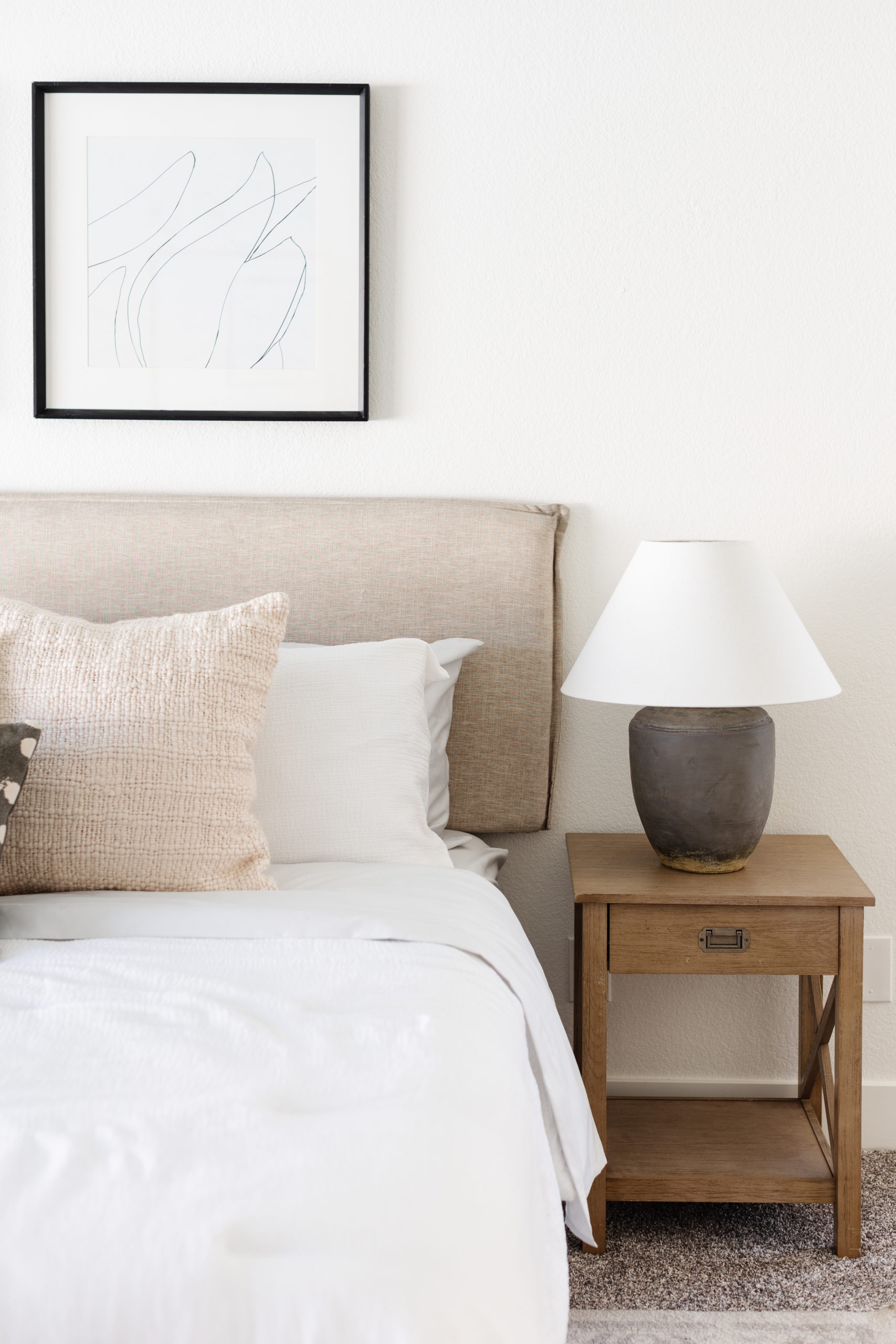
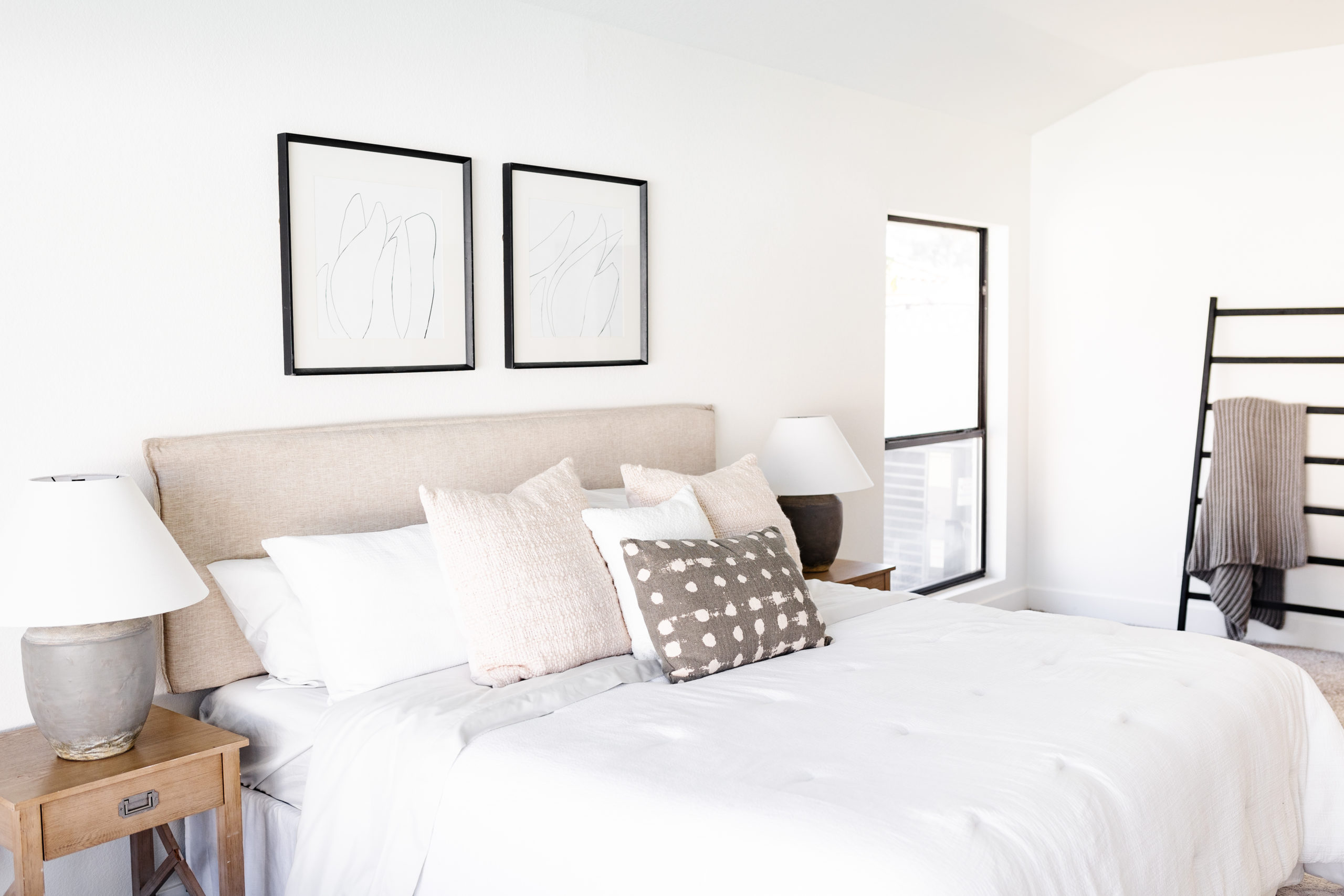
shop the primary bathroom & bedroom
kids' bathroom
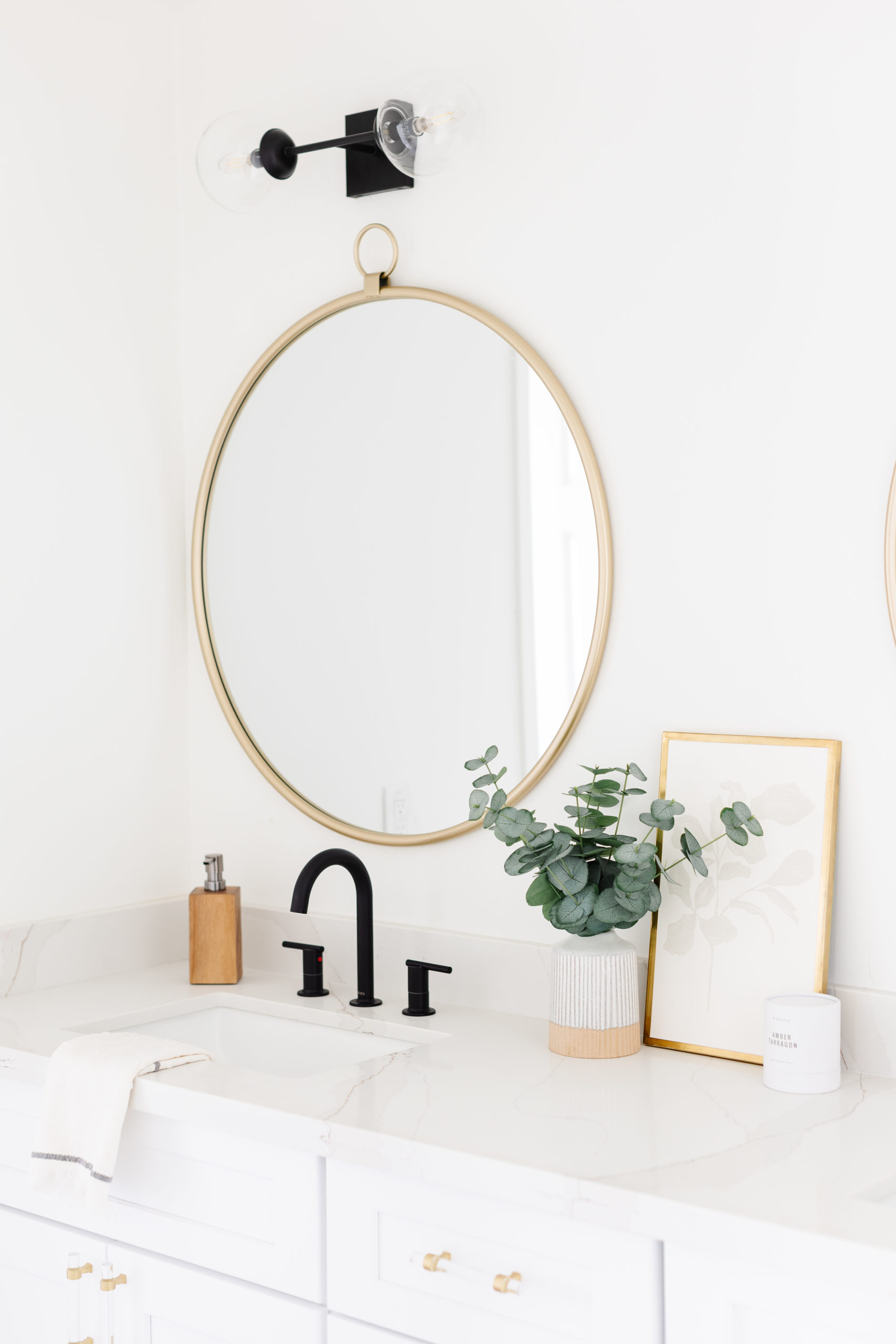
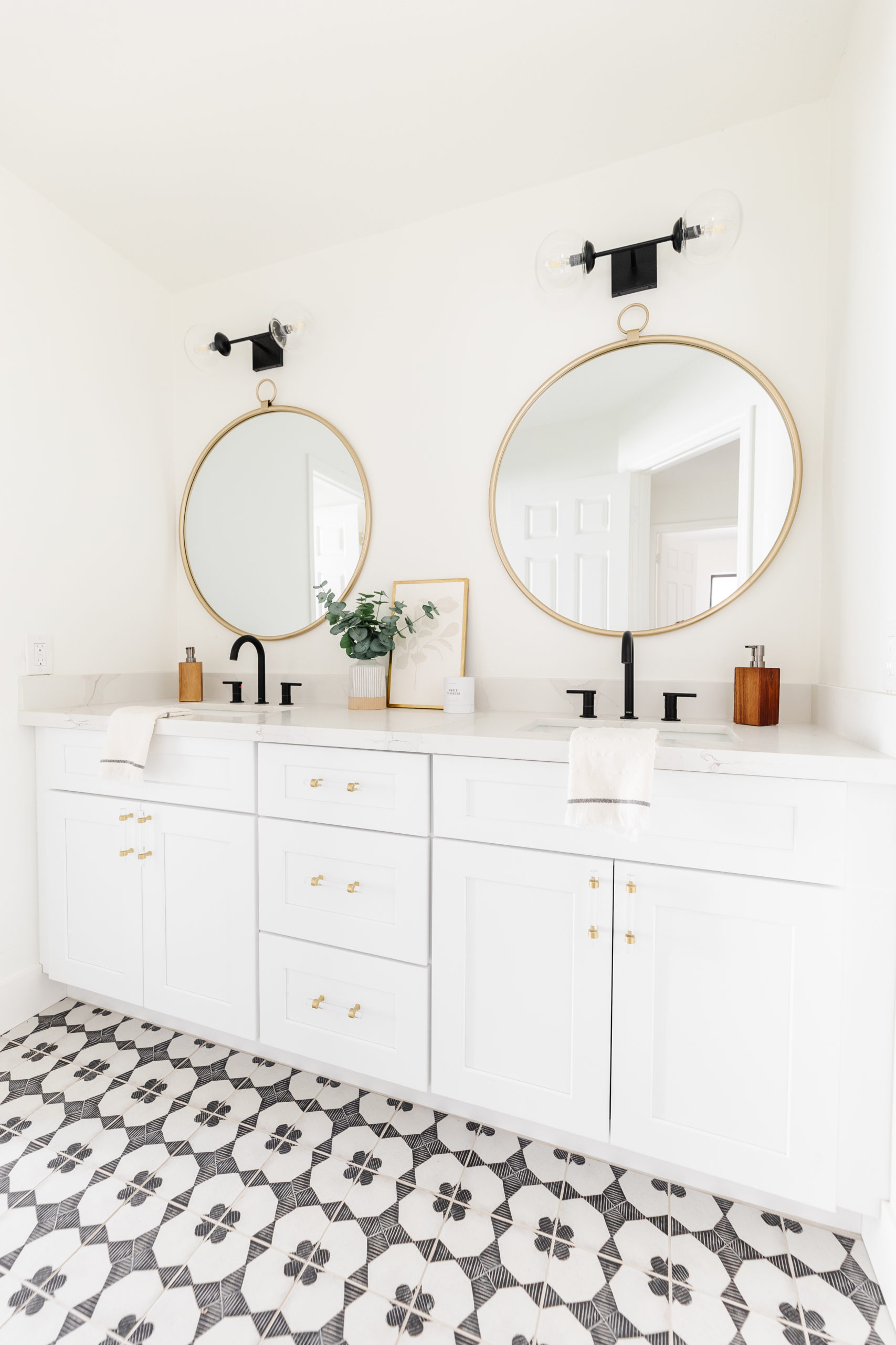
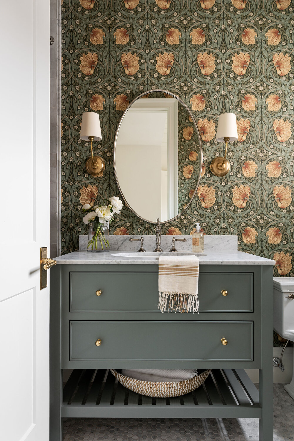
You can't really go wrong with a patterned tile floor and pretty shower tile in the kids' bathroom. The cabinets, like the rest of the home, were white. And that gave us the opportunity to have fun with the rest of the finishes - like acrylic pulls and fun brass mirrors.
The staging was kept simple with a few items on the countertop, some greenery, leaning art and a candle.
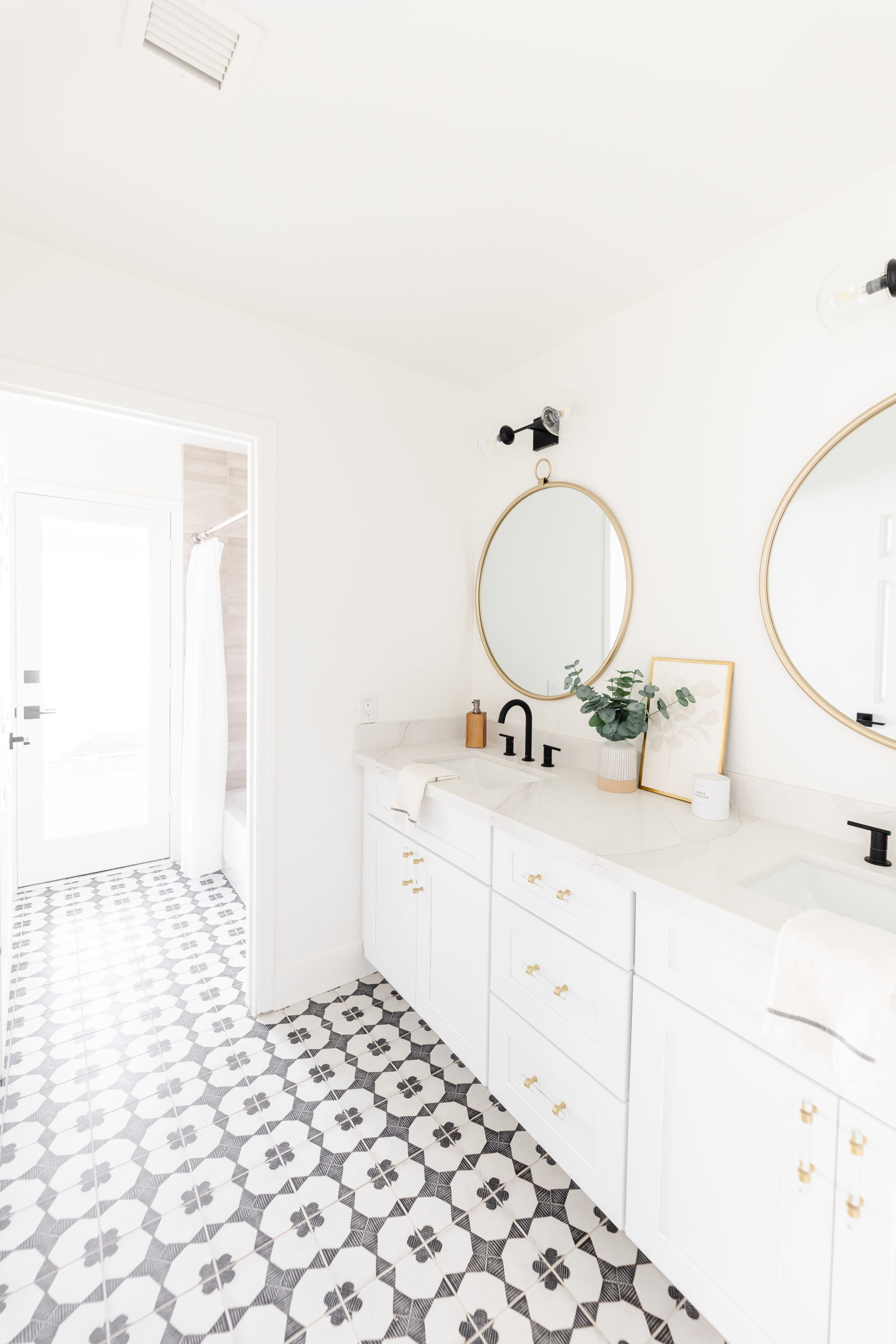
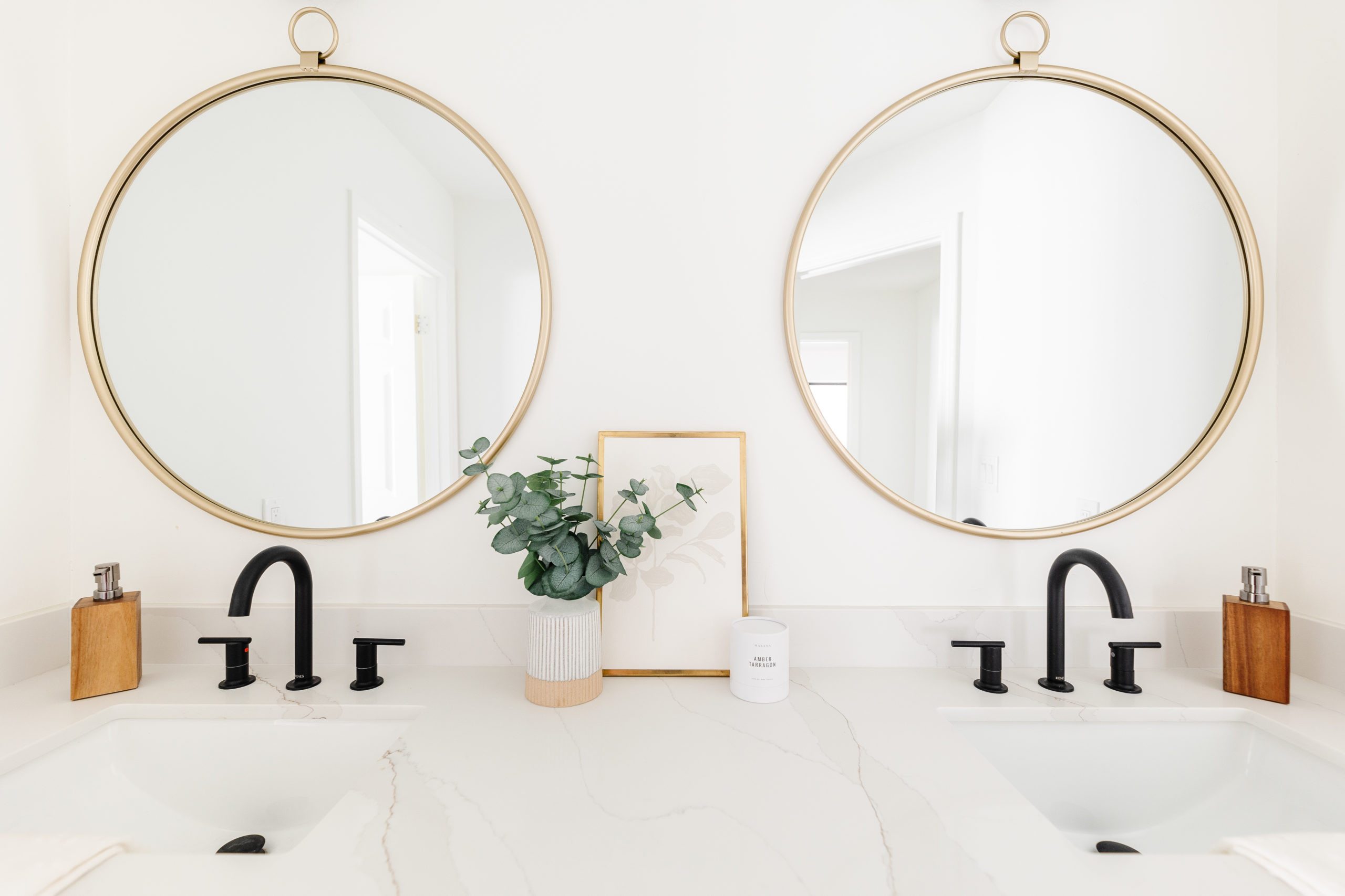
shop the kids' bathroom
I hope you enjoyed this reveal and these before and afters. I love sharing these projects with you and if you love it too, let me know in the comments!
previous post
next post
Let's be
friends!
Get exclusive design tips and blog updates sent to your inbox!


What a fun reveal!! I love the design and the decor! I am wanting to get a brand new carpet cleaning for my home renovation. It makes the space just feel better. It was fun reading this before doing it. Thanks for the inspiration!
Awesome! So glad to hear it!