


Finally!!!
I am so excited to finally share this project with. If you remember this house, it's a flip project of ours in North Scottsdale. I'm thrilled with how it turned out. Today I'm sharing the updates we made the space, the details on the staging and some of my favorite design elements in the home.
the design elements
white, wood, black and beautiful earth tones
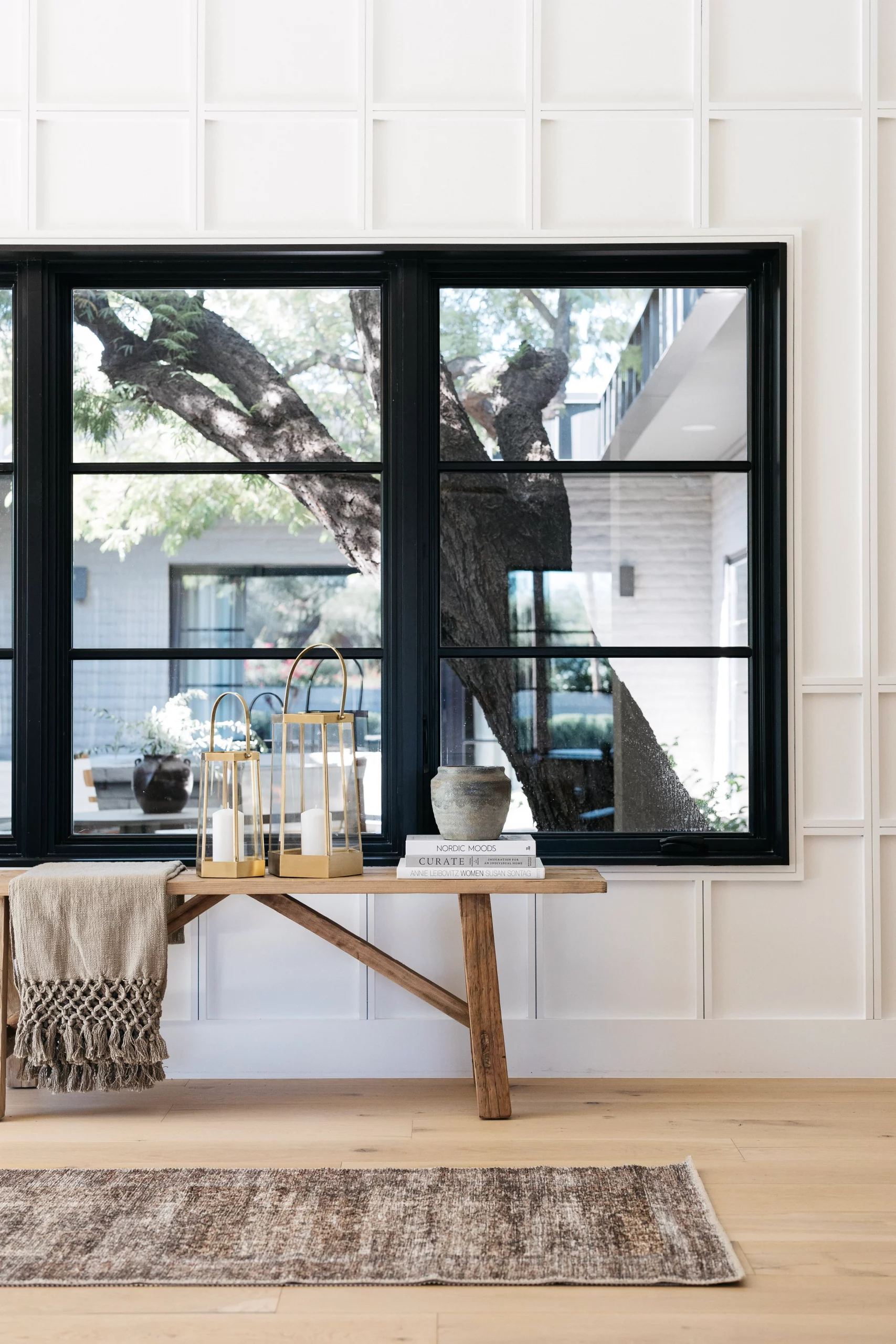
Living Room
The living room is really spacious and there wasn't much that we had to do except paint and floors. Plus, I definitely do not miss those window treatments!! In this space more than any other space, the staging really makes the biggest difference. This room is the first one that you see when you walk in and it sets the tone for the whole house. It's important to define the spaces and with the walls being white throughout the home, we wanted to bring in warmth and texture with the staging.

BEFORE

AFTER


shop the living & dining rooms

Dining room
There used to be a wall between the living room/dining room and the kitchen. We took that down and opened up the space. Where the wall used to be is where we placed the dining room. To be honest, I don't even where the dining room went before. But it feels like it should have always been right where we put it. We even added cabinets and a beverage fridge and open shelves and it feels like an extension of the kitchen. The dining light is one of my favorite parts of this room. It's simple, but it makes a statement. But I didn't want to compete with the pendants in the kitchen either.
For the staging, we used one of my favorite tables we have in inventory. It's has wood top with brass legs and it feels organic and inviting. However, pairing with the the tufted upholstered chairs makes it feel slightly more formal. The styling for the bar, as I'm calling it, was a mixture of decorative pieces to bridge the gap between the dining room and the living room. We used some glasses, but mainly used decorative that would add warmth and texture to the space. I especially love the small lamp we added on the counter. I know not everyone is fan, but I think lamps on the counter look cozy and homey and they add a layer of task lighting that feels intimate as well.

BEFORE

AFTER


shop the dining room
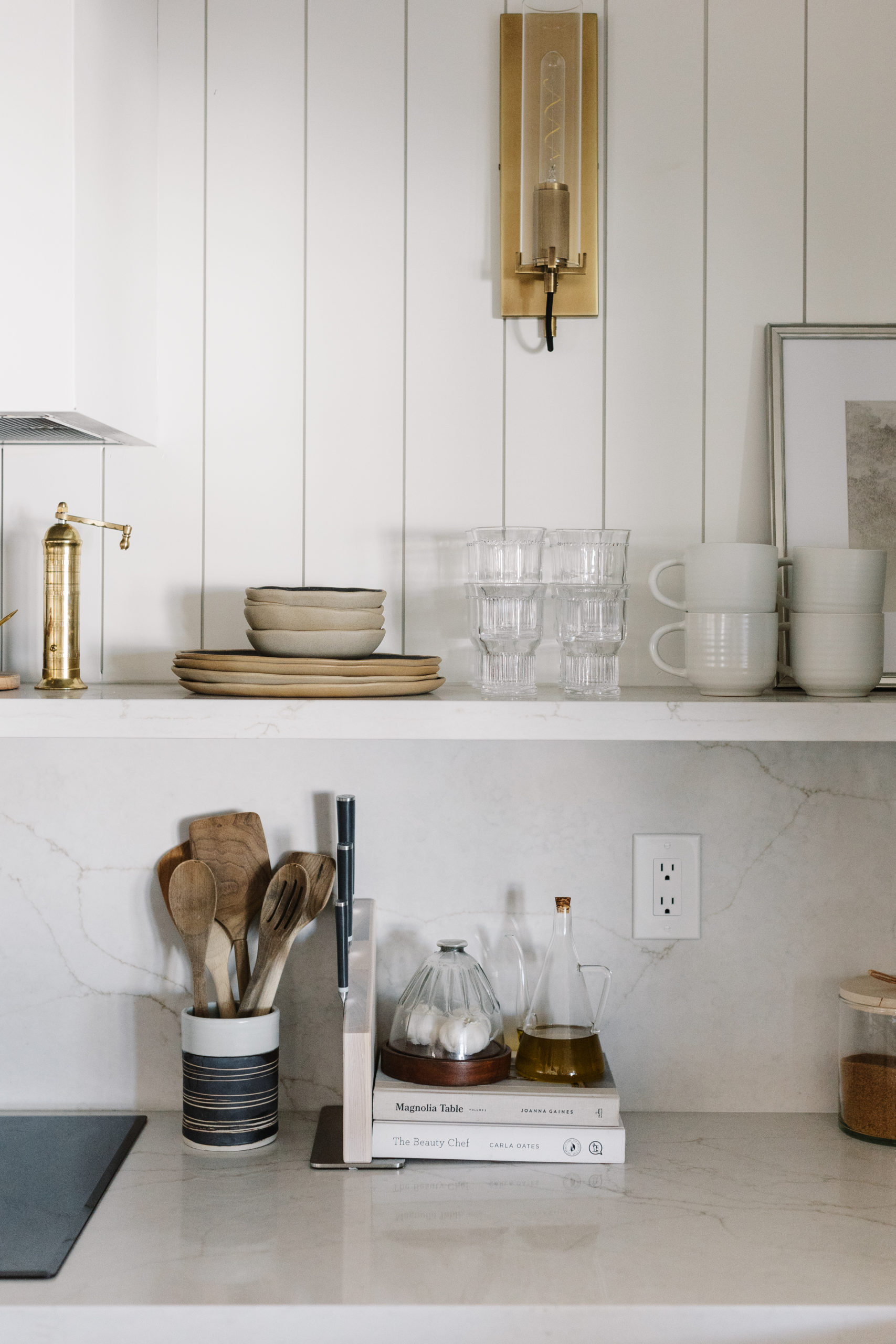
KITCHEN
I am obsessed with how this kitchen turned out! It's bright and inviting and warm and charming.
The kitchen floor plan was smaller before. It didn't extend all the way down the wall and the island was smaller. We extended the kitchen down by framing in the refrigerator with two pantries. It added additional storage and with the foot print being larger, we could also extend the island as well. The layout mainly stayed the same - with the sink under the window and the range on the wall to the right. But since we moved the refrigerator, we were able to center the range on the wall. We built a custom range hood and flanked it with wooden open shelves. We did a Thassos marble tile backsplash and then added vertical shiplap above it took it all the way to the ceiling. I sure don't miss that red wall that was above the cabinets, do you?
Staging kitchens is one of my favorite things to do. I love styling little vignettes, especially for photos when it involves fruit, vegetables and bread that I can eat after the shoot. 🙂

BEFORE

AFTER


shop the kitchen
Main Bathroom
This bathroom is so serene and relaxing. I still love the warm 12x24 tile floor paired with all of the white.
But let's start at the beginning. This bathroom has come a long way. Do you remember the glass block window? I had to make sure that it was going to be replaced and doing just that already made it feel so much more updated. The bathtub was built it in before and it wasn't a huge space - only about 5 feet long. I knew that I wanted to put in a freestanding tub in, but we needed to find a tub small enough to fit. This bathtub is 59" long.
When we are designing a flip, we have to make decisions that the designer in me doesn't always love - like not being able to use beautiful custom wood cabinets - just to name one. We are limited to a few options for cabinets based on budget, time and availability. White is classic, don't get me wrong. But there are times when I would love to use something else. However, in this bathroom paired with the warm floors and brass accents it really helps the space feel clean and timeless. Where we can really bring in some design moments are in the hardware and lighting. The light above the tub might be one of my favorites. It adds beautiful movement and texture to the bathroom and when the sun shines through it is so pretty.
When we staged this bathroom, we kept it pretty simple. We added this beautiful vintage looking runner and a black stool styled with pretty soaps and bath salts. For the countertops, we don't want a ton of clutter. We kept it really simple with a woven basket with a couple of towels, a couple of canisters and a candle.

BEFORE

AFTER


shop the primary bathroom
Guest bathroom
This bathroom turned out really good! If you know me, you know I love a good patterned floor tile and this one from Bedrosians is one of my favorites - it's a great geometric, neutral tile. It works really well the the shower tile, which has different shades of white, some of which are off white and almost light gray and pull in the colors of the flooring.
This remodel was mainly cosmetic, but getting rid of the tan and red walls, the glass block window and the dated lighting made all of the difference.
I love the mixture of polished nickel and brass that we did in here. A lot of people get nervous about mixing metals, but I love doing it. I like the think of it in terms of the undertones of the metal. Brass and nickel have warm undertones and work well together. Chrome has a cool undertone. Black is neutral and can go with any of those.
Again, the staging is simple. But I love the moment in the corner with the layered art. It was a fun way to bring in some color and visually fill some of the empty space.

BEFORE

AFTER


shop the guest bathroom
https://blissfuldesignstudio.com/park-ave-project-floors-cabinets-are-in/I hope you guys loved this reveal! We have other exciting projects that I hope to share with you soon!
Until then...you can check out this vacation rental project here that we will be installing next week!
Let's be
friends!
Get exclusive design tips and blog updates sent to your inbox!


read comments or leave a comment...