blissful design studio
I'm brittany Krupnik!
I'm a real estate investor, designer and home stager. I have staged over 500 homes and designed over 250 homes. When I'm not designing, you can find me reading, traveling or trying out a new restaurant. I'm based in Tempe, Arizona where I live with my husband and 3 kiddos!
top posts
Project Reveal: See my home!
shop blissful
Home Decor
shop now
keep reading
Our Favorite Cookbooks
Girl's Bedroom Makeover
How to Host the Perfect Gathering
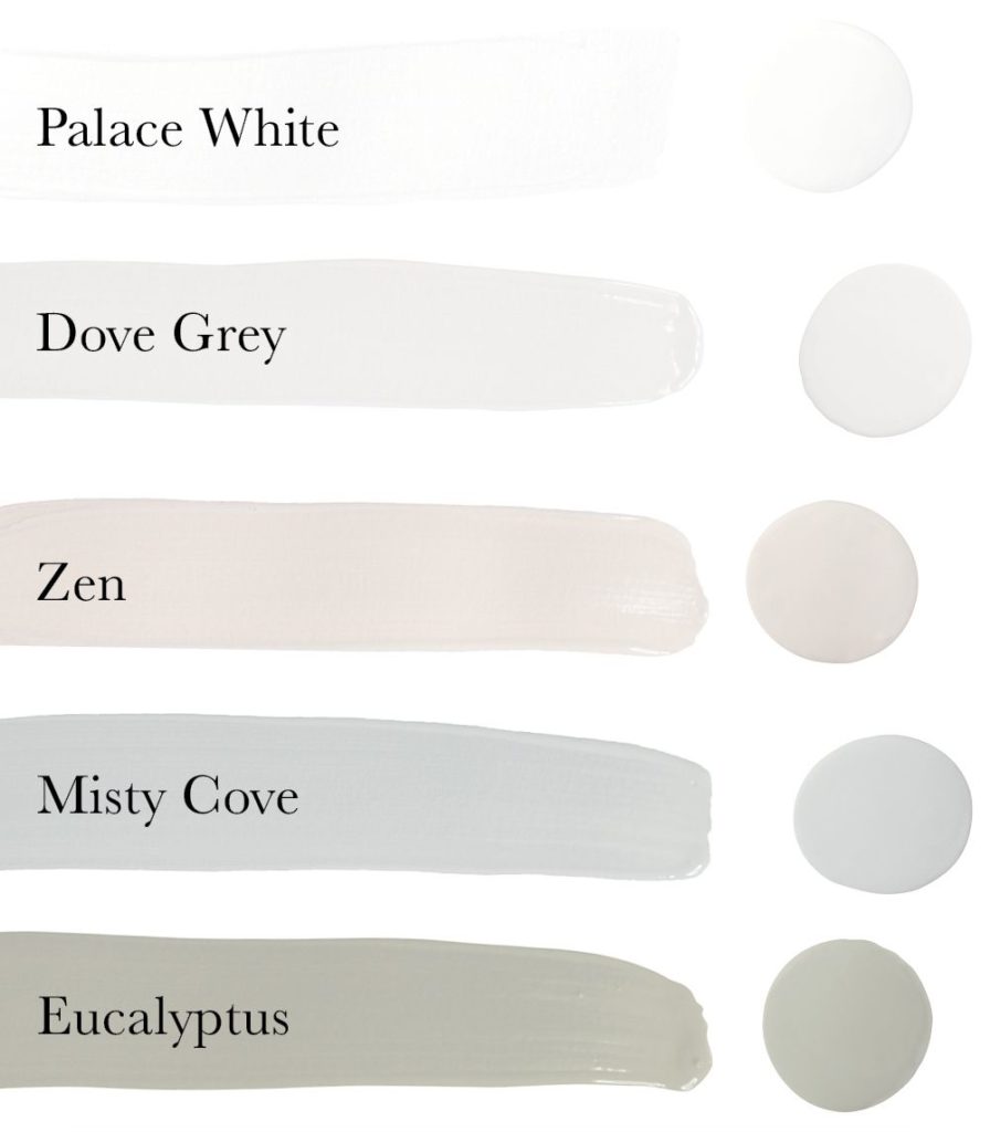
By now, when Spring rolls around, we’re used to tones of pink, yellow, and blue pastels. While these shades are beautiful, nonetheless, seeing pastels for spring are just like seeing florals for spring, and as the great Miranda Priestly once said “Florals for spring? Groundbreaking.“
That’s why, for our spring color palette, we’ve chosen muted hues from around the globe to help you feel a little less stuck and to help you continue to refresh your space.
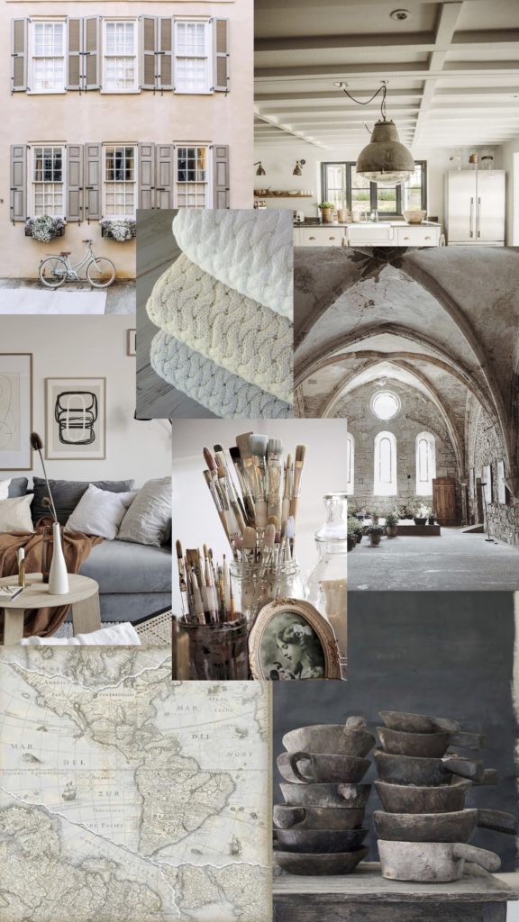
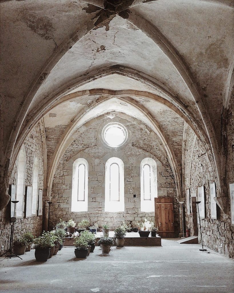
Vintage European
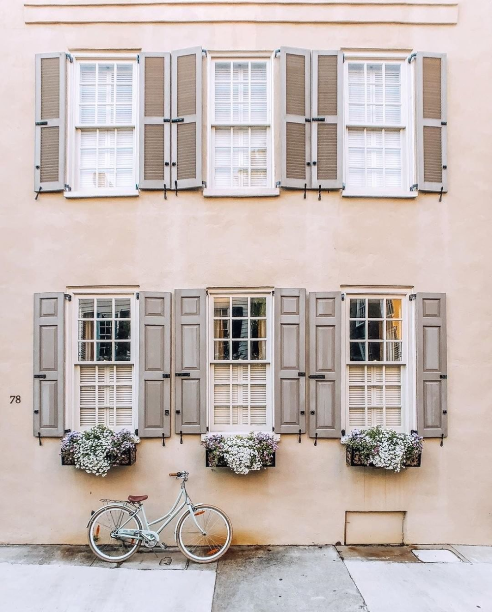
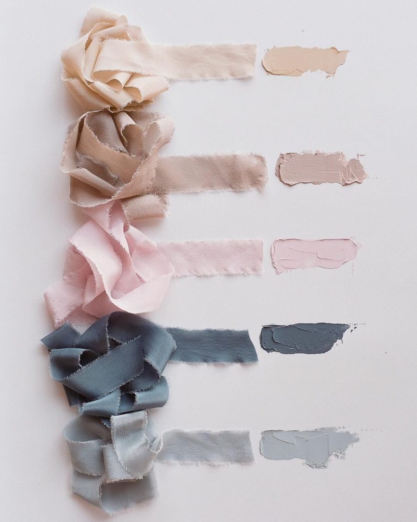
Our first stop on our Spring inspiration trek is old world Europe. We’re totally in love with these subtle grey and blue tones while the taupe brings a hint of warmth, just like summer arriving after spring.
Get the Look!
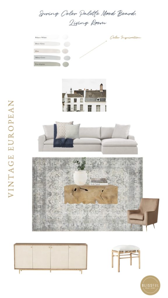
Shop the Vintage European Living Room

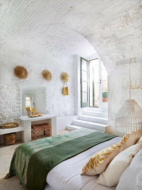
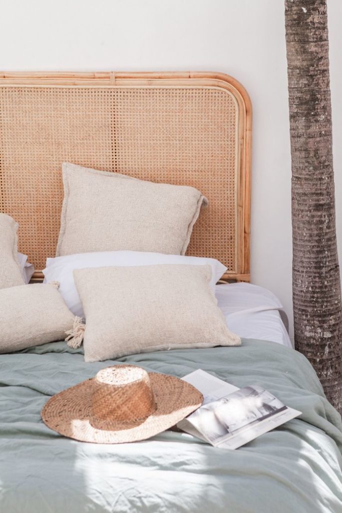
Tamed Wilds
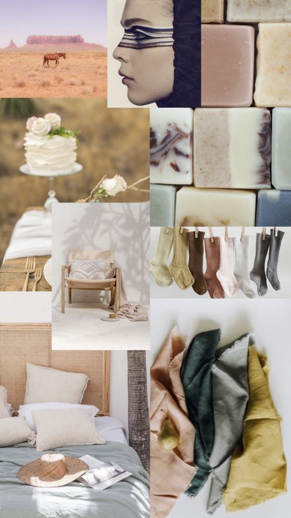
The next stop on our inspiration journey keeps some of our initial neutral tones, but brings in vivid green and blue hues. The colors are reminiscent of spring foliage against a blue sky and tame enough to remind us of a wilderness venture, all while keeping us warm and cozy at home.
Get the Look!
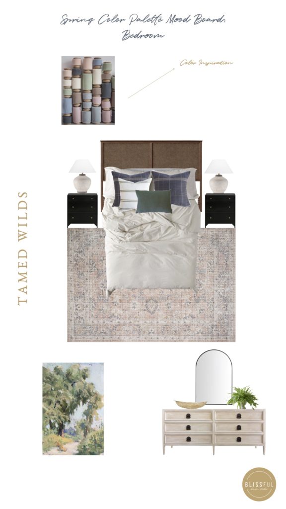
Shop the Tamed Wilds Bedroom

Art // Basket

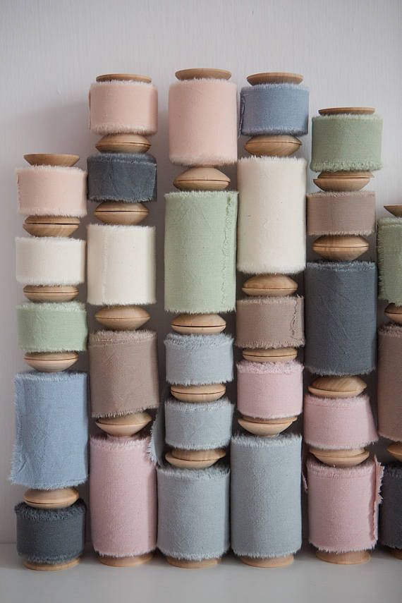
Sunset Oasis
Our last stop includes the ambient hues of a desert sunset. When you think of this palette, don’t simply think of the tans of desert sands and green cacti. Think also of the pinks and blues that illuminate the evening sky.
Get the look!
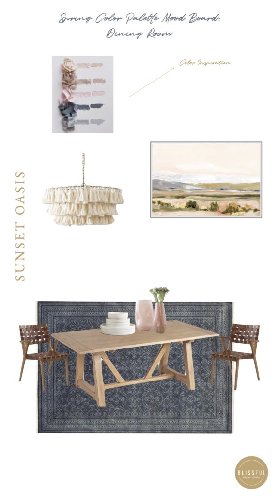
Shop the Sunset Oasis Dining Room

Dining Chairs // Art
Let's be
friends!
Get exclusive design tips and blog updates sent to your inbox!
Keep reading
I'm brittany Krupnik!
I'm a real estate investor, designer and home stager. I have staged over 500 homes and designed over 250 homes. When I'm not designing, you can find me reading, traveling or trying out a new restaurant. I'm based in Tempe, Arizona where I live with my husband and 3 kiddos!
top posts
Project Reveal: See my home!
shop blissful
Home Decor
shop now
keep reading
Our Favorite Cookbooks
Girl's Bedroom Makeover
How to Host the Perfect Gathering
follow along with Brittany's instagram
Go behind the scenes
join us on
follow along with blissful's instagram
blissful
browse the blog
Services
Arizona
Creating beautiful spaces where life can be enjoyed
Learn






read comments or leave a comment...