I'm a real estate investor, designer and home stager. I have staged over 500 homes and designed over 250 homes. When I'm not designing, you can find me reading, traveling or trying out a new restaurant. I'm based in Tempe, Arizona where I live with my husband and 3 kiddos!
I am excited to share this project reveal with you. The last few that I have done have been my personal home and vacation rentals. This one is a fix and flip that we did in Tempe and it turned out so pretty that I decided to have it photographed so that I could remember it forever and ever. As some of you may know, my husband and I have been flipping homes together for quite a while. In fact, this August will be 8 years since our very first flip and my very first home that I staged. We knew from the very beginning that staged homes would help us sell our flips quicker and for a higher profit. And I love how we used the staging in this home to highlight the design choices that we made throughout the home.
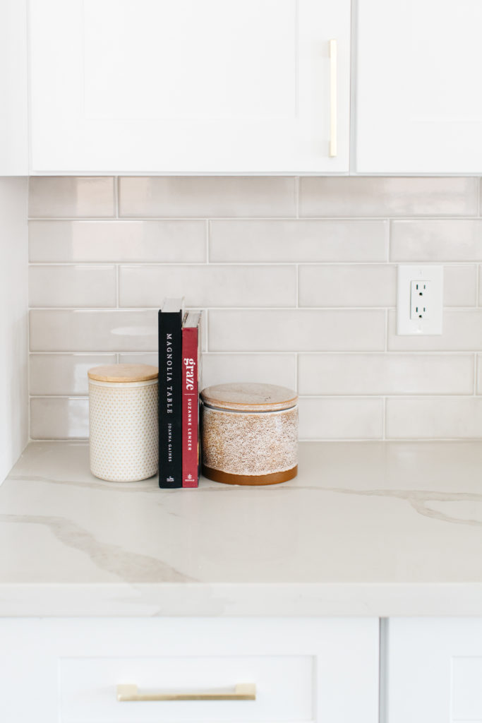
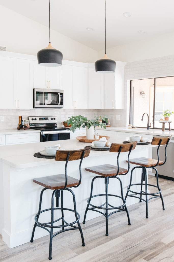
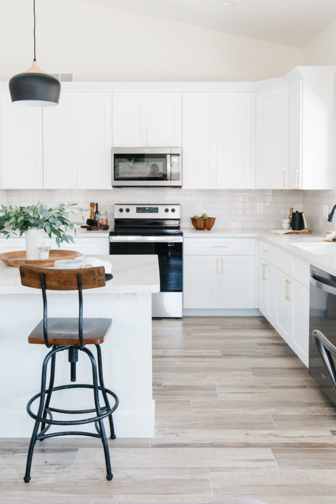
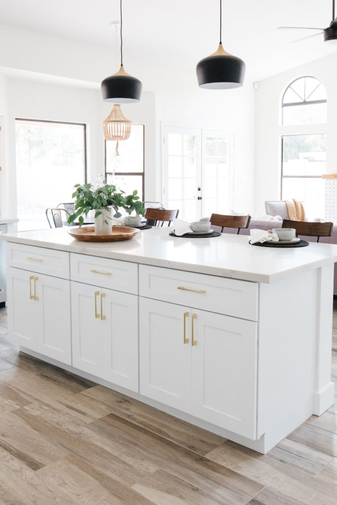
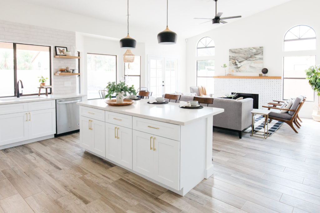
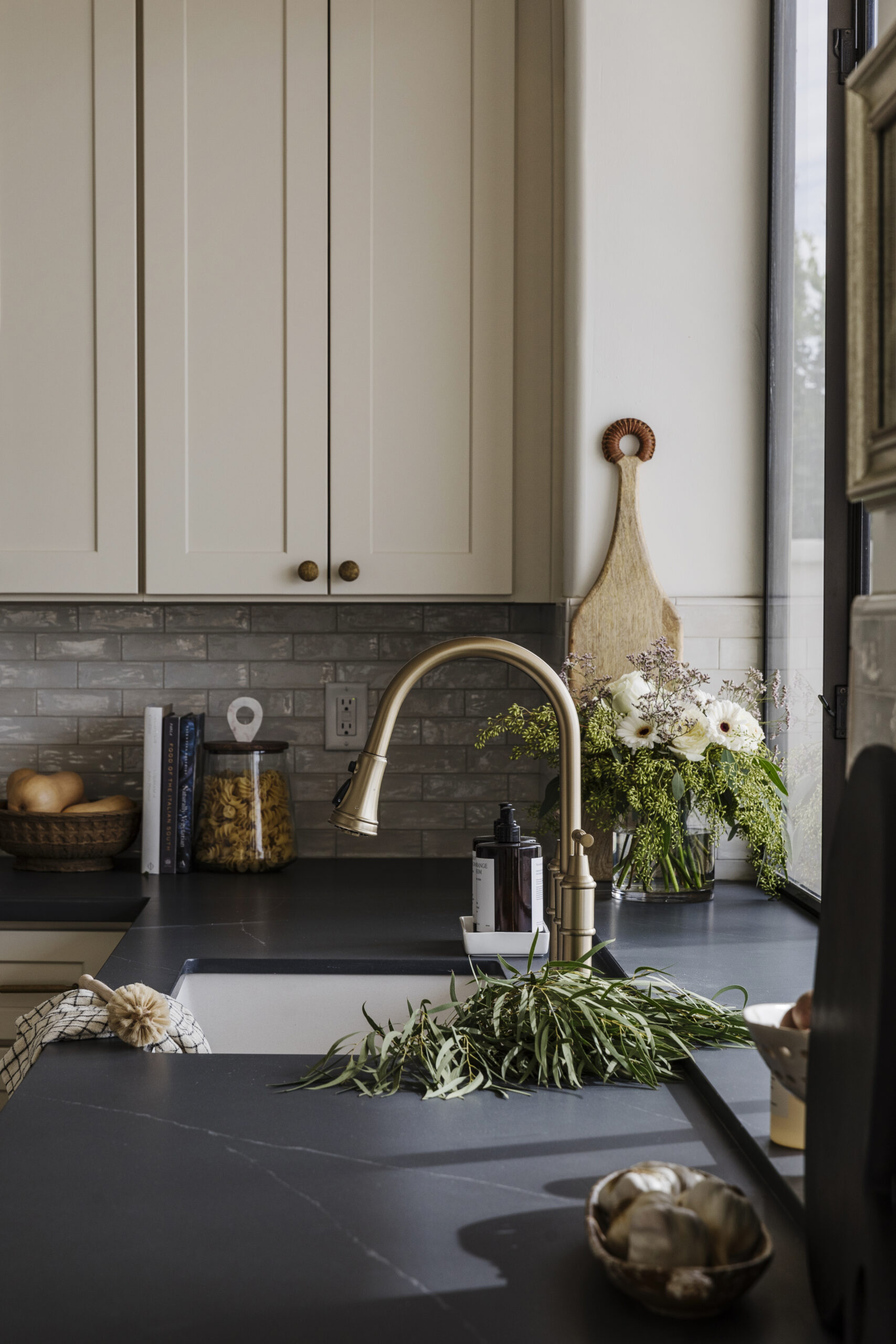
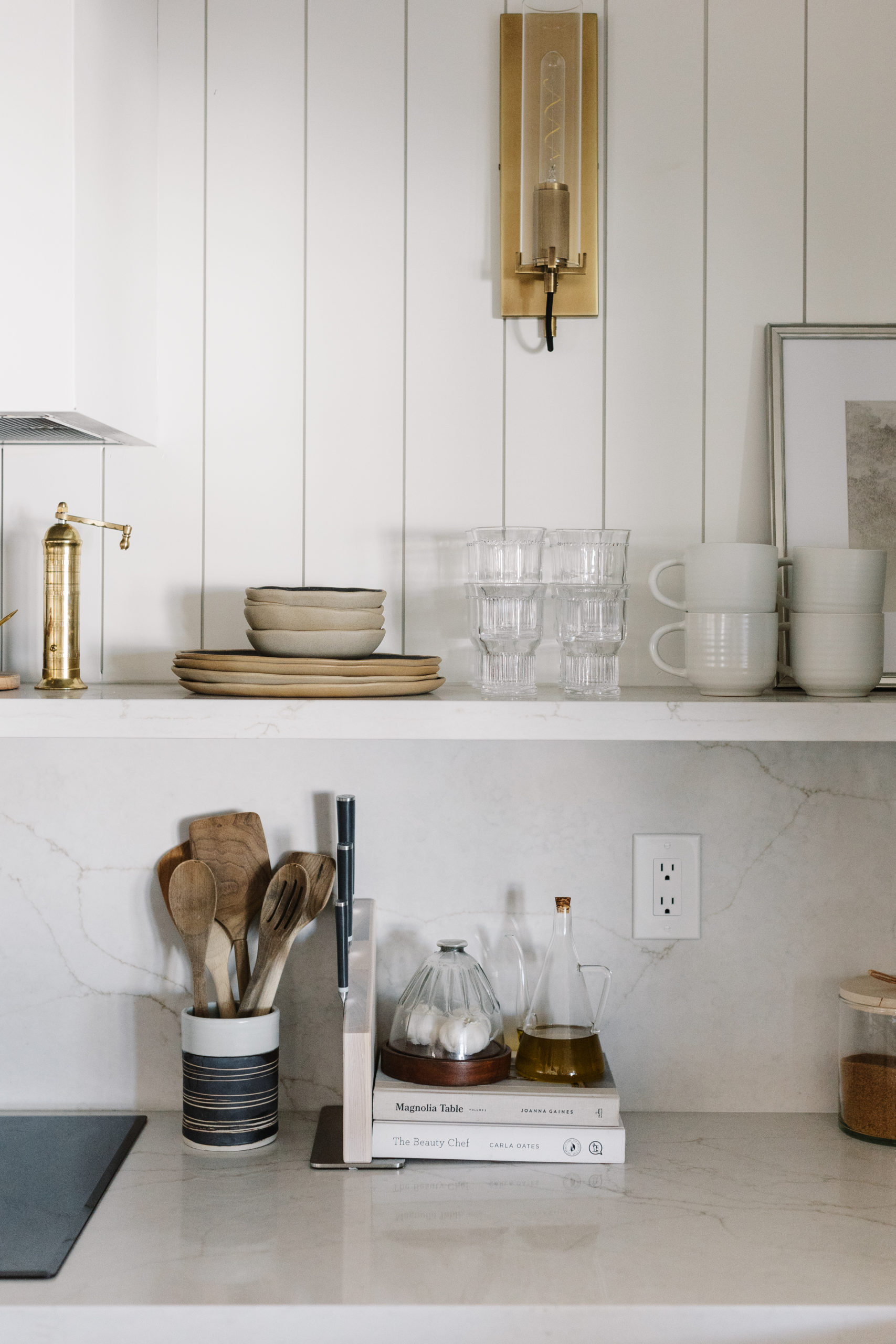
The kitchen
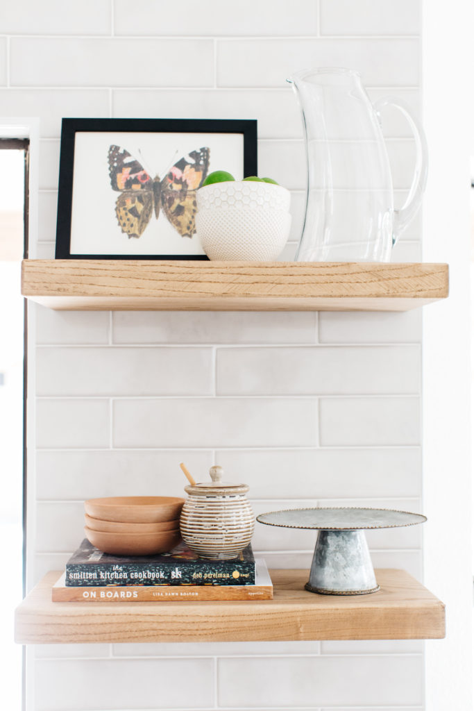
Cost and budget come into play a lot when you are remodeling a home to turn around and sell. It’s all about choosing the right places to save and where to spend in order to make the best return on investment. One of the ways that we can save money is to use ready to assemble, pre-painted cabinets. And let me be honest with you all and say that this REALLY limits my choices when it comes to cabinet options. White and gray and some really bad wood choices are pretty much what I have to work with. In this kitchen, I chose to use the white shaker cabinets and to keep it from feeling too cold and too stark, I chose backsplash tile and countertops that were a mixture of off white and gray. We also added stained wood floating shelves as well and brass hardware to warm up the space.
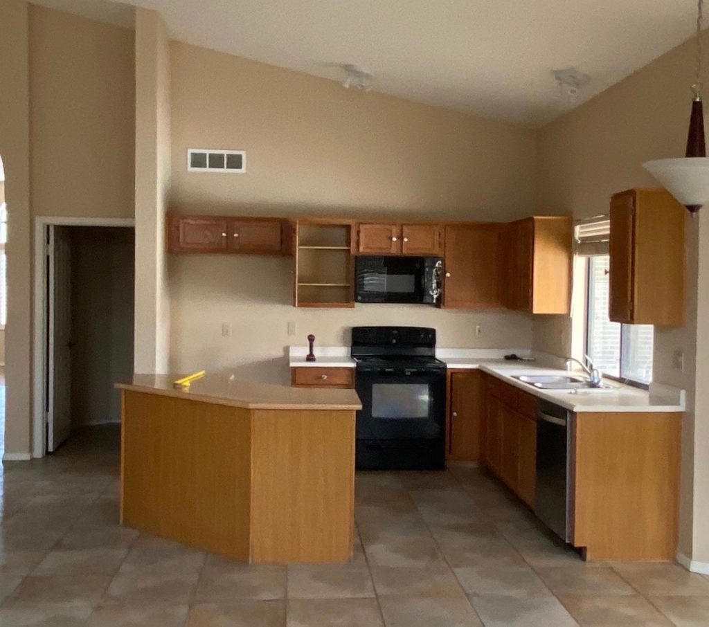
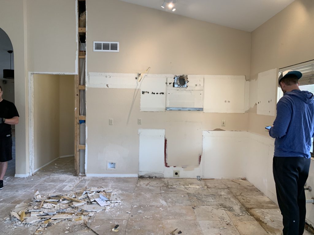
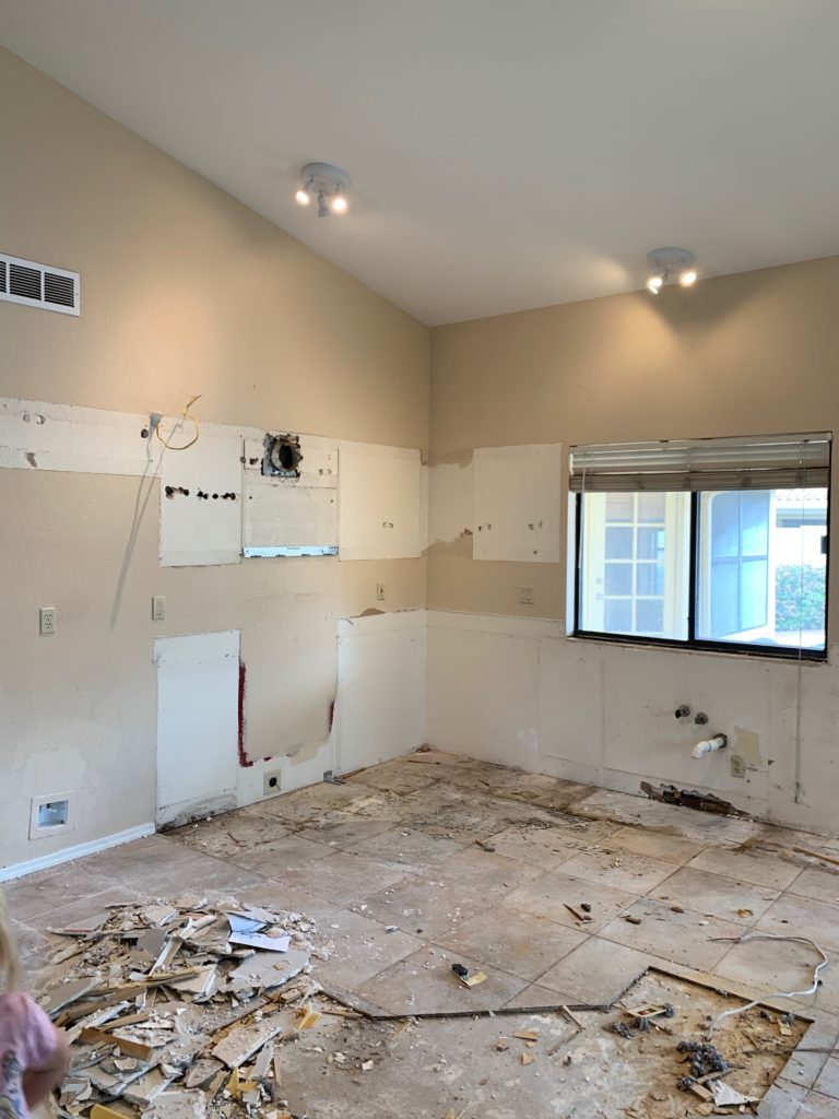
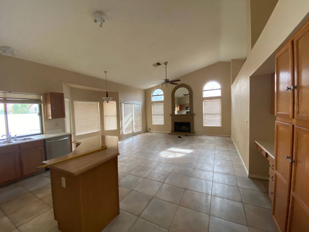
The layout of the kitchen before made the kitchen feel much smaller. The door to the laundry was closed off and moved to the other side of the wall in order for us to gain extra space in the kitchen. We were able to move the refrigerator down and we ended up with much more continuous countertop space. We also reoriented the kitchen island. Instead of keeping it at an angle, we squared it off in the space and made it larger. We were able to make the island almost 8 feet long, which provides extra countertop space and bar seating.
Shop the Kitchen
Before
after
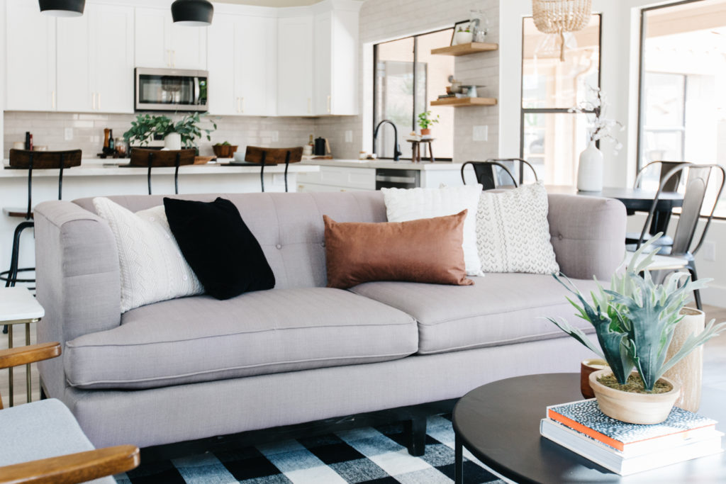
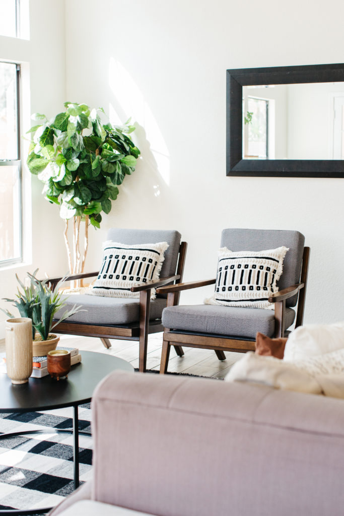
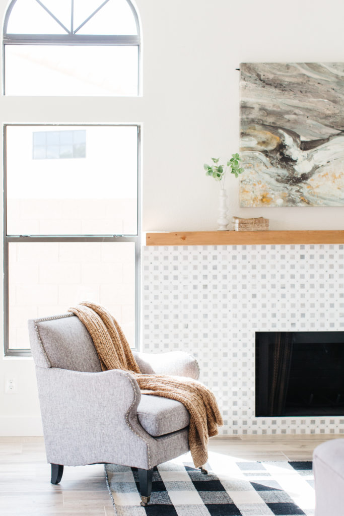
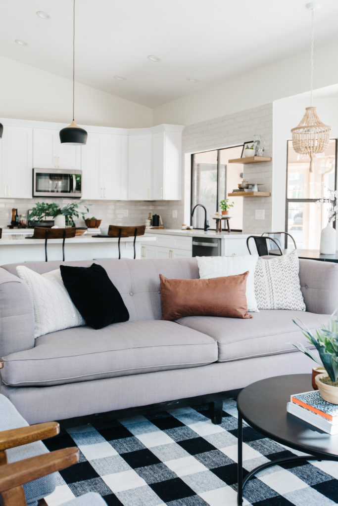
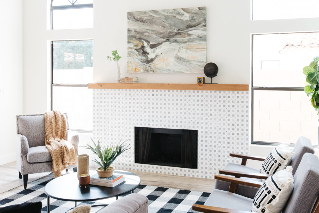
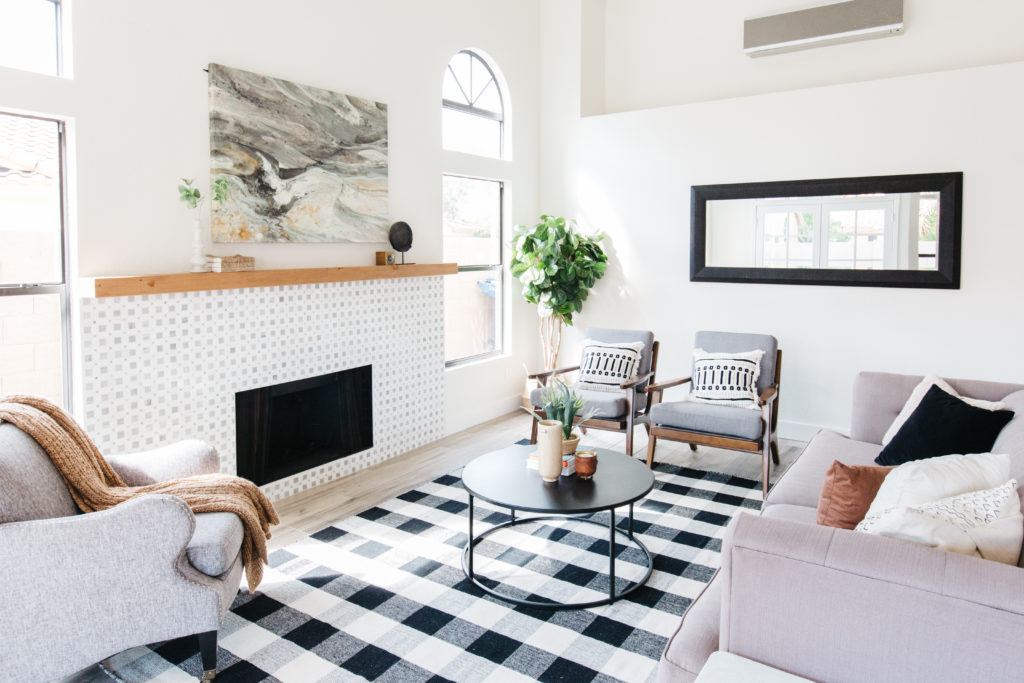
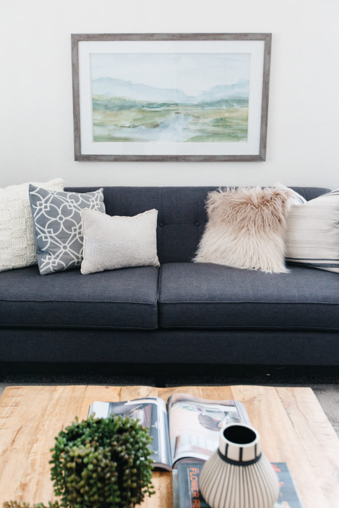
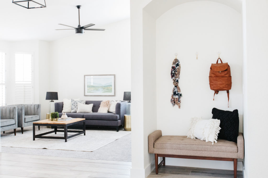
The Family Room
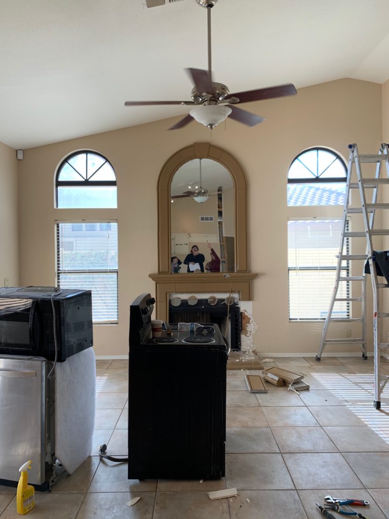
The family room is right off of the kitchen and used to have arches galore!! Arched windows with an arched mirror above the fireplace?? No, thank you. Don’t get me wrong, I love arches. But maybe not 3 in a row. We removed the fireplace surround, which included that arched mirror and we replaced the whole surround with a beautiful marble mosaic tile and topped it with a stained wood mantle.
Staging this room was about showing how it would be used by the buyer and we wanted to show plenty of seating in this space. We used a large sofa and 3 accent chairs in shades of gray. With all of the squares and clean lines in the space, we chose a round coffee table and an accent chair with rounded arms to balance it out.
Before
After
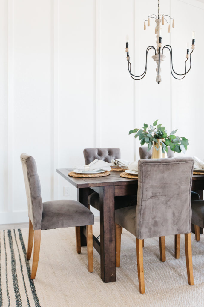
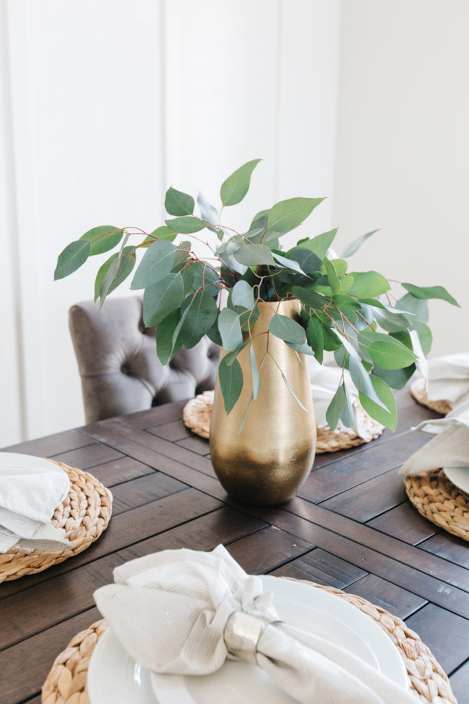
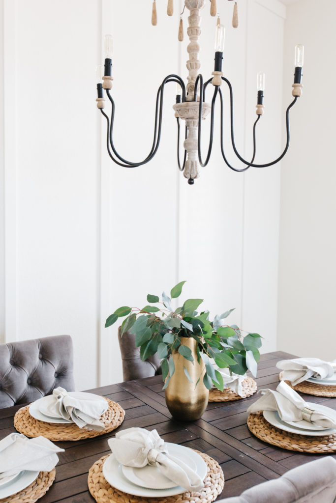
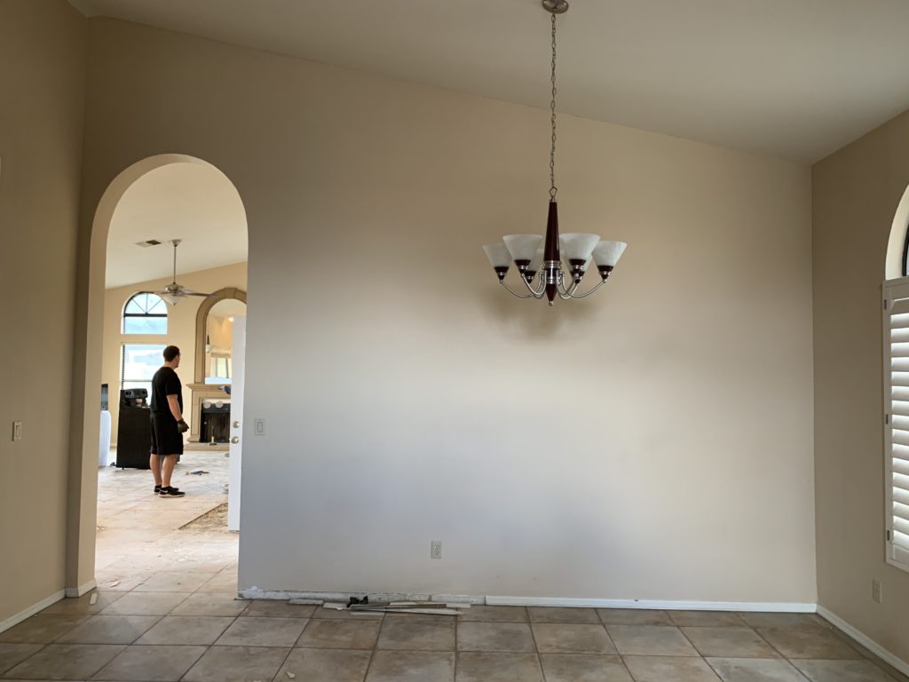
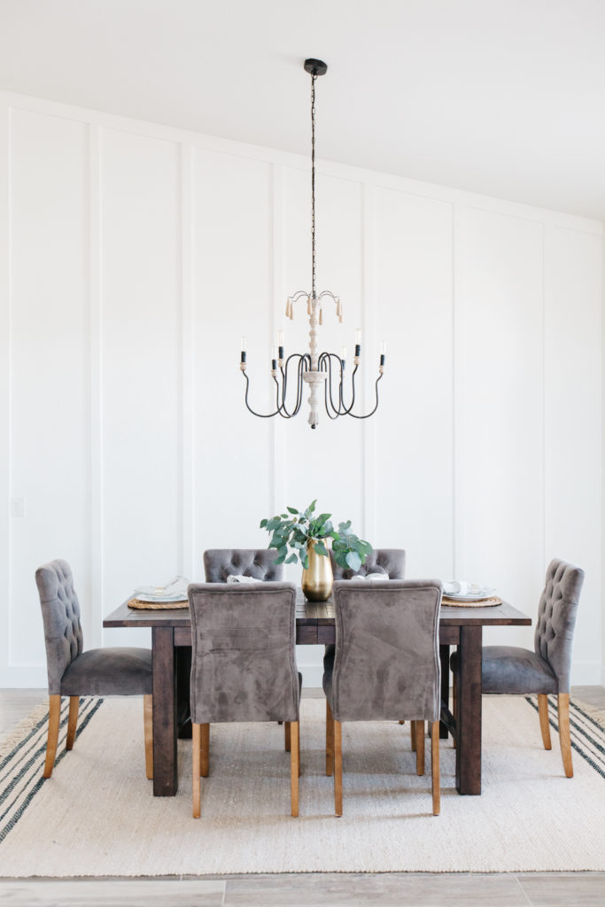
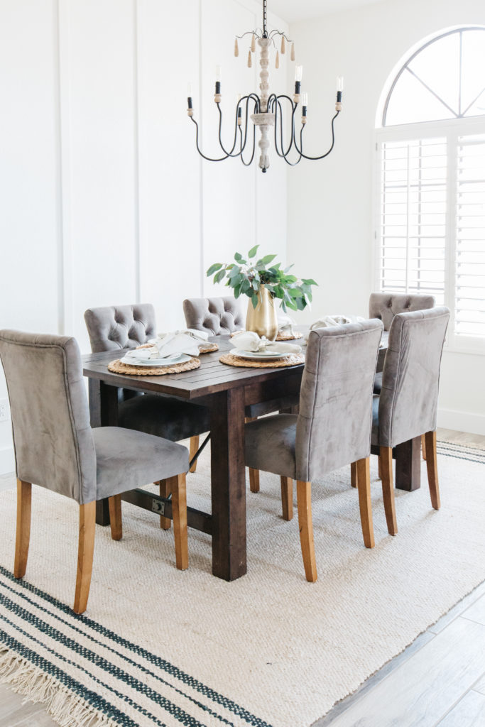
The Dining ROOM
Isn’t it crazy how much of a difference bright white walls and board and batten can make in a space? Throw in a beautiful light fixture and some staging and it’s a completely different room! Board and batten is one of the easiest and most inexpensive ways to add character to your walls. And when it comes to return on investment, you can’t beat it!
Shop the Dining Room
before
after
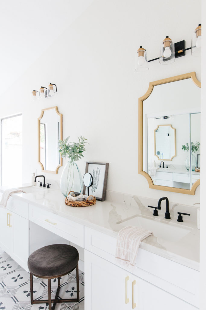
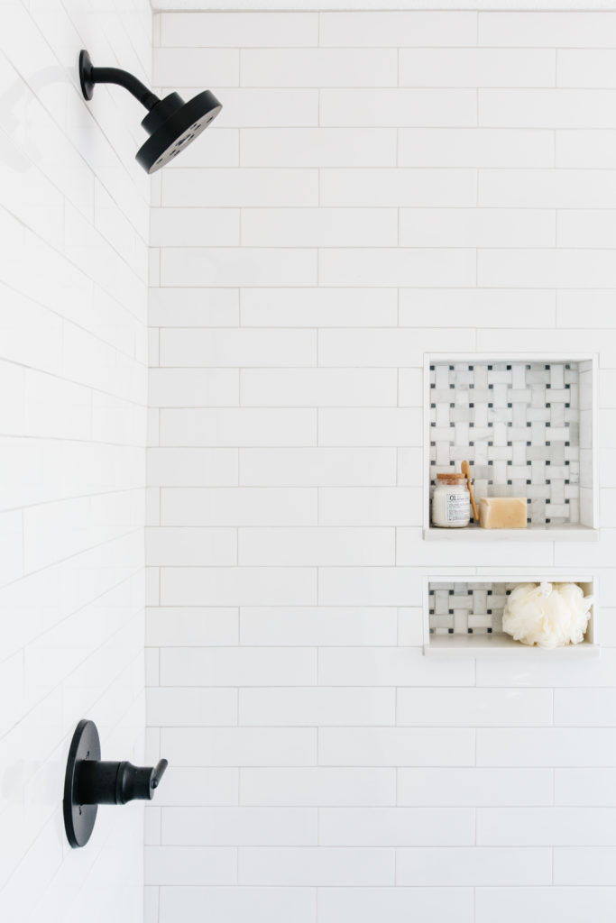
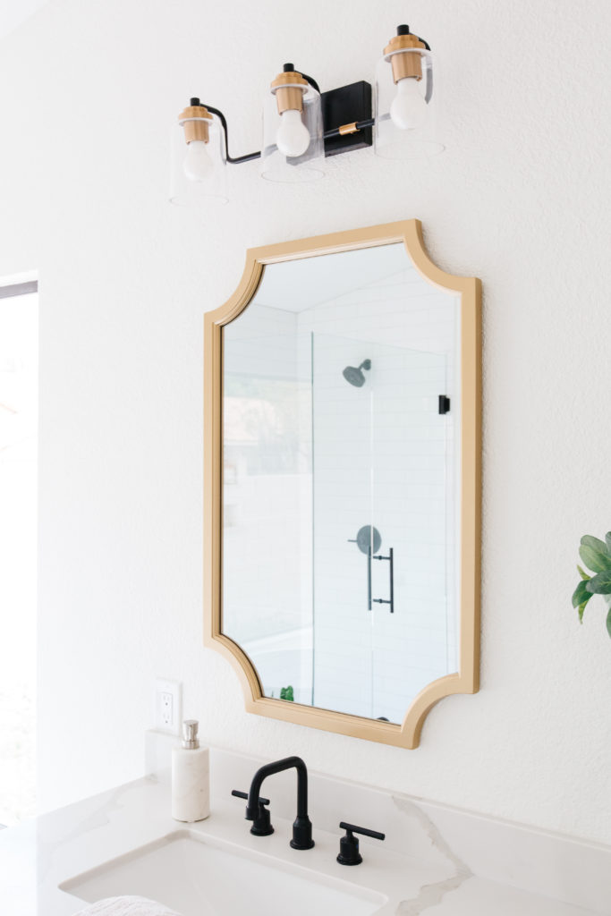
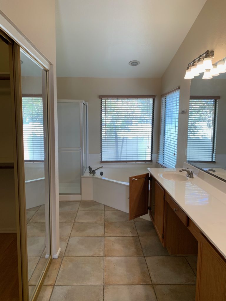
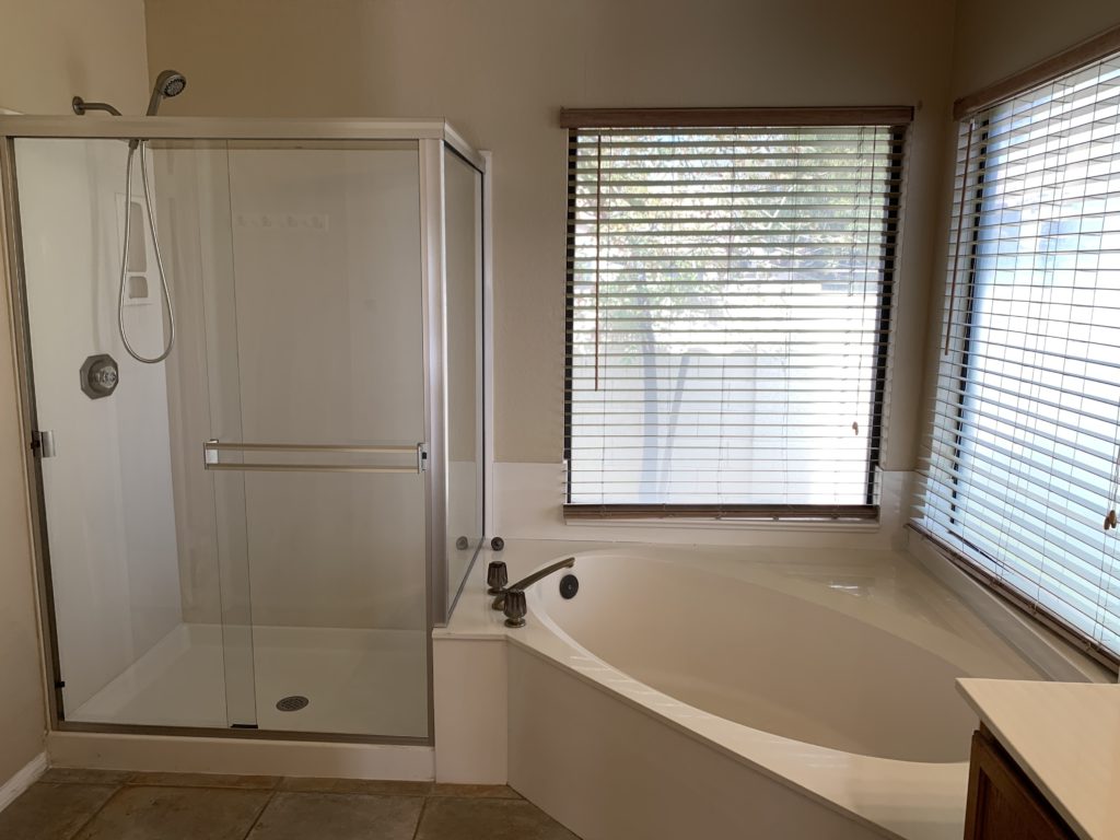
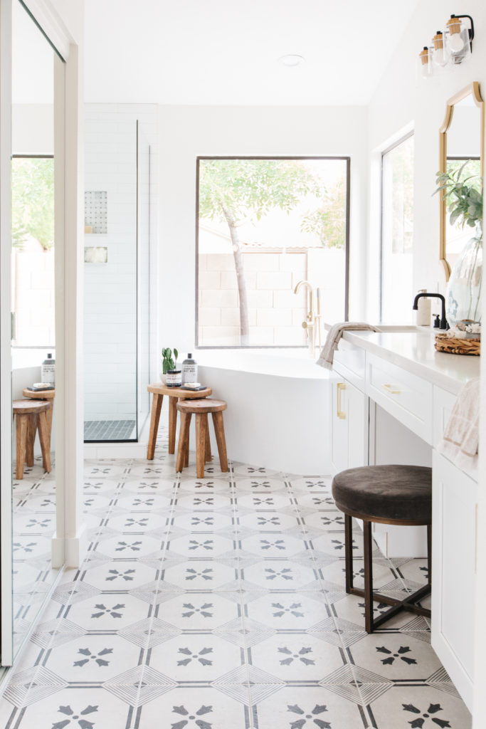
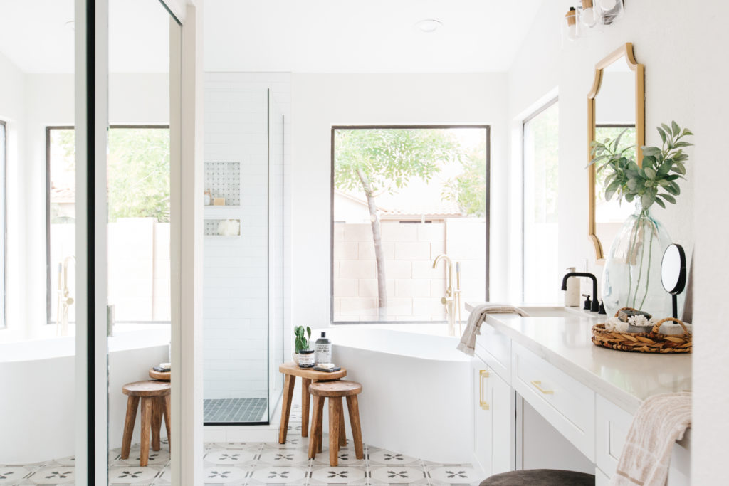
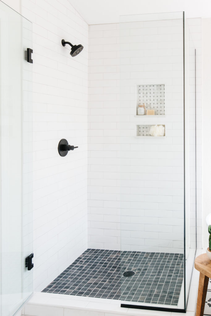
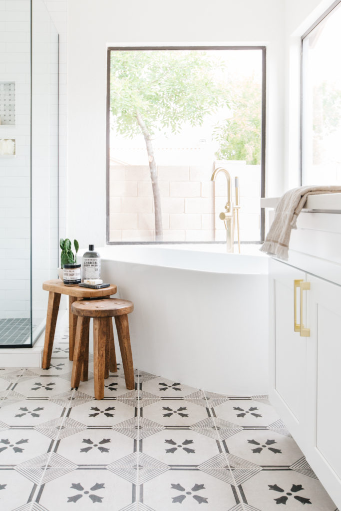
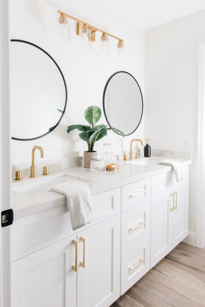
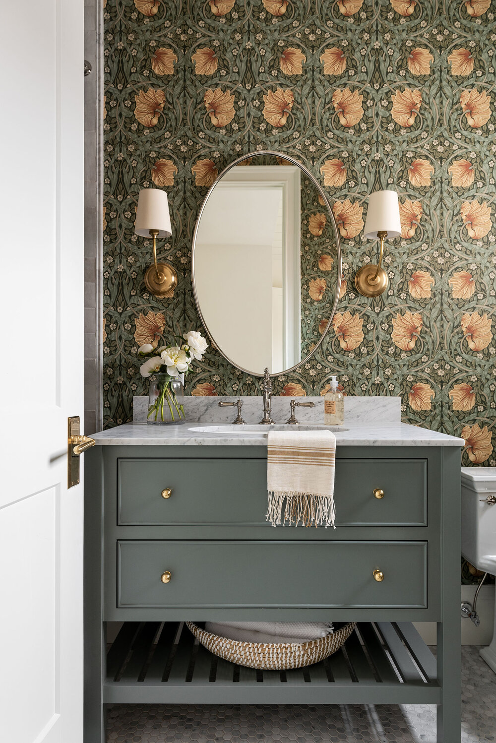
The master bathroom
Oh, this bathroom is my favorite part of the whole remodel for sure!! Look at this floor tile! Because we chose white cabinets for cost purposes, it was important for us to find a cost effective way to add a fun design element to this bathroom. Using a patterned floor in a neutral color is a great option in a flip because it feels custom, but it won’t alienate a lot of buyers. In order to balance out the strong pattern, we chose tile and other finishes with little to no pattern. Our hardware and lighting is a combination of black and brass and it’s a combination that never disappoints.
The layout of this bathroom plenty much stayed the same, but replacing the original tub with a freestanding tub visually opens everything up. Plus, who doesn’t love the look of a freestanding tub??
Shop the Bathroom
before
after
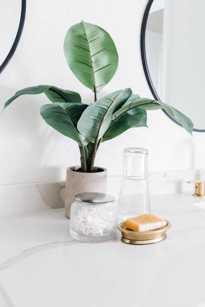
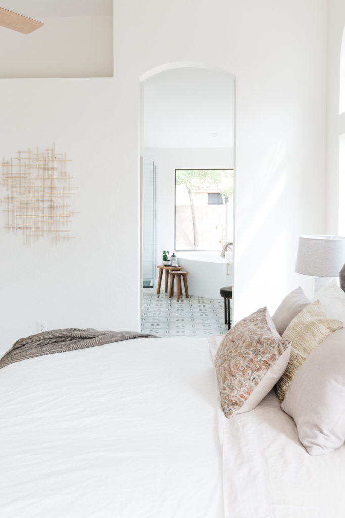
The other spaces
I don’t have before photos of the other spaces, but these rooms are too pretty not to share anyway. These are the formal living room, the hall bathroom and the master bedroom.
I'm a real estate investor, designer and home stager. I have staged over 500 homes and designed over 250 homes. When I'm not designing, you can find me reading, traveling or trying out a new restaurant. I'm based in Tempe, Arizona where I live with my husband and 3 kiddos!


read comments or leave a comment...