Latest Post
Is this even the same bedroom??
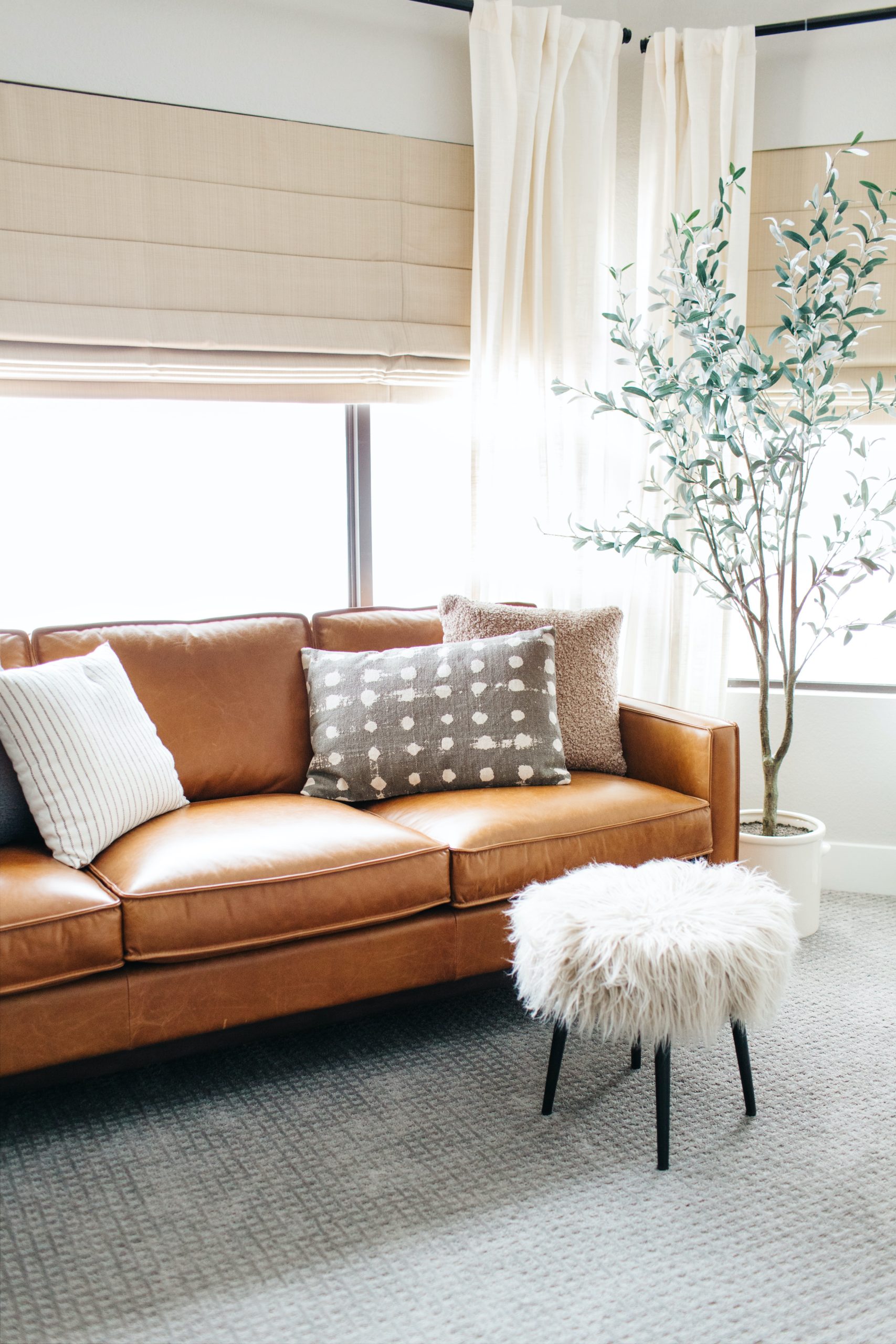
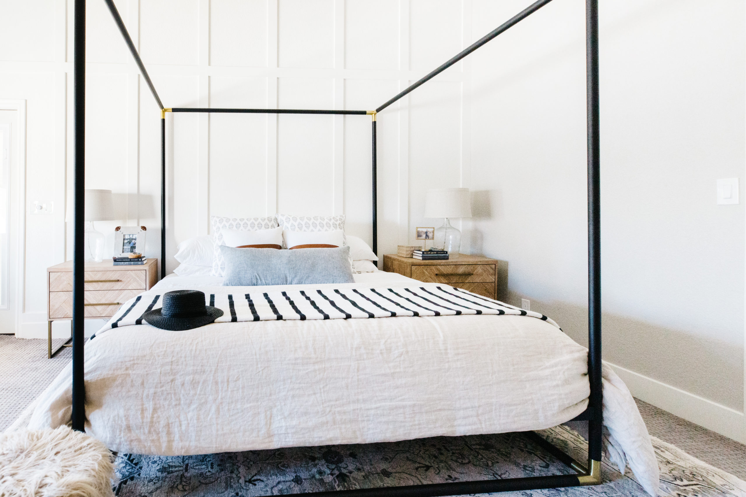
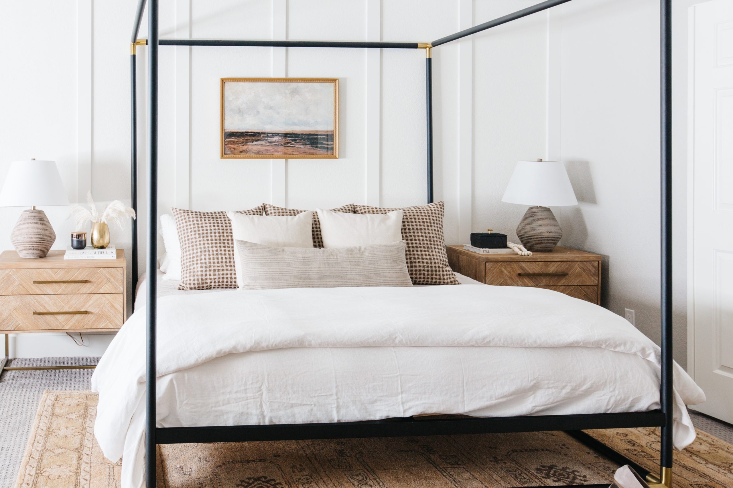
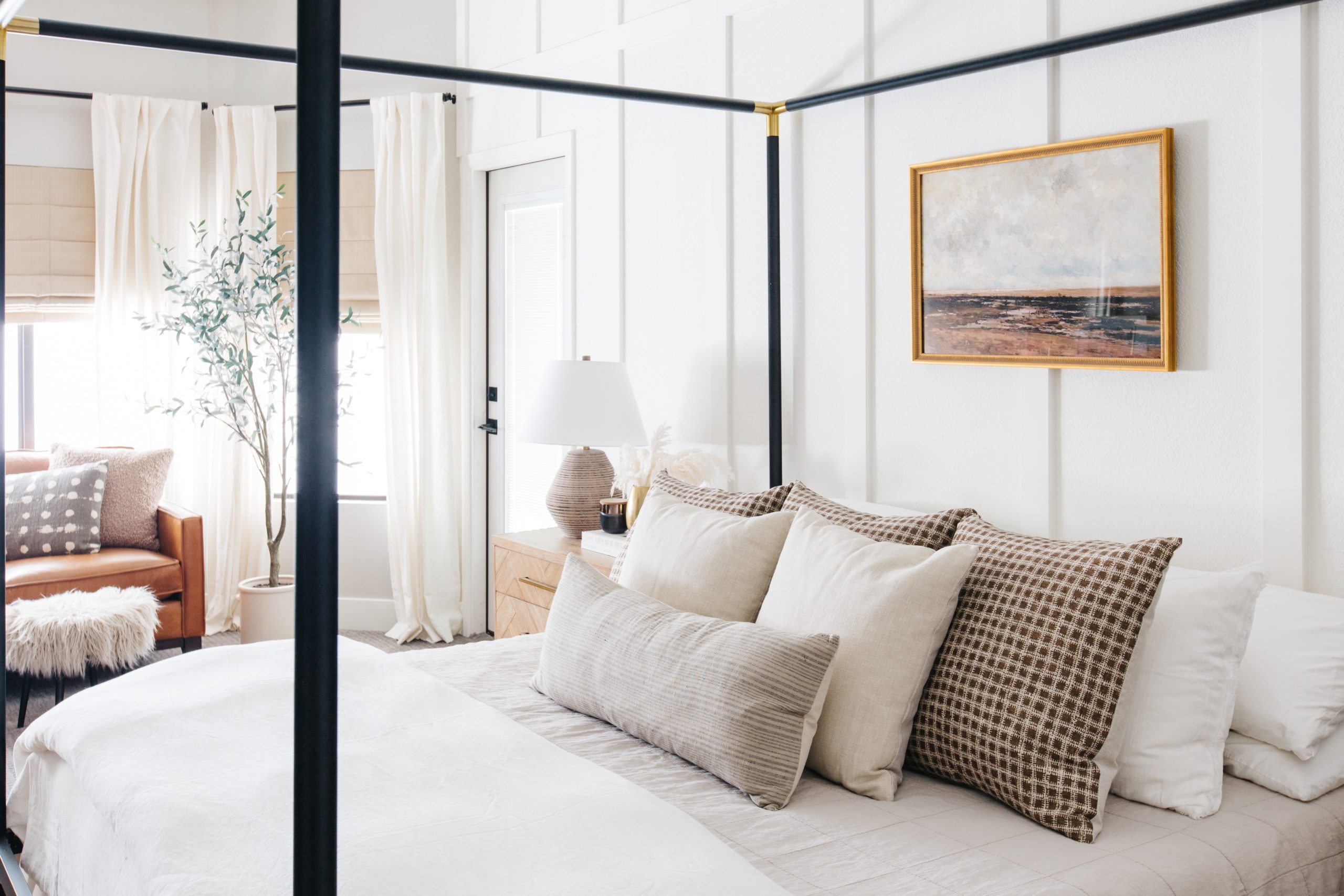
If you remember from my previous post about my bedroom refresh, I decided to make some changes to the overall color palette and style in my bedroom. I really loved it before, but I really wanted a warmer feeling and I used my new rug from McGee & Co that was originally meant for my cabin as the jumping off point for the room refresh. Below is how the bedroom looked when we photographed the space 2 years ago. When I look at this room, there is nothing I don’t like. But I am really in love with how I feel when I walk in to my room now. It’s so warm and cozy and there is texture and a charm that wasn’t there before.
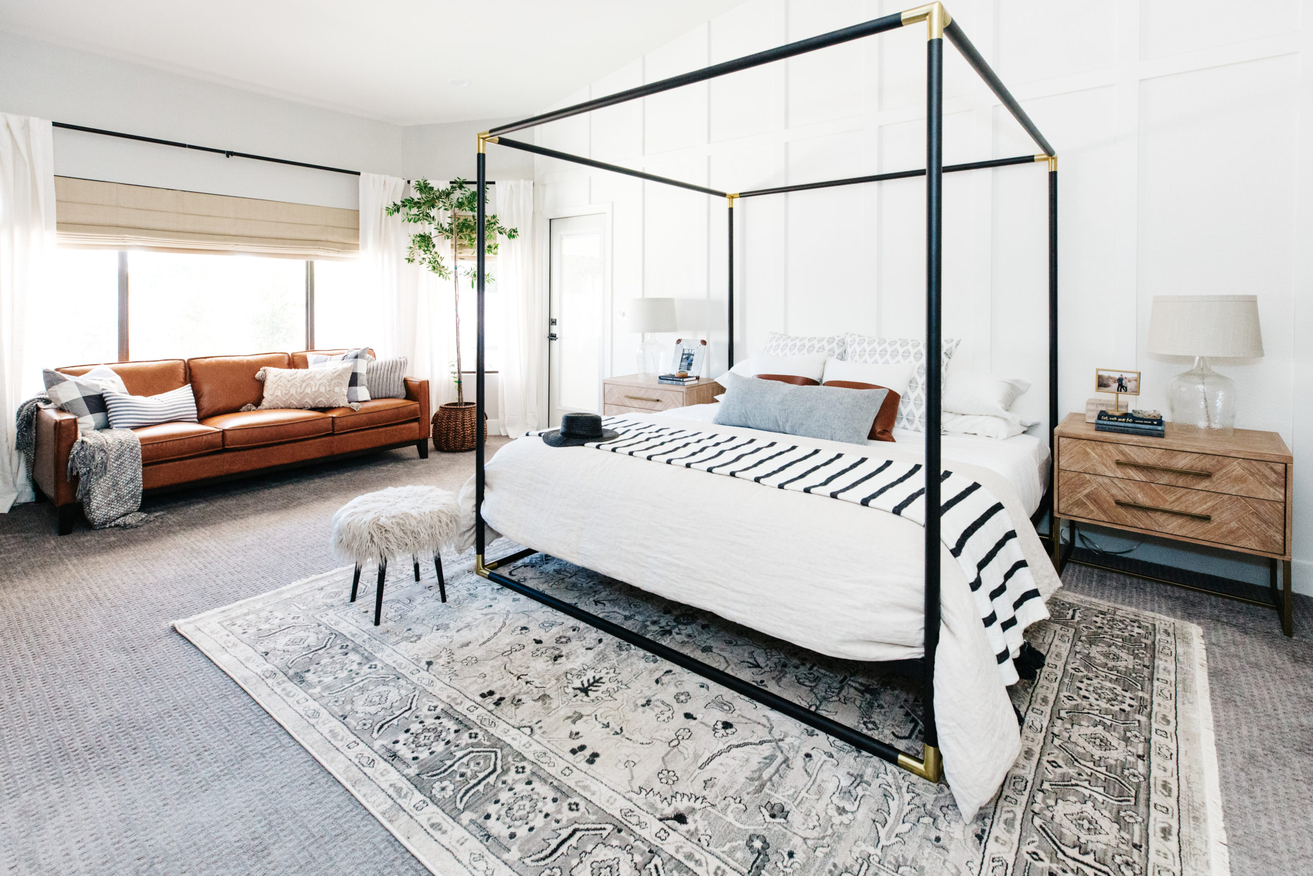 BEFORE
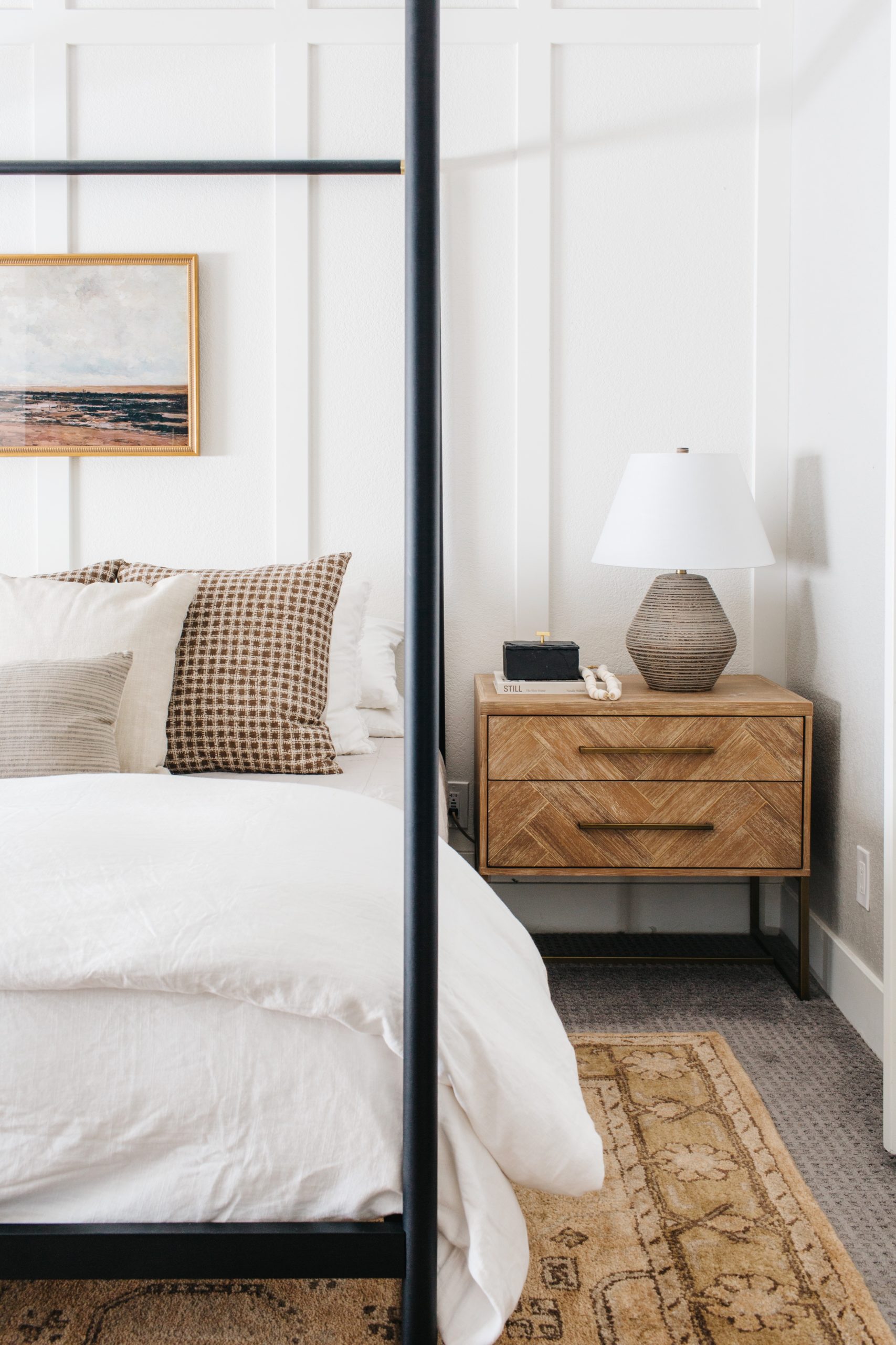
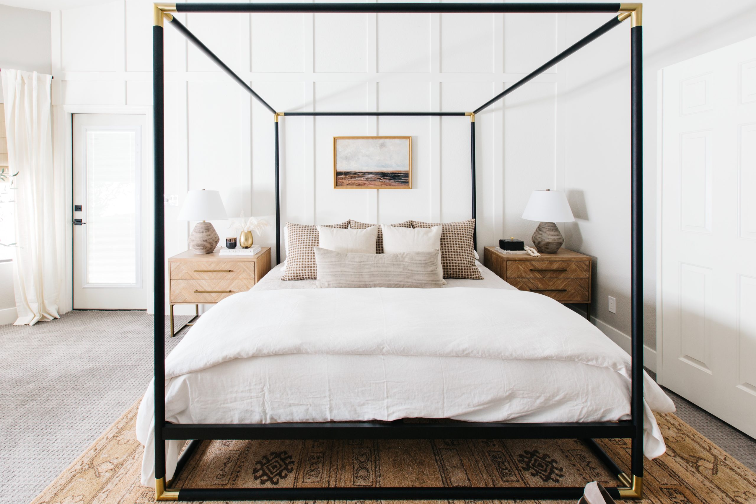
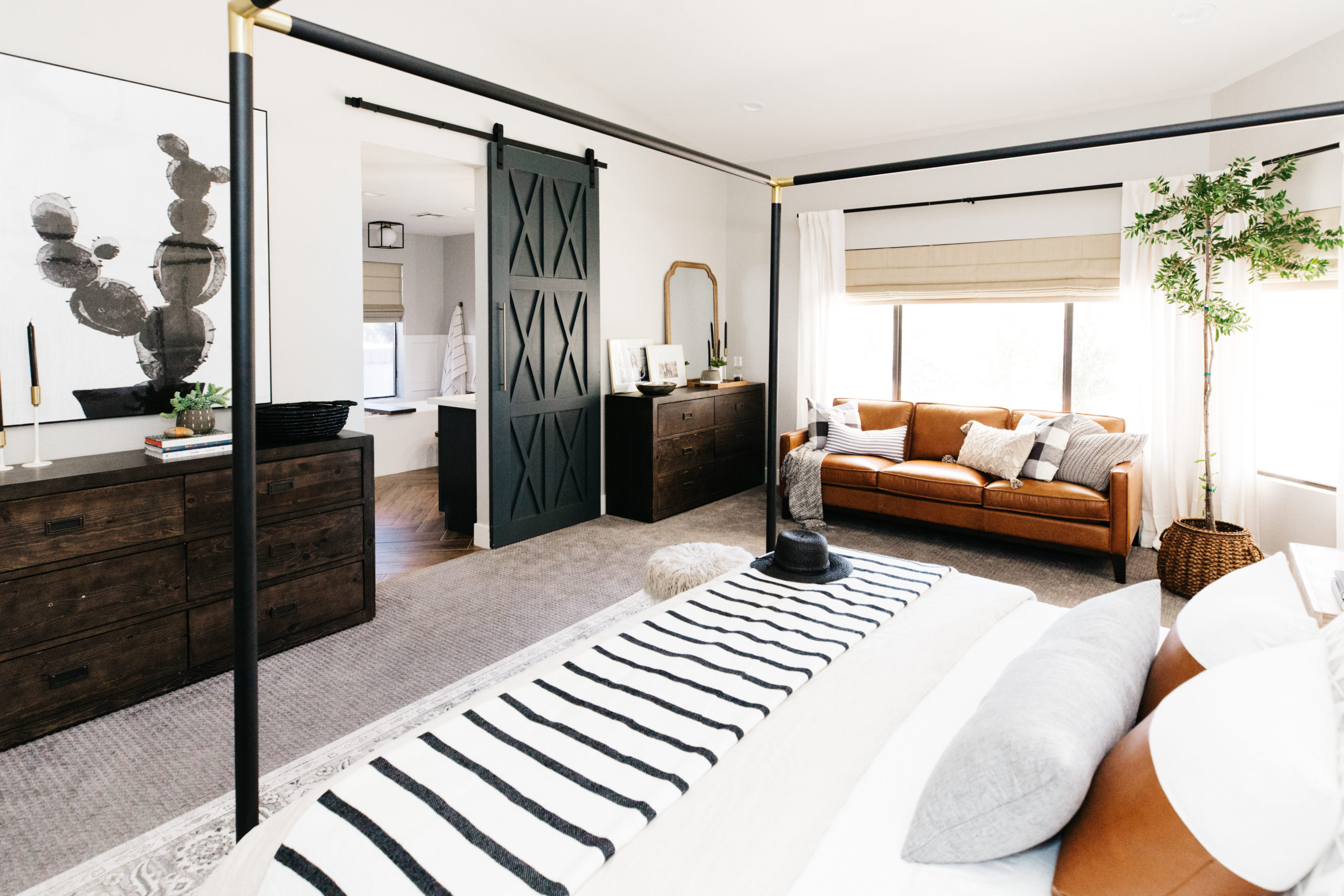
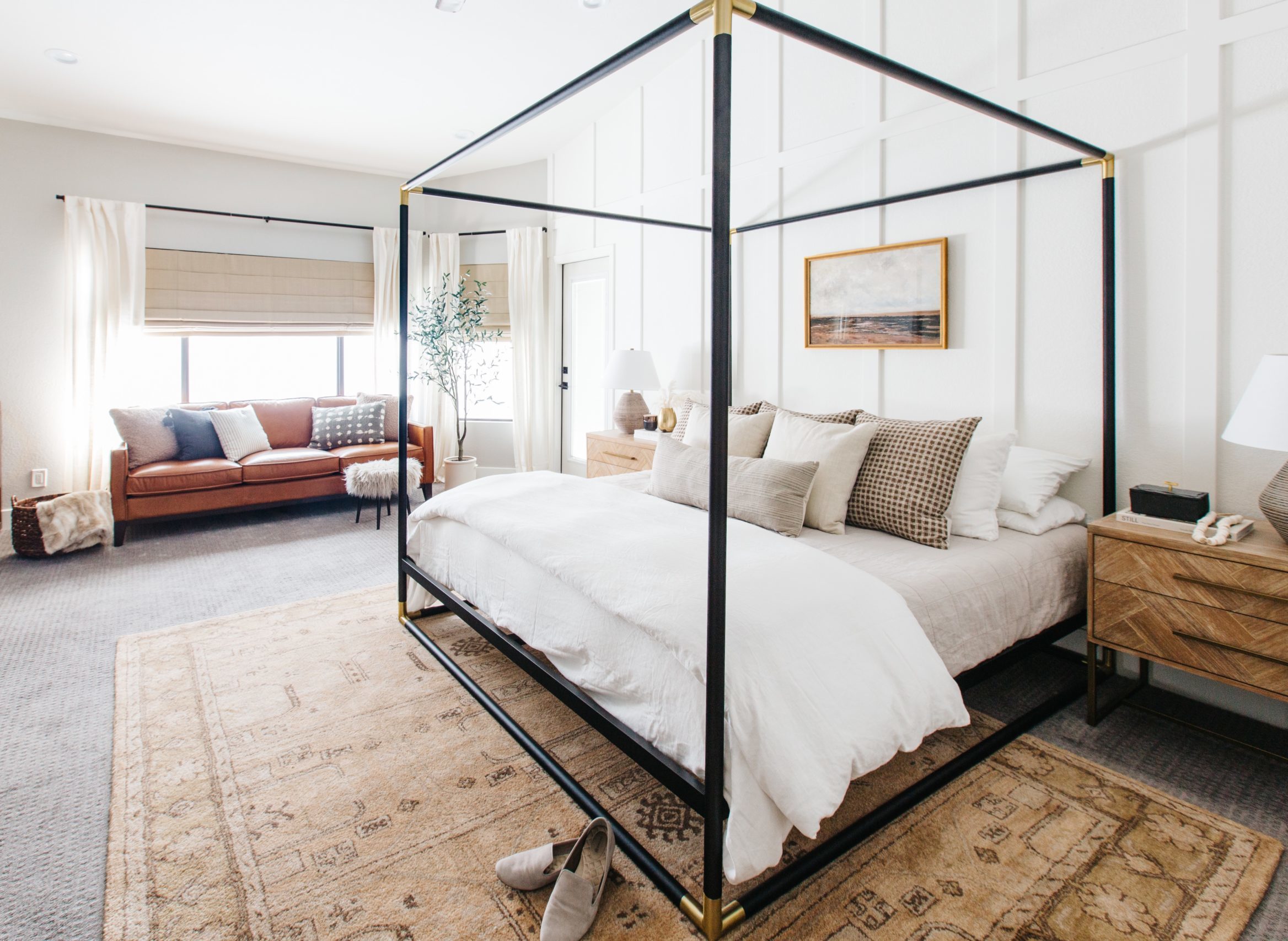 AFTER
AFTER
So, what’s new?
Area Rug
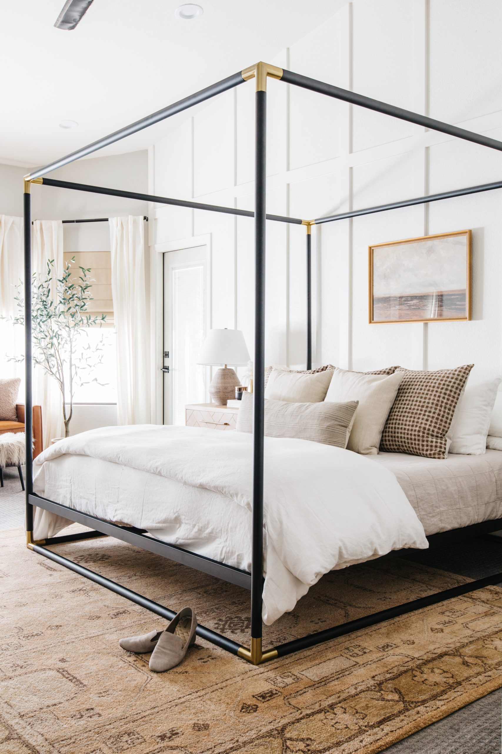
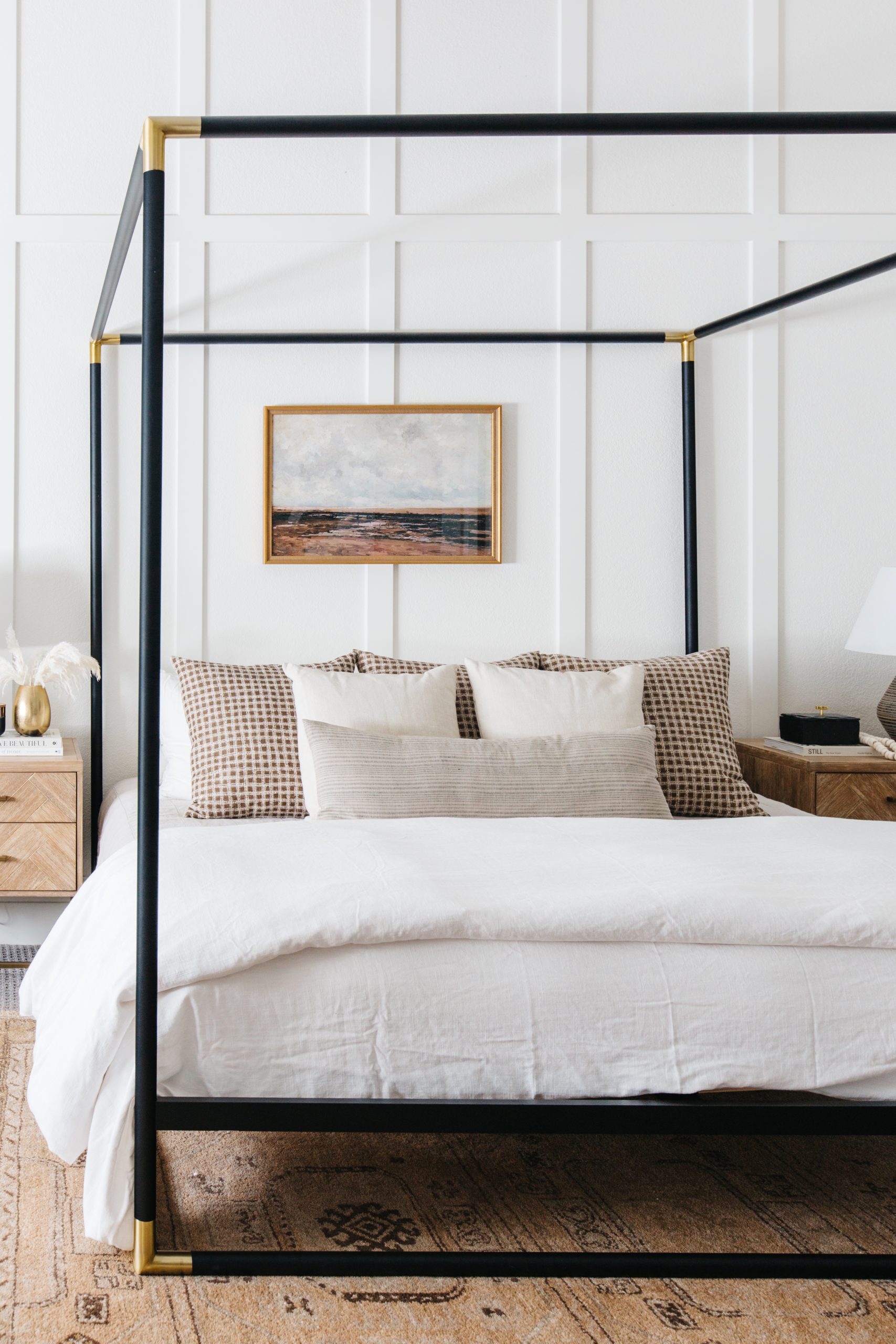
The first new item that I swapped out in the room was the area rug. It’s warm and so cozy to walk on. It’s more of a tan base with gray and brown weaved throughout. Once that was in the room I knew that the strong gray and black accents in the room were no longer going to work. There needed to be warmer tones in the space, so I found ways to bring that in while still making sure the space felt bright and well balanced.
Bed Pillows
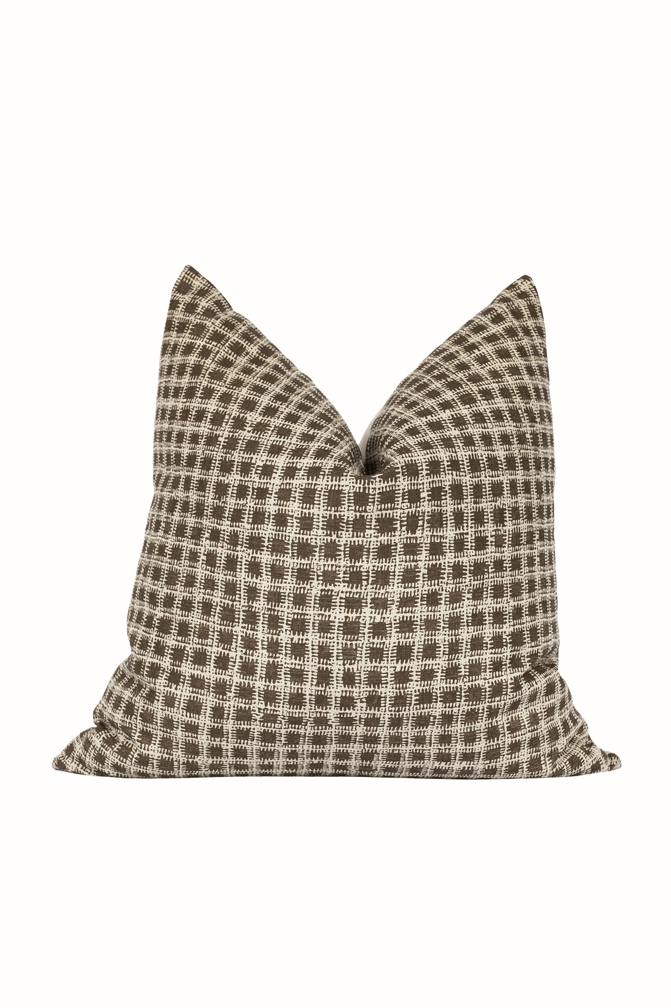
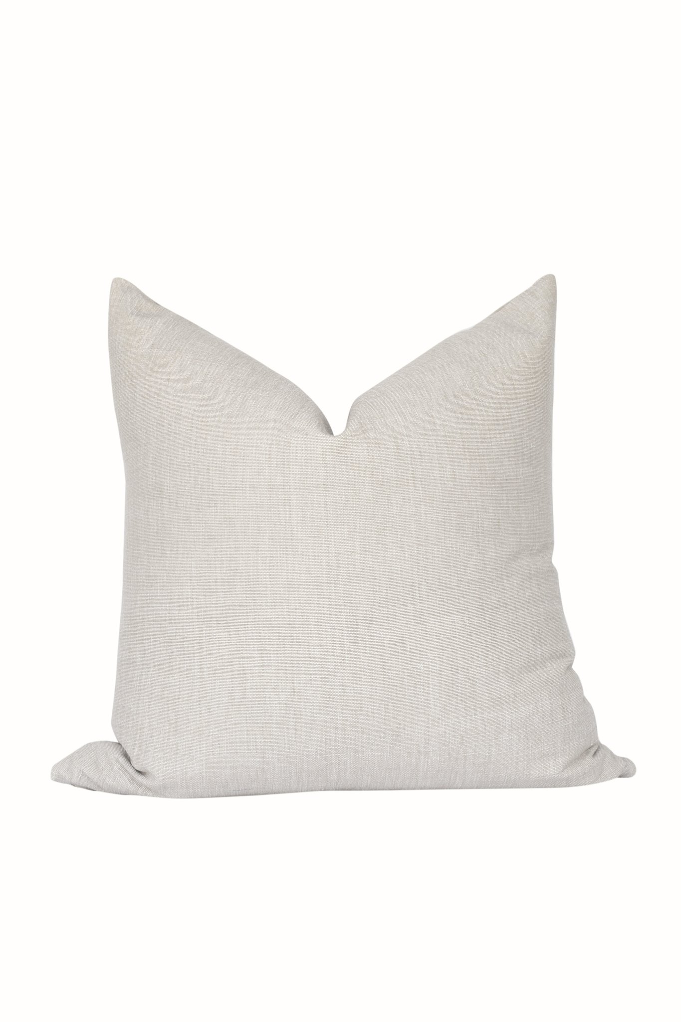
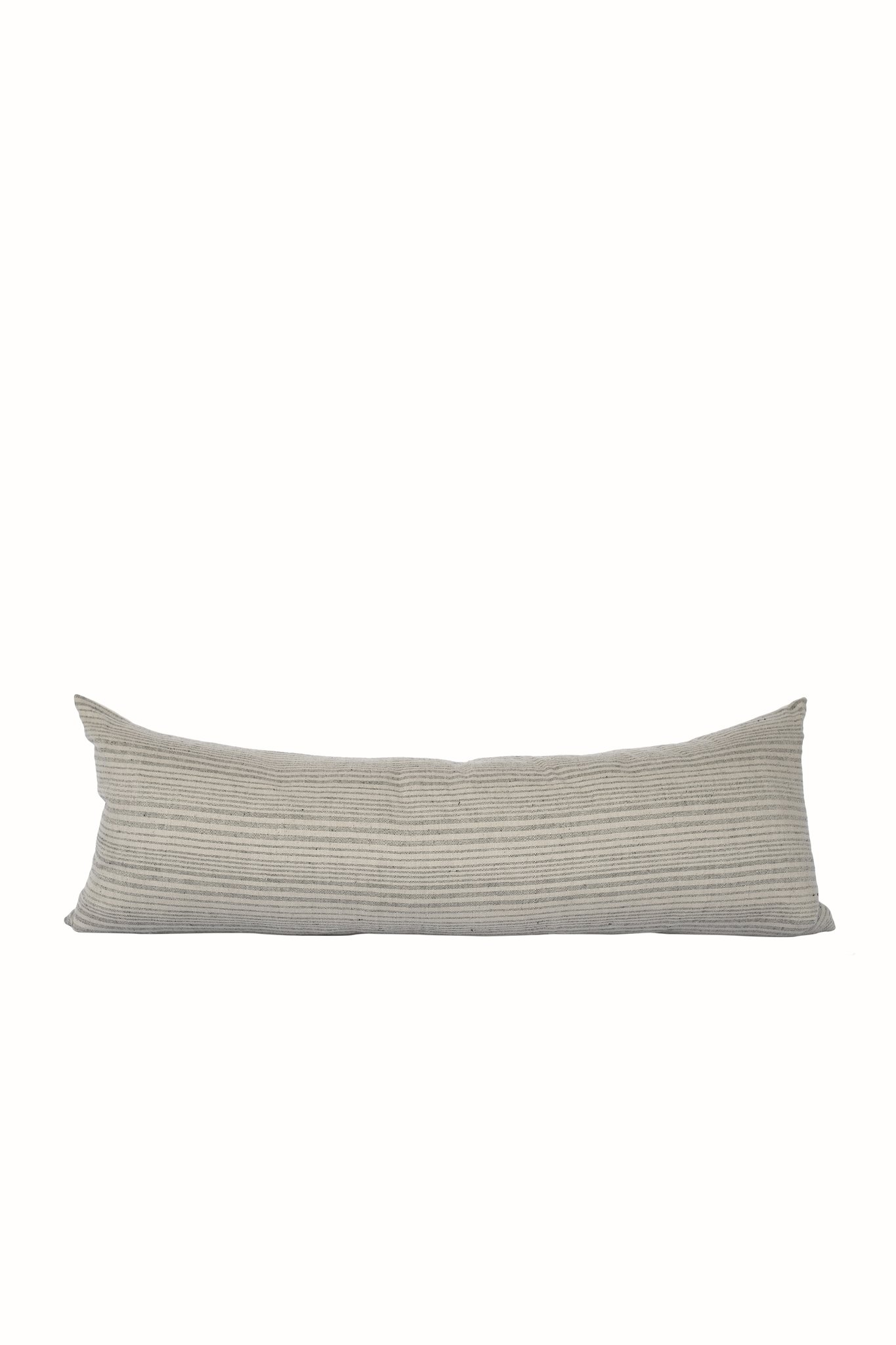
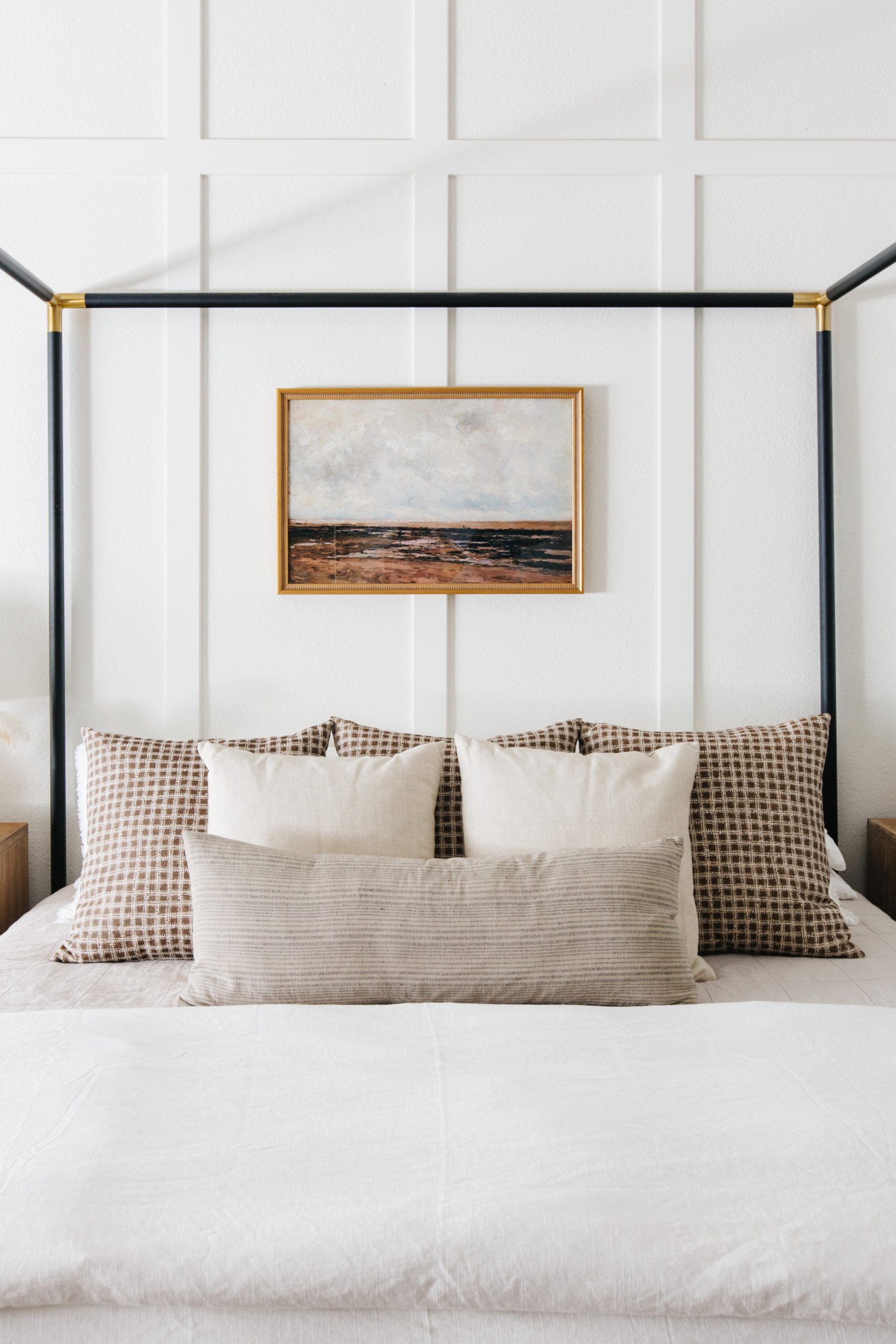
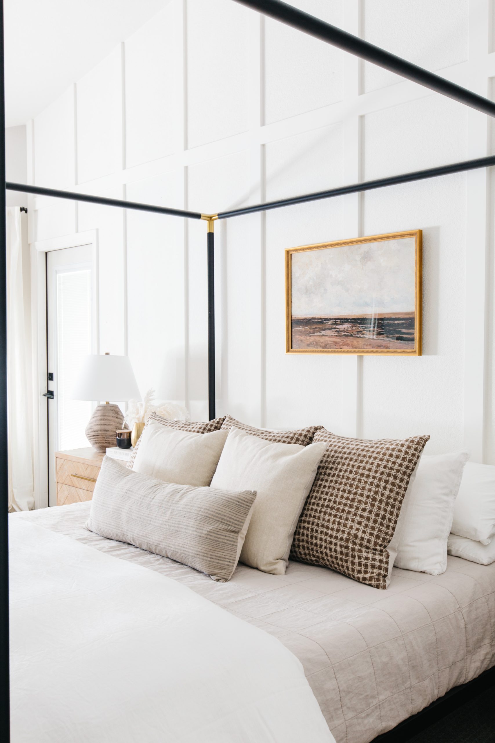
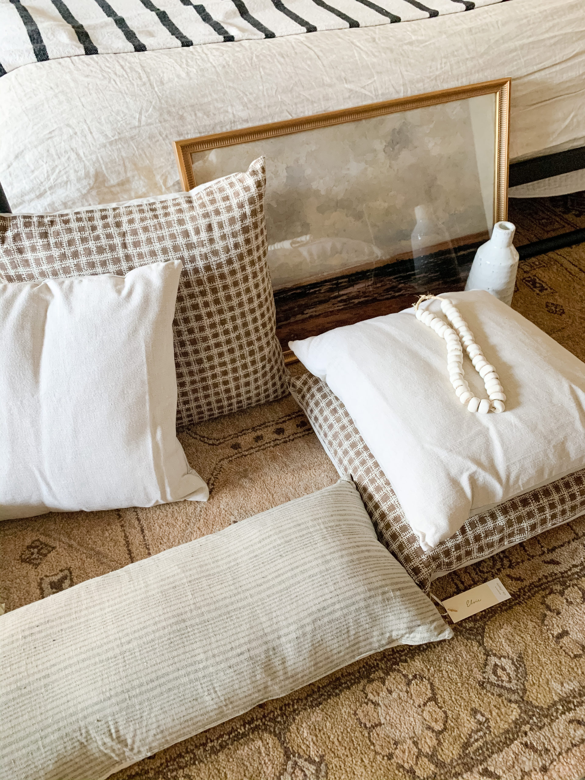
The pillows for the bed were the second purchase I made. All of them are from Elsie Home and they are GORGEOUS and so well made. I love the Pippa pillows that bring in the brown in the back. I layered the Raw Solid pillows in Flax in the middle to break up the pattern and then used the Kora Stripe in the 14″x36″ lumbar to bring in the gray tones.
Art
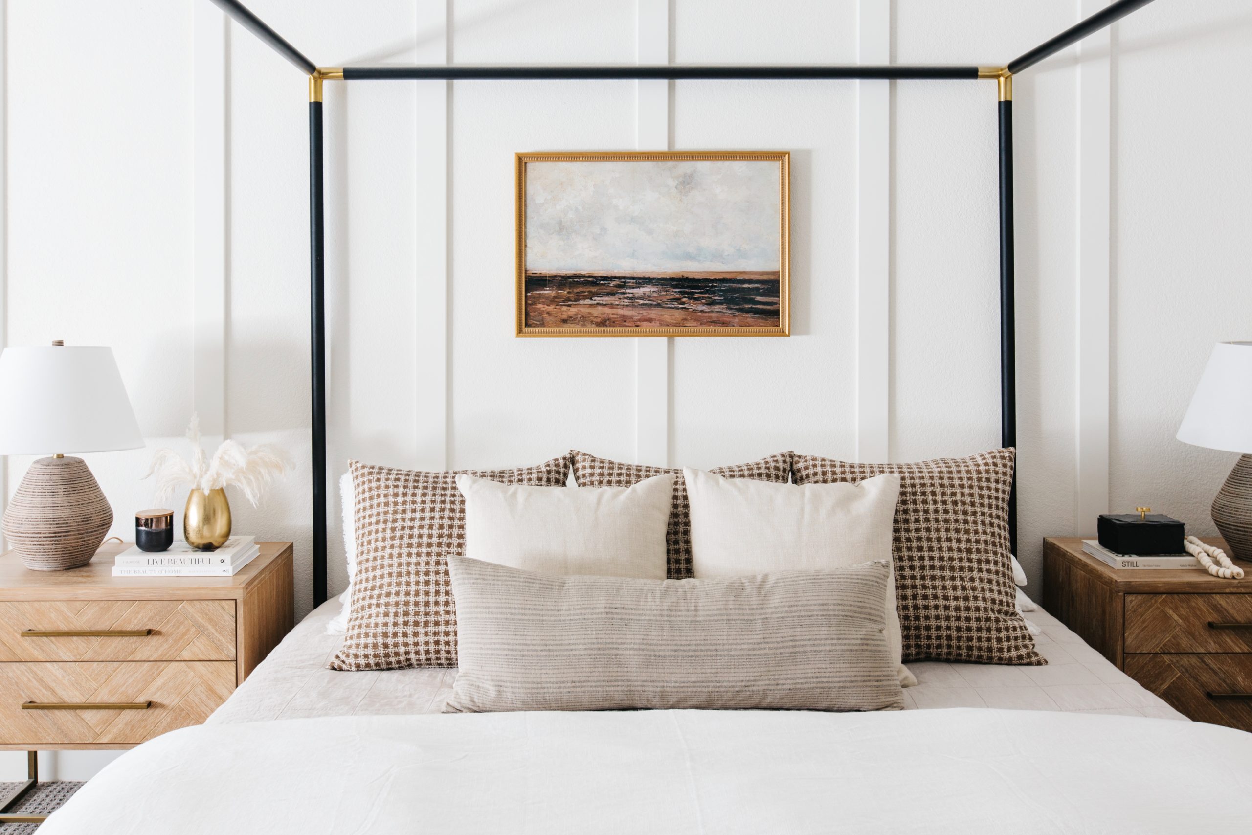
The framed art above the bed is the piece in this room that I didn’t know I needed until I hung it and then I wondered why I had not added it sooner. It’s a digital vintage print that I had framed and I love the visual interest and color that it adds.
Bedding
The white linen duvet replaced my previous duvet cover, which was a flax color and was really too beige next to the warm tones of the new rug. I added a beautiful new quilt from Parachute Home in a warm gray color and now the space feels brighter and airier.
Pillows & Lamps
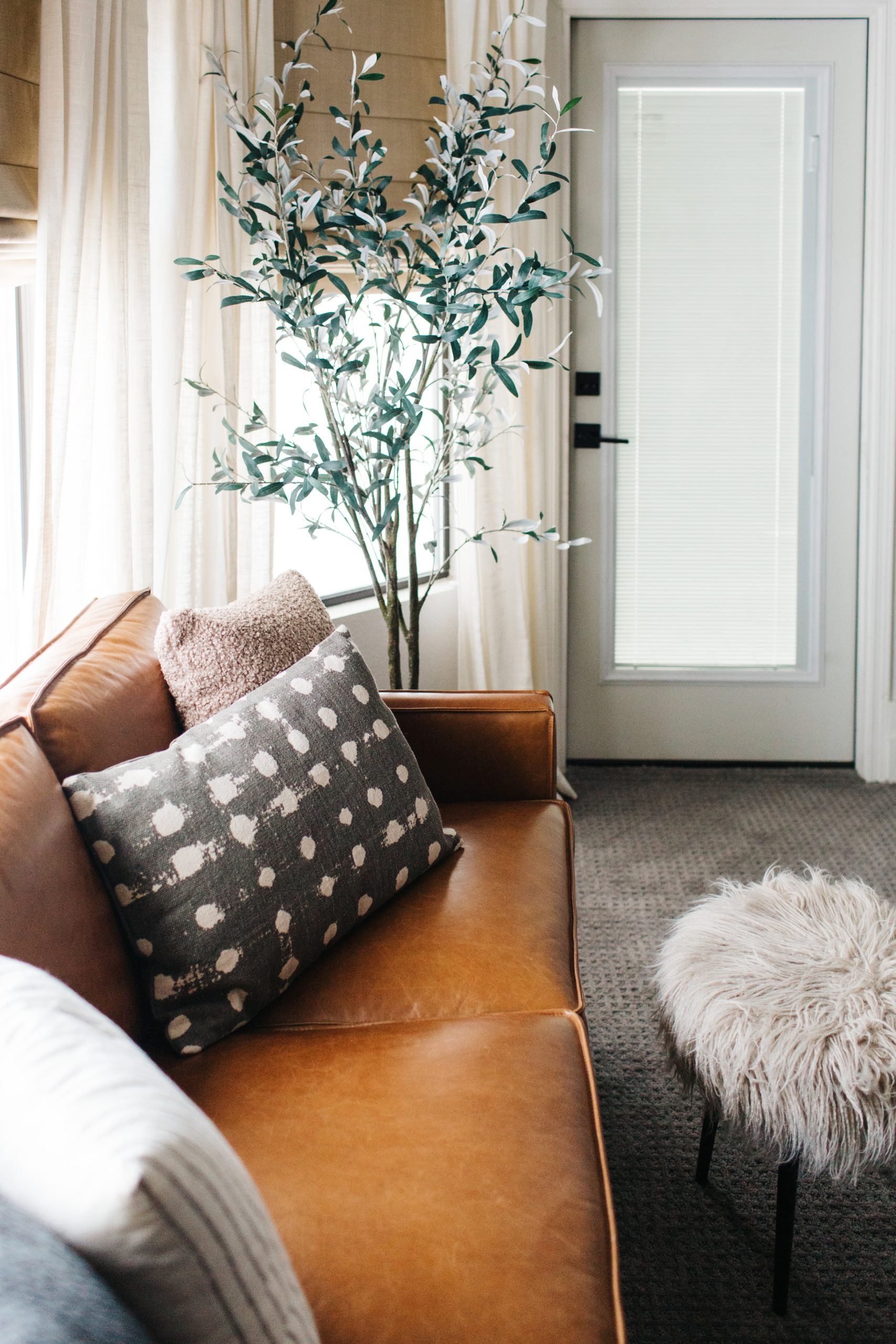
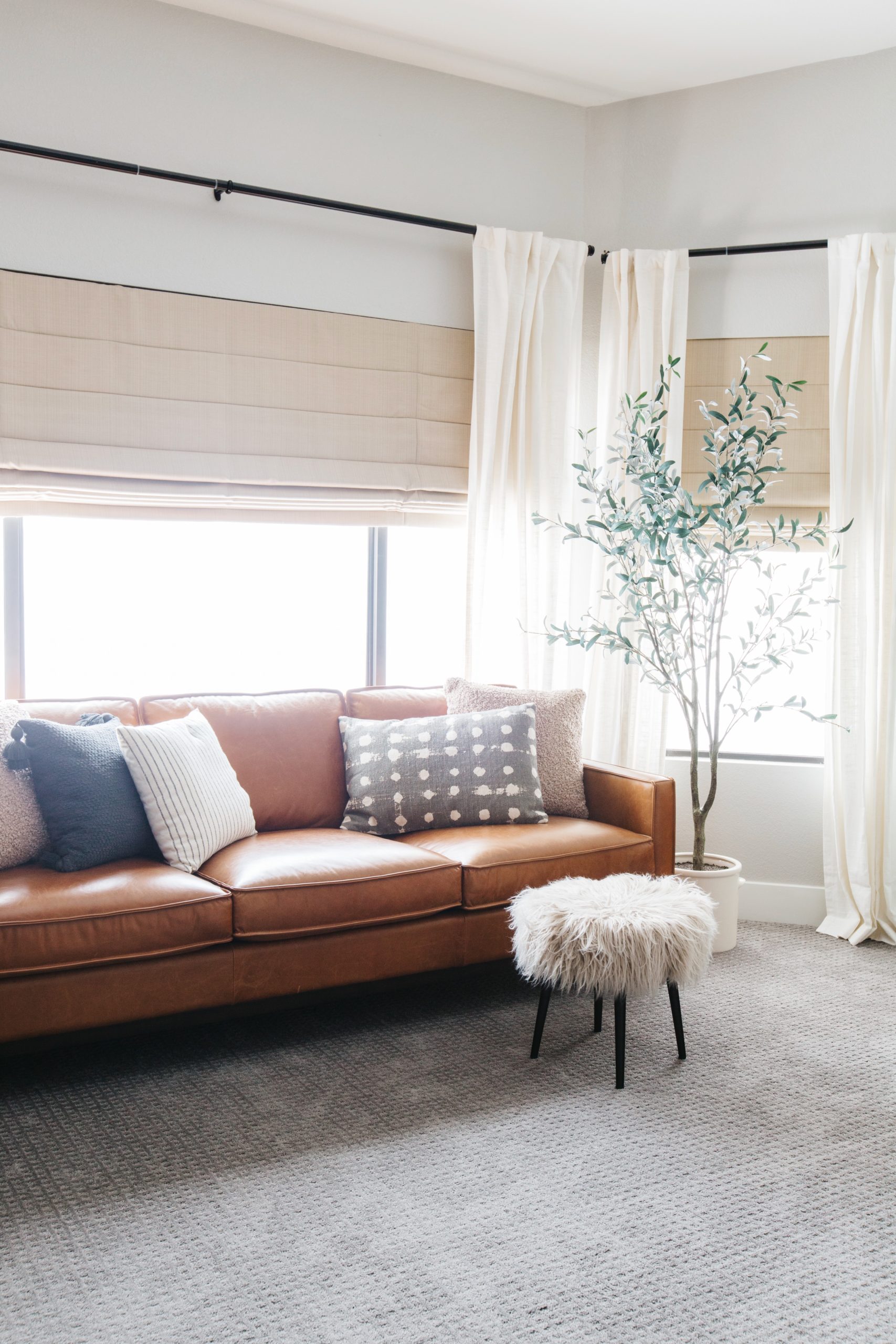
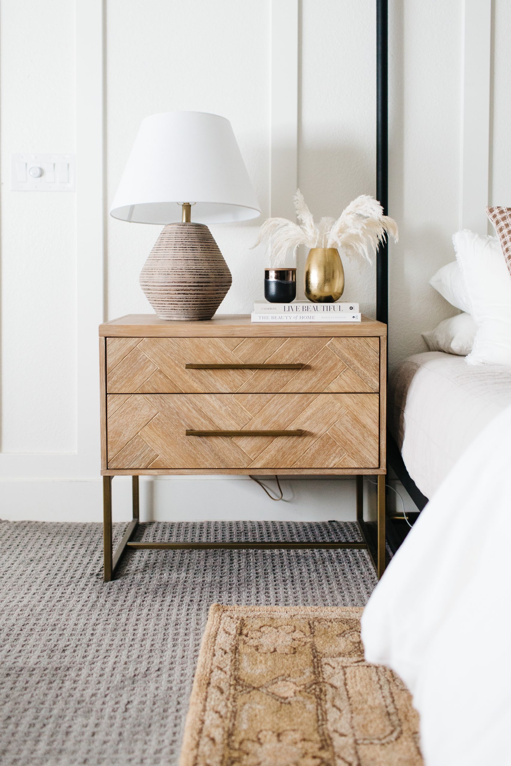
The sofa and the nightstands are got a little refresh with new pillows, lamps and accessories. I love the texture and pattern that everything brings in.

shop the bedroom
 JavaScript is currently disabled in this browser. Reactivate it to view this content.
Still more to do…
If you notice, there are no photos of our dressers and that’s because I still haven’t finished those areas yet. If you remember from the previous post, I was struggling with what to do in regards to the art above my dresser. It’s a large framed black and white cactus piece and while it’s really a great piece, it’s not the right piece for the space any longer. I would love to find another option that works with the new art above our bed, but I haven’t found that yet. And then there is the issue of the fact that we have matching dressers on the same wall separated by the sliding door into the bathroom. Do I need to find 2 pieces that work together – one for my dresser and one for my husbands? What about the fact that I still want a large standing floor mirror and no place to put it?
I planned to keep the leather sofa and I love the new pillows that I found for it, but maybe I should find one larger chair instead and then angle the floor mirror next to it?
Once I figure out the remaining areas I will update you with a new post, but I hope you have enjoyed seeing the bedroom refresh update and how it’s coming along!
read post
Browse the blog posts
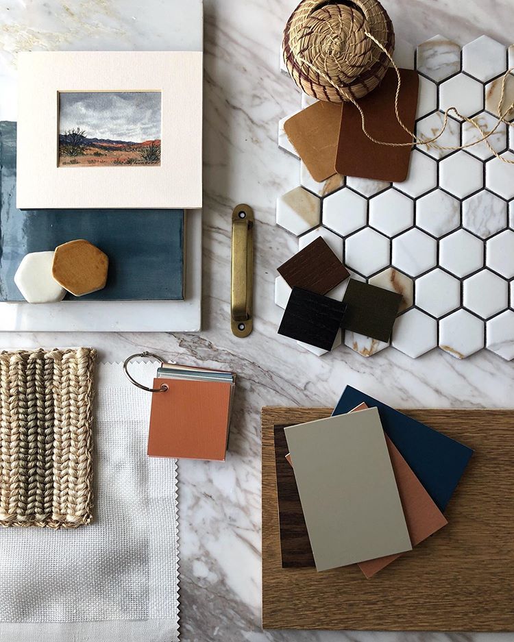

Anyone else love Summer Color Palettes? Every season we love to get our creative juices flowing and design spaces for that season. There are so many gorgeous colors when you think of summer and we are loving these color palettes! Greens, blues, and golden tons are definitely the colors for this summer season. Fresh Greens […]
Brittany Krupnik is a real estate investor, designer and home stager. She creates spaces where life can be enjoyed - whether that is reimagining a space and bringing it back to life through flipping, helping someone envision themselves and the life they can have in a new home through staging or designing a vacation rental that serves as the backdrop for families and friends to create memories.
Brittany has staged over 500 homes and designed over 250 homes. When she is not designing, you can find her reading, traveling or trying out a new restaurant. She lives in Tempe, Arizona with her husband and 3 kids.
I'm Brittany — real estate investor, designer & home stager.
Meet the designer
Learn best practices for choosing a neutral paint color!
Neutral Paint Guide
ALMOST THERE!
tell me!
Learn best practices for choosing a neutral paint color!
Wondering what color is right for your room? Get our neutral paint color guide!
Browse the entire shop of favorites!
CURRENTLY LOVING
products we are
SHOP BLISSFUL
