


i'm so excited to share this lower arcadia flip with you!
Over months and months, I have shared this flip project in the lower Arcadia area of Phoenix in my Instagram stories, but now it's making its blog debut. This home got a complete renovation makeover - we took walls down, closed in windows, rearranged some spaces, took over closets to make a larger shower, etc. And it really made all of the difference. So without further ado...
the design elements
black, gray, brass and beautiful warm tones
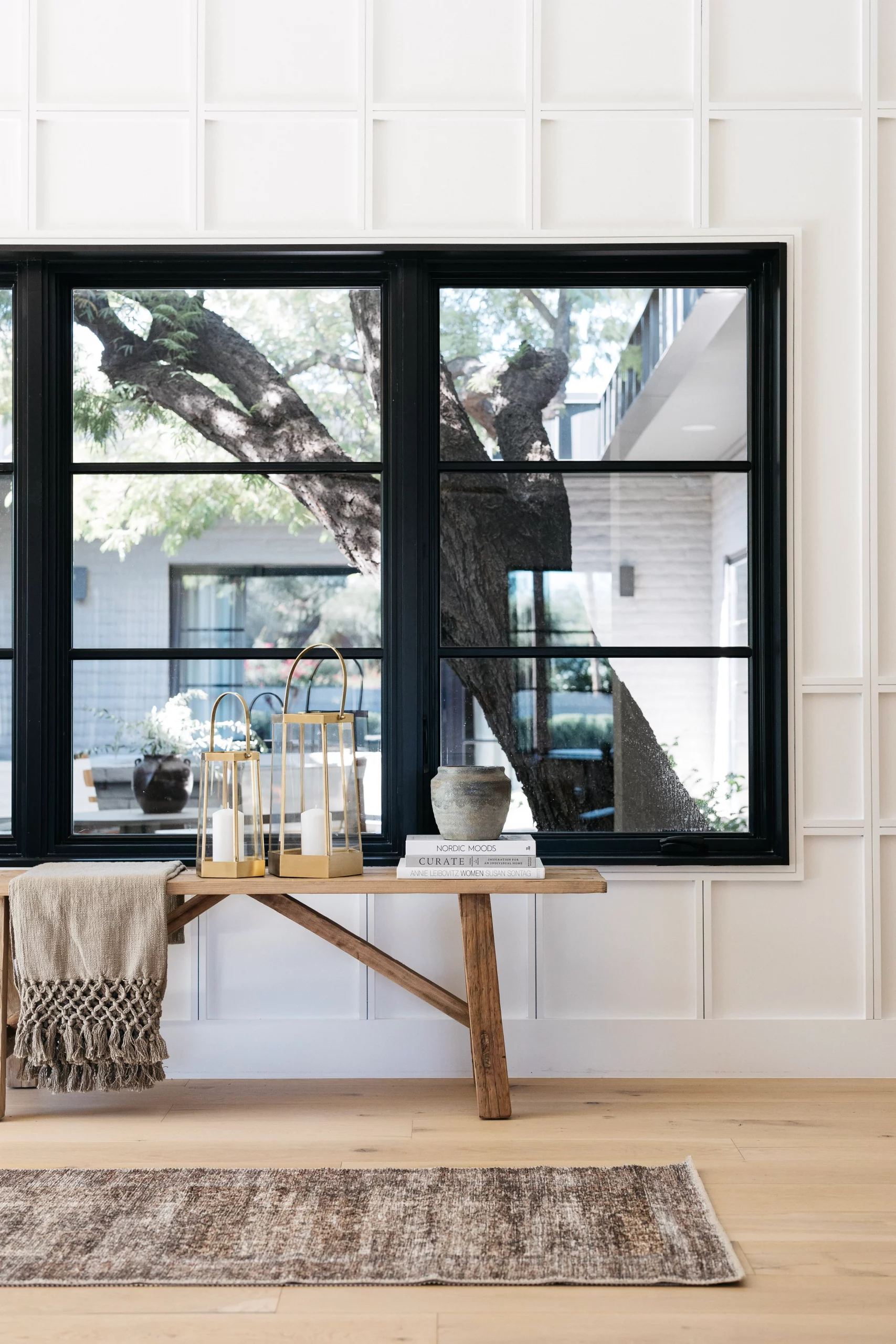
Living Room
The living room didn't get much larger, but it definitely feels larger once the walls between the living room and kitchen were removed. We replaced the slider and changed where the door opens in order to make this space more functional. Before you would have had to walk through the living room to get outside, but now that the door is on the left side there is a direct path between the kitchen island and the back of the sofa.
The staging is really where this room shines though. We have some beautiful pieces from the curved back sofa, the area rug (that I bought at Home Goods years and years ago), the sideboard we used as a media console and the leather strap accents chairs.

BEFORE

AFTER

BEFORE

AFTER


shop the living room

Dining room
We changed the location of the dining room in order to make the kitchen larger. It used to be in the left back corner, but we moved it in front of the large window and now it just feels like one large great room. But the modern black chandelier anchors the space and defines it.
We kept the staging simple with a wood table and black dining chairs, but I love the upholstered head chairs that make it feel a little more cozy. Instead of using place settings, we have really loved groupings on the dining table that feel more informal. We used greenery, a pretty metal vase, a bowl of pears and some taper candle sticks.

BEFORE

AFTER


shop the dining room
KITCHEN
This kitchen used to be a cave. It was closed it and felt dark. My before photos are during demo, but I think it's pretty clear that with all of those walls, it was not the best use of space and opening up the walls made the kitchen so much larger and also made the whole space feel open and inviting.
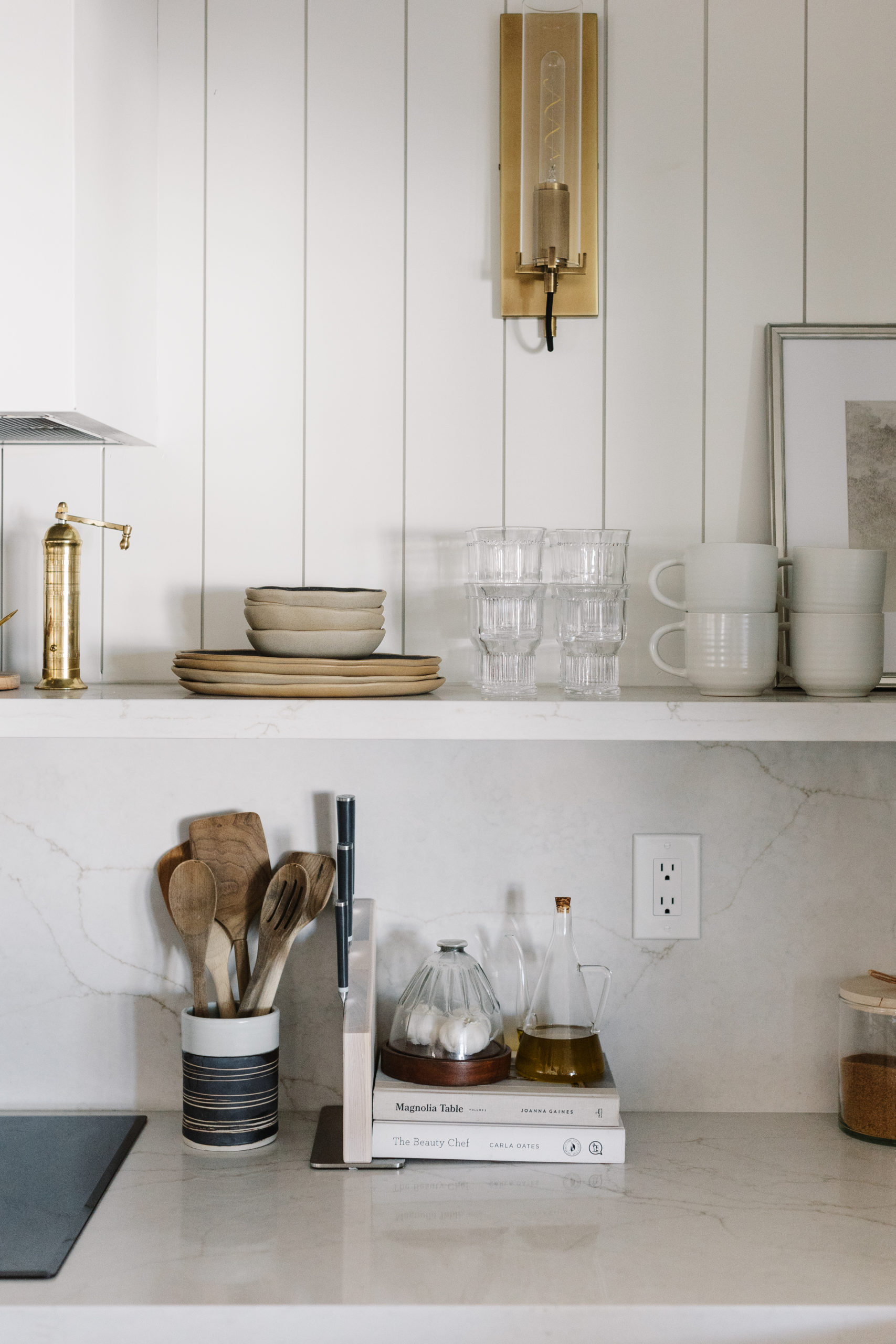
We kept the sink wall under the window, added a large kitchen island where the wall used to be and then extended the kitchen along the back wall by closing in a window to the carport and taking over the previous dining room. We chose to use painted cabinets in a color called Usual Gray by Sherwin Williams. It wasn't my first choice. I chose another color from Benjamin Moore, but our cabinet company said they would only use Sherwin Williams colors, so I tried to color match it and this is what we came up with. Too be honest, it's not the same color that I started the design with. This one reads more blue than my original green gray color palette. However, the cabinets looks either blue, green or gray depending on the lighting and although I was disappointed at first, I really love how it turned out. We also planned on having open shelves on either side of the window under the sconces, but those were ordered from Pottery Barn months ago and they still haven't come in. But I really love how we used the art and the cutting boards to take up visual space with the staging.
The rest of the staging is a combination of wood, black and brass pieces.

BEFORE

AFTER


AFTER


shop the kitchen
Main Bathroom
This is one of my favorite bathrooms that we have completed in a while. I love the marble shower tile and the taupe cabinet color. We made the shower much larger and added a double sink by taking over a hall closet and also a second closet in the bedroom. Now it's a large walk-in shower and the bathroom is much more spacious. I love the texture in this bathroom from the slate herringbone floors. I feel like it adds character to the brand new bathroom. We kept the bathroom feeling warm with arched mirrors and brass vanity lights.
One of things we debated about during the remodel, that some of you voted on in my stories, was whether or not we should enclose the toilet into a separate room or leave it as is and therefore keep the natrual light in the whole bathroom. The majority voted the way that I was leaning and that was to not enclose the toilet and keep the natural light in the space. I'm glad we did that. You can't beat natural light in a bathroom and I love how it turned out!
We kept the staging simple with a faux olive plant, hand towels and soap dispensers. I feel like this bathroom was already so beautiful and I didn't want to compete with the slate and the marble. I think everything in there adds enough without taking away from the finishes.


AFTER

BEFORE

AFTER


shop the primary bathroom
Guest bathroom
This bathroom was hard to photograph to really showcase how this bathroom turned out. We chose a simple color palette of beige, white and black. It keeps the space feeling light and bright and I like the play of the hexagon floors with the square shower tile.
Again, the staging is simple with a few items on the countertop, some greenery an art piece on the opposite wall. Adding the hooks and towels also take up wall space and make it feel functional as well.

BEFORE

AFTER


shop the guest bathroom
I hope you enjoyed this reveal and these before and afters. I love sharing these projects with you and if you love it too, let me know in the comments!
Let's be
friends!
Get exclusive design tips and blog updates sent to your inbox!


read comments or leave a comment...