blissful design studio

search the blog

categories

studio blog

projects

staging

design tips

travel

personal

the blissful blog

Project Reveal: Bullmoose

Latest  Post

This Chandler fix & Flip is light, bright and neutral!

I almost convinced my husband that we should buy this house, remodel it and move into it. It was a month or so into stay-at-home orders. I was homeschooling 3 kids and not able to go into my studio. Our backyard still wasn’t done and I was so in need of a new project. I loved the floor plan and the location was great and it had so much potential. I even had my kids convinced that we should keep it and they started picking out their rooms.

Needless to say we didn’t decide to keep this home, but I put a lot of time and care into selecting the finishes and then I had to convince myself all over again that we shouldn’t keep it. I wanted it to feel light and bright, but really warm. The color palette of tones of gray, taupes and whites was carried throughout the home.

The kitchen

The footprint of this kitchen to start wasn’t terrible, but it wasn’t great either. There was a soffit that came down above the cabinets and it made the ceilings seem short even though they are vaulted in this room. By removing it and using white cabinets on white walls it feels less visually interrupted. To keep things light and bright, I chose a white backsplash and white quartz countertops. I have used this tile in so many other homes, but I really love how it turned out in the white square. In keeping with keeping the eye interrupted, I found these great white rattan pendants. I love that they add a moment of texture even though they blend into the cabinets and walls. 

For the island, I chose to do gray to add some contrast. This island ended up almost doubling in size. We chose to make it deeper in order to make sense of what used to be the “bar” in the living room. By making the island extend further back, we made that new area of cabinet feel like part of the kitchen. Now there is a great place that can be designated as a coffee bar or just a bar.

Shop the Kitchen

Before

after

The Living Room

The living room is right off of the entry. What I love about this room is that with all new carpet, paint and staging it looks like a brand new room!

When staging this room, we started with the neutral art piece and used it to build the color palette of black, blue, white and brown. This room is one of the first ones you see when you walk in the door and we wanted it to feel warm and inviting and cozy.  It’s a large room, so we used large pieces to fill out the room. The trickiest part of this room was where to hang the art and we opted to center it over the sofa even though it’s not centered the wall. I think that was the best option because the alternative was to center it on the wall, but then it would have hung halfway over the sofa and halfway off. 

Before

After

The Dining ROOM

The dining room is the other room right off of the entry way and although we didn’t do a lot to the room, we still needed it to make an impact when you walk in. We added a new light fixture and grid board and batten to the room. I love the little window seat moment that we styled. I mean, who doesn’t love a good window seat?

Shop the Dining Room

before

after

The primary bathroom

This bathroom design is where everything started. You can see in the design board how I used the color inspiration as the jumping off point for the whole bathroom. I fell immediately in love with the Makoto line of tile from Bedrosians and I had been really wanting to use the taupe tile. This tile has so much movement and variation. It’s earthy and warm and paired with the cooler gray of the cabinets, it helped to balance out the space. 

This bathroom had a great layout already, so we didn’t change anything except to replace the built in tub for a freestanding tub. In order to add character to the bathroom we added vertical shiplap to the wall behind the vanity. I chose brass and polished nickel as the hardware finishes. They both have warm undertones, so they pair well together. And don’t get me wrong, I love black hardware. But I wanted this room to feel light and bright and I feel like we accomplished that in this room. 

Shop the Bathroom

before

after

half Bathroom

The half bathroom got its own transformation and I love how it came together. The floor tile brought in all of the warm neutrals that are throughout the rest of the home. Laying in a herringbone pattern added visual interest to the space. Because this room has no natural light, it really benefits from the fact that I chose to do white walls and gray trim. It feels so much brighter now! We kept the brass and nickel pairings in this bathroom as well, mixing both polished and brushed nickel.

Before

AFter

Shop the bathroom

hall bathroom

The last space on our tour is the hall bathroom. I love the pattern on the floor. It makes this bathroom much more fun. Getting rid of those terrible 80s vanity lights also didn’t hurt making this bathroom look so much better! We kept this space light and bright, but still warm with the wood mirrors and the brass fixtures.

Before

AFter

Shop the bathroom

read post

Browse  the  blog posts

Project Reveal: My Home | Half Bathroom, Kids’ Bathroom & Master Suite

Studio Blog

Project Reveal: My Home | Kitchen, Family Room, Dining Room, Entry & Laundry Room

Studio Blog

Project Reveal: Cambridge

Studio Blog

This warm neutral remodeled vacation rental is so good! I think this is my favorite remodel we have done to date. There is something about the overall look and feel if this home that really makes me happy! I have a tendency to lean towards a neutral color palette anyway, but I wanted this one […]

Project Reveal: Highland

Studio Blog

Project Reveal: Edgemont

Studio Blog

Living Room + Edgemont Vacation Rental + Blissful Design Studio
Meet Brittany

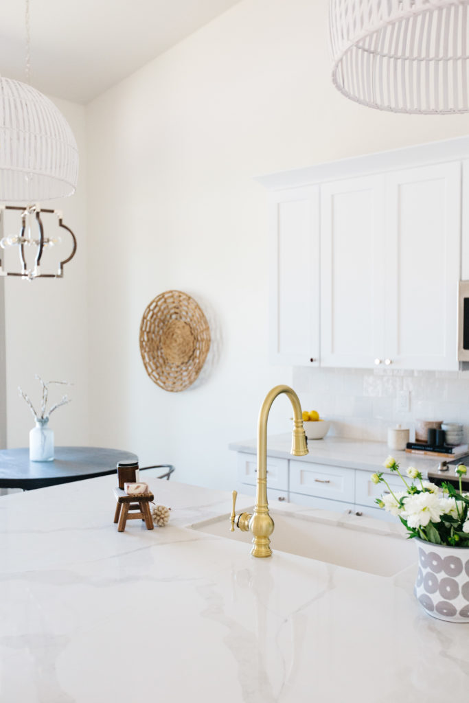
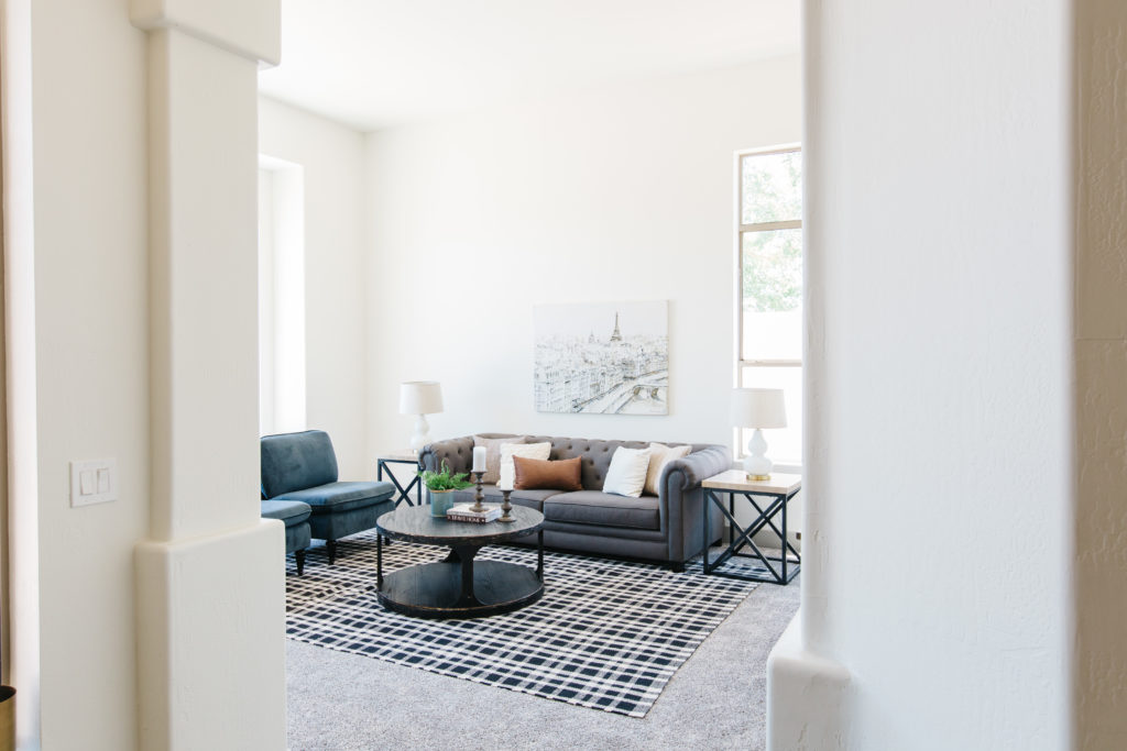
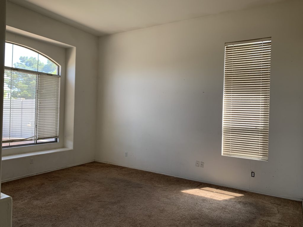
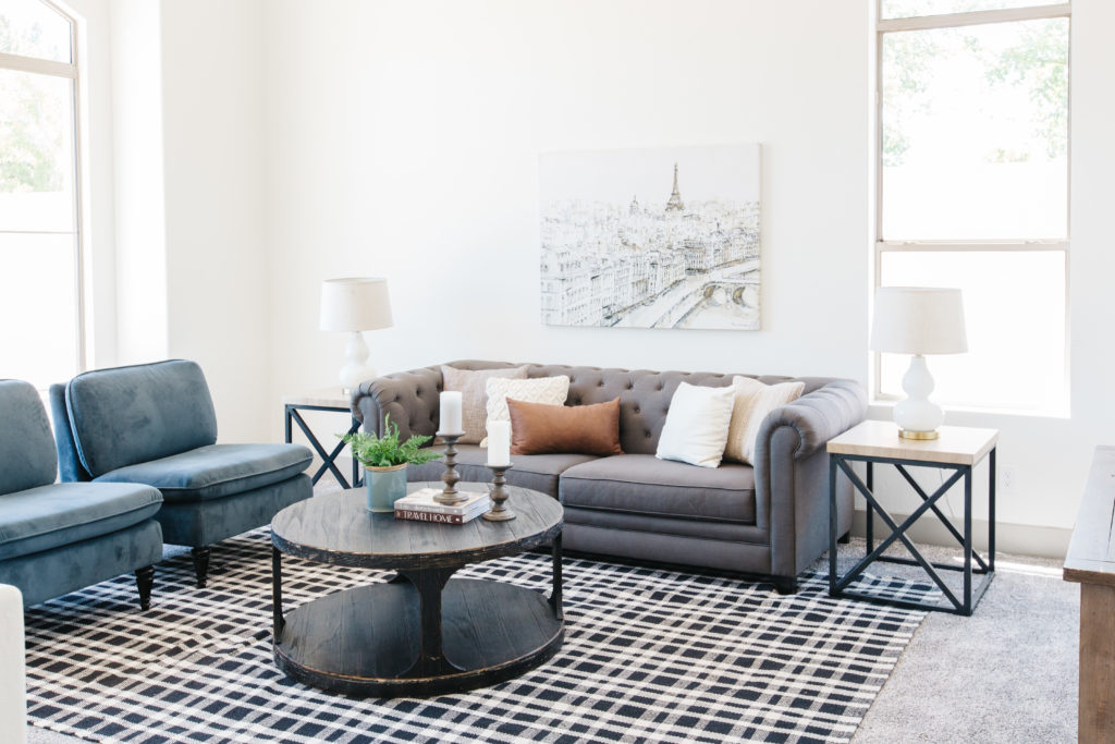
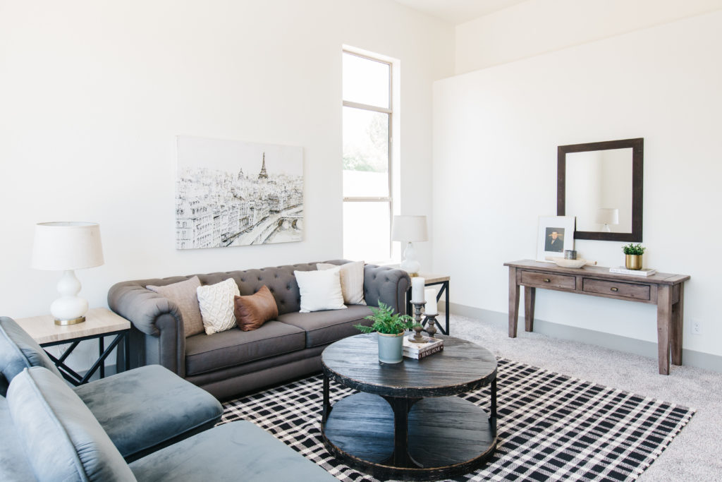
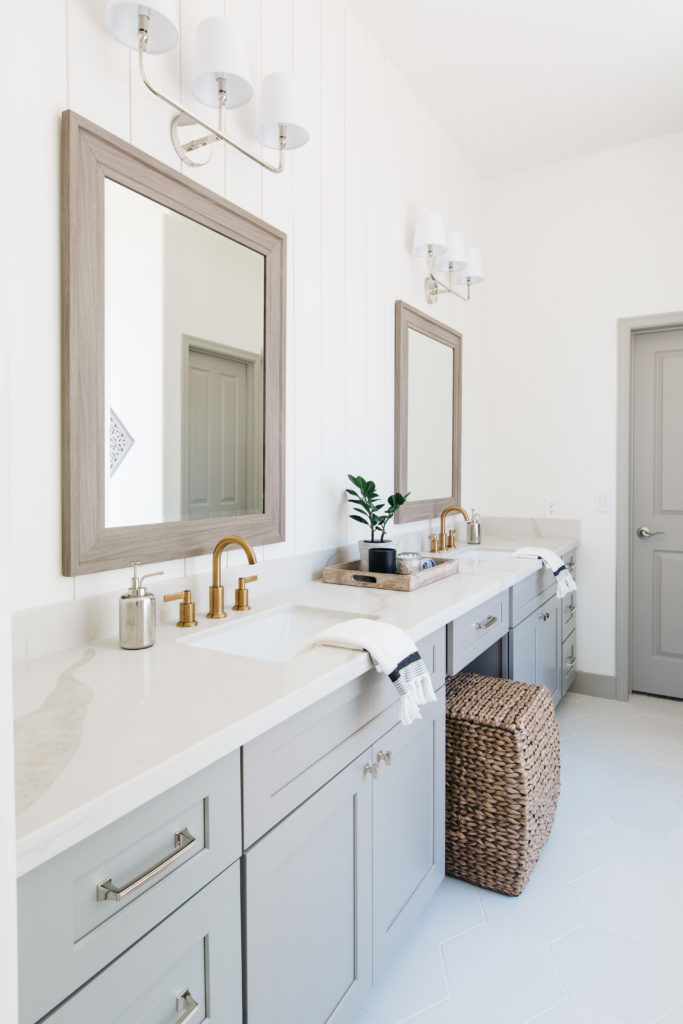
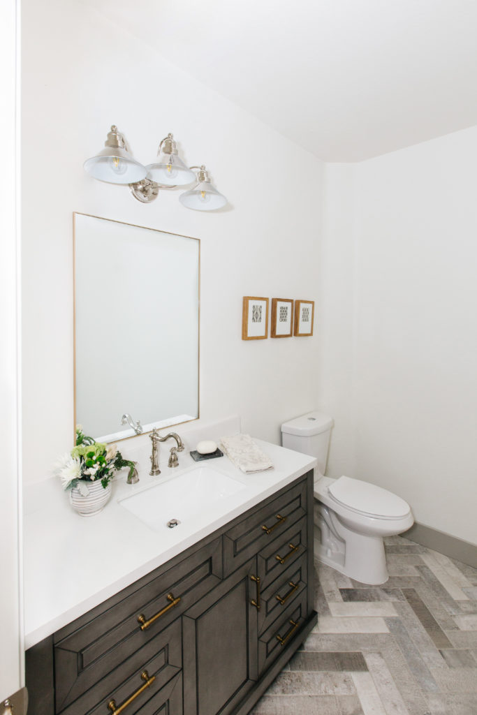
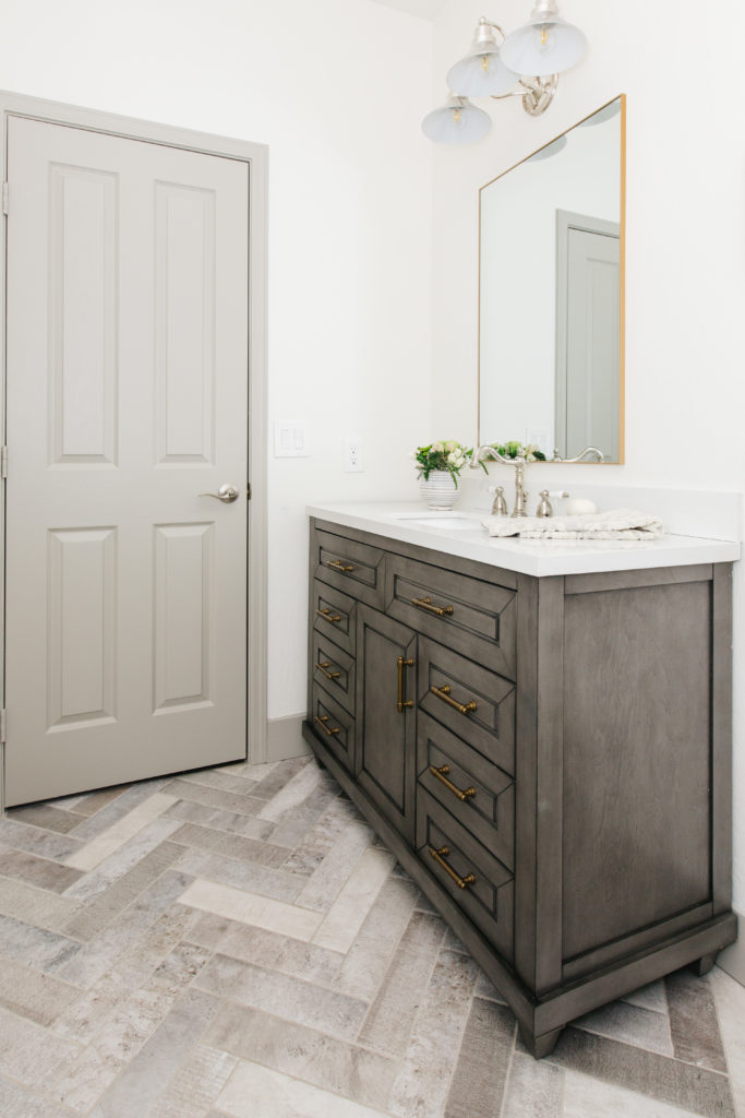
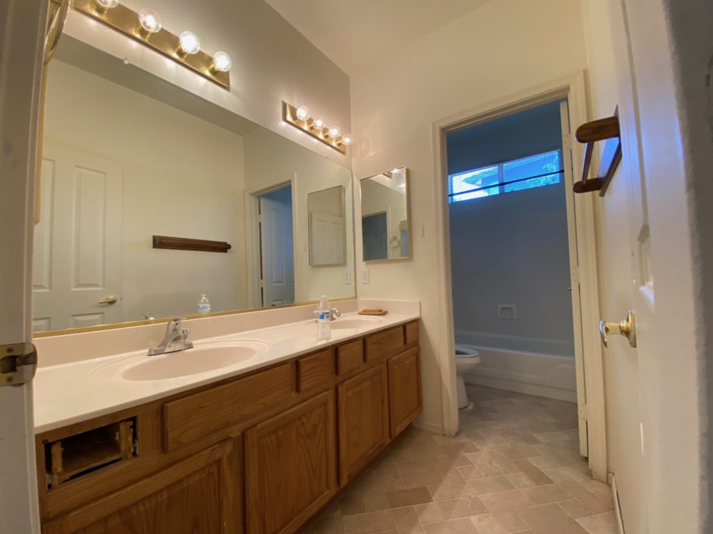
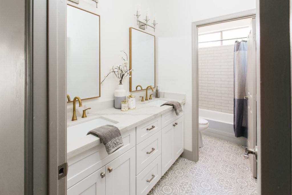
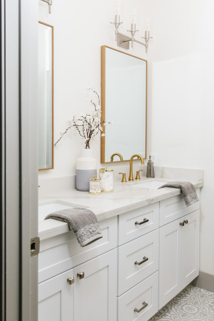
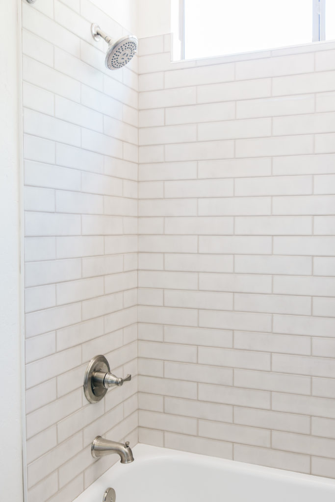
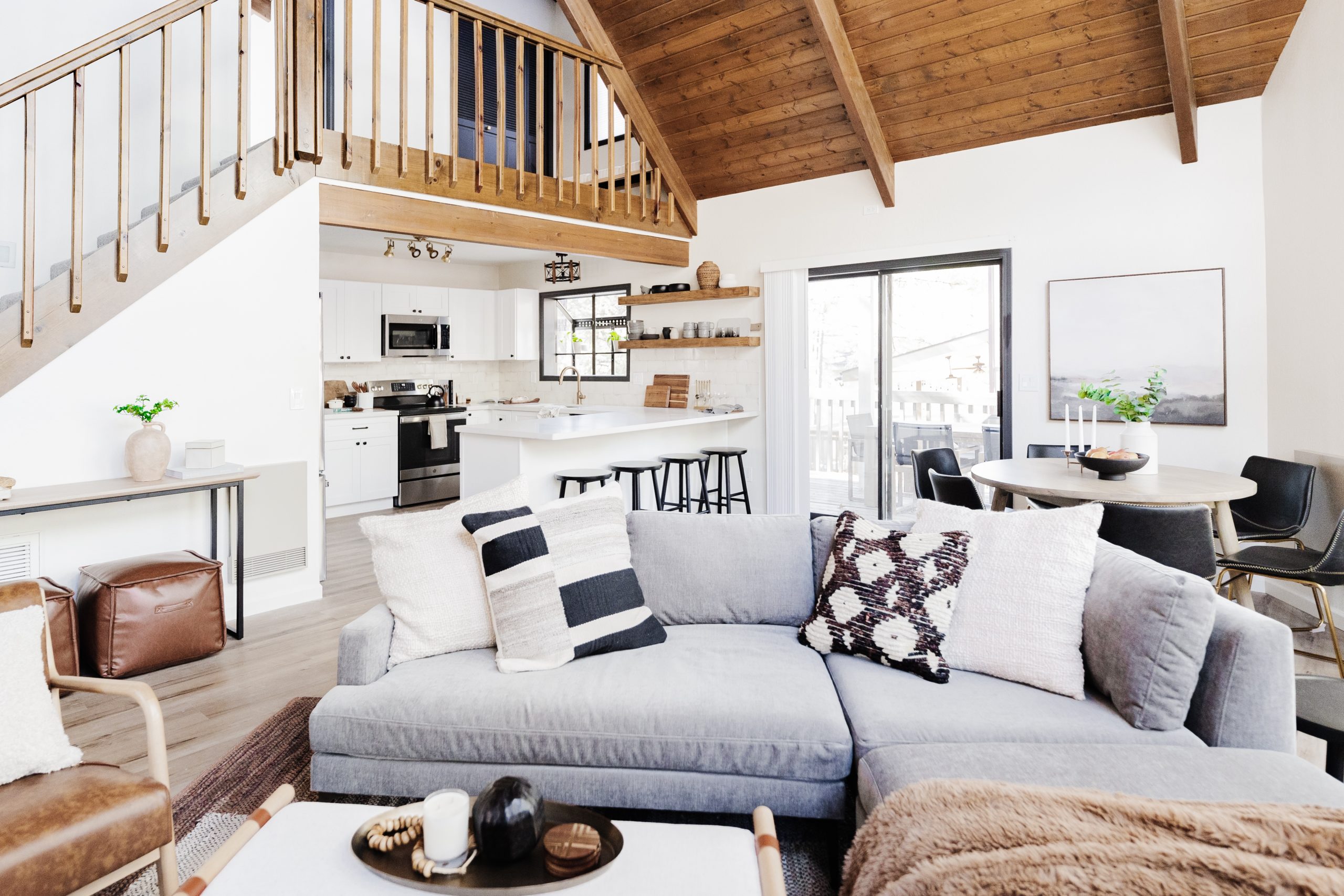
Brittany Krupnik is a real estate investor, designer and home stager. She creates spaces where life can be enjoyed - whether that is reimagining a space and bringing it back to life through flipping, helping someone envision themselves and the life they can have in a new home through staging or designing a vacation rental that serves as the backdrop for families and friends to create memories.

Brittany has staged over 500 homes and designed over 250 homes. When she is not designing, you can find her reading, traveling or trying out a new restaurant. She lives in Tempe, Arizona with her husband and 3 kids. 

I'm Brittany — real estate investor, designer & home stager.

Meet  the designer

Learn best practices for choosing a neutral paint color!

Neutral  Paint  Guide

ALMOST THERE!

tell me!

Learn best practices for choosing a neutral paint color!

Wondering what color is right for your room? Get our neutral paint color guide!

free resource

best of home makeovers