Latest Post
There is nothing like a neutral kitchen…
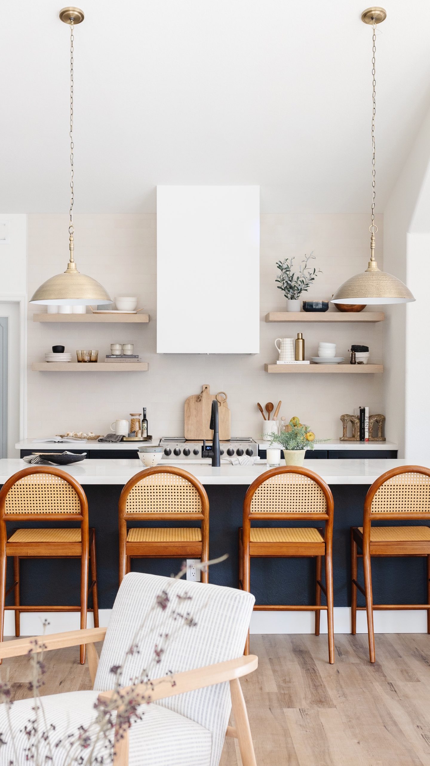
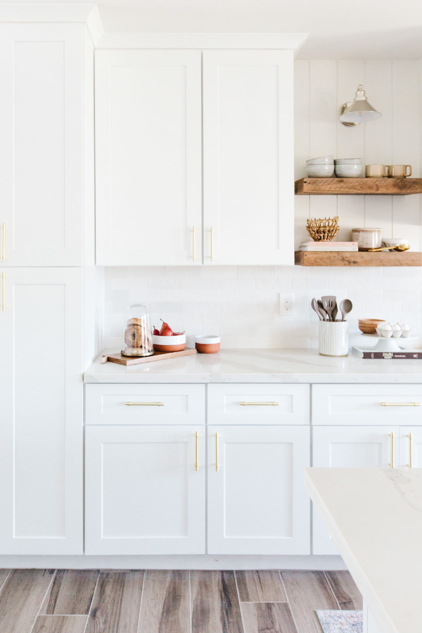
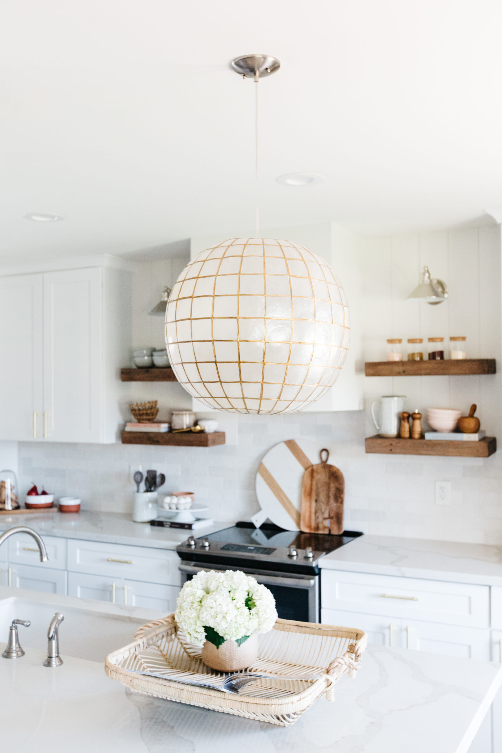
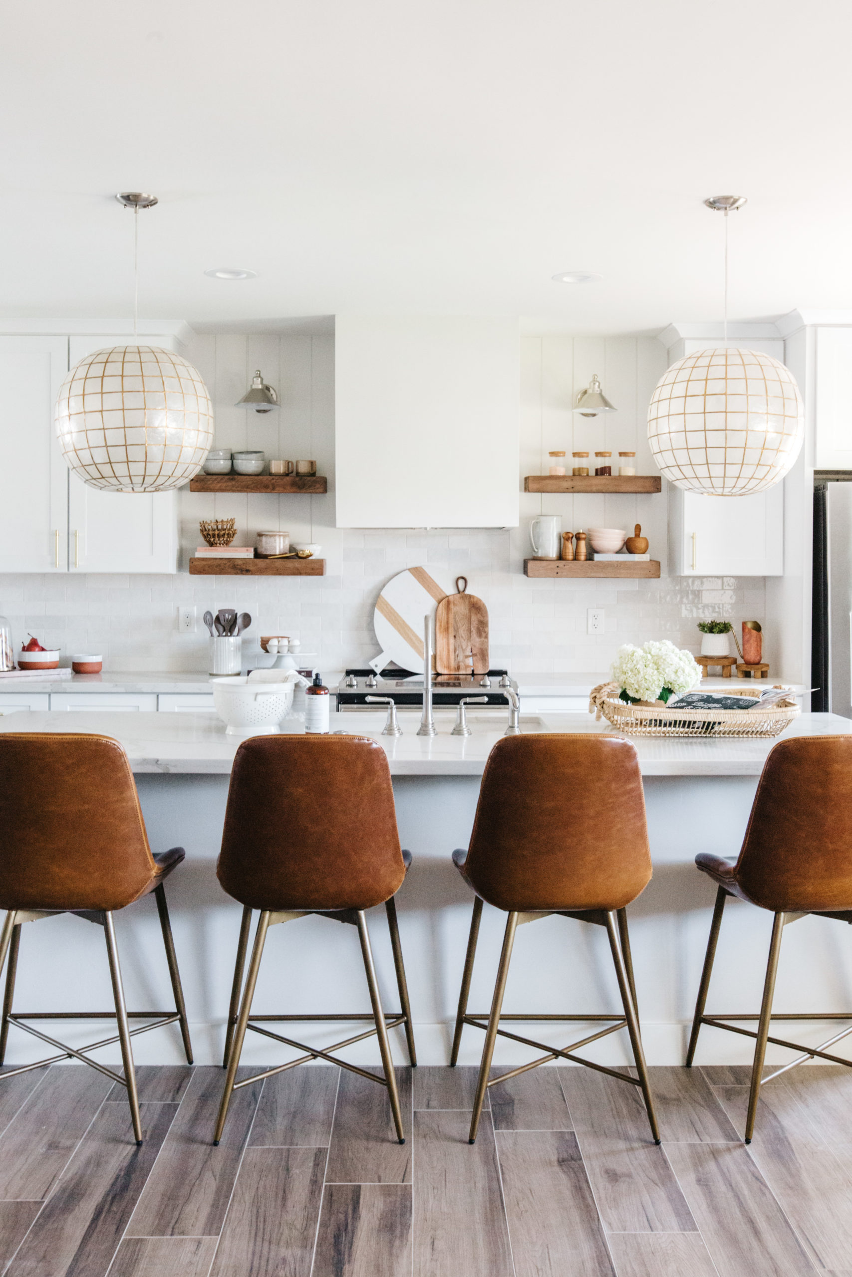
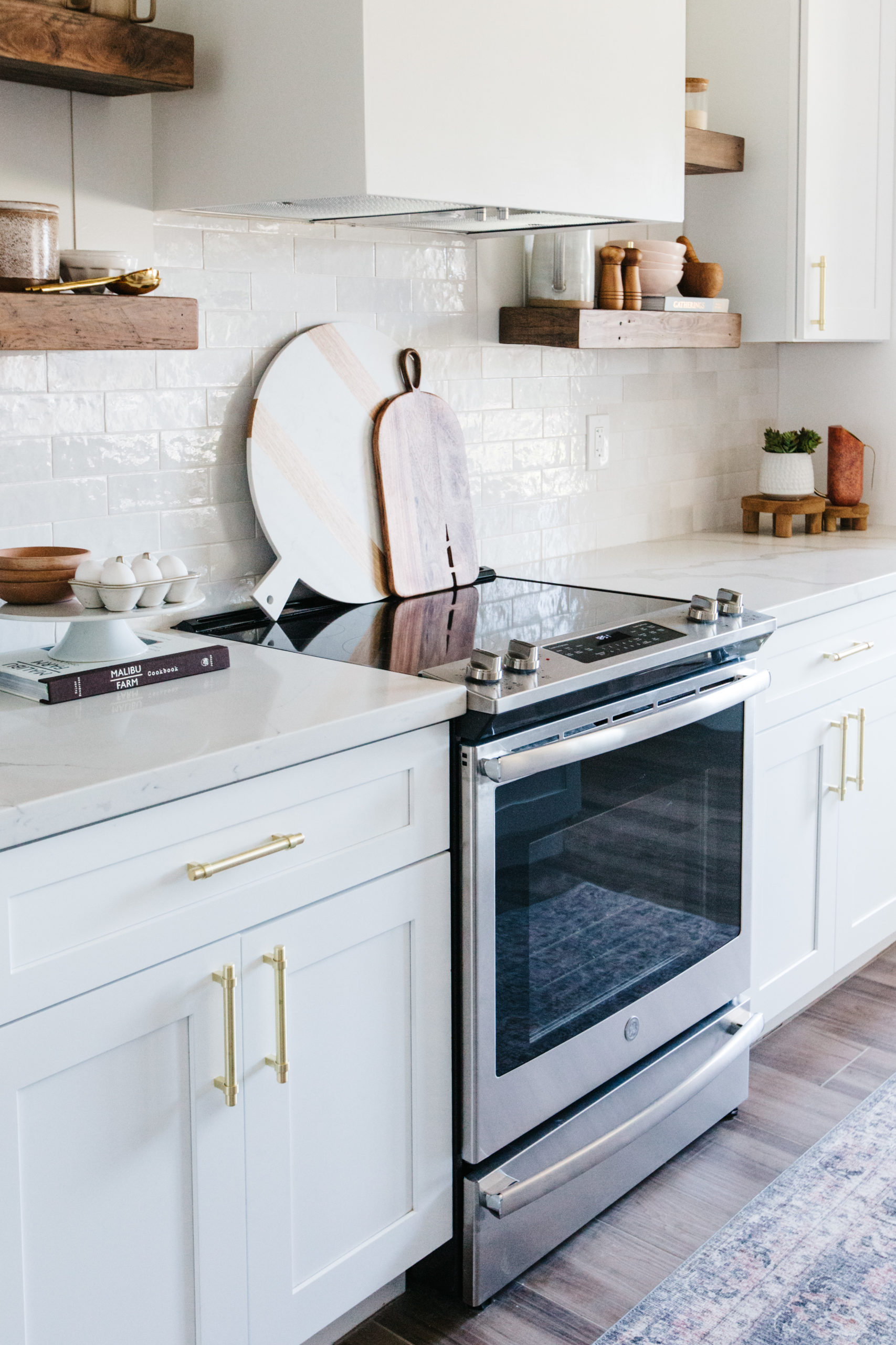
Last year, I designed our Edgemont vacation rental and I had a strong vision of what I wanted the color palette to be: white, rust, terracotta, blush and taupe. I wanted it to feel warm and a little bit boho. If you head to the project reveal, you will find bold floors in the main bathroom and a lot of color in the furnishings throughout. However, if you look really close you will notice that the kitchen design is totally neutral. I wanted a beautiful warm and white kitchen that I could add the color palette to. And that is why this kitchen was the perfect one to restyle to show you how only changing out barstools and accessories can change the look and feel of your kitchen. We restyled the kitchen in neutrals – think black, white and taupe. And we also restyled it in an earthy color palette of cream, gray, brown, greens and blues. Honestly, I love all three versions. But let me show you each one and you can decide for yourself which one you love the most.
The Original One
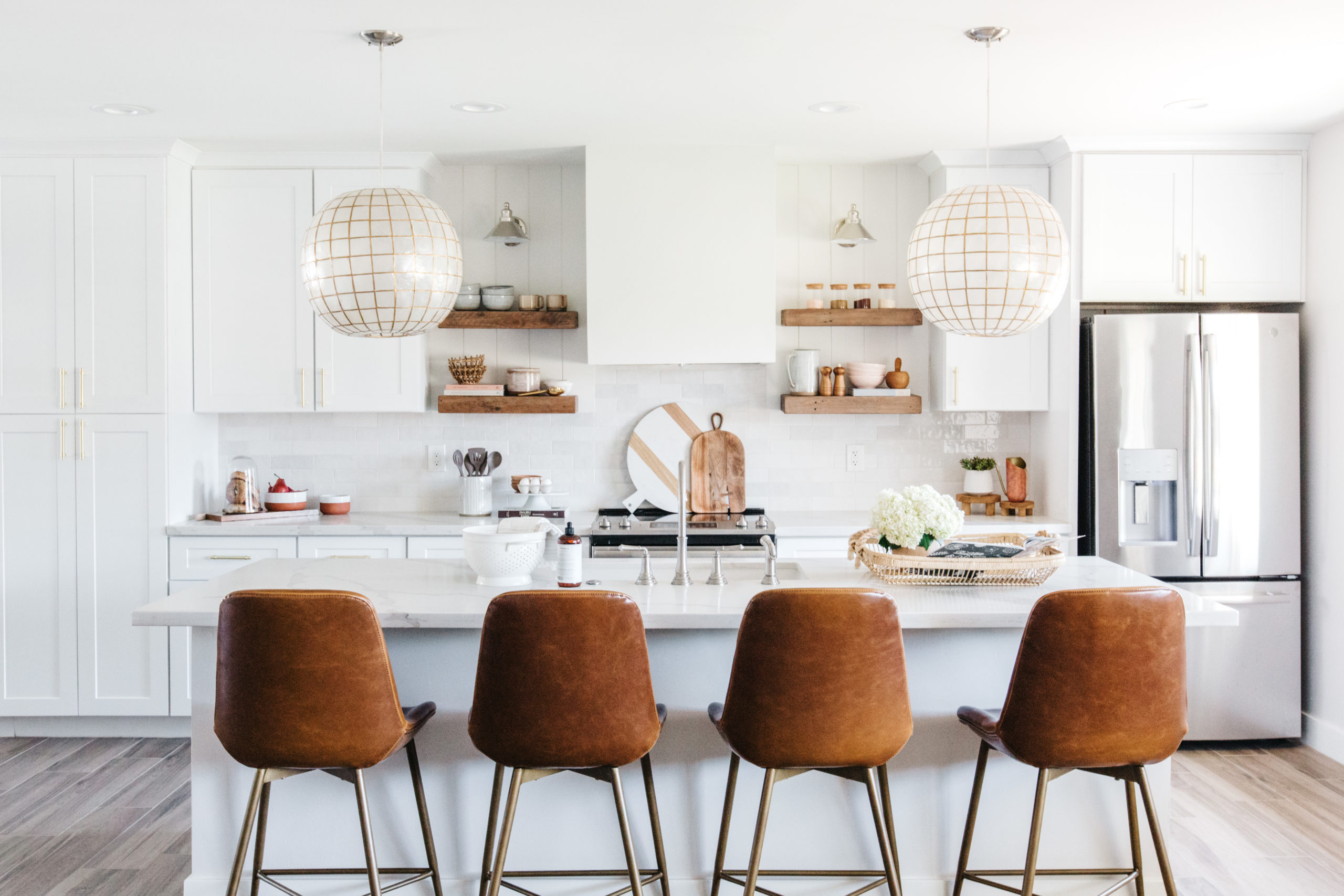
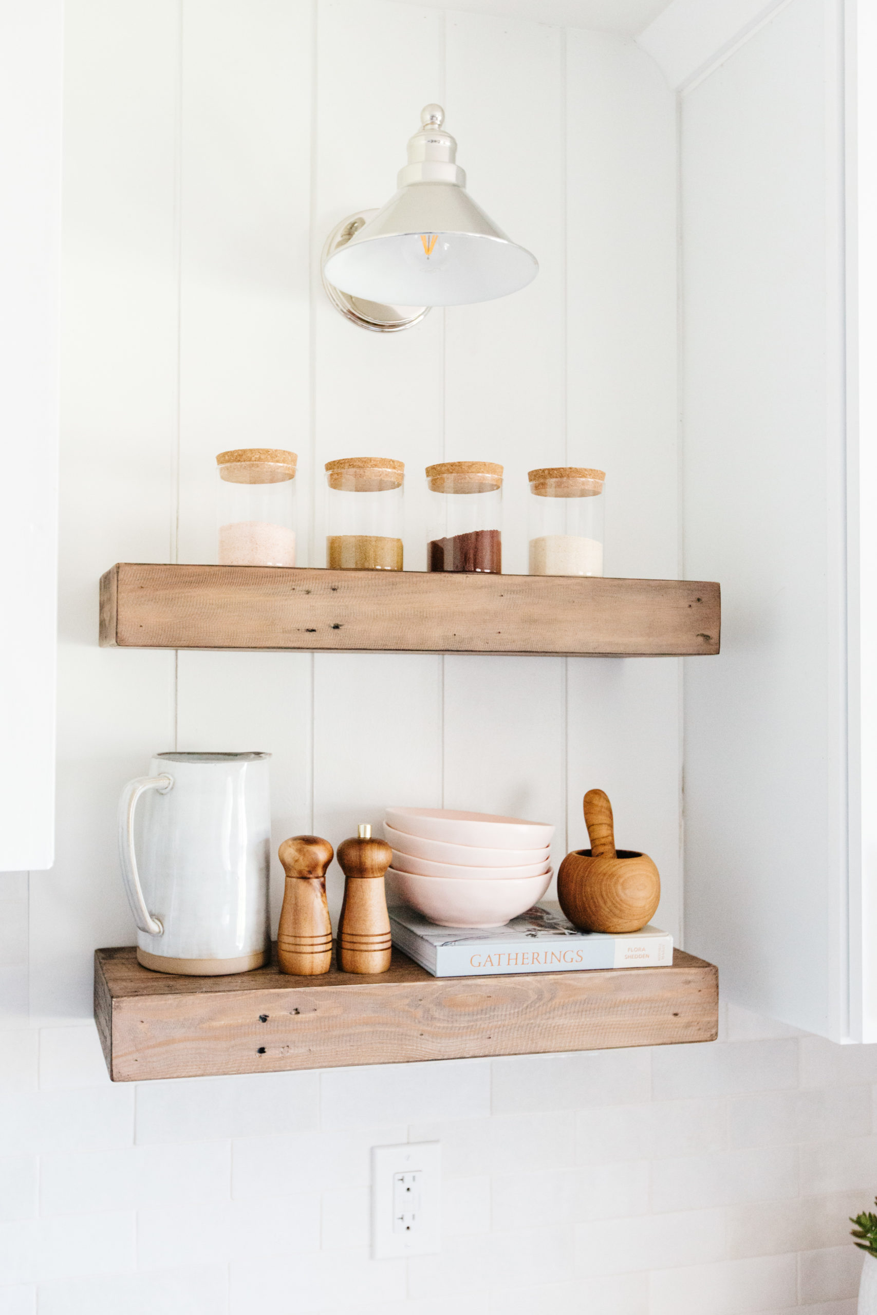
The main pop of color in this version of the kitchen are the cognac barstools. They are the prettiest color and yes, I’m biased because I also have these barstools in my own home. In order to infuse the color palette of rust, blush and terracotta we used accessories in those colors on the countertops and on the open shelves. It’s subtle, but still there.

shop this kitchen
 JavaScript is currently disabled in this browser. Reactivate it to view this content.
The Neutral One
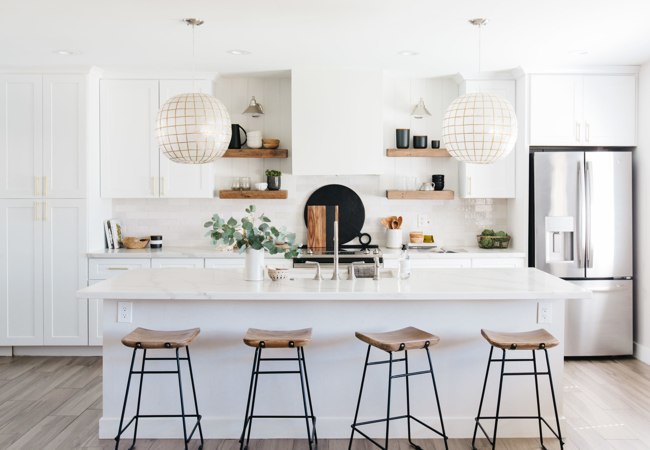
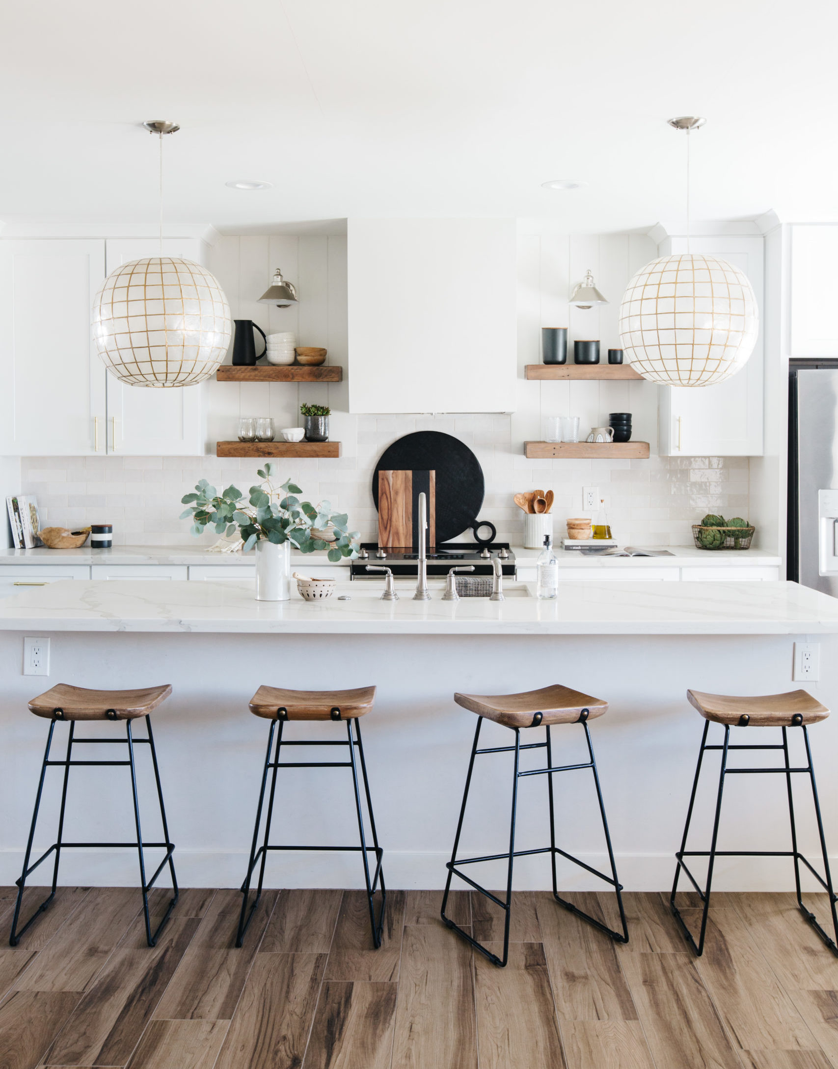
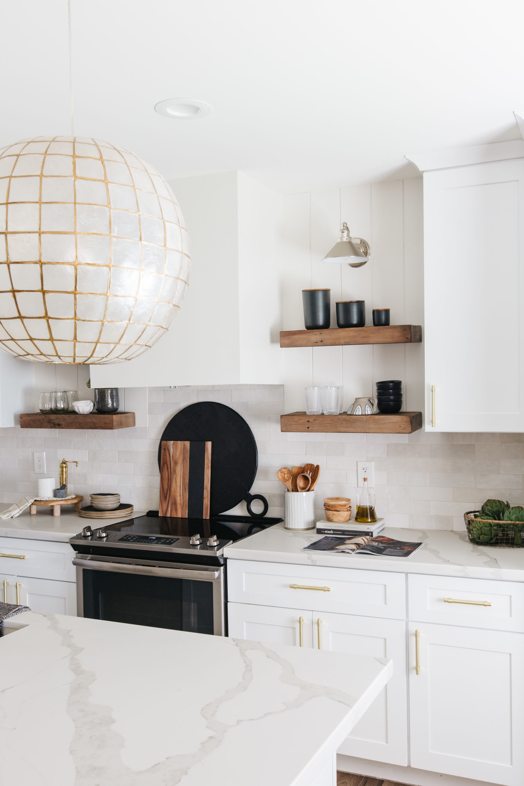
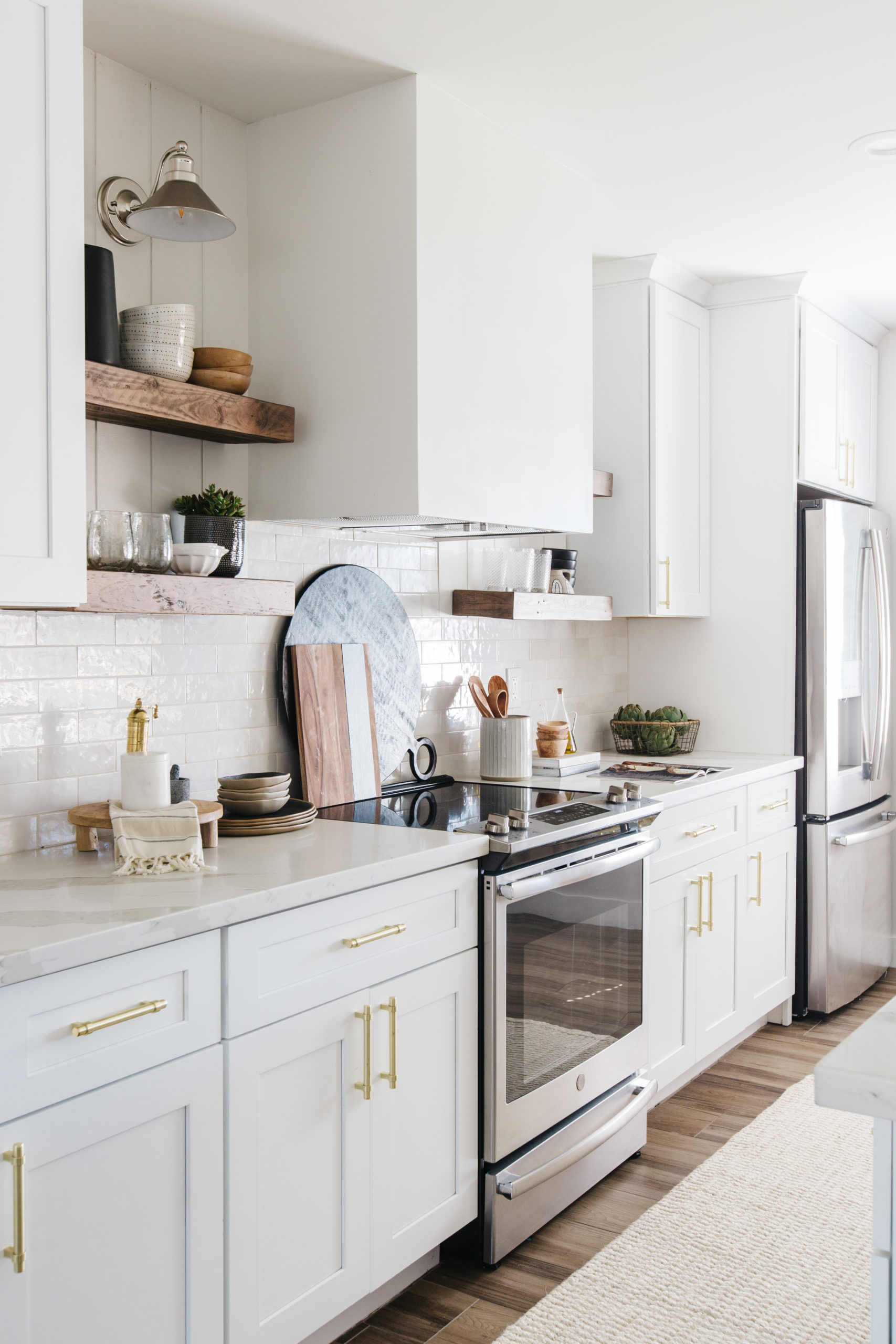
In my heart of hearts, this one is probably my favorite version of this kitchen and that is because I am really in love with the combination of white, black, wood and greenery. It feels like a combination I will never get tired of.
Right away, this kitchen feels different without the leather barstools. In this version, we used these wood and black saddle barstools that I originally bought for our cabin, but since that project is taking way longer than expected I decided to put them to use in this space. They add warmth to the space and I love the detail on the back.
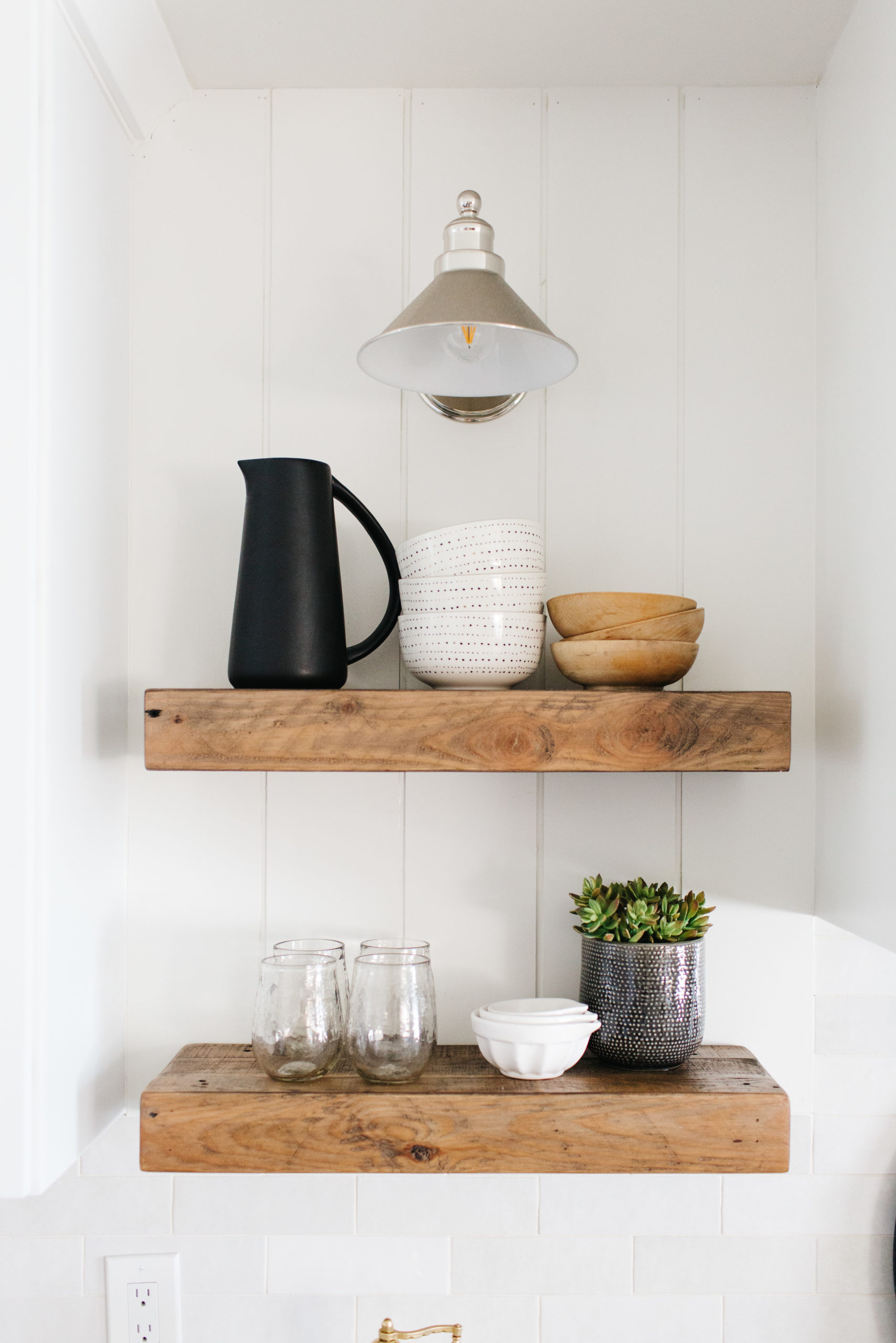
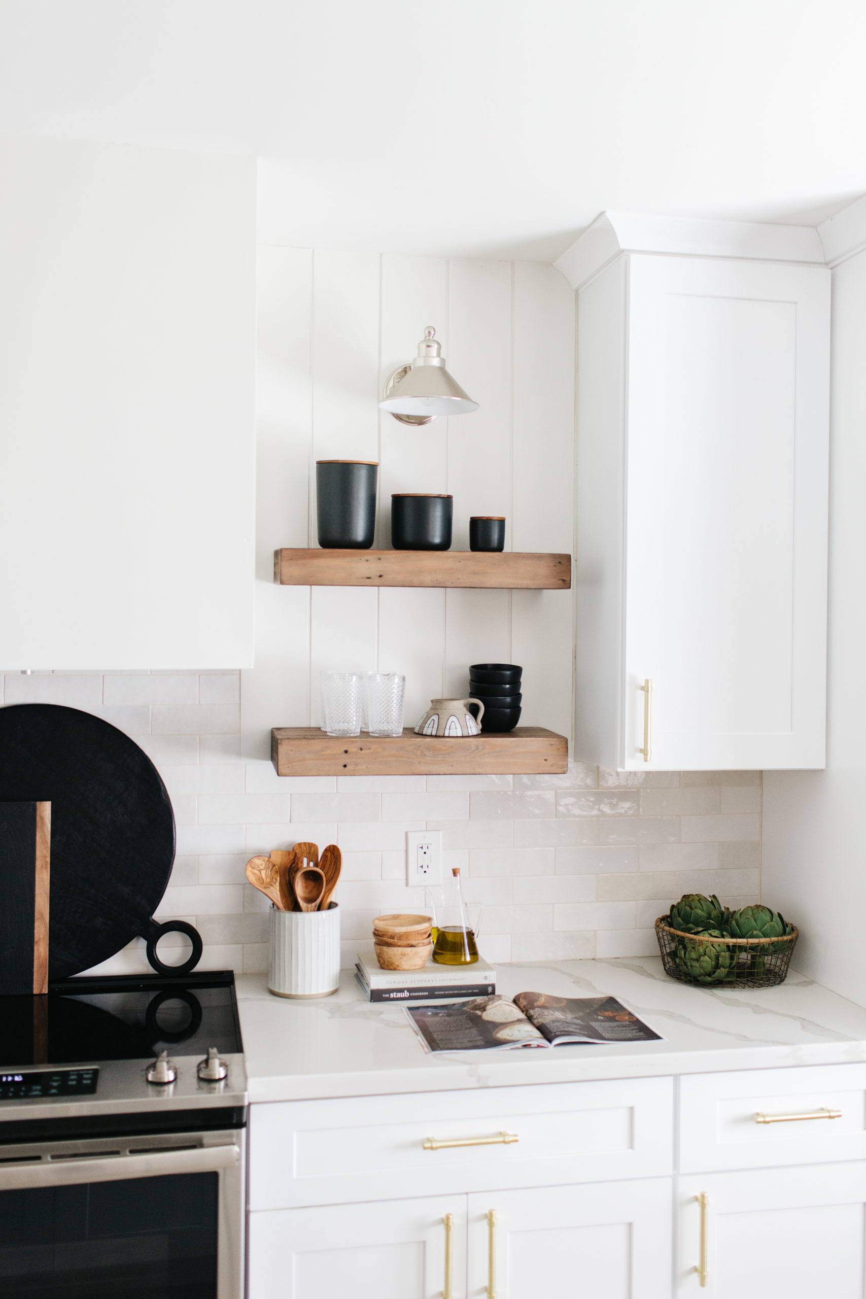
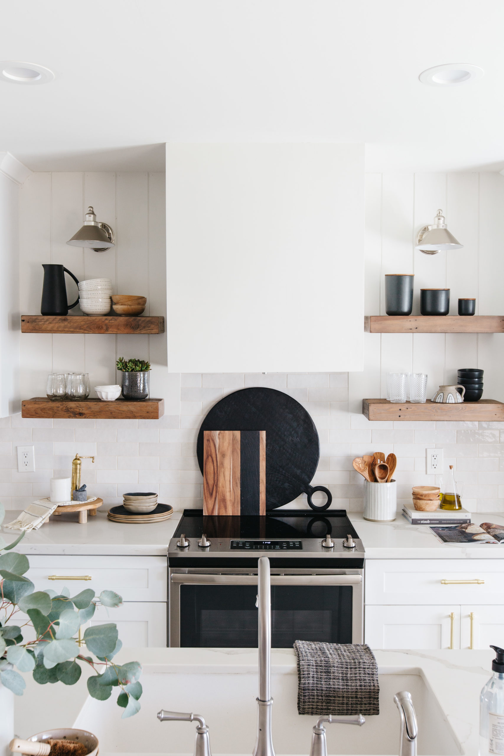
The other changes we made were just to the accessories and we stuck with wood, white and black and some pops of green with the eucalyptus and the bowl of artichokes. I always say that I style open shelves with both pretty and functional items. I love using glassware, pitchers, bowls and canisters because then you can both form and function!
shop this kitchen
 JavaScript is currently disabled in this browser. Reactivate it to view this content.

The Earthy One
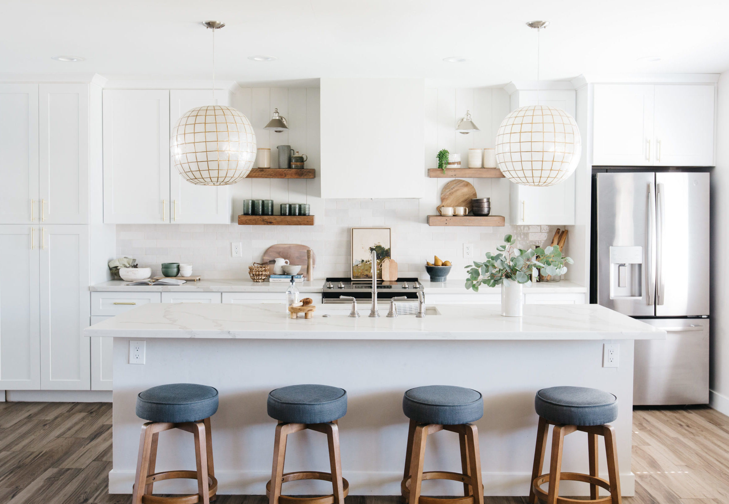
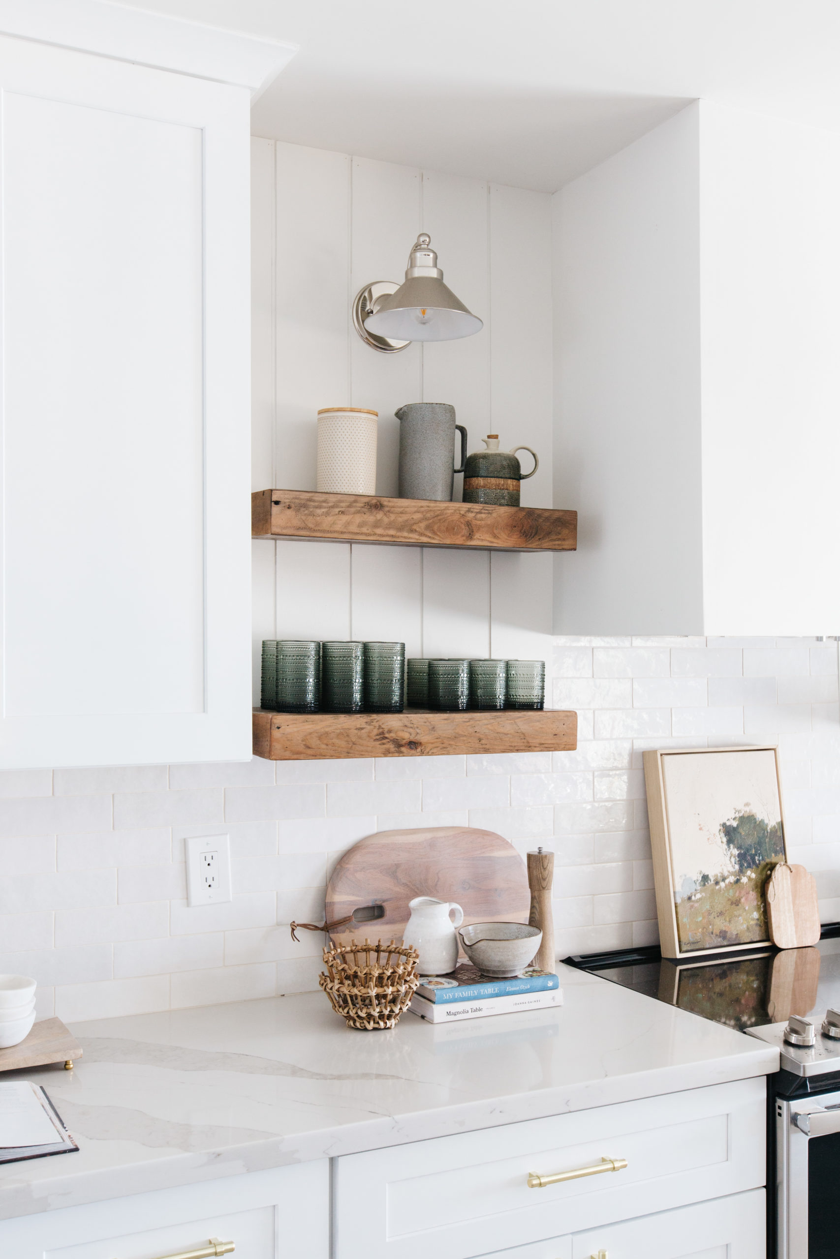
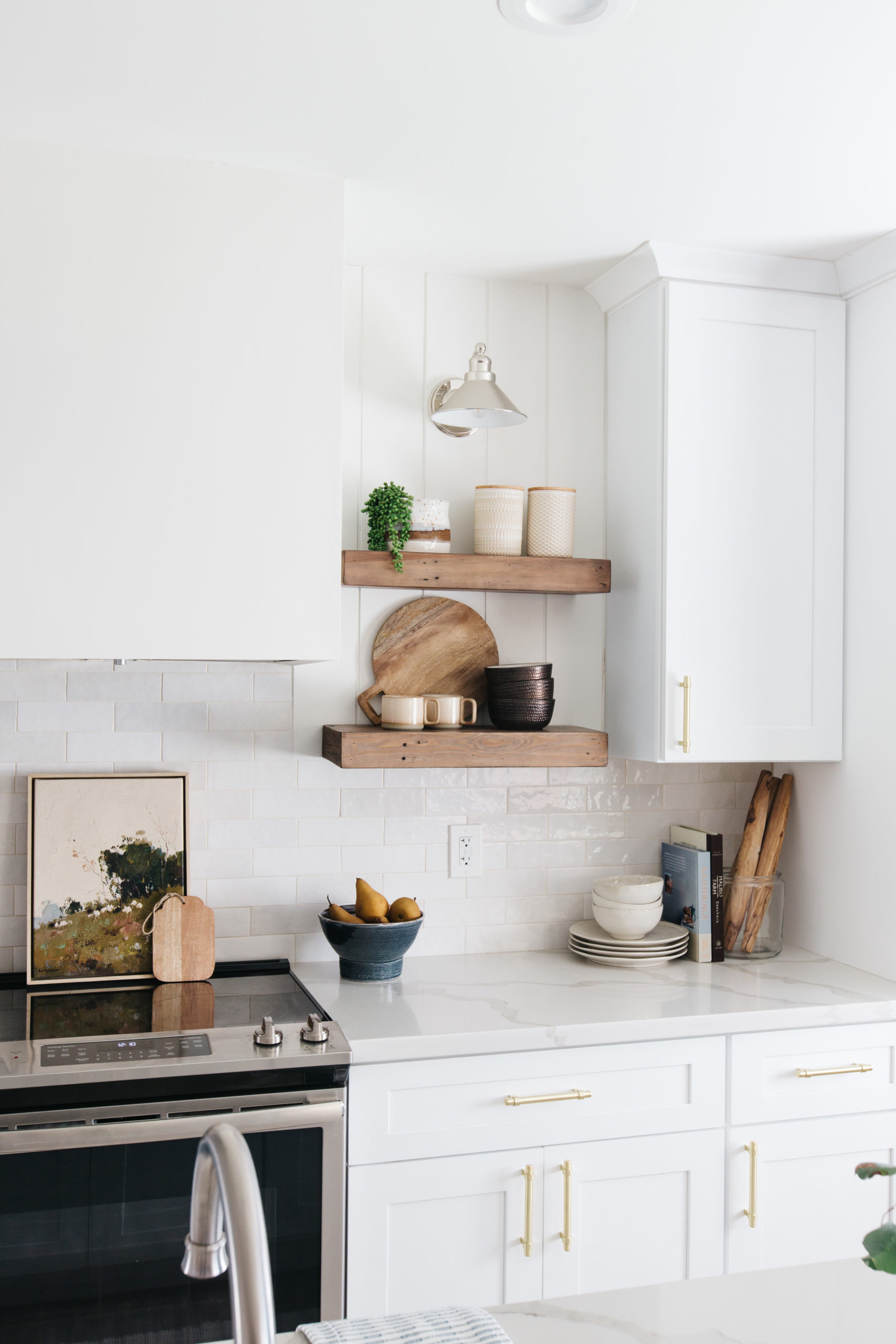
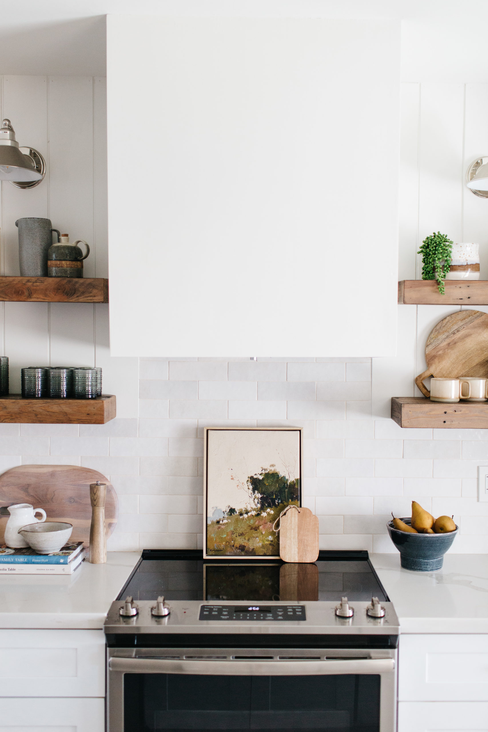
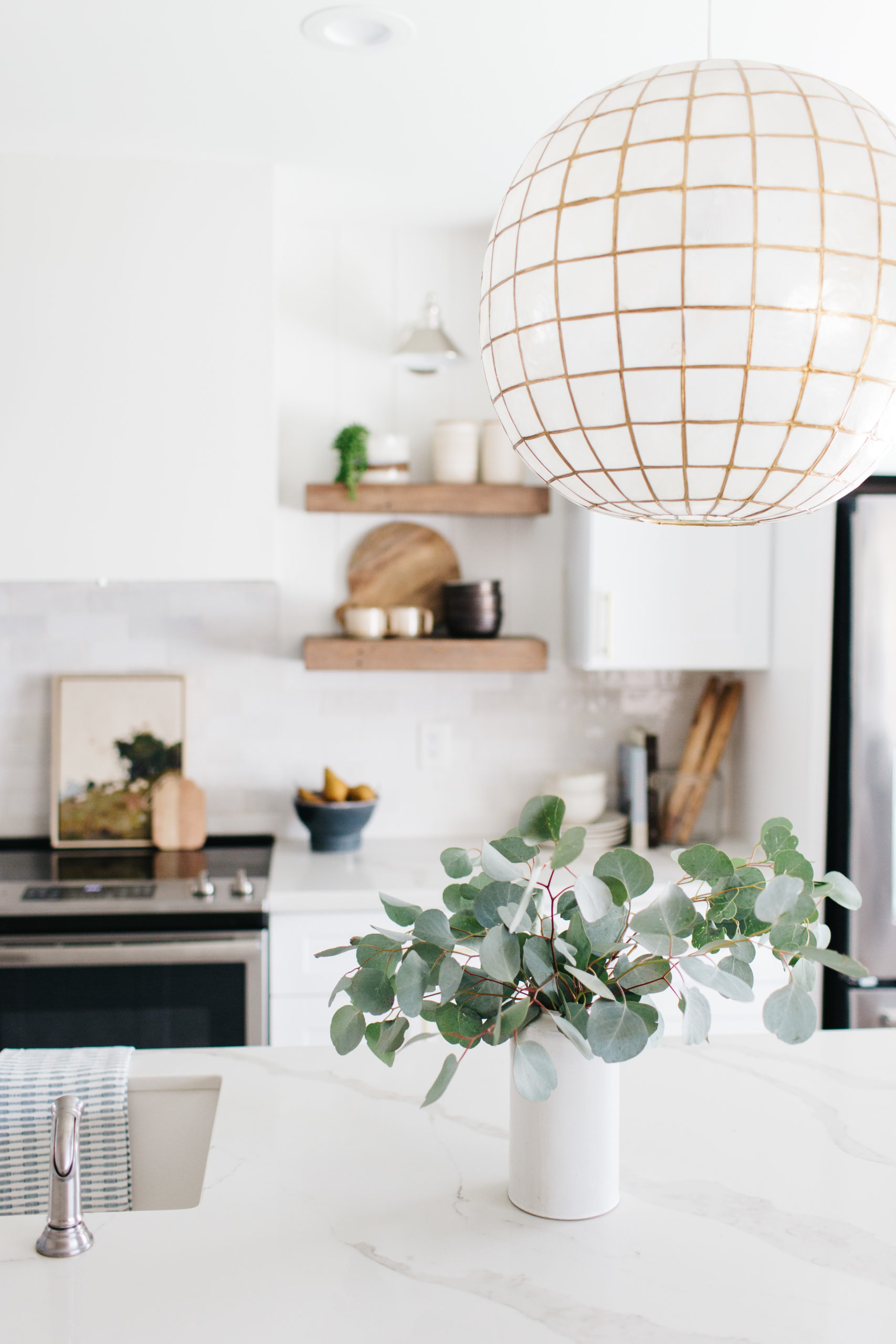
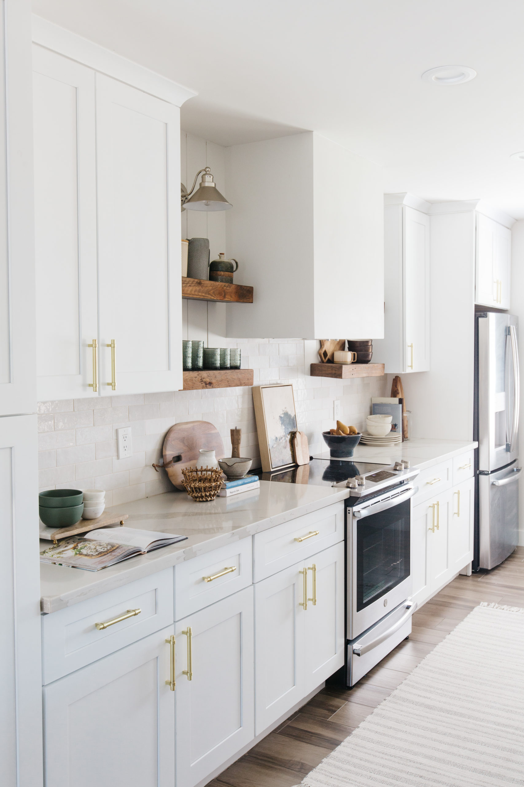
Okay…maybe this one is my favorite? I don’t know! I love them all. This color palette was inspired by the art piece leaning behind the range. We know that art behind the range isn’t the most practical thing in the world because you know…cooking. But it’s so pretty and we love it layered with the cute little bread board.
We used the art as our color palette inspiration and pulled colors like green, slate, cream and brown from it. But the colors are so muted and warm, so it gives it an earthy feel.
The open shelves are filled so much texture from the glassware to the canister. We mixed a lot of different wood tones in the kitchen, but they all blend well together since they are similar in tone. I love the warmth it adds!
shop the kitchen
 JavaScript is currently disabled in this browser. Reactivate it to view this content.
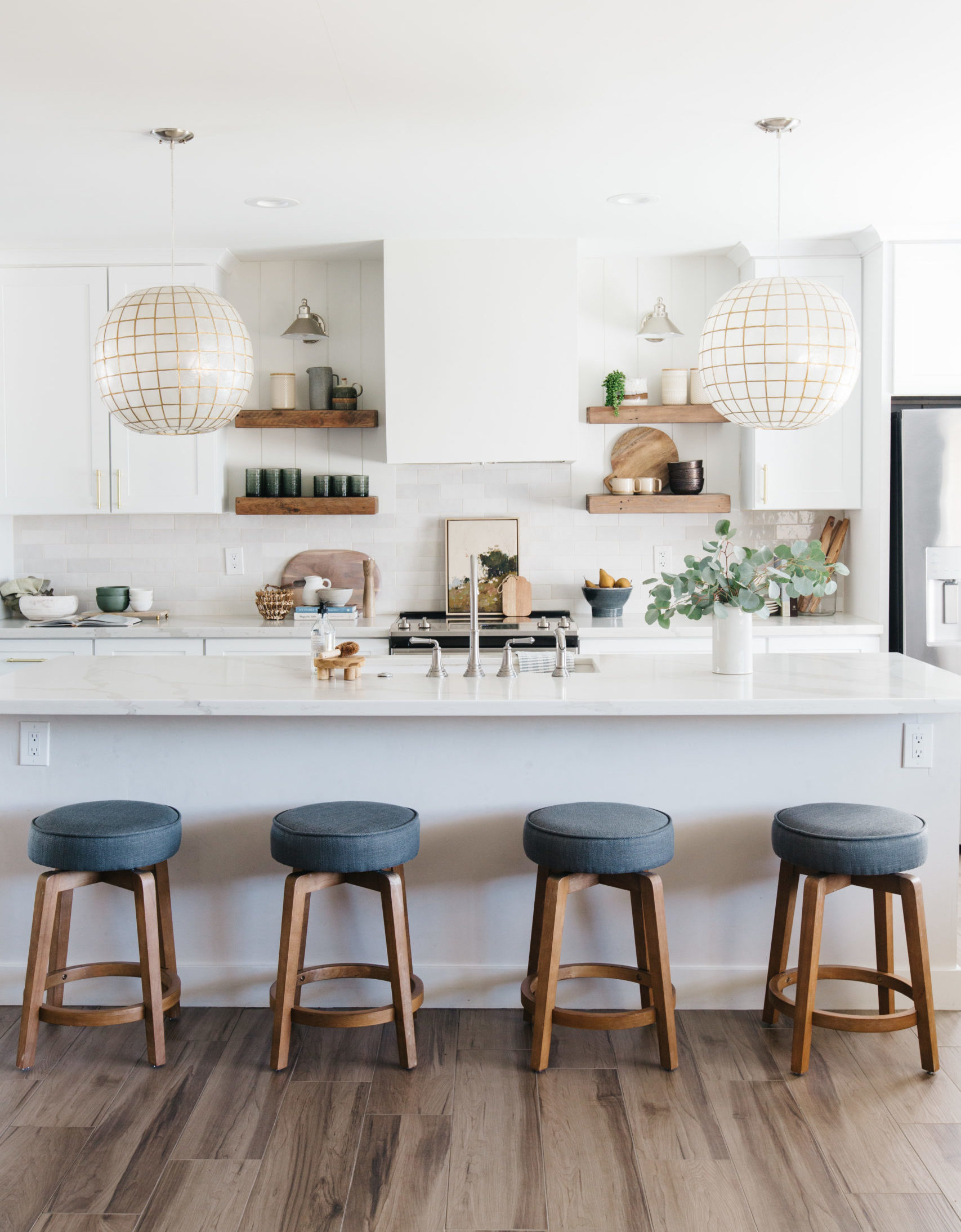
We have shown you how you can change the look of a neutral kitchen with just changing out the barstools and accessories. That is the beauty of a neutral kitchen. So, who else is ready for a little kitchen refresh??
So, which kitchen would you choose?


read post
Brittany Krupnik is a real estate investor, designer and home stager. She creates spaces where life can be enjoyed - whether that is reimagining a space and bringing it back to life through flipping, helping someone envision themselves and the life they can have in a new home through staging or designing a vacation rental that serves as the backdrop for families and friends to create memories.
Brittany has staged over 500 homes and designed over 250 homes. When she is not designing, you can find her reading, traveling or trying out a new restaurant. She lives in Tempe, Arizona with her husband and 3 kids.
I'm Brittany — real estate investor, designer & home stager.
Meet the designer
Learn best practices for choosing a neutral paint color!
Neutral Paint Guide
ALMOST THERE!
tell me!
Learn best practices for choosing a neutral paint color!
Wondering what color is right for your room? Get our neutral paint color guide!
Browse the entire shop of favorites!
CURRENTLY LOVING
products we are
SHOP BLISSFUL
