Project Reveal: My Home | Kitchen, Family Room, Dining Room, Entry & Laundry Room
April 14, 2020
search the blog
blissful design studio
April 14, 2020
search the blog
I'm brittany Krupnik!
I'm a real estate investor, designer and home stager. I have staged over 500 homes and designed over 250 homes. When I'm not designing, you can find me reading, traveling or trying out a new restaurant. I'm based in Tempe, Arizona where I live with my husband and 3 kiddos!
Project Reveal: See my home!
shop blissful
Home Decor
Our Favorite Cookbooks
Girl's Bedroom Makeover
How to Host the Perfect Gathering
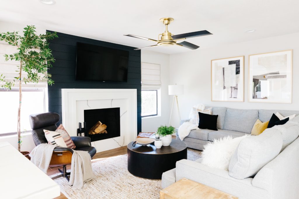
I can’t believe I haven’t shared this project reveal with you on the blog. It’s one of my favorites because…well, it’s my house! We have lived here for not quite 2 years and although my home has been featured on Rue and The Haven List, I have not yet shared this home with you. Today’s post covers the kitchen, family room, dining room, entry way and laundry room.
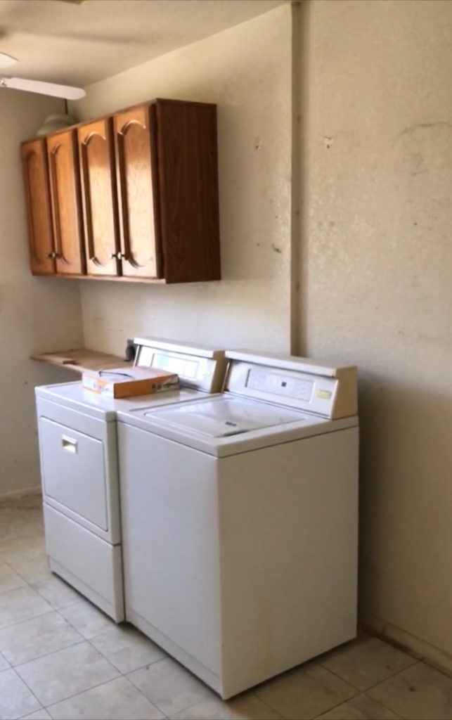
When we found this house, we had no plans to move. Like at all. We had moved into a new home about a year before and we loved that home. Maybe I should share that project sometime as well? It’s a good one too! But like I said, we did not plan on moving in the near future, if ever. But when this house found its way onto our radar, we just fell in love. Mainly with the backyard, but that is not what I am sharing with you today because it’s still not done. That is a rant for another time though! 🙂 We really liked the neighborhood and the lot and the home had a cozy and intimate feeling that we were missing in our home at the time. We had flipped homes in the neighborhood before, 2 with this floor plan already, and we knew the potential that it had. It was in rough shape, with a lot of walls and mirrored walls that needed to go, but we knew that we could make it something special. And we did… I’m taking you space by space so that you can see how we were able to transform this 80s tract home into something with character that fit our family’s needs perfectly.
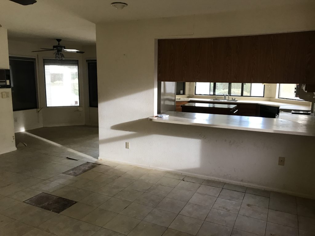
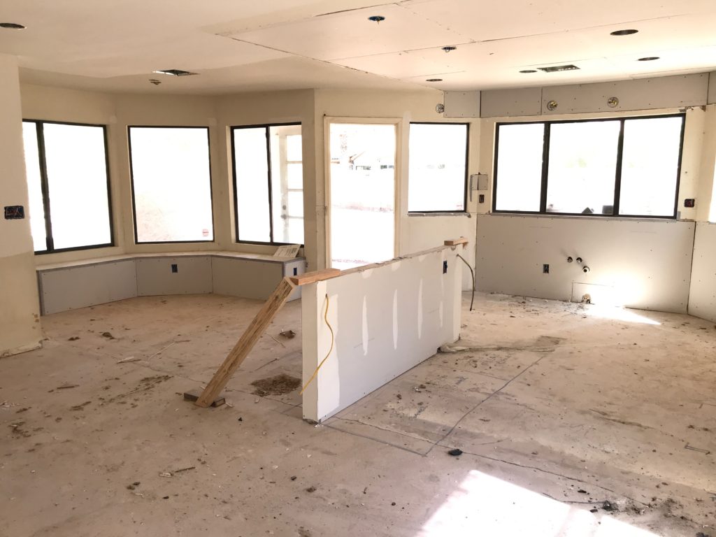
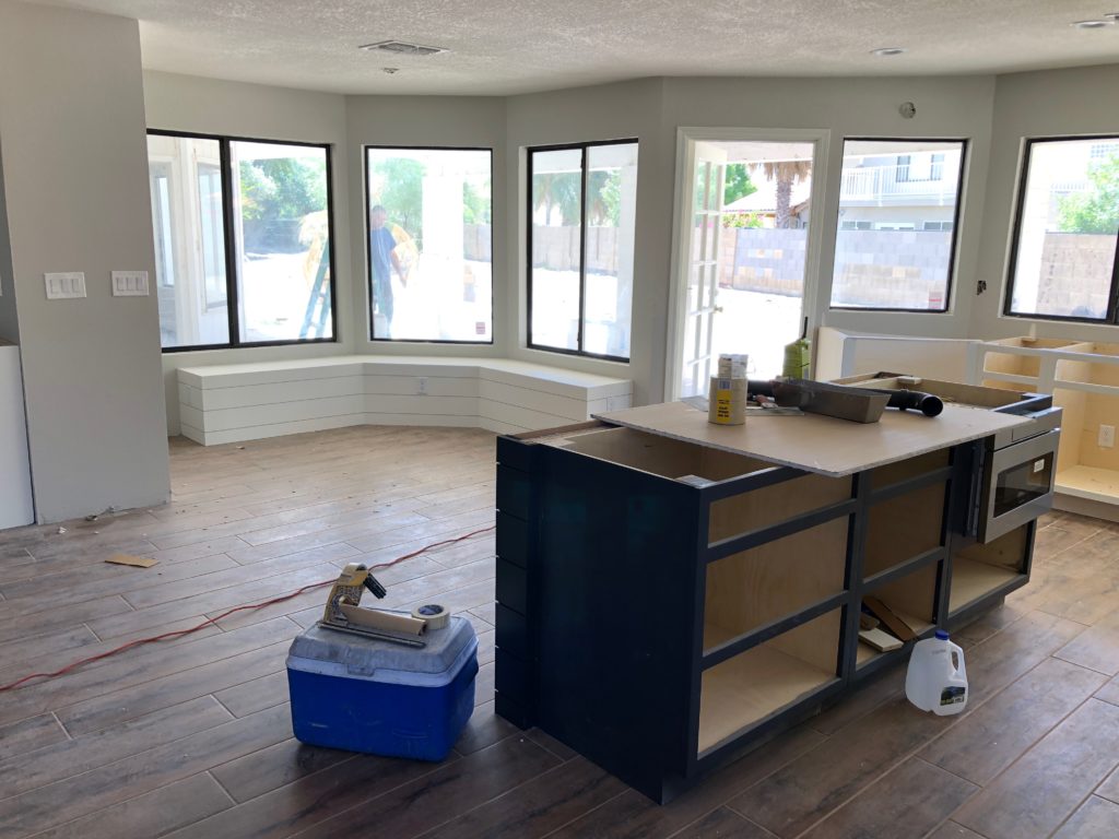
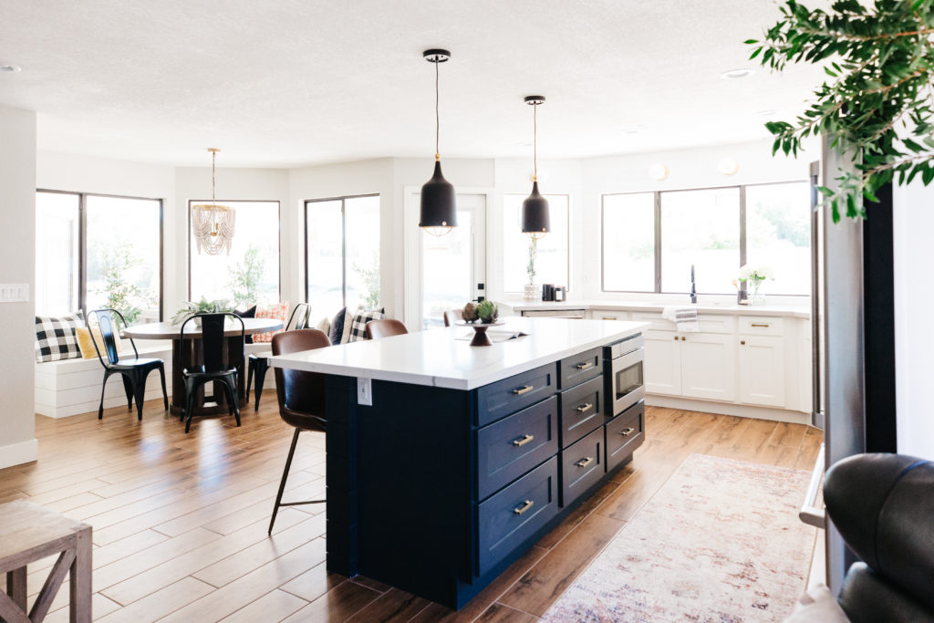
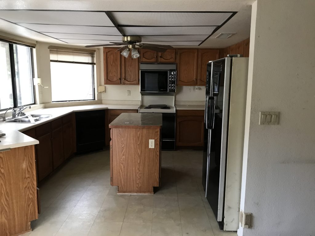
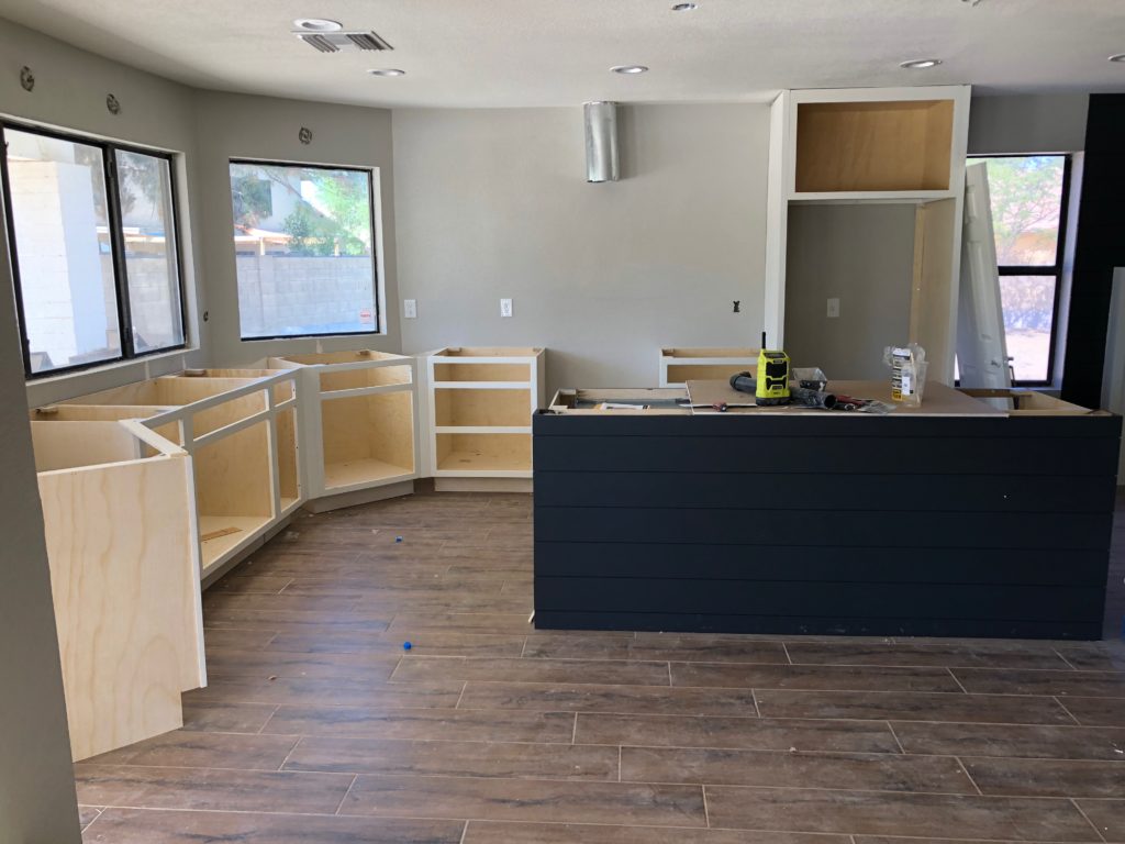
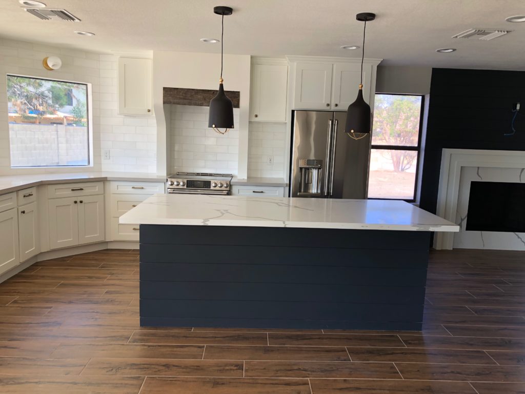
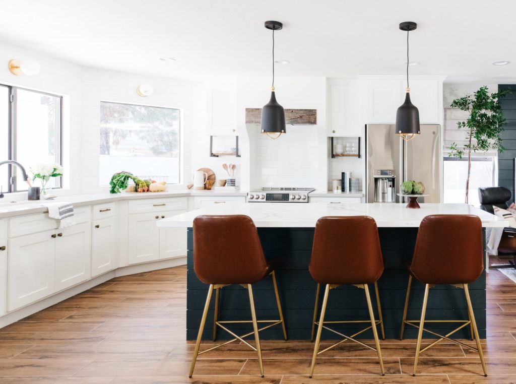
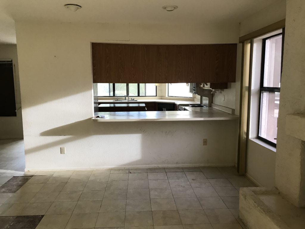
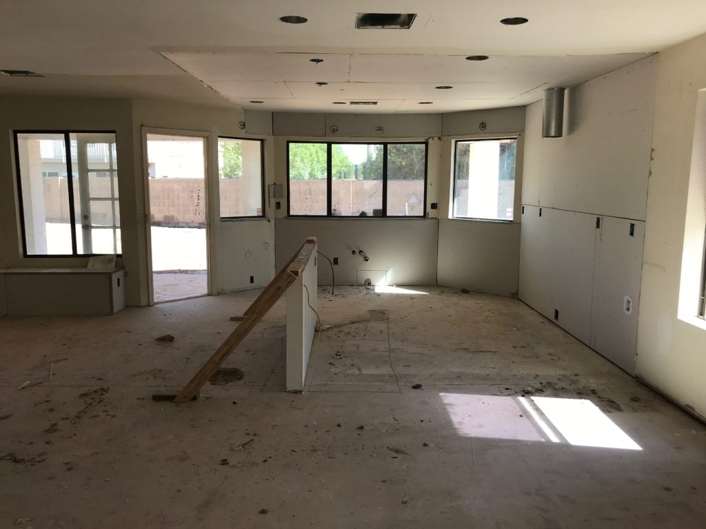
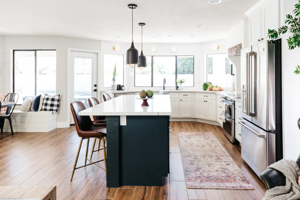
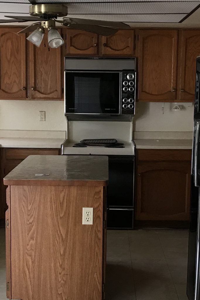
As you can see from the before photos, there was a wall separating the kitchen from the family room. The kitchen was dark and cramped and the island was small. The ceilings were even lower due to the fluorescent lights and there was a ceiling fan…yep, a ceiling fan in the kitchen. Big changes happened in here and I couldn’t be happier with how it turned out!
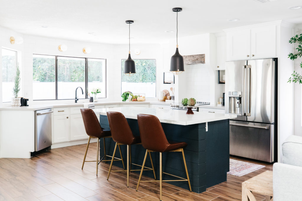
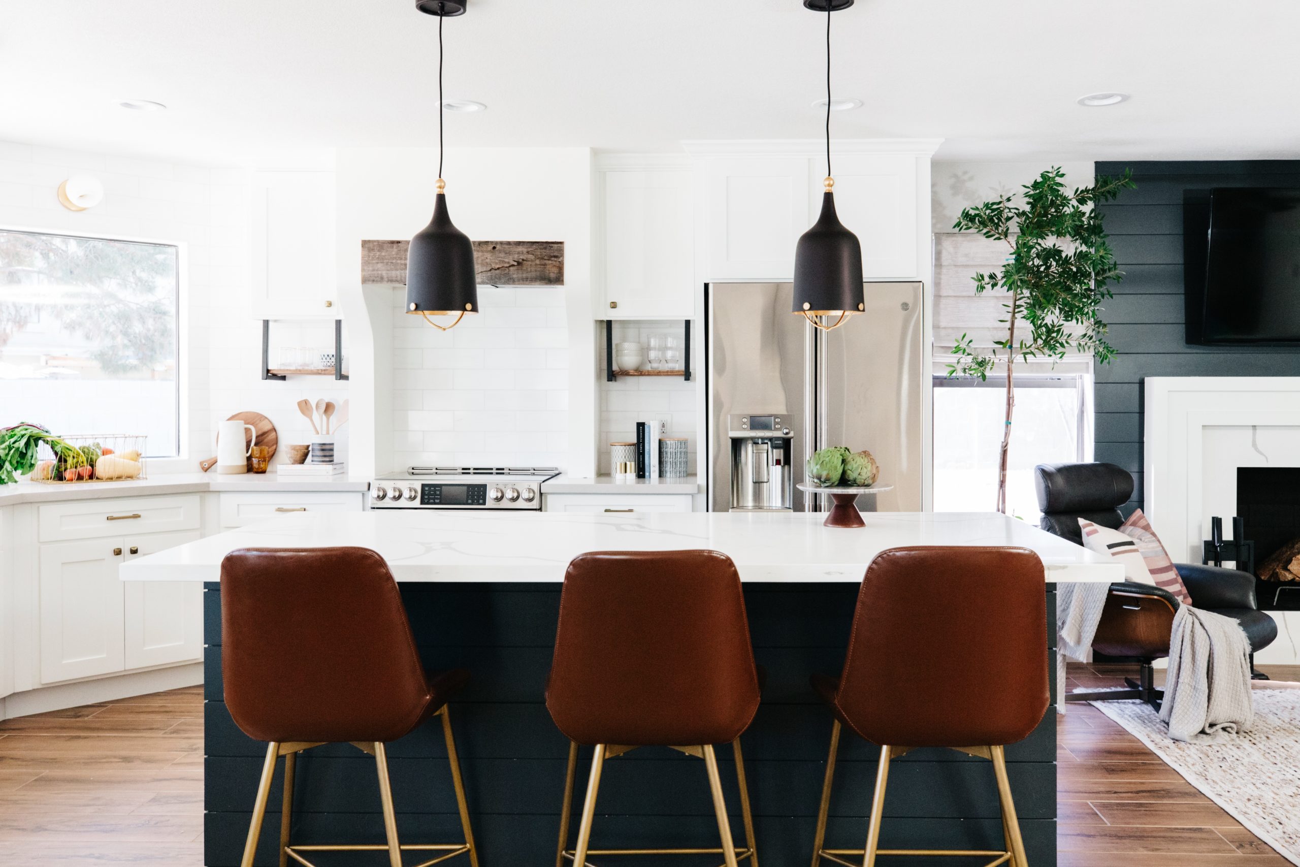
When I started designing our new home, I started with the kitchen. It sets the tone for the whole home in terms of style and overall feeling. I knew that I wanted what I was calling “Modern Old World” style, which in my mind was earthy tones, some European influence and a comfortable elegance. I wanted my home to feel welcoming and cozy to everyone who came over. I knew that I wanted an overall neutral color scheme, but I wanted something other than just black, white and gray. We added dark blue and taupe into the color scheme as well and I really love the result. Plus, having the leather barstool add a really warm element to the space and they are wipeable as well, so double win!
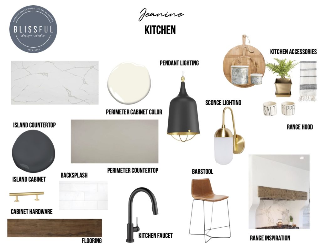
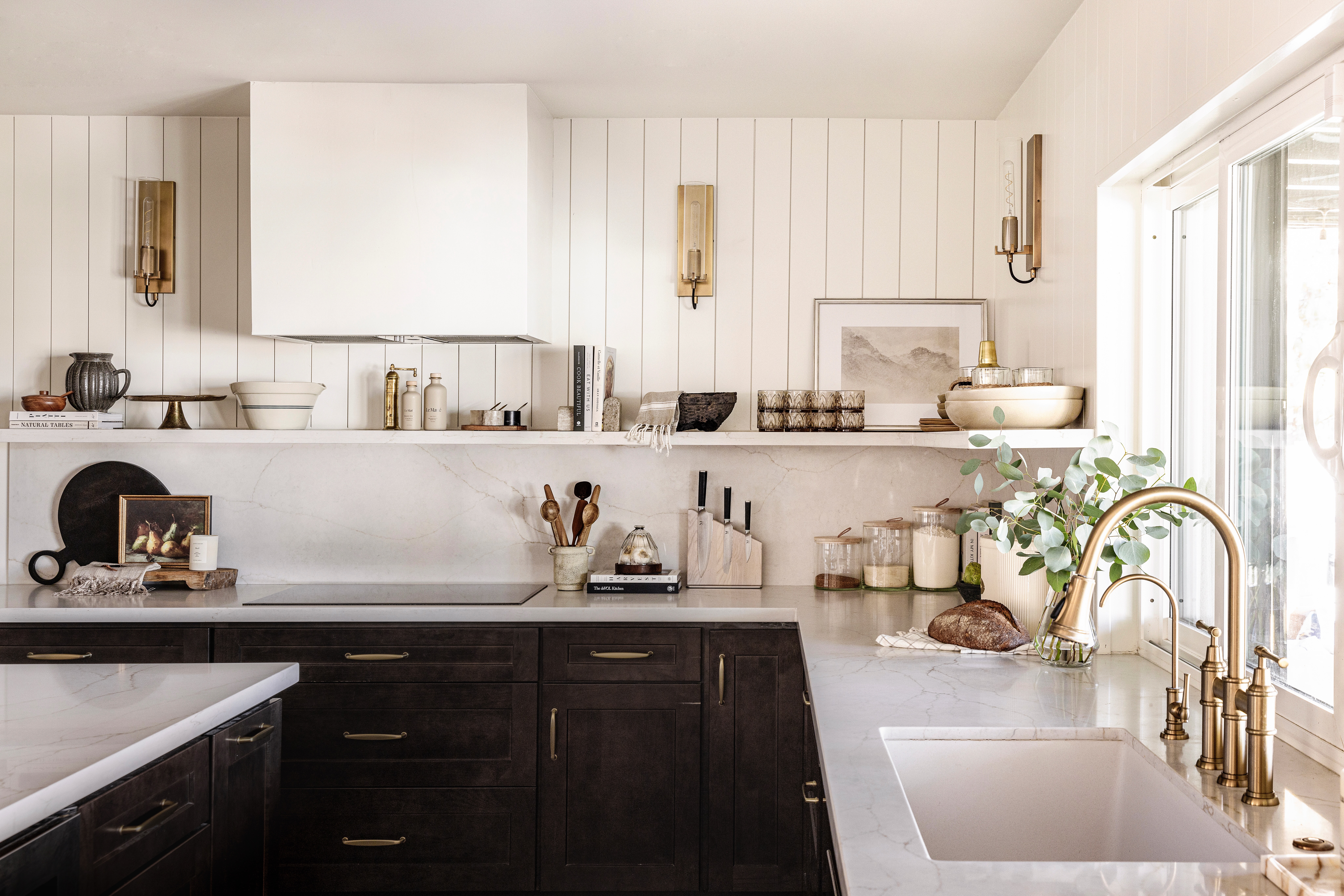
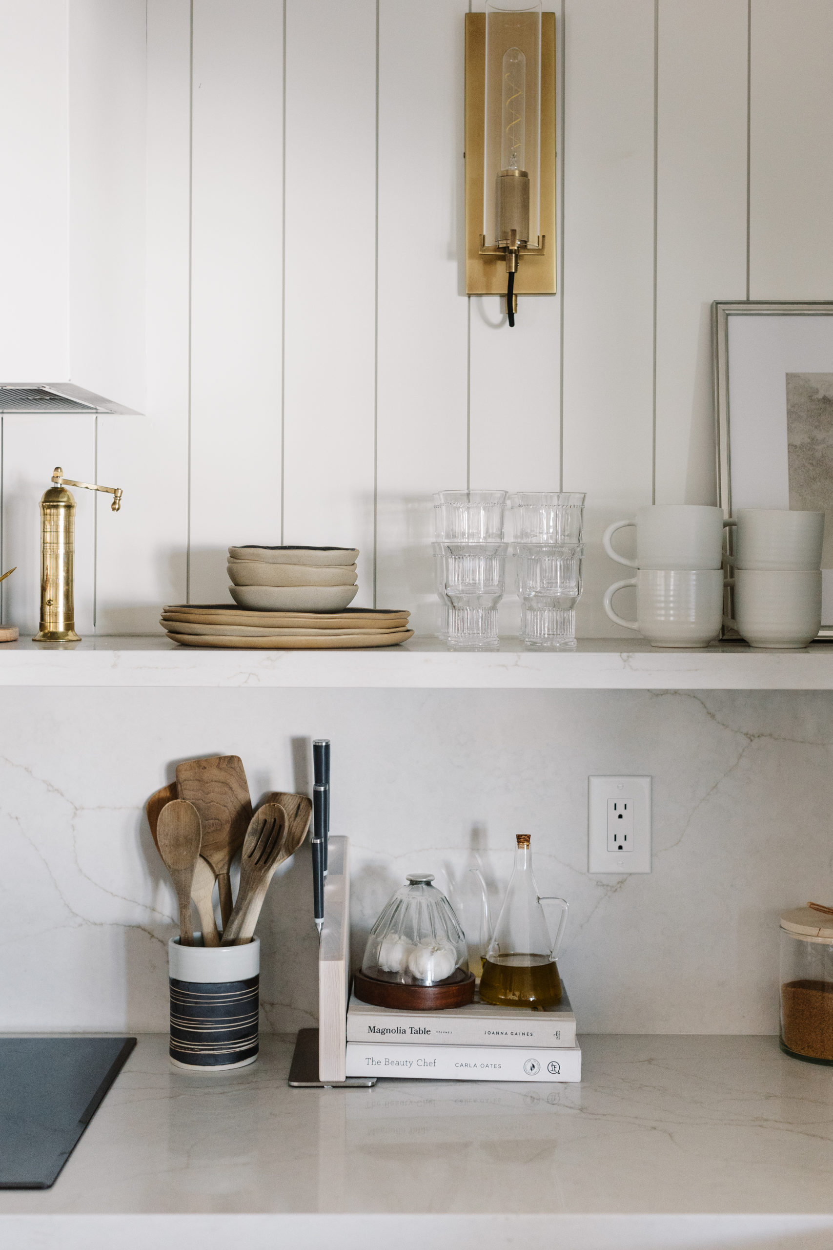
Our cabinets were custom built to fit the space. The perimeter cabinets are painted Simply White by Benjamin Moore and our island was painted French Beret by Benjamin Moore. In my heart of hearts, I wanted to do only open shelves on either side of the range, but then we wouldn’t have any upper cabinet storage and space was already limited. I saw this shelf under the cabinet idea on an episode of Fixer Upper and I knew that this was the only that I could get that open shelf look while still making sure that we had enough storage space. I ordered custom L shaped brackets from Cascade Iron Co and had them powder coated black. The uppers are 30 inches and the brackets are 12 inches, so the equivalent of a 42 inch upper cabinet. I love that we implemented a lot of large drawer storage in this kitchen. We use it for our pots and pans and also our plates and bowls.
At our previous home, we had a gas range and I absolutely loved it. But this home did not have an option for gas, so we went with the next best thing in my opinion – an induction range. Our range is by Cafe Appliances and has a double oven, which we use all the time! It comes in so handy. For the range hood, we did a simple vent hood and then we framed it in down, so that it ran into the countertops to create an alcove. I love the curve to the wall that we did as well. It keeps it a little more open and allows for more counter space. We also inset a piece of reclaimed wood to bring in a more rustic feel to the space.
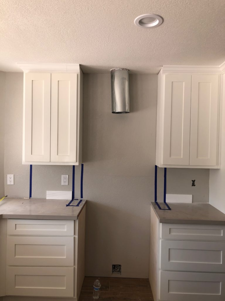
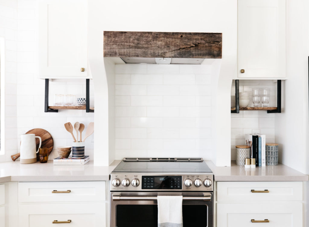
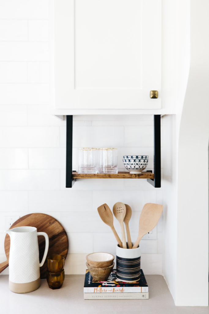
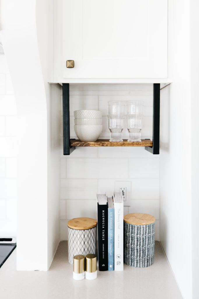
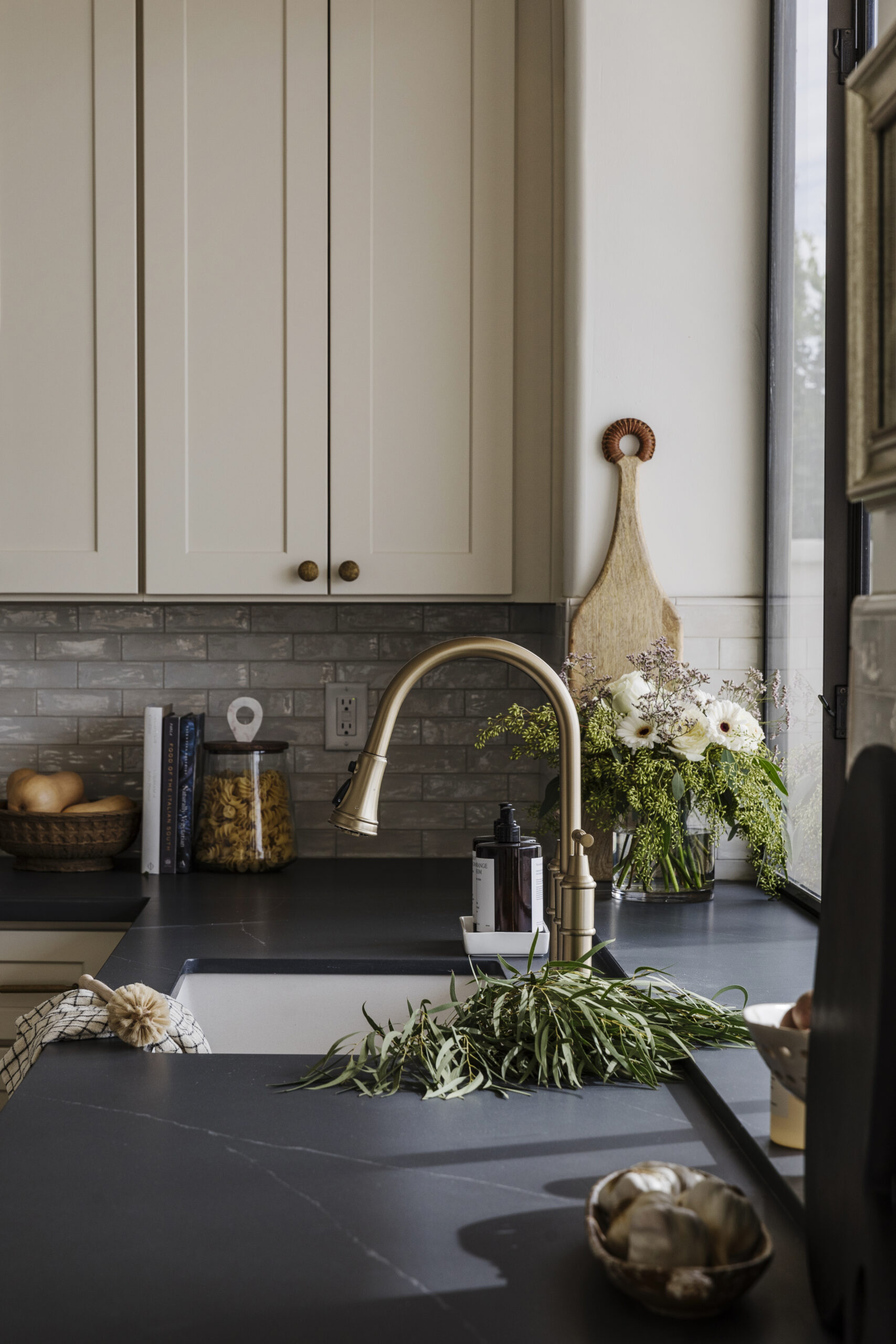
The backsplash in our kitchen is Dolomite marble from Floor & Decor and I love how subtle it is without just being white subway tile. It has a very soft veining of warm gray and ties in really well with our taupe quartz countertops on the perimeter. On the island, I chose to do a calcutta marble looking quartz countertop. I truly love the look of real marble, but I had real marble a couple of houses ago and I didn’t love the etching and scratches. Maybe someday I will be brave enough to try natural stone again!
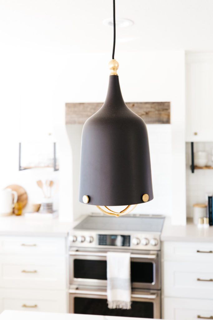
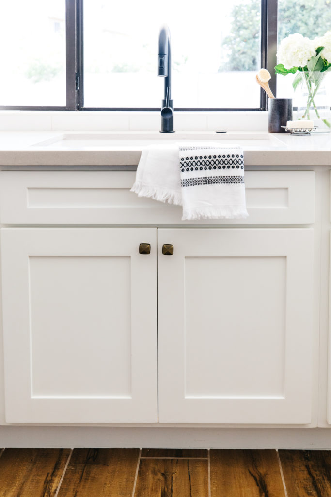
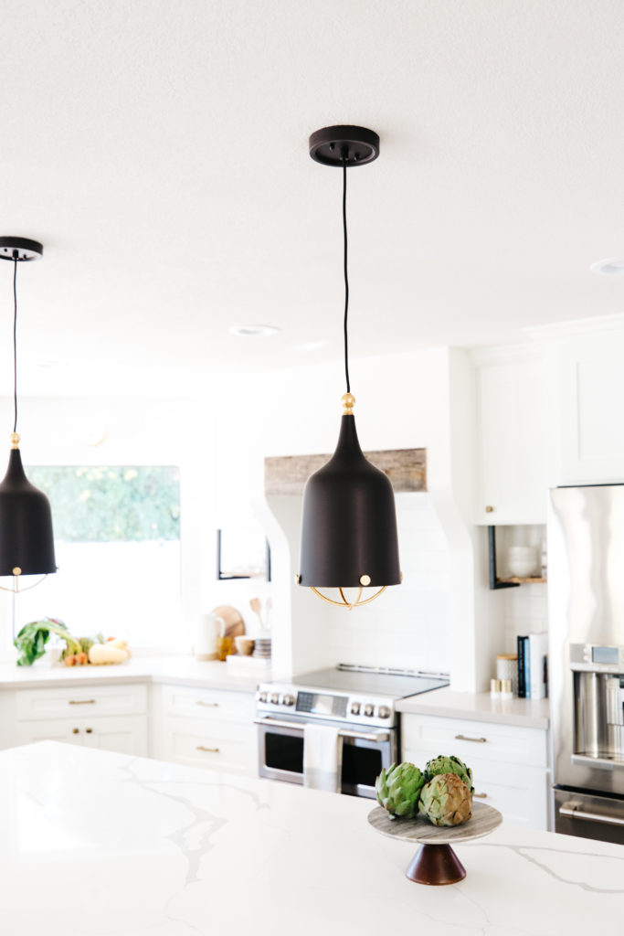
For the lighting, we did 2 pendants over the island. I really love how they are mainly black with the brass interior and caging at the bottom. And then we did brass sconces from West Elm over the windows. I think adding sconces above the sink always looks good and it just made sense for us to continue that over both of the other windows as well. And speaking of sinks, we chose a white granite single bowl sink. I love the clean look of the white and granite keeps from staining. It does get dirty, but with some magic eraser and soft scrub and a minute of elbow grease, it cleans up like new!
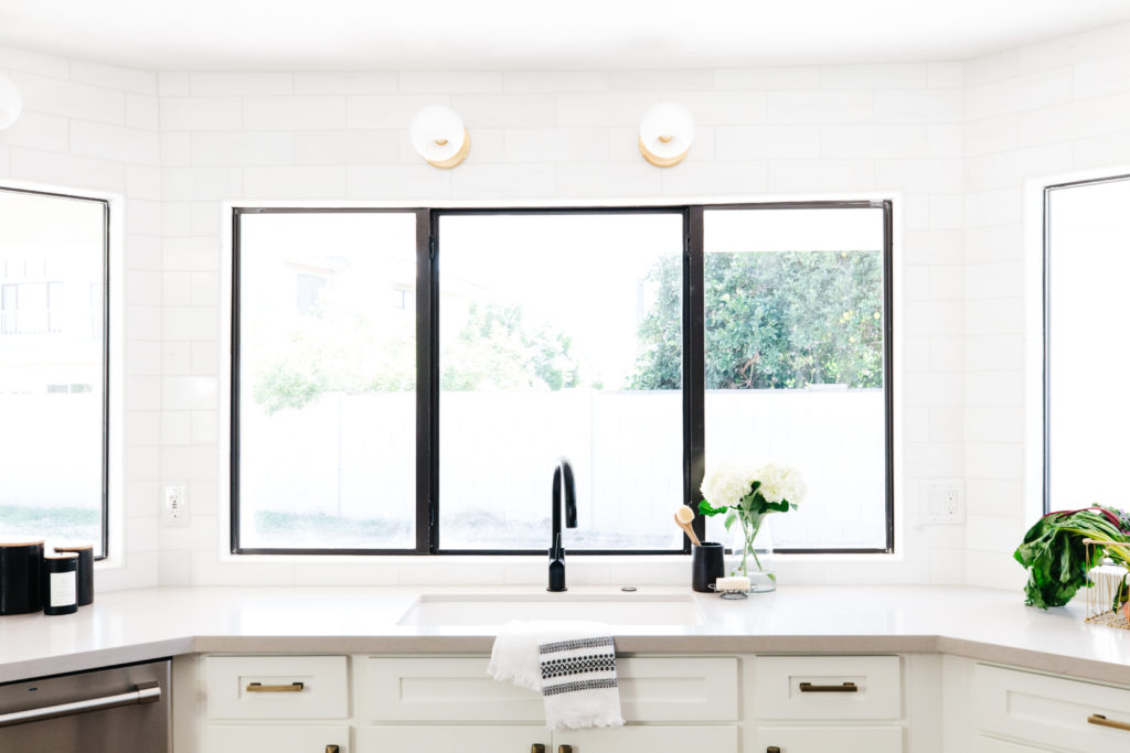
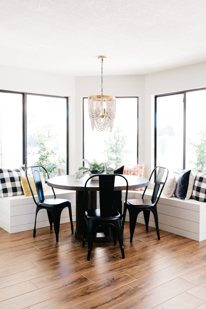
The pantry is in the breakfast nook. We did a built in bench all the way under the windows and clad it in horizontal shiplap. We added this beautiful draping wood bead chandelier from World Market and did a round table with black metal chairs to complete the space.

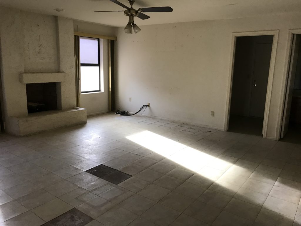
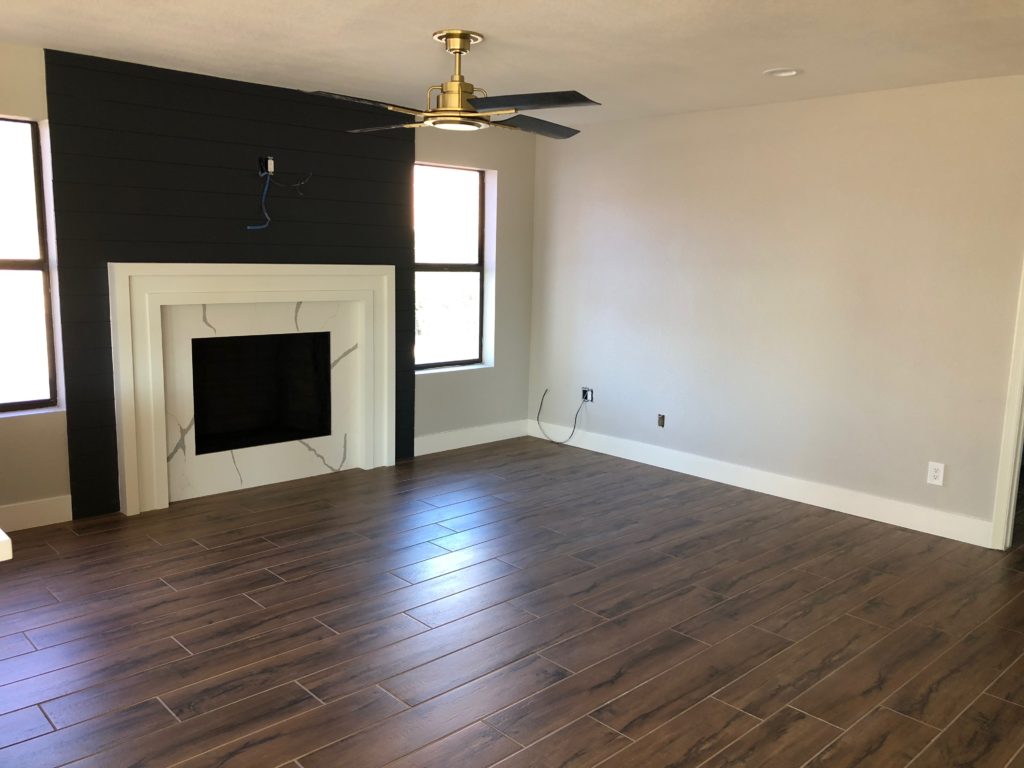
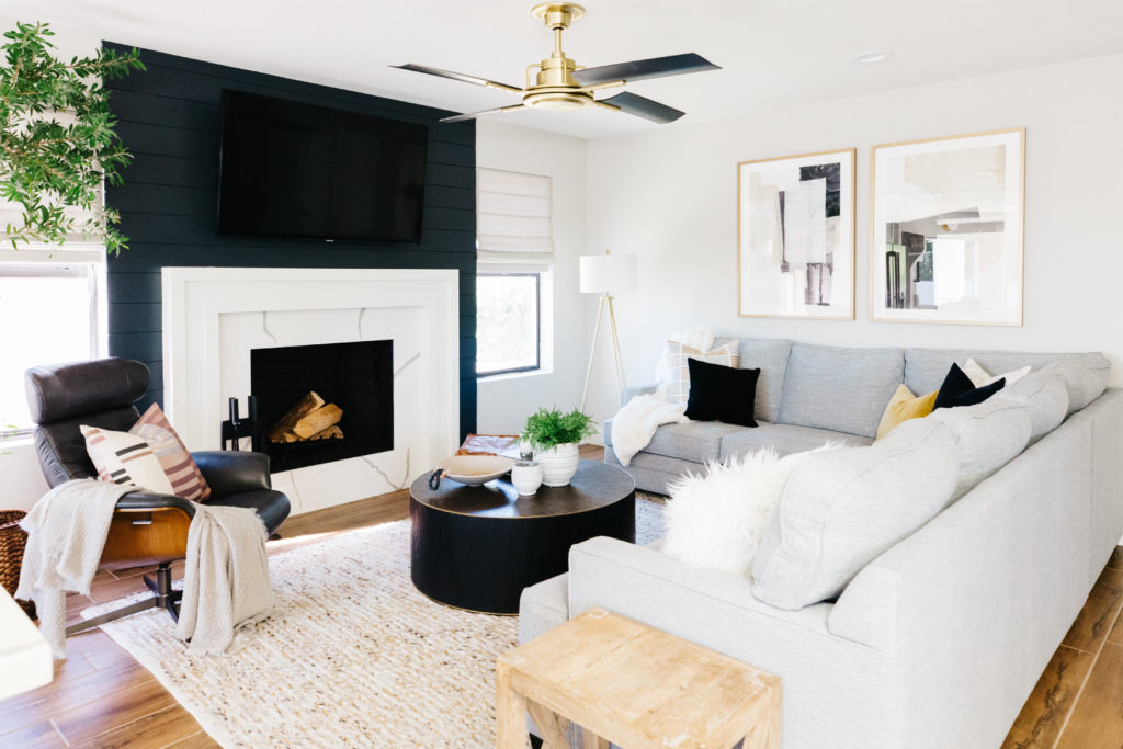
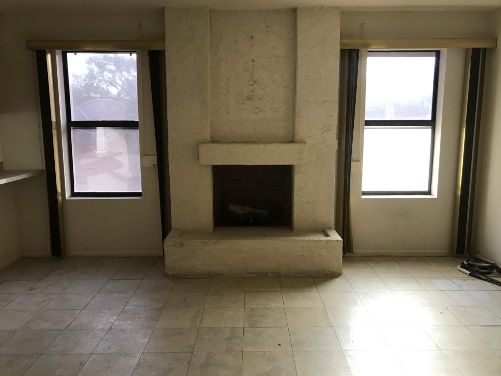
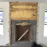
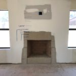

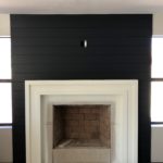
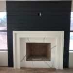
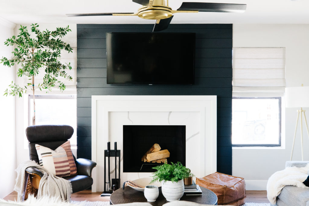
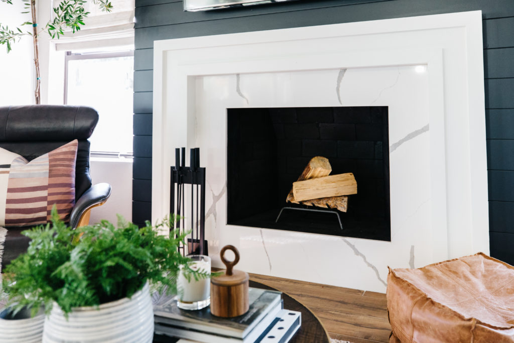
There were a few things wrong with the family room, but nothing that wasn’t cosmetic. The room is not overly large, so really it just came down to adding as much space as we could do the room. The first thing we did was remove the fireplace hearth and make the fireplace flush with the wall. That gave us almost 2 feet of extra space in the family room. We added horizontal shiplap on the wall between the windows, painting it French Beret by Benjamin Moore, which is the same color that the kitchen island was painted. For the surround we used a slab of the same quartz as the kitchen island and then framed it out in layered molding that we painted Simply White, the same as the perimeter cabinets.
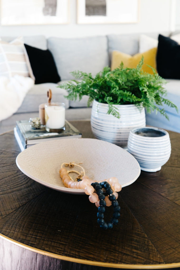
In order to maximize the amount of seating, we chose a sectional sofa from Living Spaces that literally could not have fit the space any better. We added a swiveling accent chair from Living Spaces that can recline as well. Due to the smaller size of the living room, I opted for a round coffee table. It gives us plenty of room to walk around. I love the brass detail around the top and the pattern of the wood of this one from McGee & Co. I styled it using coffee table books, a shallow bowl with glass beads and 2 vases, one with a drop in faux fern. The art from Minted served as the jumping off point for the color scheme to coordinate with the finishes in the kitchen and family room. I love the tones of white, blue gray, taupe, gold and black. And because I love throw pillows, we have plenty of them on the sofa with a combination of solids and patterns.

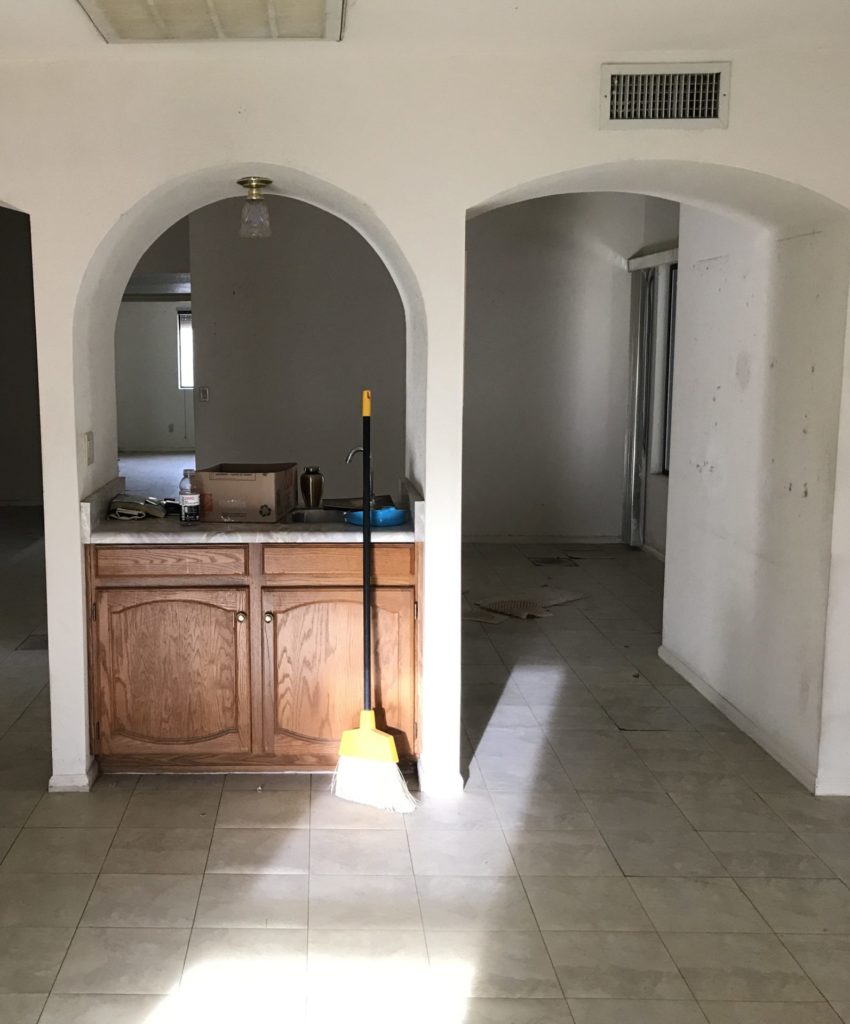
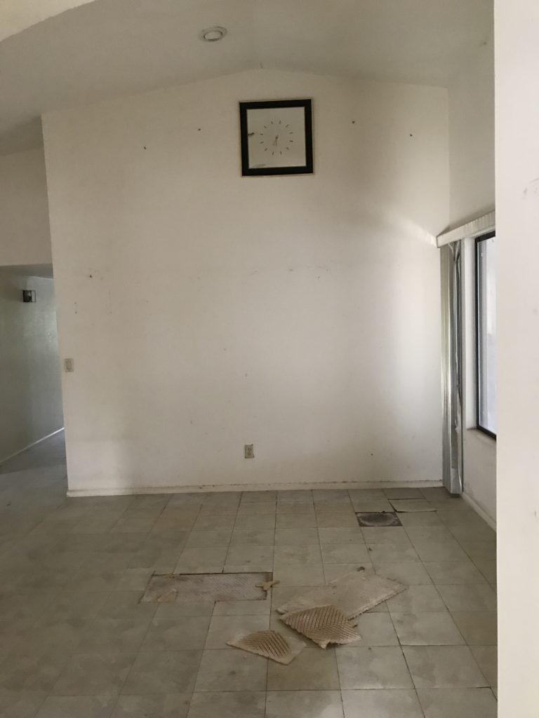
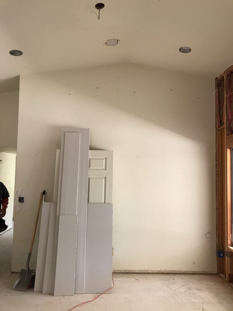
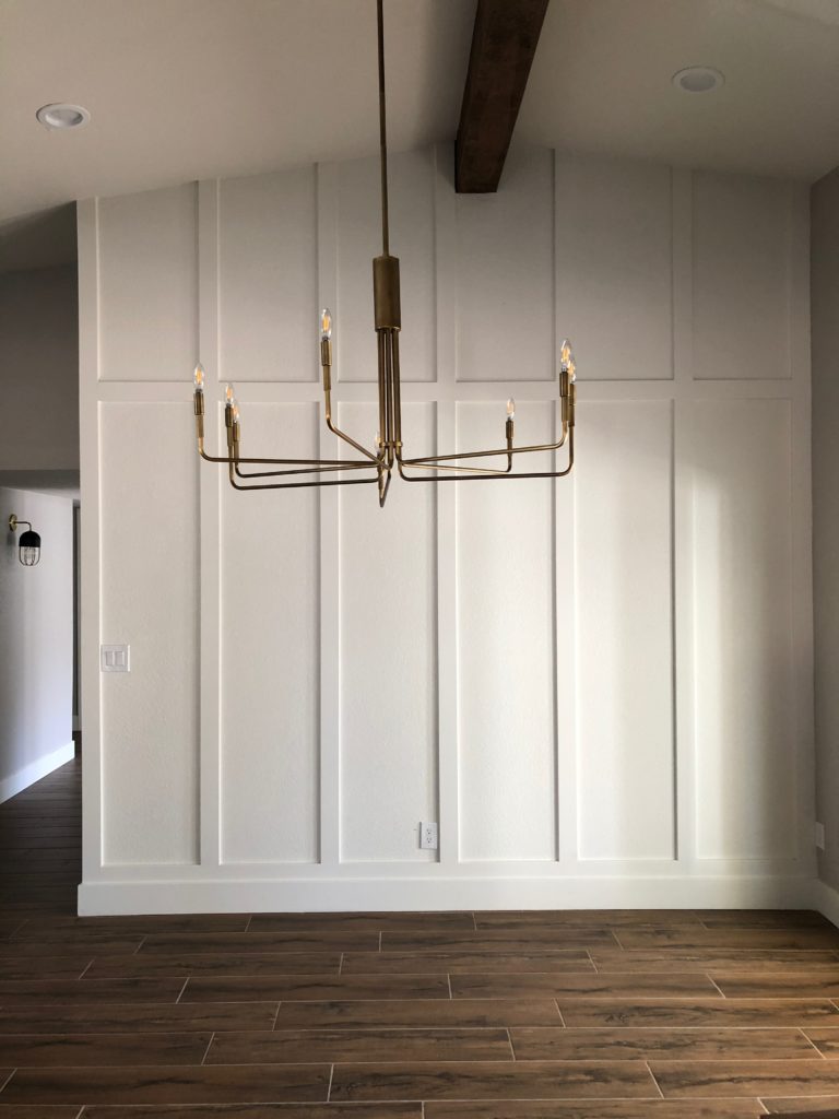
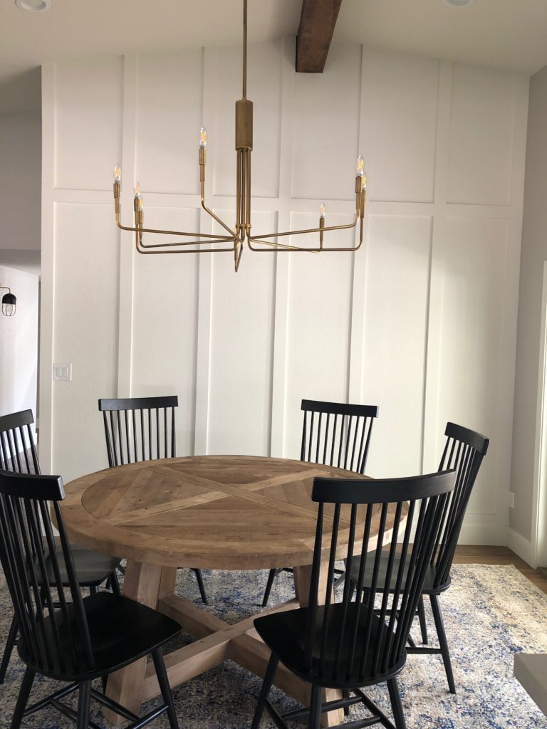
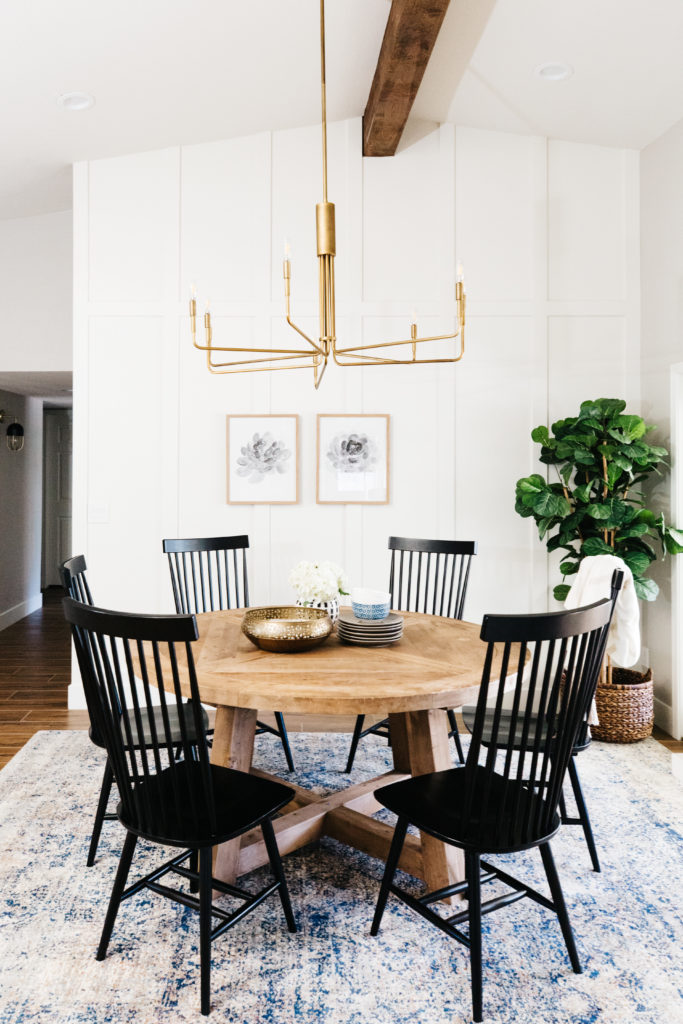
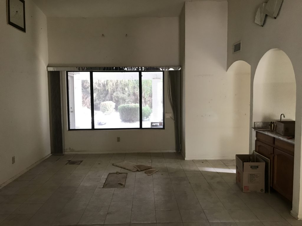
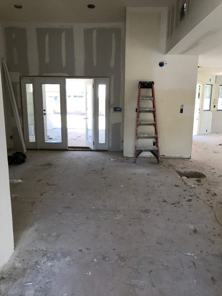
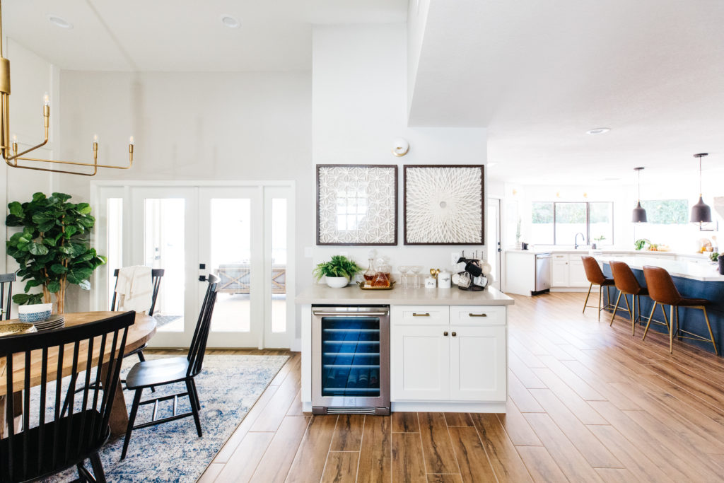
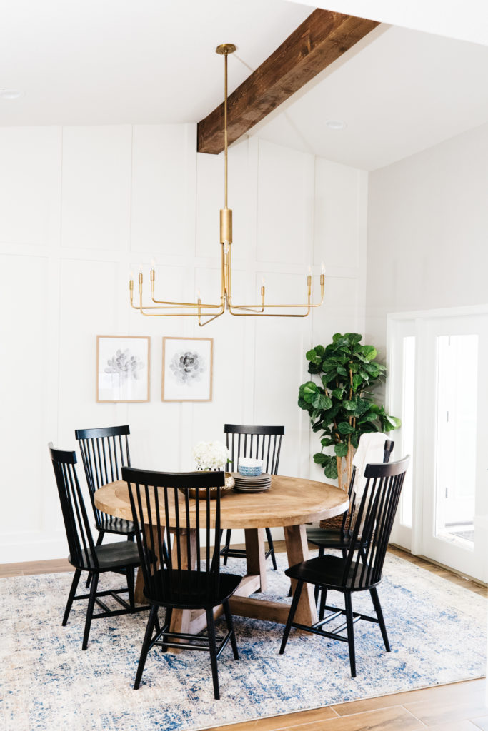
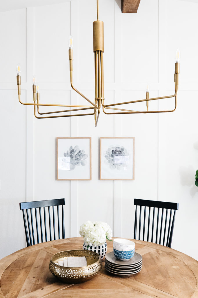
I love our dining room!! It’s the first room that you see when you walk in the door and it’s where we have our vaulted ceilings, which I love so much. The kitchen and family room ceilings are only 8 feet, so having the large vaulted ceiling when you walk in makes everything feel more spacious. We added the beam to highlight the vault even more and did a board and batten treatment on the wall. The chandelier from Crate & Barrel is a show stopper and honestly one of my favorite light fixtures ever. I think that it is the perfect mixture of traditional and modern. Our dining table is a 60 inch round reclaimed wood table from Restoration Hardware. We had this table in our previous home in our breakfast nook and I loved it so much I couldn’t part with it, so we decided to do a round table in our dining room. The room isn’t overly large and we have the new french doors to the back patio that replaced the previous existing window, so a round table gives us plenty of clearance to walk and it’s large enough to also seat 6 chairs very comfortably.
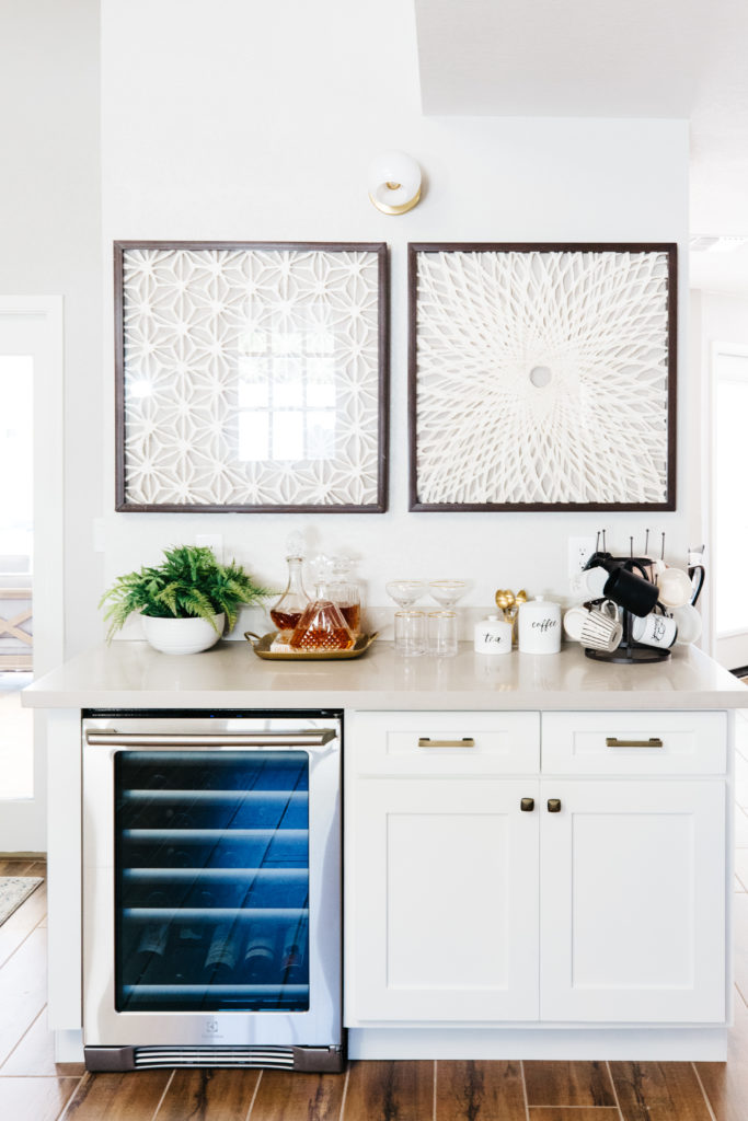
There used to be a wet bar with two arched doorways on either side separating the family room from the dining room. We removed that, wall, but we chose to have a bar area. It gives us that connection between the spaces and gives us room for our wine fridge and our bar and coffee items.

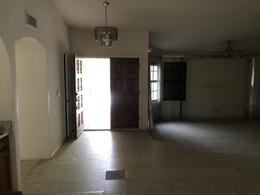
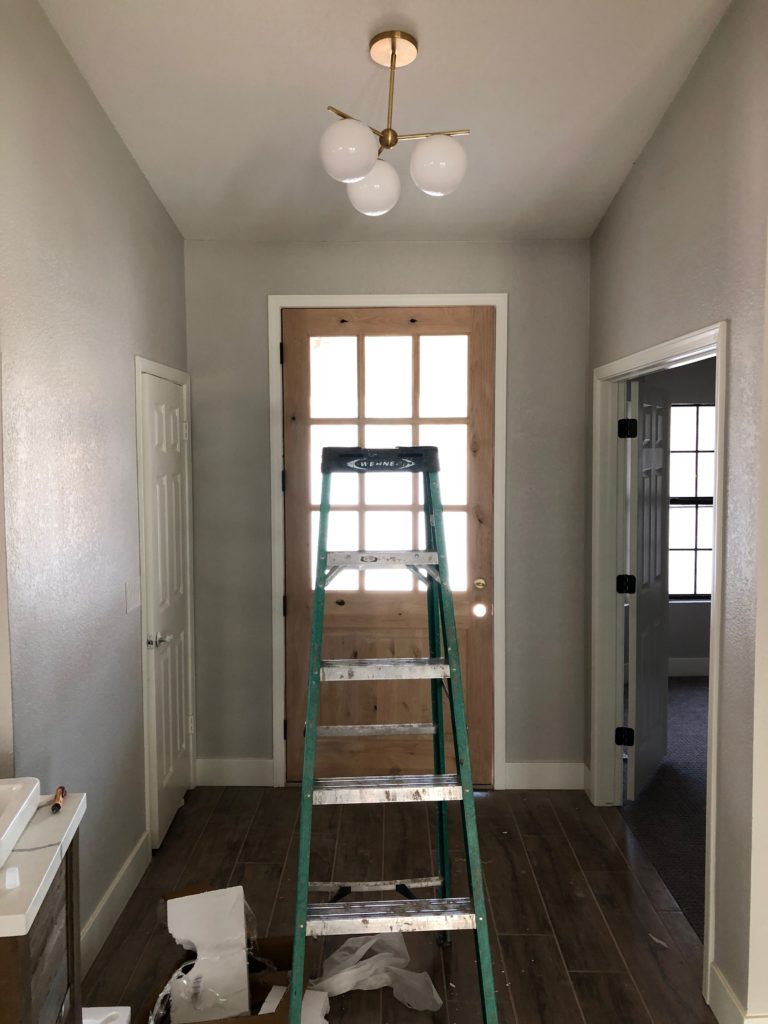
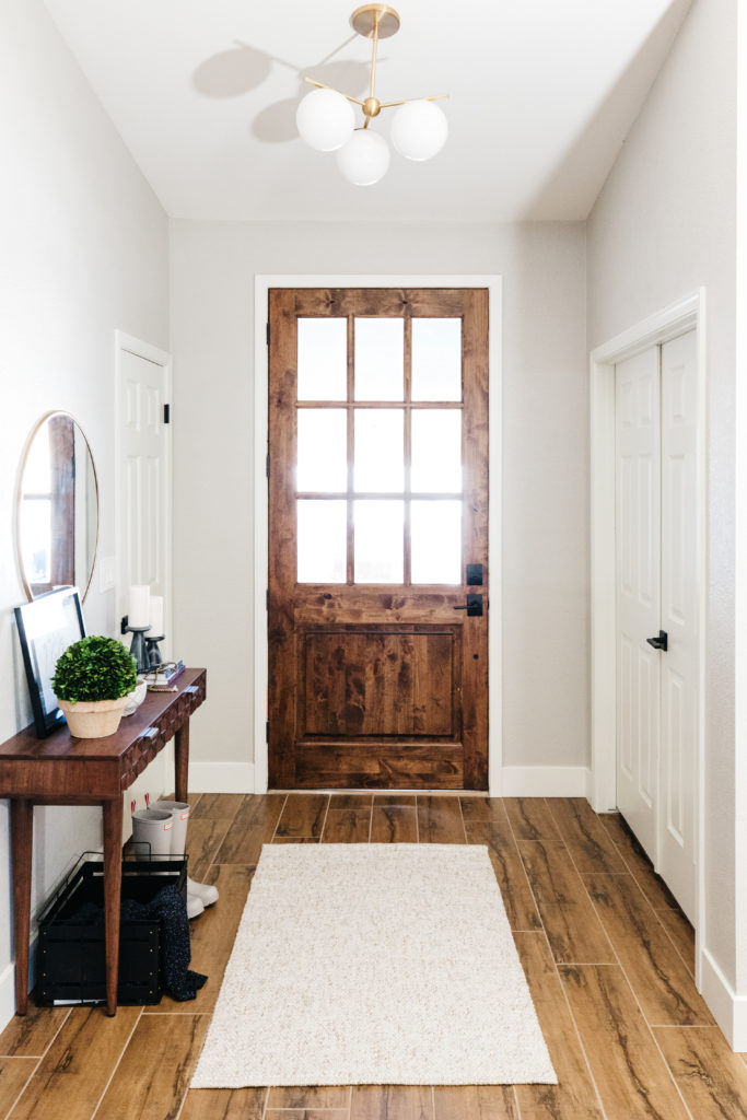
Our previous entry way used to look a little different. We used to have double front doors, but we decided to close in the front living room into a playroom and we needed a little extra wall space, so we shifted over the front door, raised up the door height and made it an oversized single front door. I wanted to get as much natural light in, so I found a craftsman style door that we could stain to match the beam in the dining room. The entry light is from West Elm and it doesn’t hang down too low and won’t be hit when the front door opens. That happened to my first light choice there.
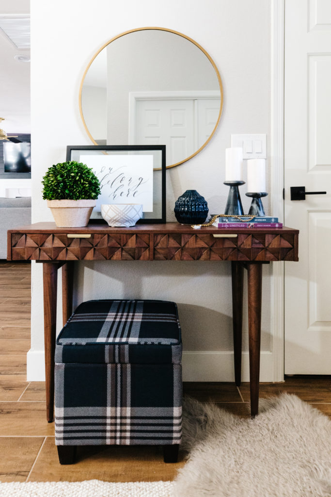
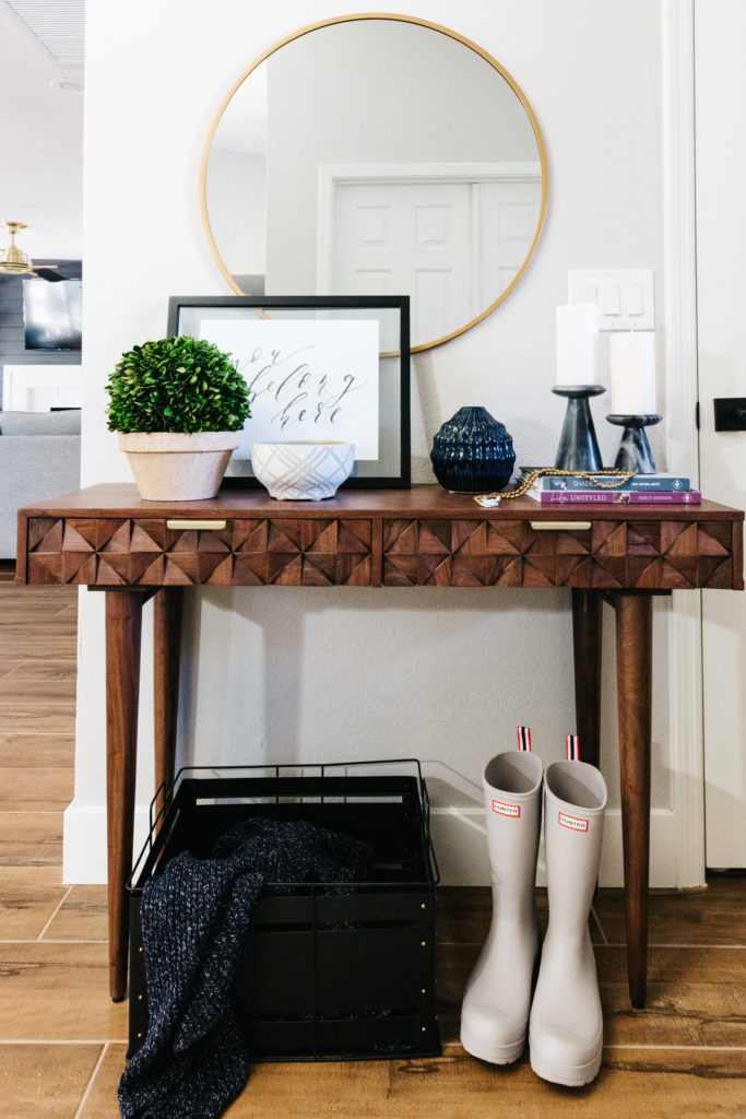
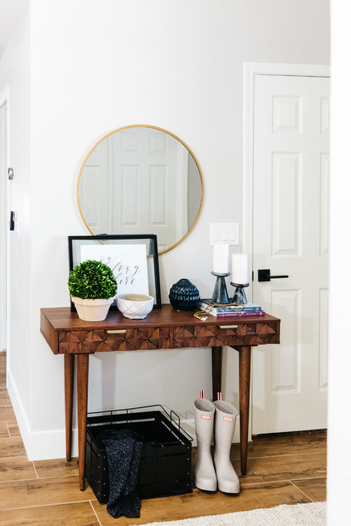
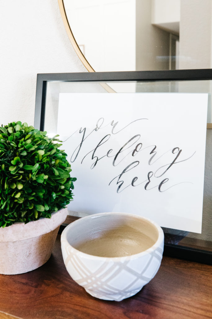
The entry way isn’t too large, but we have a small console table there with some storage. I love having a mirror over the entry table for one last look on the way out. For my other favorite entry way ideas, you can read about more of those here.

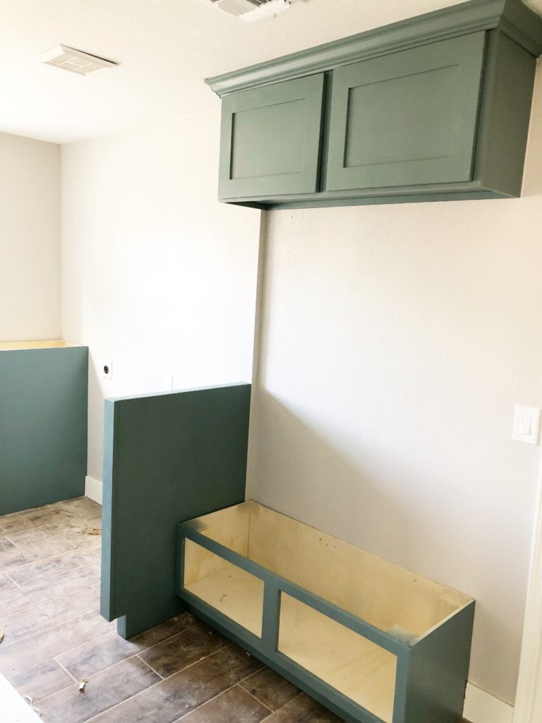
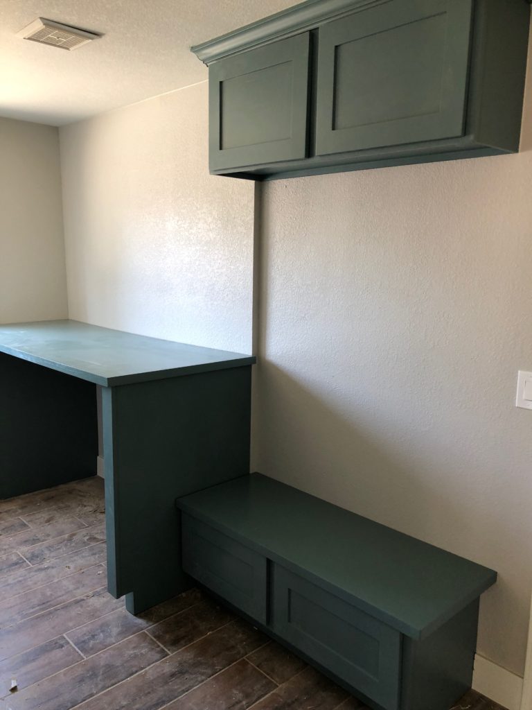
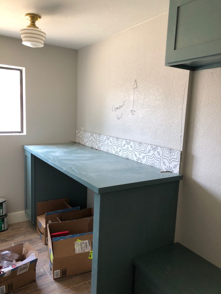
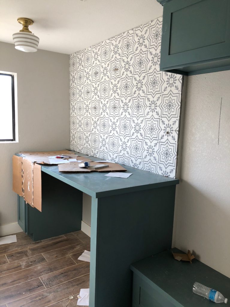
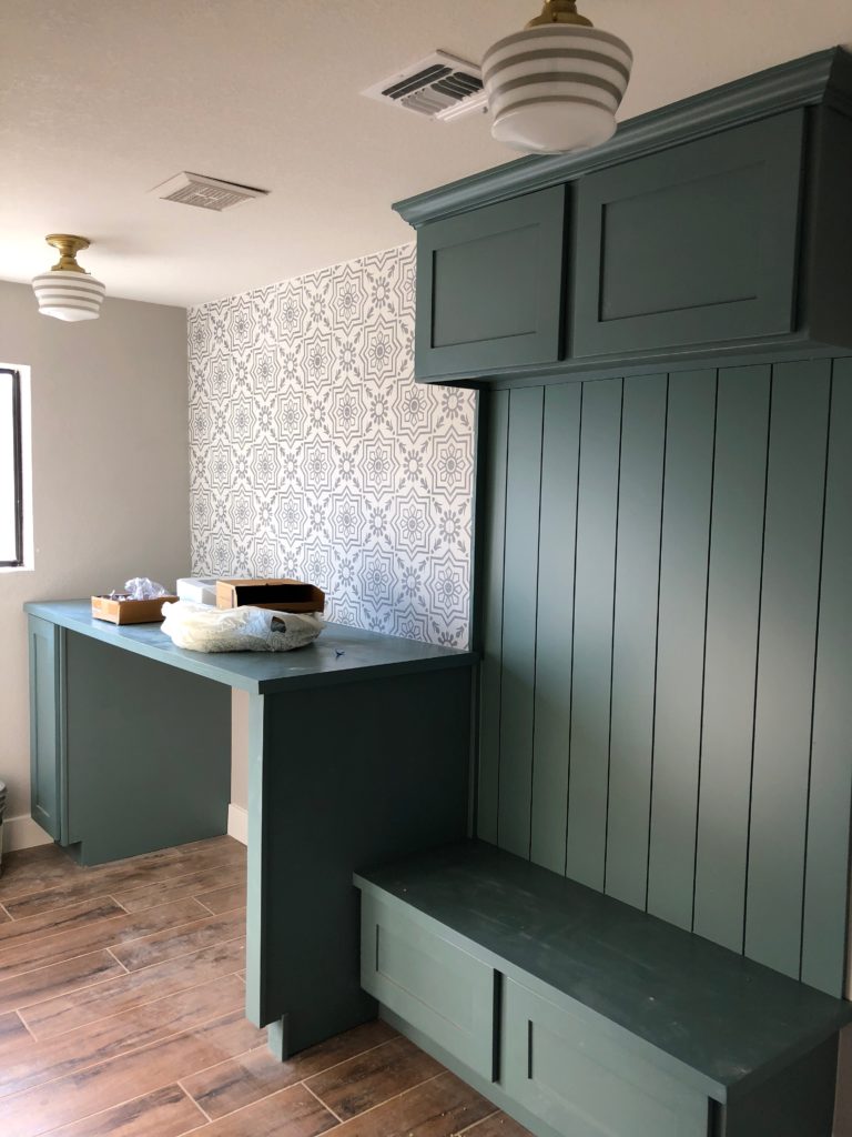
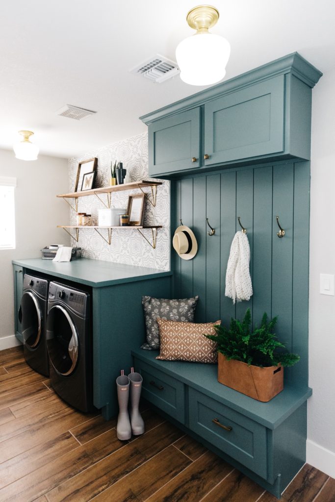
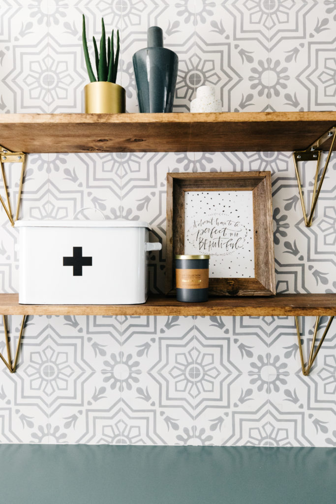
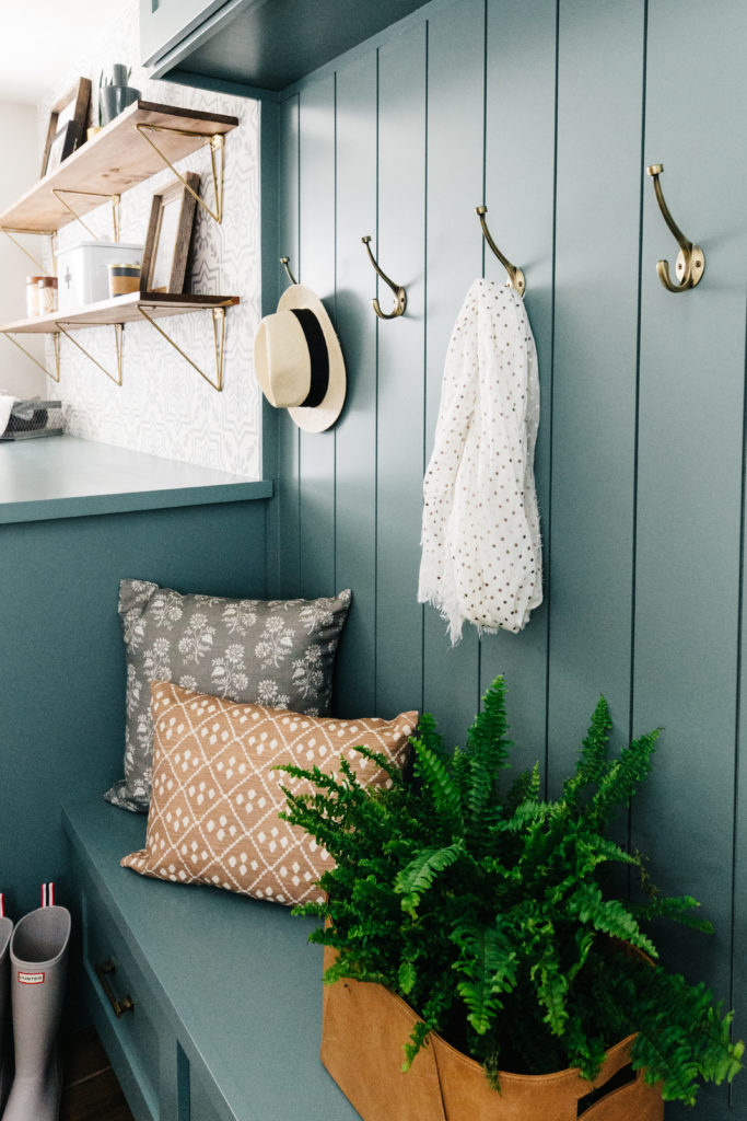
The laundry room was where I decided to have some fun! Fun with color and pattern and functionality. Gotta have functionality in a laundry room/mudroom too! Here are a few things that I wanted to have in this space: 1) folding space, 2) storage, 3) open shelves, 4) a place to hang up backpacks. In order to achieve this, we continued the custom cabinets in this space too. We were able to get one large cabinet on the far side of the room next to the washer and dryer where we keep a lot of our cleaning supplies. We also have some upper cabinets and drawers for additional storage. We built in the washer and dryer in with a top to match the cabinets and that gives us plenty of space to folder our laundry…and leave it there. Haha! I am the worst at putting laundry away.
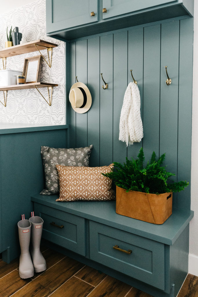
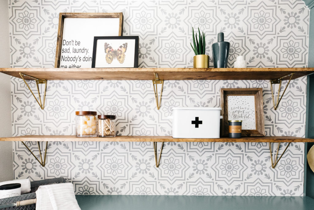
I love the cement tile behind the open shelves. We also used that on the floor of the half bathroom, which is right next to the laundry room and will be included in the next part of the project reveal. The open shelves are really long and we have since added baskets for additional hidden storage, but there is still plenty of room for decorative items as well. I really wanted to incorporate vertical shiplap in the space, so we did that on the space between the drawers and upper cabinets and added hooks for hanging up backpacks. I wish I could say that this room stays as clean as it is in these photos, but that would be a lie. It’s a laundry room and a drop zone, so it gets out of control sometimes.
Whenever I post this photo on social media, the question I get the most is “what color are the cabinets?” This gorgeous color is Studio Blue Green by Sherwin Williams and it’s absolutely one of my favorites!

I hope you enjoyed this project reveal and I can’t wait to share the next part of it with you. Next up will be my master bedroom, master bathroom, the half bathroom and the kids’ bathroom. In the meantime though, you can check out our most recent post where we are sharing our favorite brass cabinet hardware.
Explore more categories: Before + After, Design Tips, Personal, Projects, Studio Blog
share this post:
Get exclusive design tips and blog updates sent to your inbox!
I'm brittany Krupnik!
I'm a real estate investor, designer and home stager. I have staged over 500 homes and designed over 250 homes. When I'm not designing, you can find me reading, traveling or trying out a new restaurant. I'm based in Tempe, Arizona where I live with my husband and 3 kiddos!
Project Reveal: See my home!
shop blissful
Home Decor
Our Favorite Cookbooks
Girl's Bedroom Makeover
How to Host the Perfect Gathering
follow along with Brittany's instagram
follow along with blissful's instagram
blissful
browse the blog
Services
Creating beautiful spaces where life can be enjoyed
Learn
Thank you for the tour! Did you mention what type of flooring you choose for the main living spaces? I’d love to know what type of wood it is and where you found it!
It’s actually a wood tile. The color is Sedona Light from Sunstone Tile.