

Latest Post

A HIGH CONTRAST, NEUTRAL REMODEL THAT IS ANYTHING BUT BORING.
If you caught our recent feature over on The Haven List, then you read all about how a neutral color palette doesn’t have to be boring. It can be full of pattern, warmth and texture.
This neutral remodel was so much fun to design and we used shades of white, gray, beige paired with black and brass hardware throughout and we accentuated the finishes with staging that made the home warm and inviting.
I can’t wait to show you are around and show you what it looked like before!
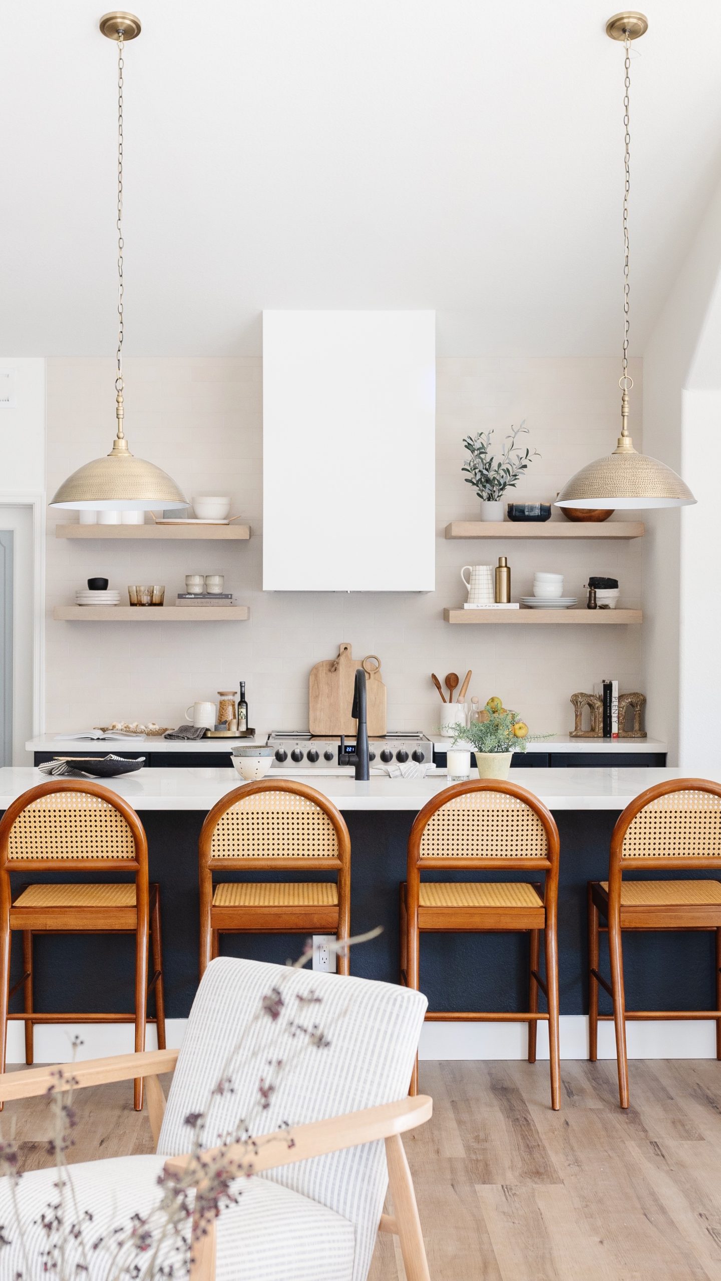
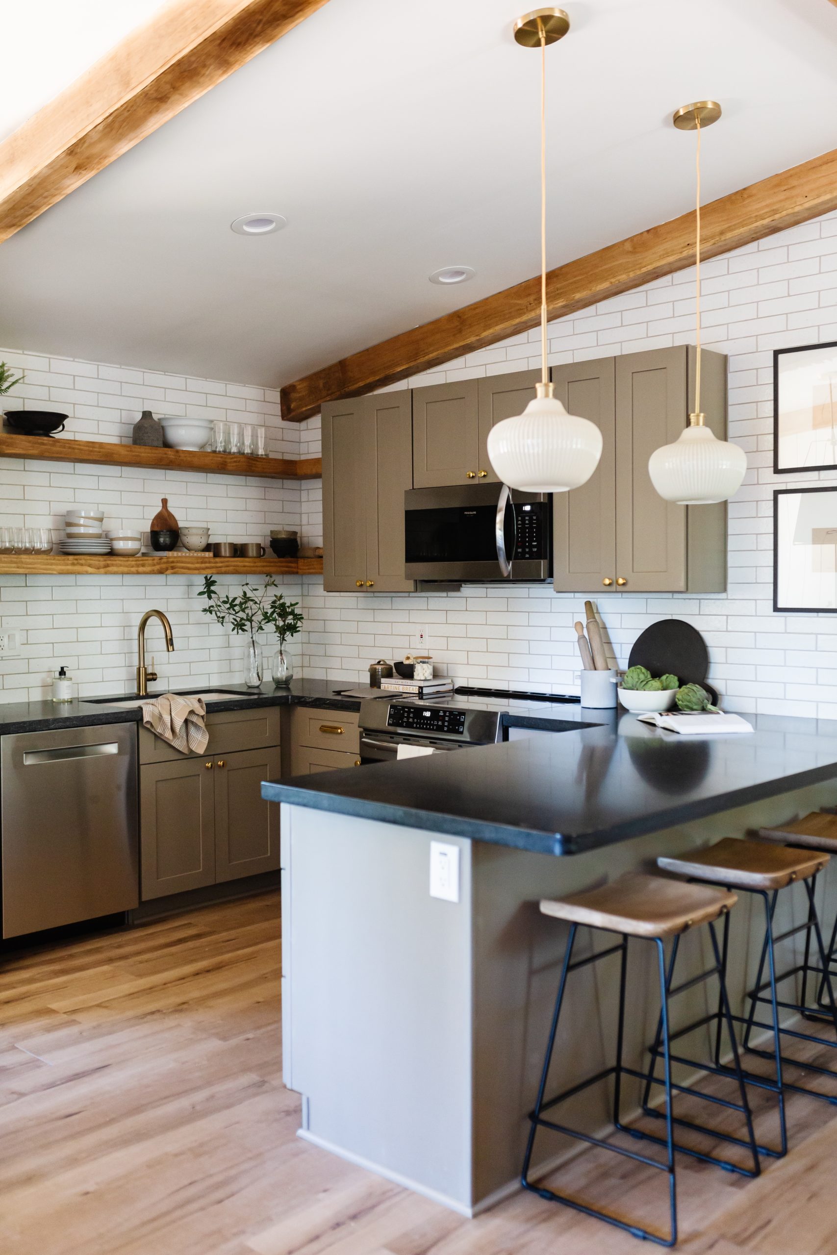
THE KITCHEN


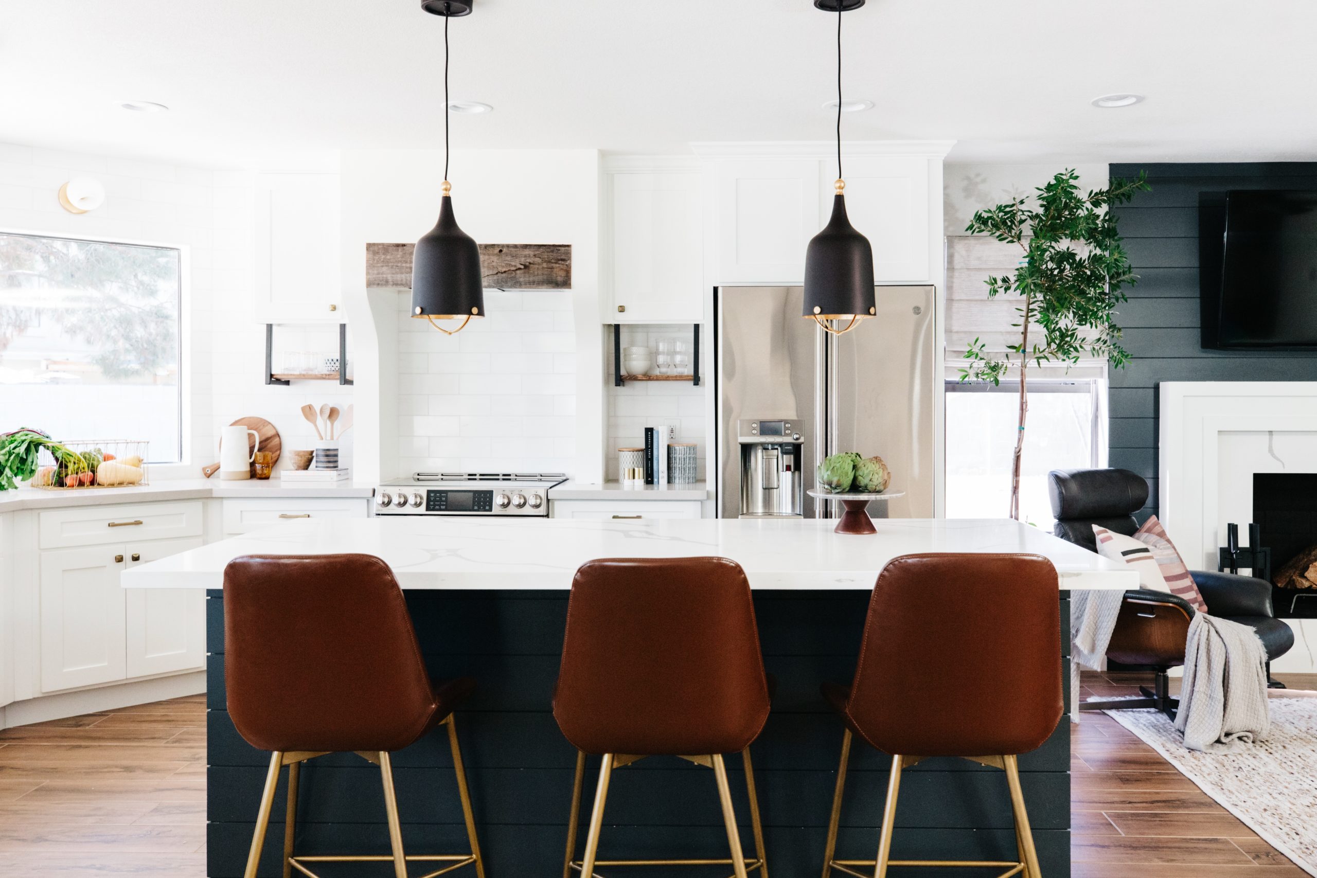
This kitchen is one my favorites!! It was dark and had a terrible soffit, dated cabinets and a really odd shaped island that cut off the kitchen and made it feel really small. We had to keep the soffit on the left side, but we were luckily able to remove the one from the back wall. Once we reoriented the island so that it didn’t cut off the kitchen it made the space so much more open and spacious.
We brightened up the entire kitchen with white cabinets and white shiplapped walls. I love the high contrast and of the matte black granite countertops. We warmed it up with reclaimed wood open shelves, neutral brick look backsplash and brass accents!
Styling the kitchen was so much fun! The open shelves are a great place to showcase both functional and pretty pieces. Adding fresh fruit and greenery bring life into the kitchen. My favorites to use are artichokes, lemons and eucalyptus branches.
shop the kitchen
 JavaScript is currently disabled in this browser. Reactivate it to view this content.
BEFORE & AFTER


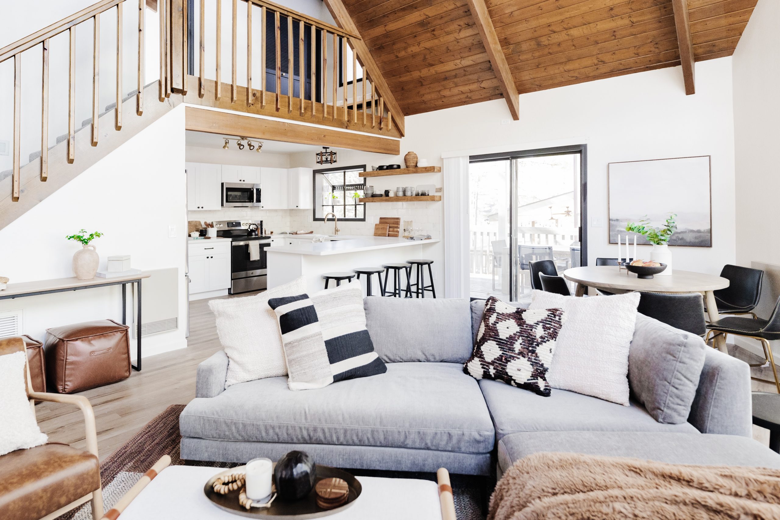
FAMILY ROOM


All we really changed in the family room was the fireplace, but it made such a difference in the room. Well, the new paint color didn’t color didn’t hurt either!
I definitely don’t miss the stair step pop outs above the fireplace, do you? We simplified and modernized the fireplace by removing the hearth and the pop outs and adding a herringbone black slate tile surround.
shop the living room
JavaScript is currently disabled in this browser. Reactivate it to view this content.
BEFORE & AFTER


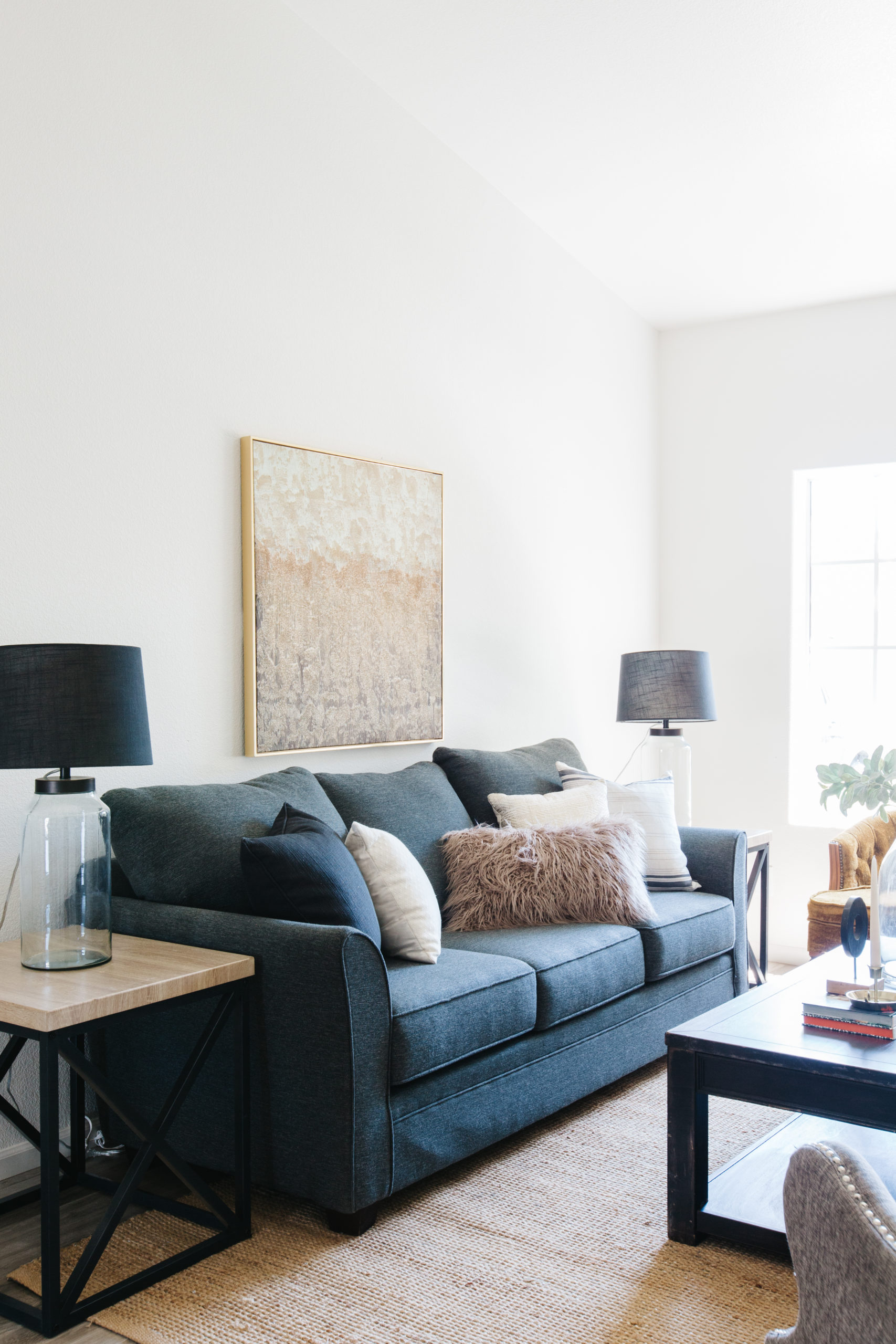
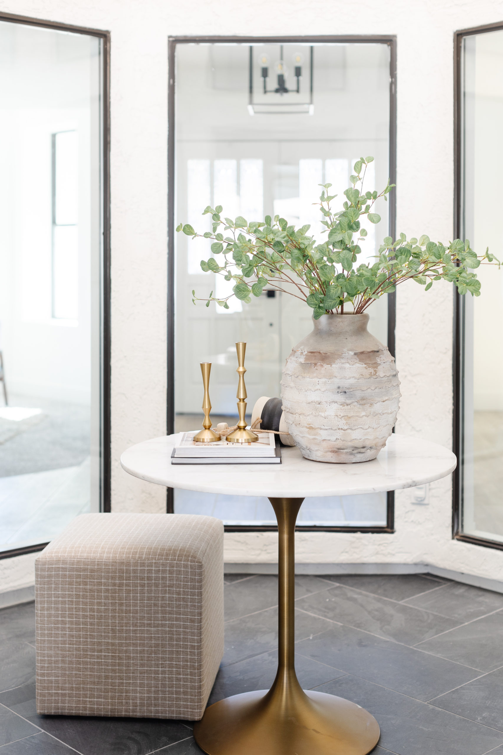
FORMAL LIVING & DINING ROOMS


These spaces are the first ones you see when you walk in the door and again, the updates were super minimal – paint and a new dining room light. It feels so much lighter and brighter and the staging furniture helps define the spaces.
My favorite part of this room are the gold velvet accent chairs. I found them on my first walk through of the home after we bought. They were dirty and in pretty rough shape, but I really wanted them to have a place in the home was it was remodeled. Once they were cleaned up, the team and I found this art piece that worked perfectly with the color of the chairs and they added some much needed character in the room since most of the other staging furniture had clean lines and a more modern feel.
shop the living & dining rooms
JavaScript is currently disabled in this browser. Reactivate it to view this content.
BEFORE & AFTER


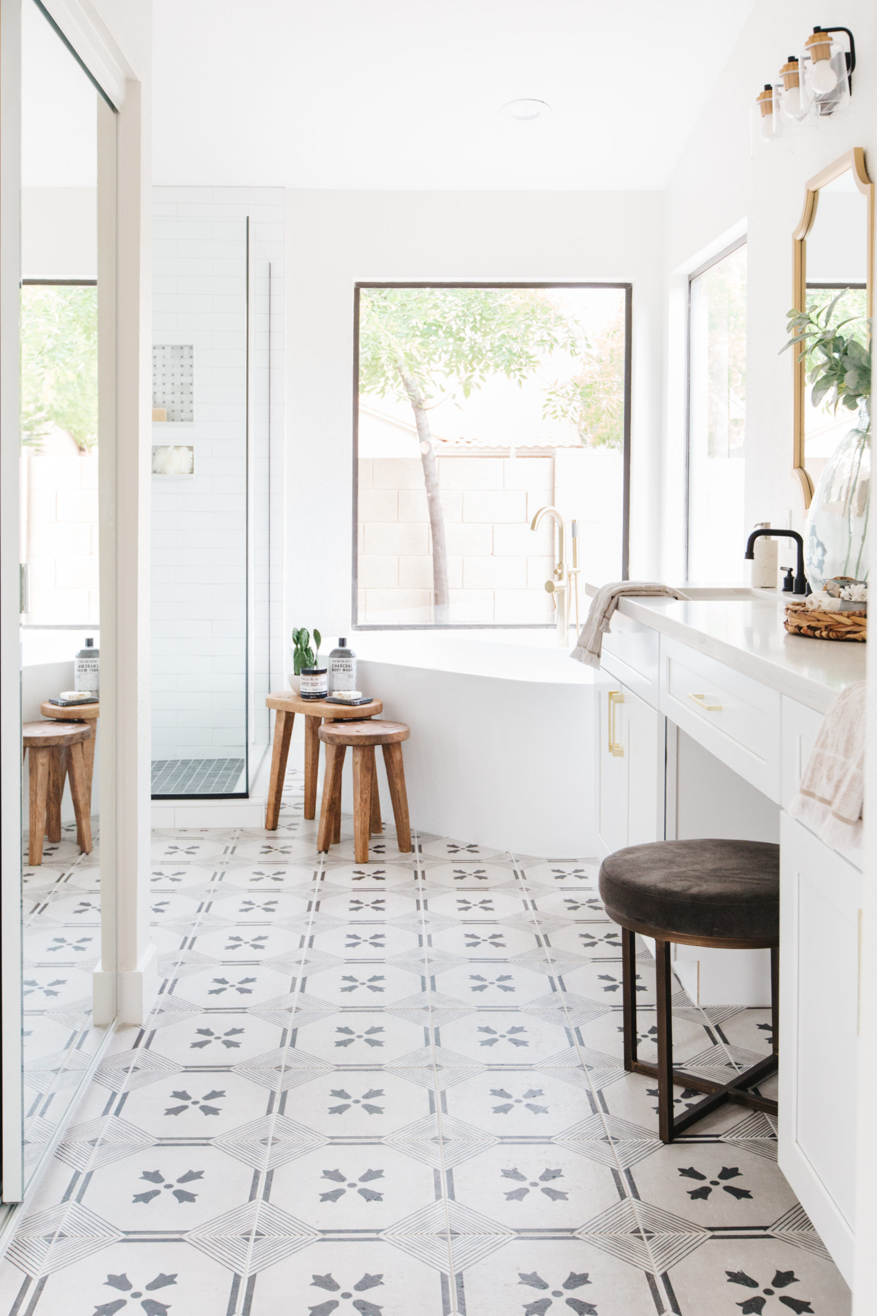
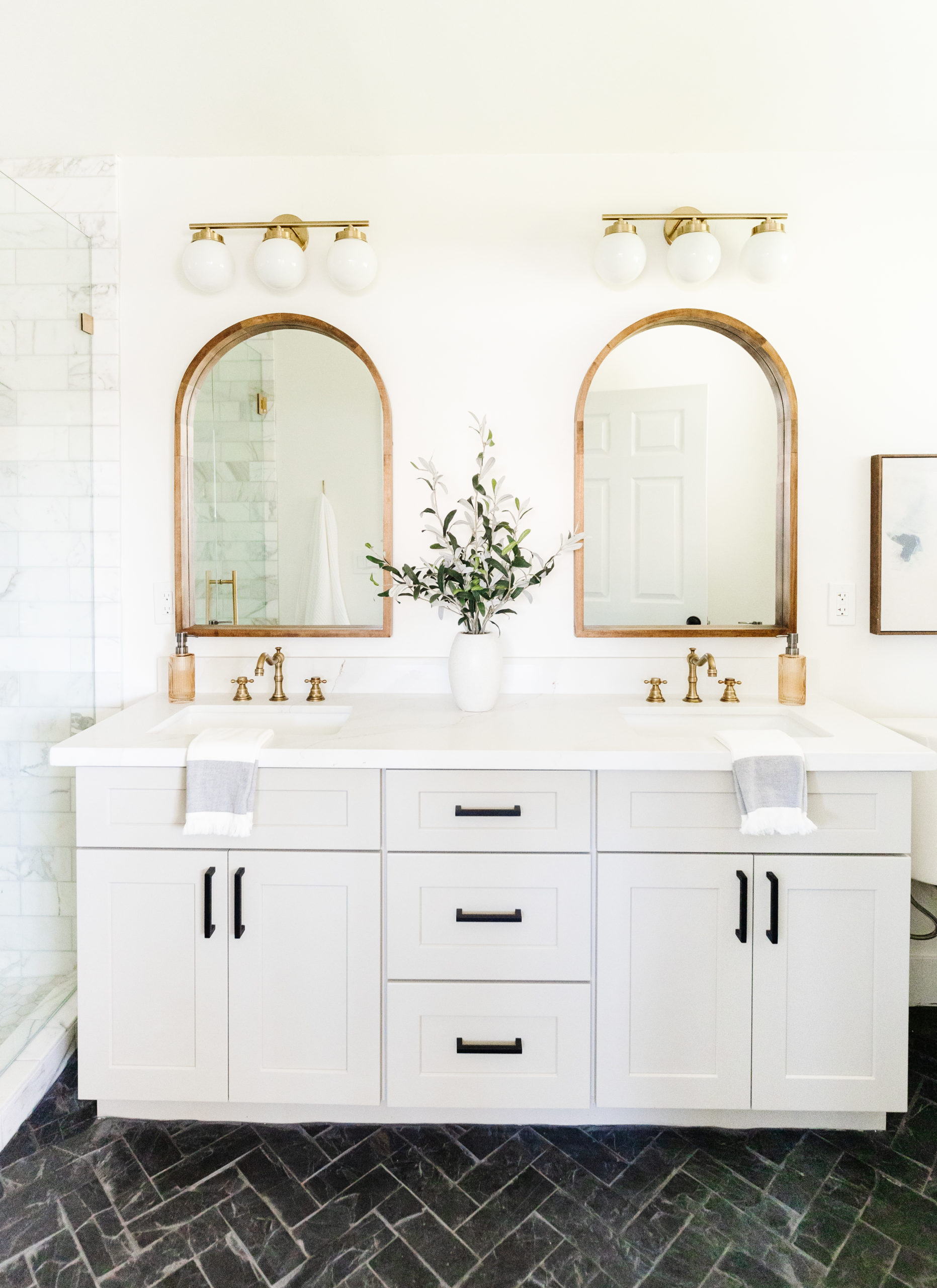
MASTER BATHROOM


The master bathroom might be my favorite room in the house! Like I am literally obsessed. I could not wait to use a black freestanding bathtub in a flip remodel and I could not be happier with out it turned out. The bathtub was a statement, but there is nothing wrong with having two statements in one space. And that is where this gorgeous patterned tile floor came in. I love the color palette of black and white with accents of taupe, wood and brass. Adding those warmer elements make this bathroom inviting and cozy.
Styling this bathroom was about bringing in pretty functional pieces like the wooden stools paired with decorative items like leaning art, a vase and florals and soaps.
shop the master bathroom
JavaScript is currently disabled in this browser. Reactivate it to view this content.
BEFORE & AFTER


OTHER BATHROOMS
The other bathrooms in the home all have the same neutral color palette, but they were all designed differently and with their own finishes. There are so many ways to use a neutral color palette with black and white and warm accents.
In the first bathroom we used these really textural and warm floor tiles in a herringbone pattern and paired with a light warm gray subway tile laid in a staggered vertical pattern with a marble mosaic niche.
In the half bathroom, we used this super fun marble look hexagon porcelain tile on the floor and used the same honed black granite on countertops as in the kitchen. I like having fun with pattern and contrast in small spaces, so this bathroom was a great place to do that.
In the ensuite bathroom we carried the wood tile that is in the rest of the home on the floors. I like how it warms up all of the white in this bathroom from the cabinets, countertops and the marble tile shower. The brass mirror is one of my favorite pieces and adds a visually interesting element.


shop the bathrooms
JavaScript is currently disabled in this browser. Reactivate it to view this content.
BEFORE & AFTER


I hope you enjoyed this project reveal! This was such a rewarding remodel to work on and I love the finished result.
Need more before & afters in your life?? Check out this project reveal!
read post

Browse the blog posts
Coastal, collected scottsdale vacation rental! This was one of my favorite vacation rentals to design. I love the color palette of blues, grays, whites. There are so many great natural textures from the wood and rattan. The color palette lends itself to a coastal feel, but we layered in pieces that feel collected and eclectic. […]
Meet Brittany

Brittany Krupnik is a real estate investor, designer and home stager. She creates spaces where life can be enjoyed - whether that is reimagining a space and bringing it back to life through flipping, helping someone envision themselves and the life they can have in a new home through staging or designing a vacation rental that serves as the backdrop for families and friends to create memories.
Brittany has staged over 500 homes and designed over 250 homes. When she is not designing, you can find her reading, traveling or trying out a new restaurant. She lives in Tempe, Arizona with her husband and 3 kids.
I'm Brittany — real estate investor, designer & home stager.
Meet the designer
Learn best practices for choosing a neutral paint color!

Neutral Paint Guide

ALMOST THERE!

tell me!
Learn best practices for choosing a neutral paint color!
Wondering what color is right for your room? Get our neutral paint color guide!
free resource


Browse the entire shop of favorites!
CURRENTLY LOVING
products we are
SHOP BLISSFUL
