Latest Post
My Current Home Renovation Reveal!
Back in November of 2022 we moved into a new home. We knew this wasn’t going to be our forever home since we were in the process of building a home (still are!). But we had an opportunity to purchase a home in the neighborhood that we are building in and we were excited for some extra space and to just move into the neighborhood that we ultimately want to live in. However, even though we knew that we wouldn’t be here forever we still would live here for 2-3 years and there were some areas of the home that were not our style and wouldn’t function for us the way that we would want for the next few years. The biggest change happened in the kitchen, but the other areas got the benefit of small changes like lighting and paint and that made a huge difference.
I can’t wait for you see the spaces below and how they looked before!
the design elements
inviting, transitional, wood and brass
Great Room
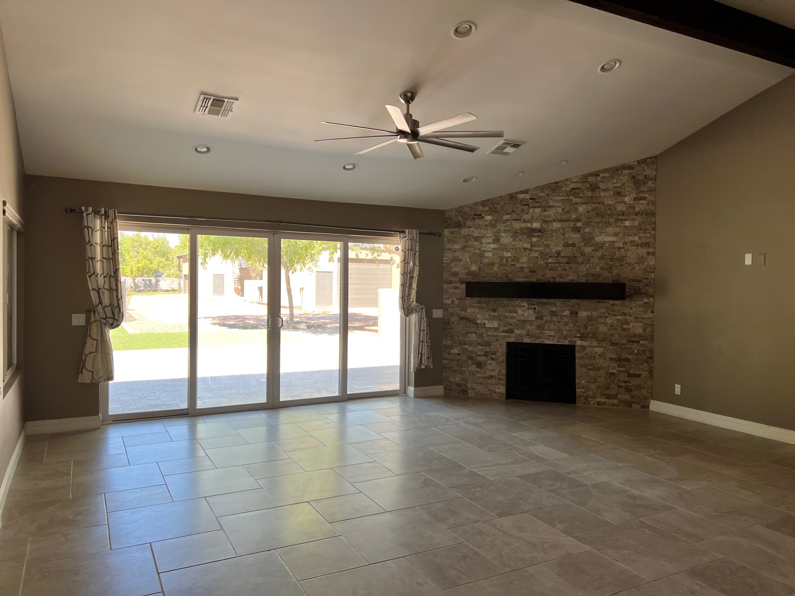
The previous owners opened up walls and raised the floor in their own renovation years before and while we loved the open concept it also meant that there were two living spaces side by side. The main issue we dealt with was how to make both spaces function for our family and make them feel like their own unique spaces. The fireplace area is ideally where I would have loved to have our television. Since that is a space we would hang out in the most I wanted to be able to see enjoy the fireplace as much as possible. However, the angles of the room and how it was set up with the sliding patio doors didn’t really make sense. So we chose a large sectional sofa to go in one area where could have a media wall and then the fireplace area became a conversation seating area.
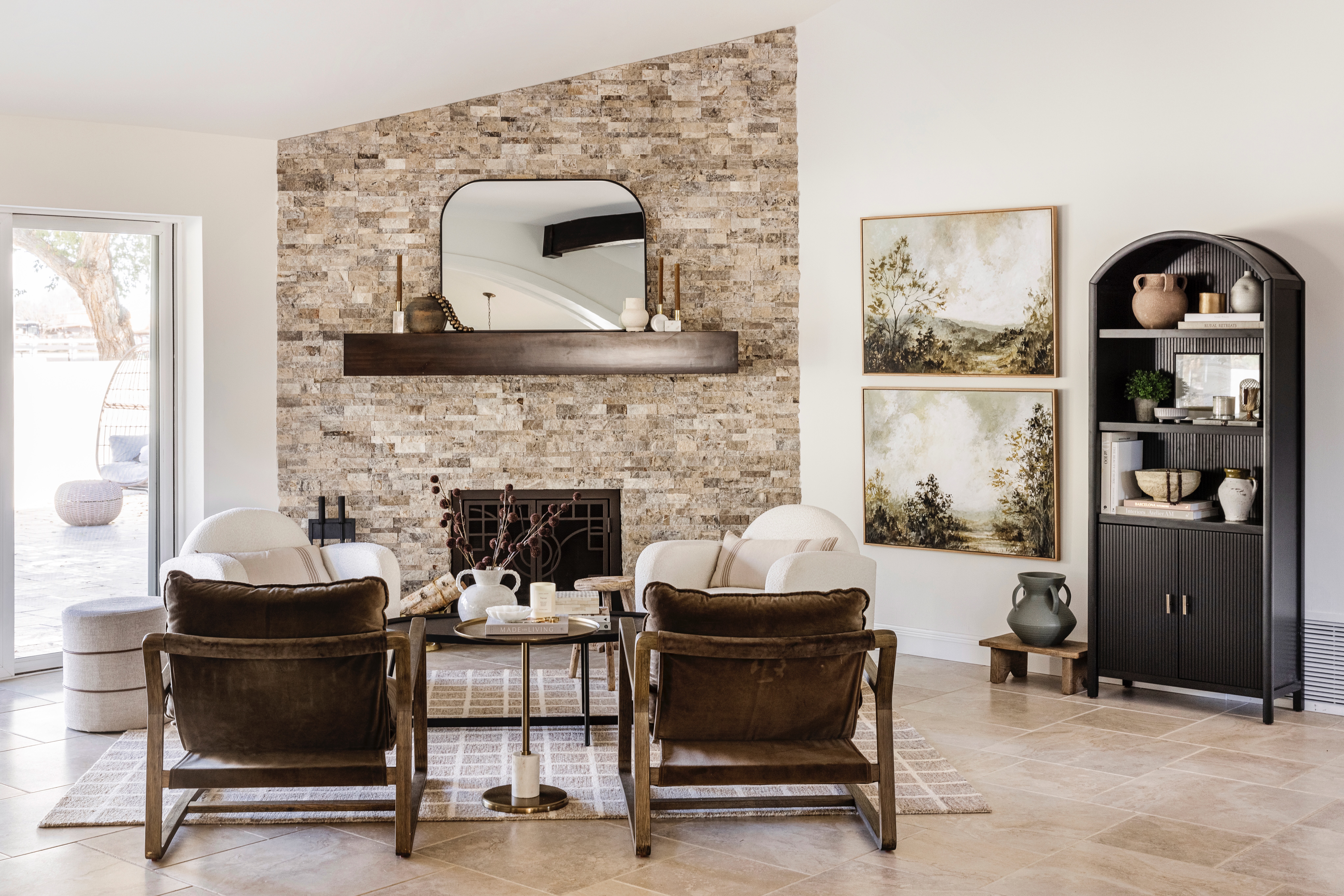
The space underwent a few different variations, but this is my favorite. It’s a place where I sit and work in the morning or have a glass of wine and read. I love 4 chairs around in a circle for chatting with friends as well. The stone and mantle were already there and although they wouldn’t be materials I would normally choose, I chose artwork and other furniture pieces that all tie in well together. It’s one of my favorite spots!
The art is from Juniper Print shop and it really set the tone for the rest of the space. It works well with the colors in the stone and the rug reads neutral, but actually has multiple thread colors when you look closely so it adds a little something extra. My favorite chairs are from The Lifestyled Co and I love that they pull in the green from the art. The last piece to be added was the bookcase after I removed the console table I had in there and then decided to rehang the art to stack vertically instead of horizontally. It adds a nice visual balance and I got the style some shelves, which I love to do!
In the TV space, the sectional sofa fits my family of 5 comfortably, so it’s a large sofa and there wasn’t space for much else. In fact, the round coffee table makes the most sense there so that it feels like there is flow. It faces our media console and our frame TV, which I love because it really does look like art. I chose a print from Juniper Print shop that has different brown tones and adds some warmth to the space and also ties into the rug as well.
 BEFORE
 AFTER
AFTER
 BEFORE
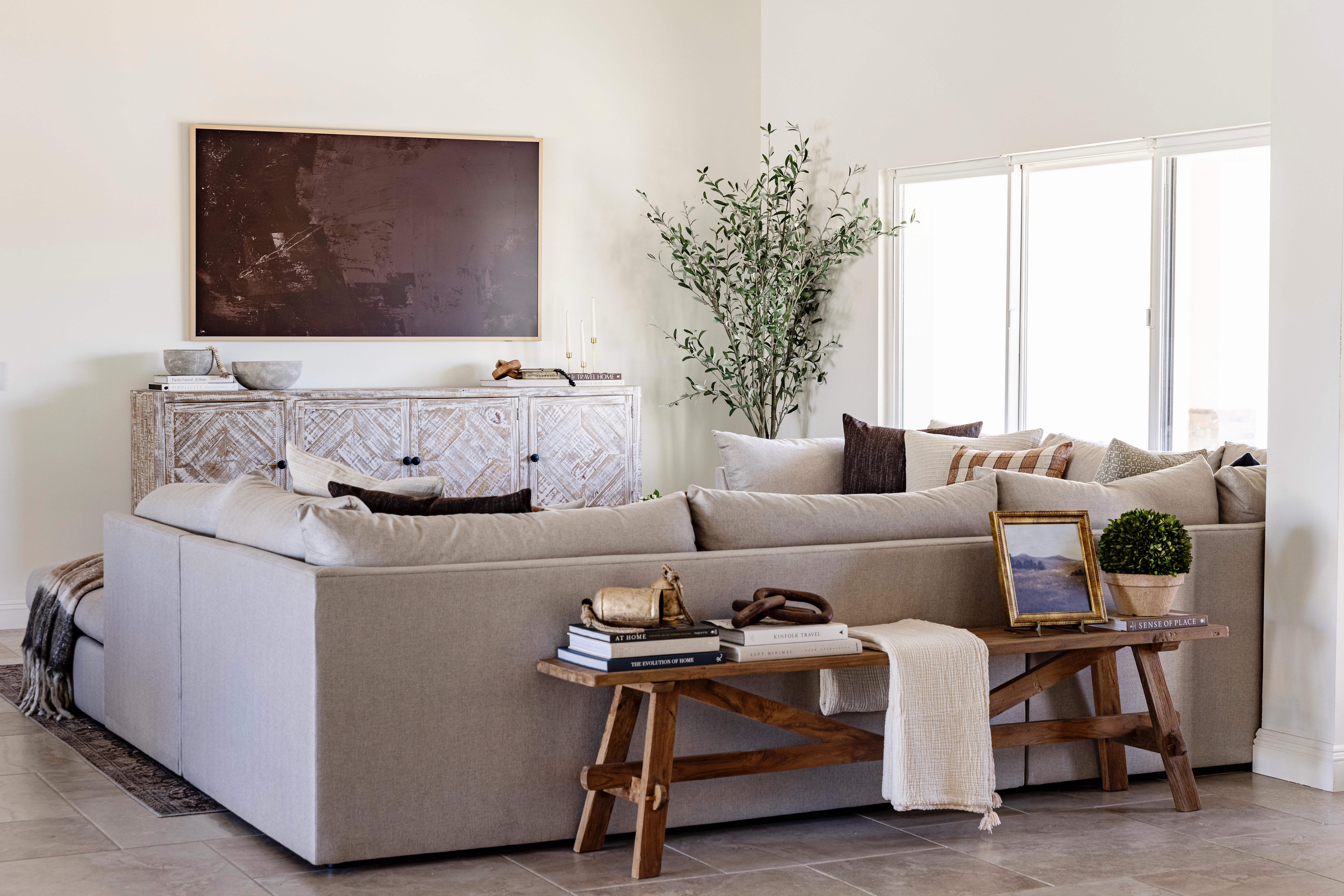 AFTER
AFTER
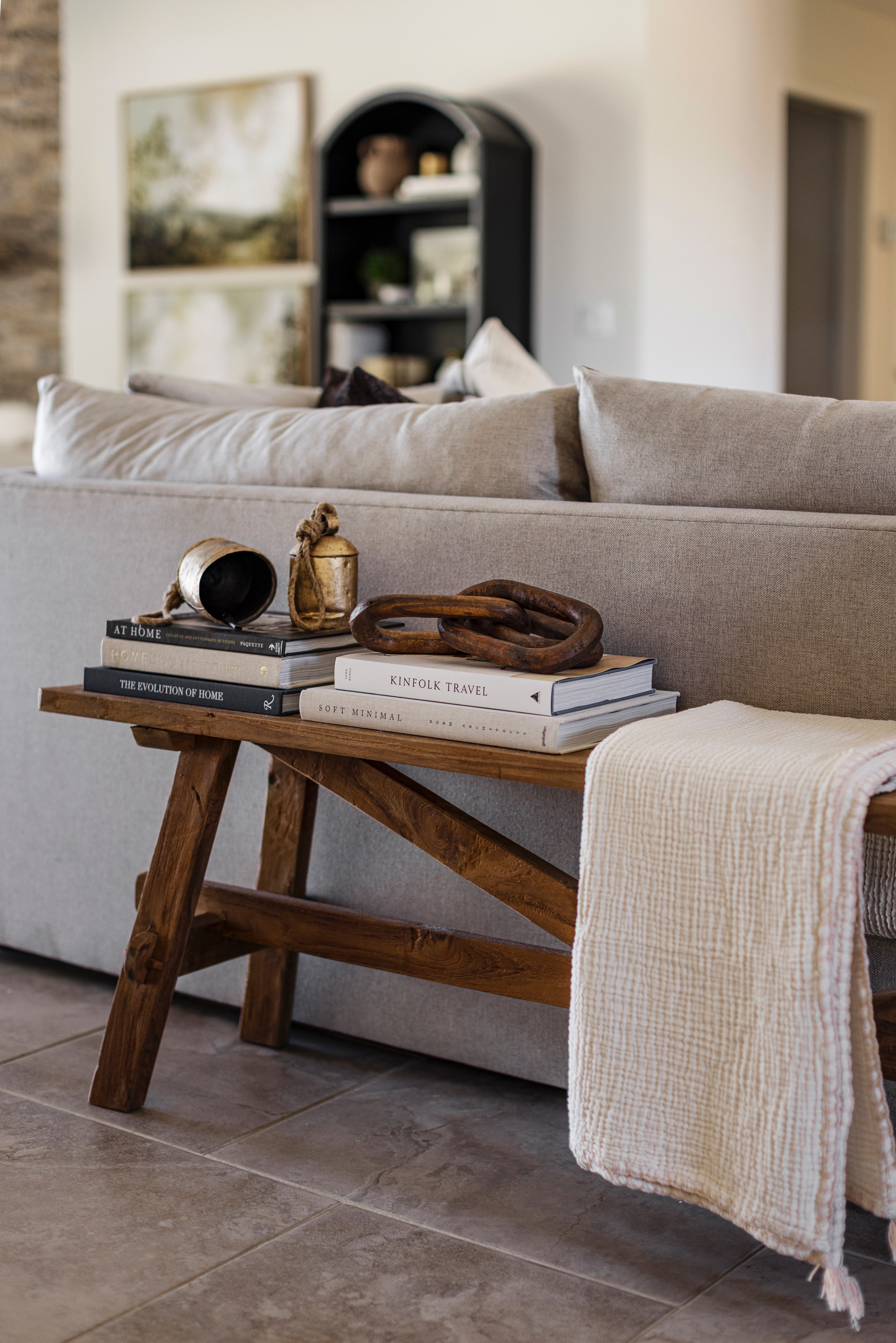
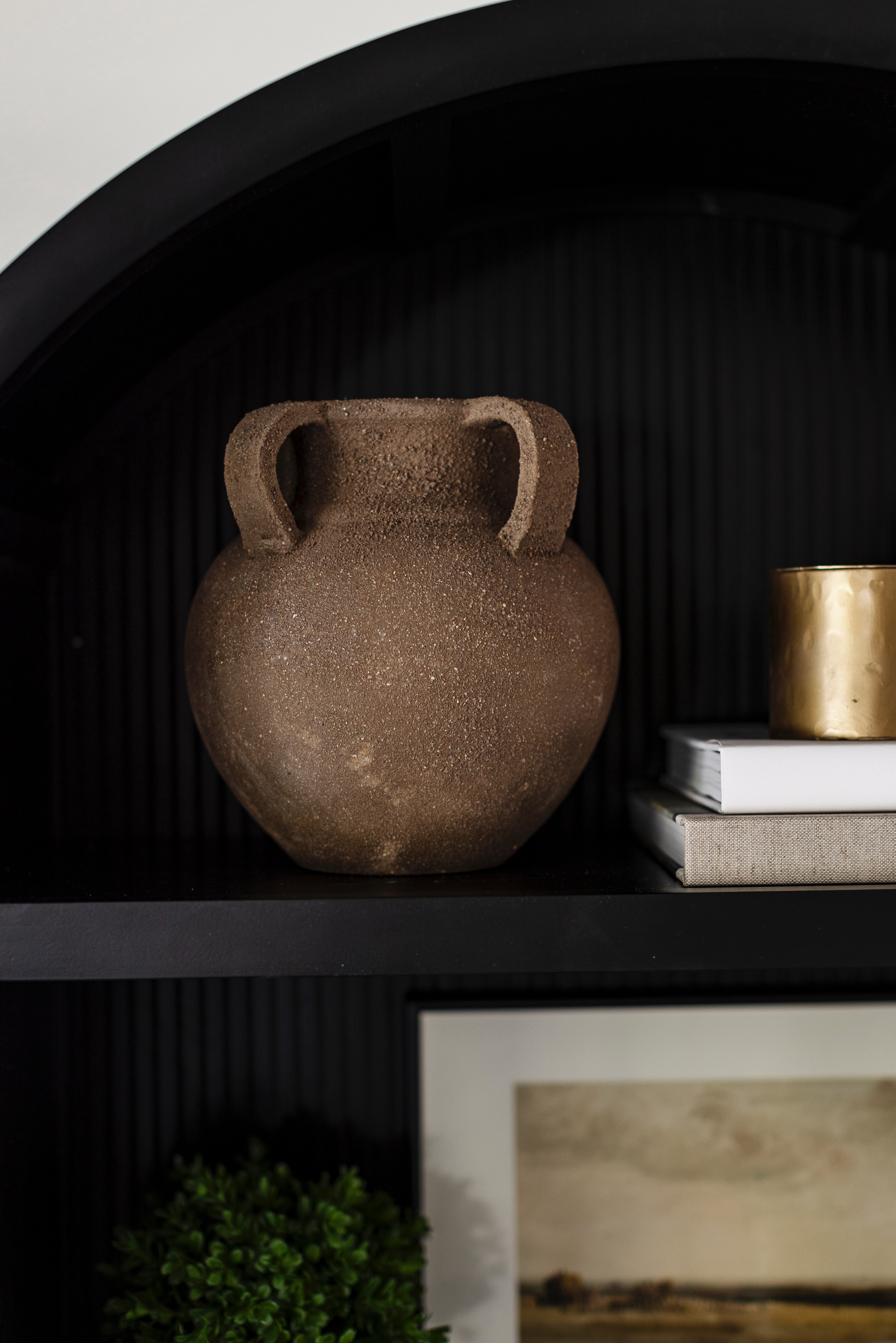
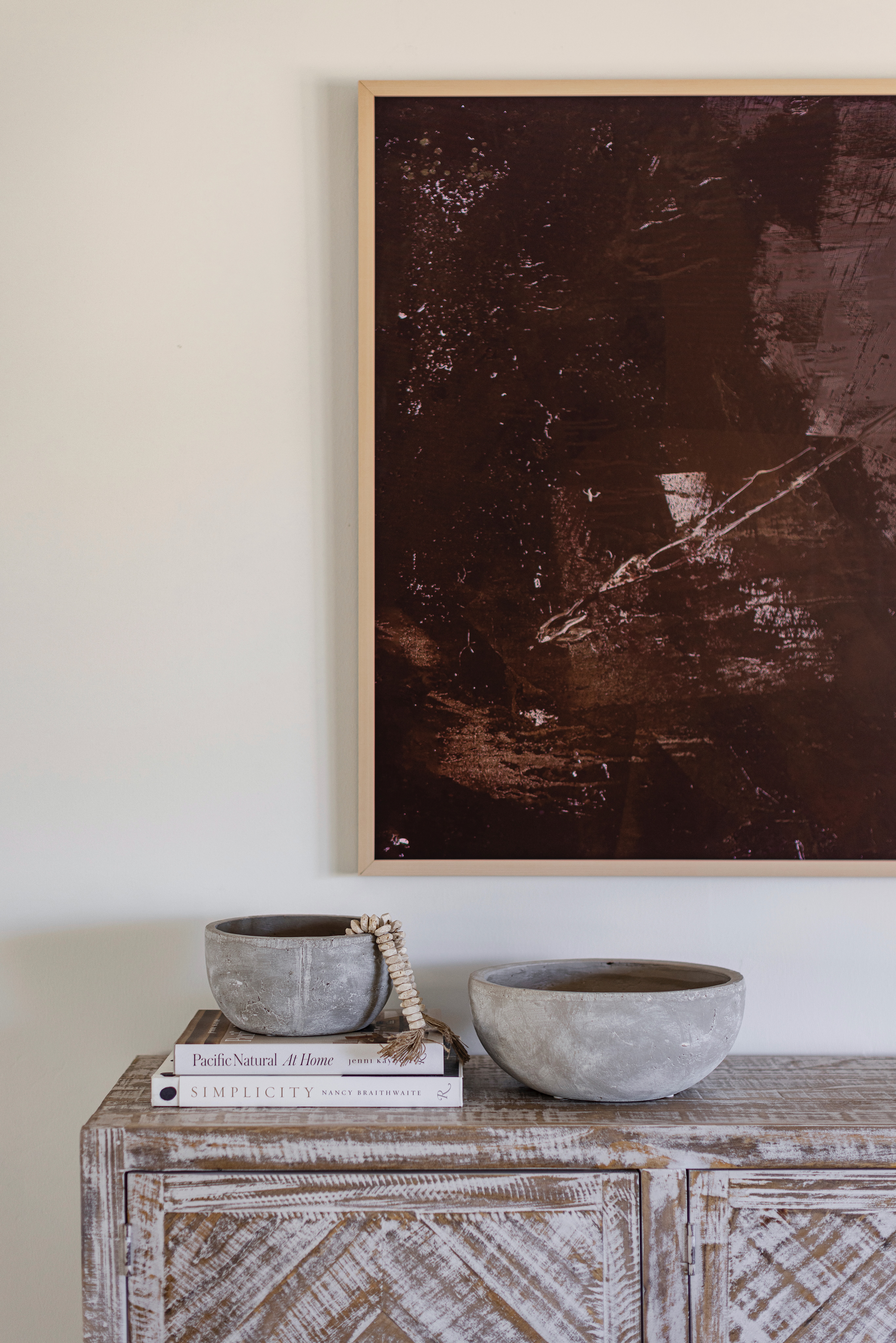
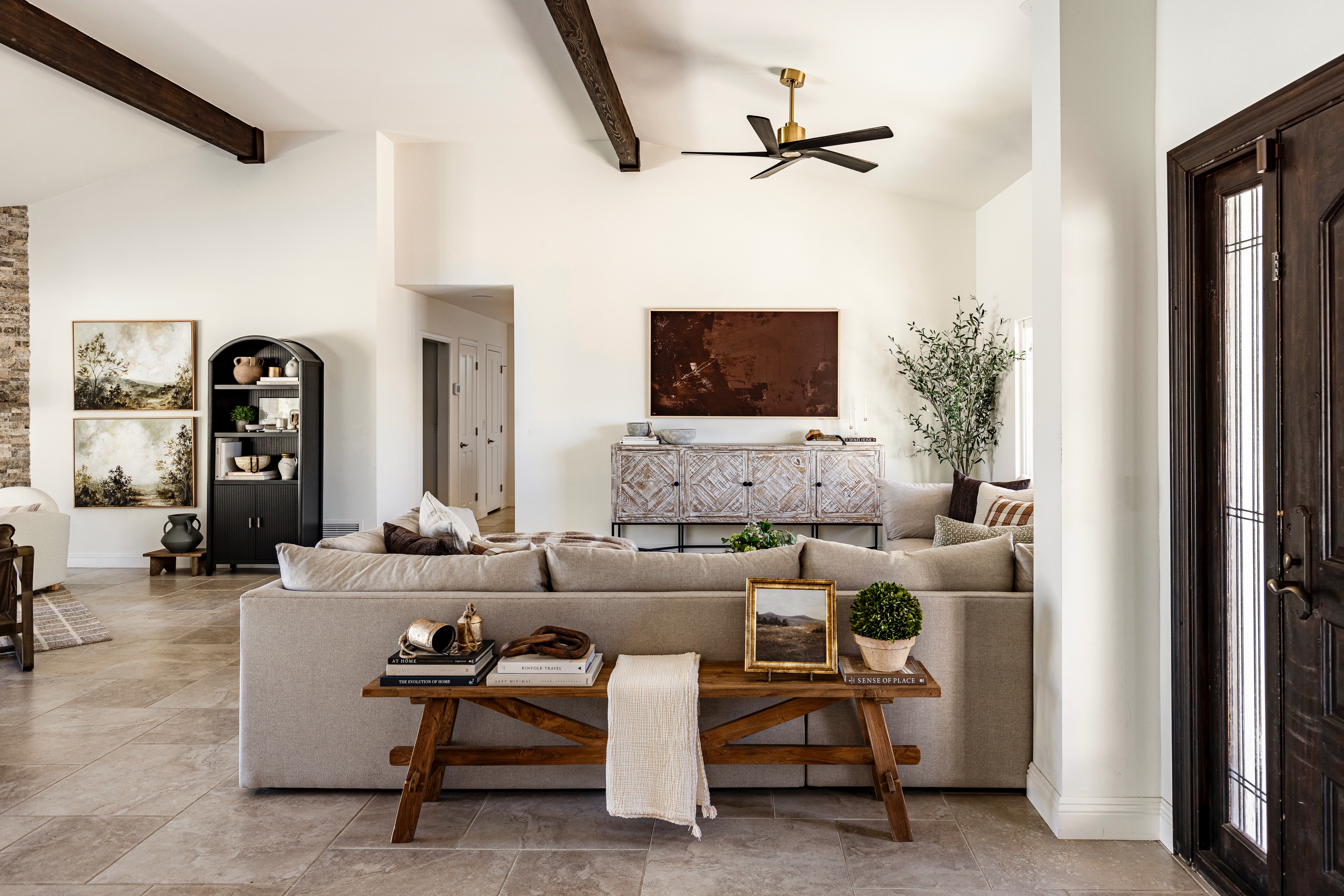
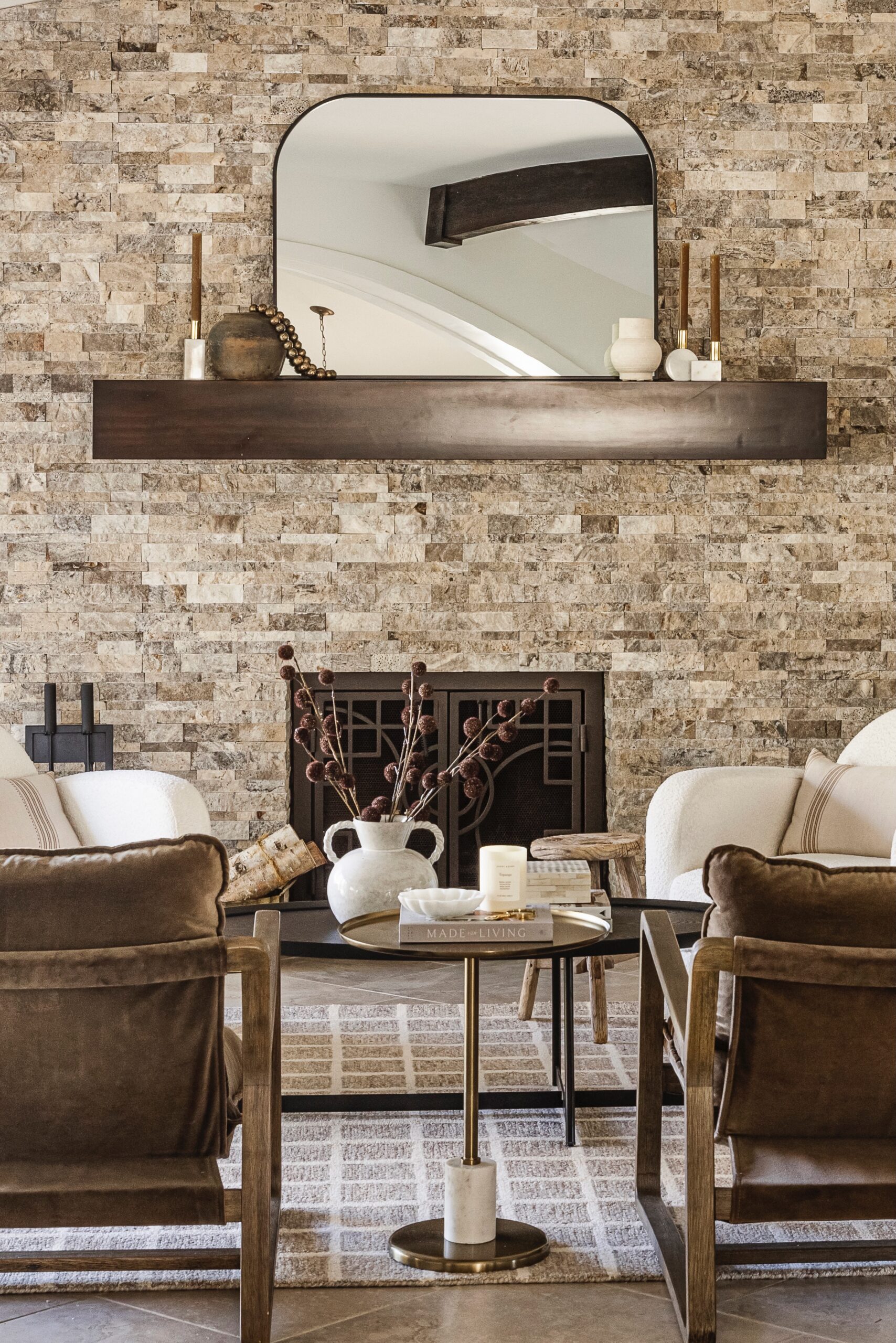
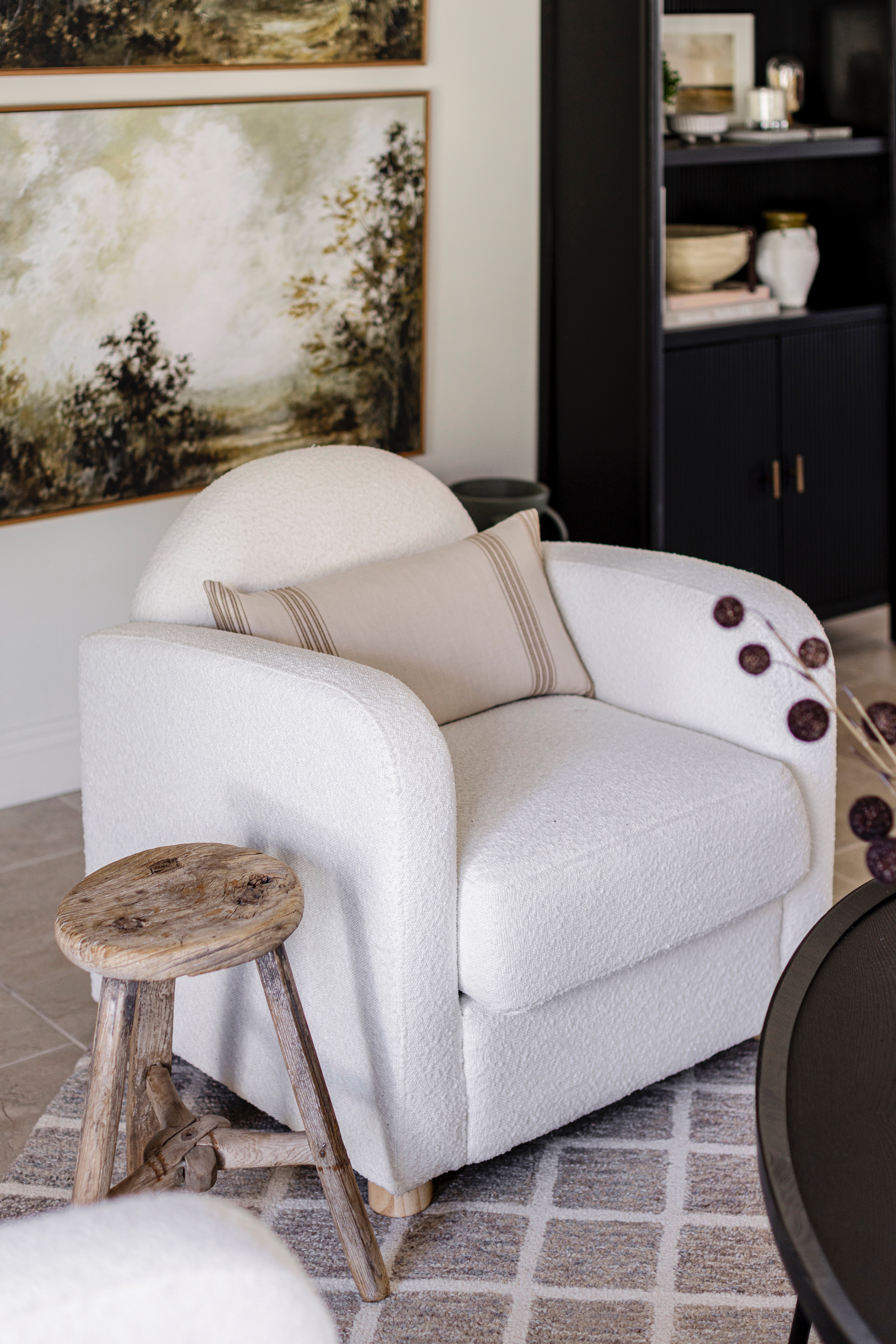
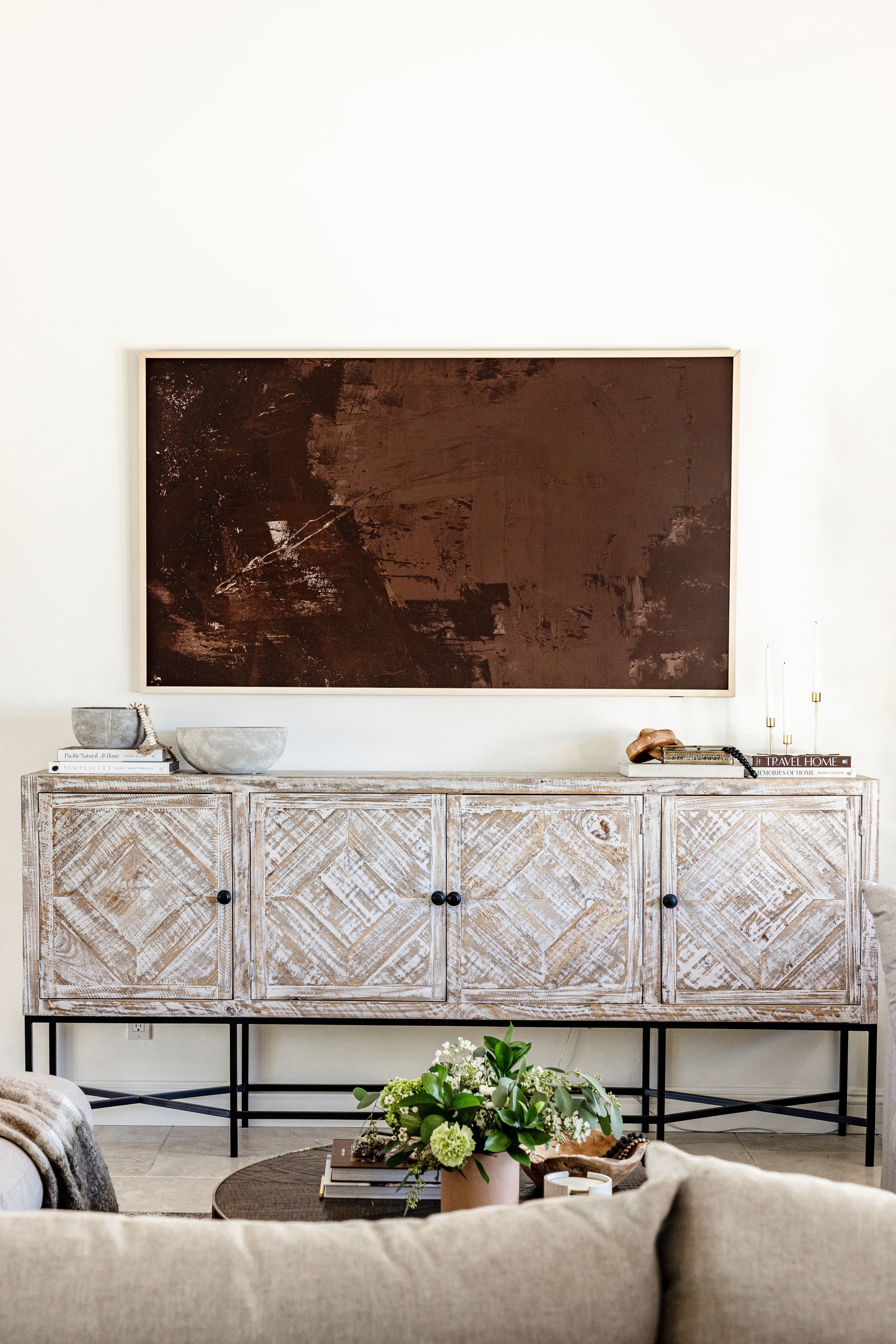
shop the great room
 JavaScript is currently disabled in this browser. Reactivate it to view this content.
Dining room
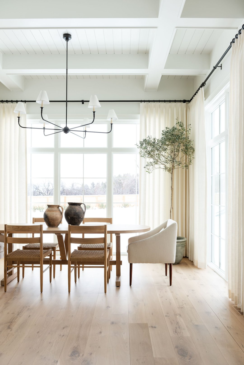
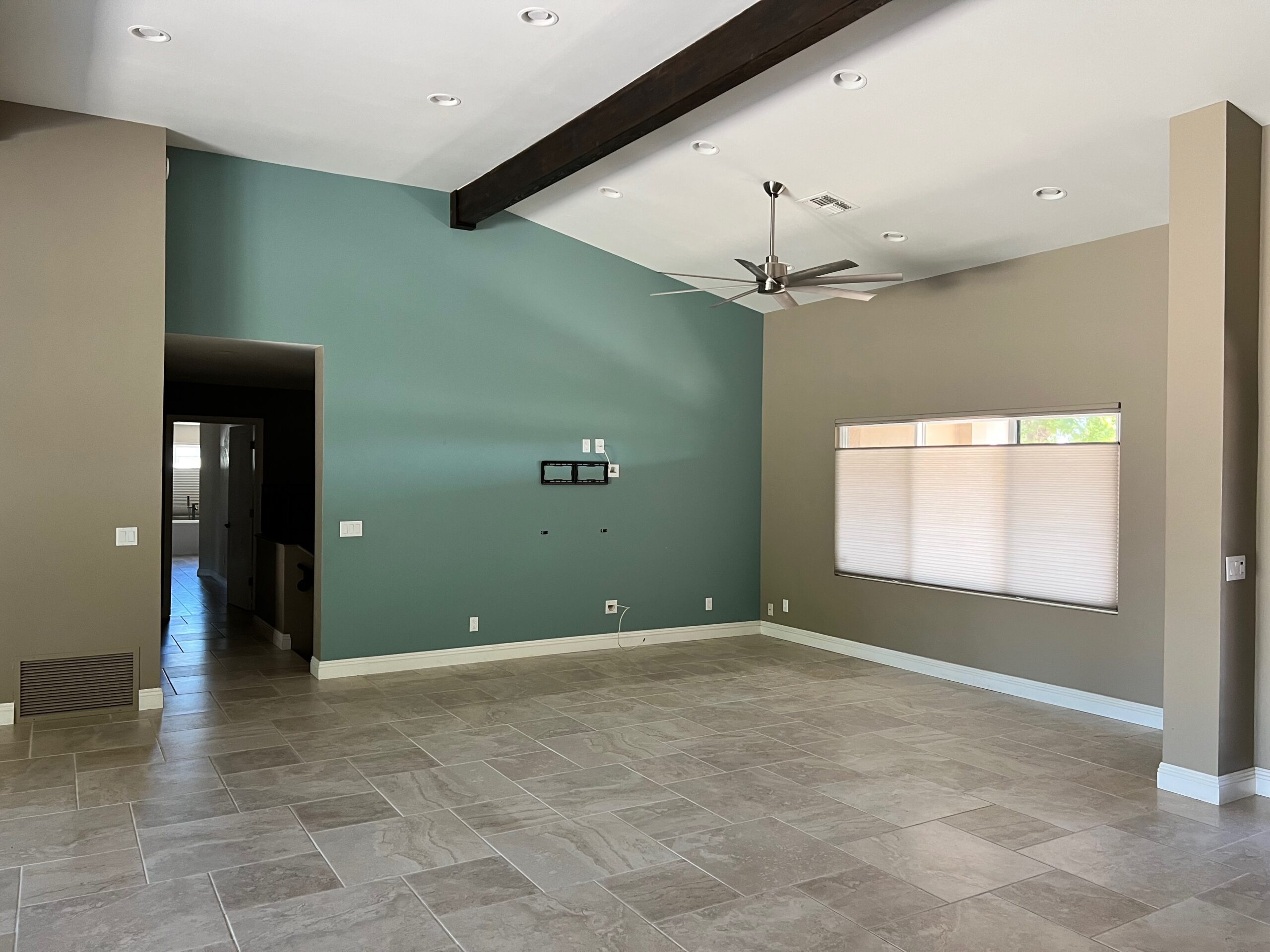
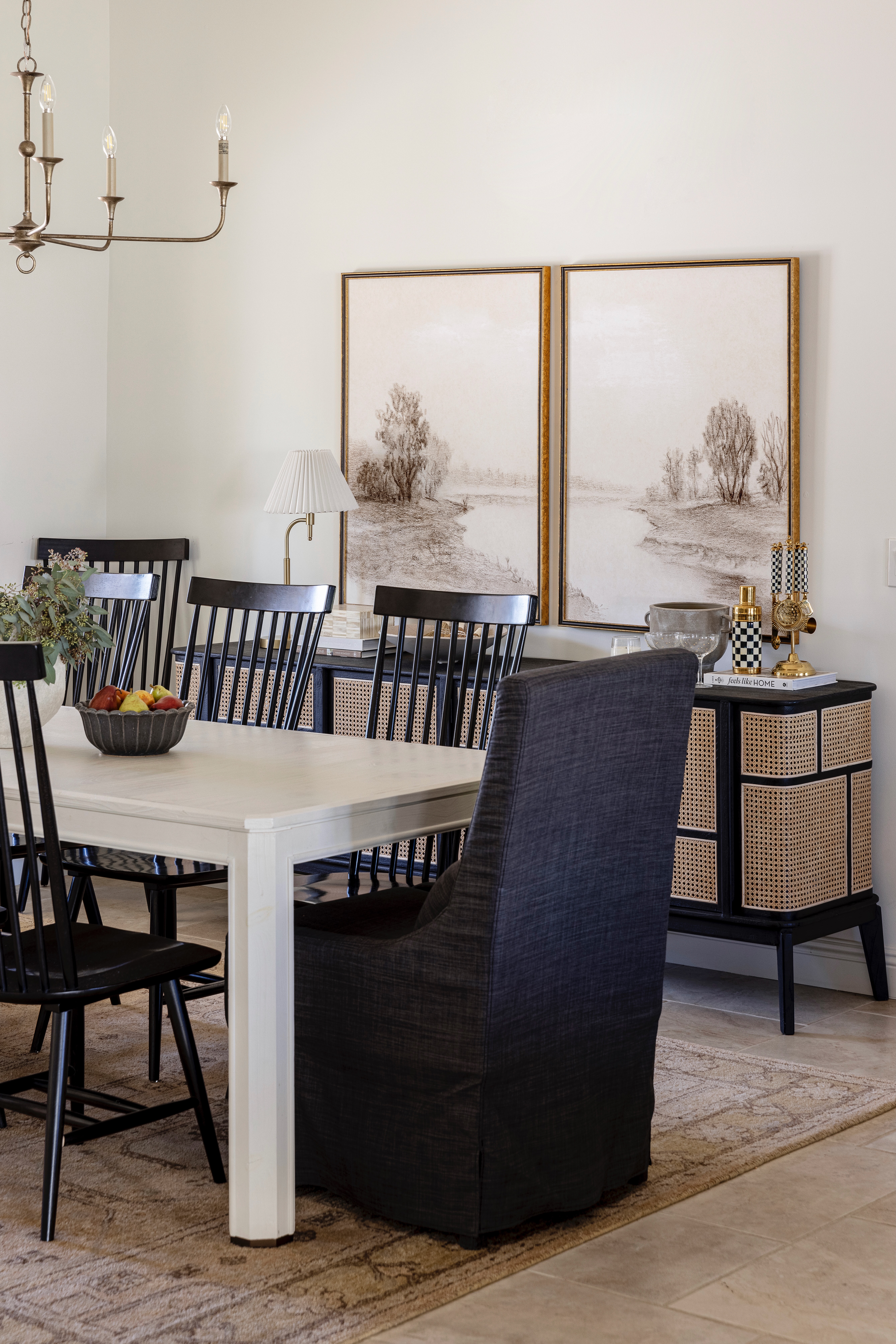
The dining room got a coat of paint and a new light fixture and looks like a completely different space! Getting rid of the bright teal made all the difference the champagne metal of the chandelier feels refined in a way that the previous light did not.
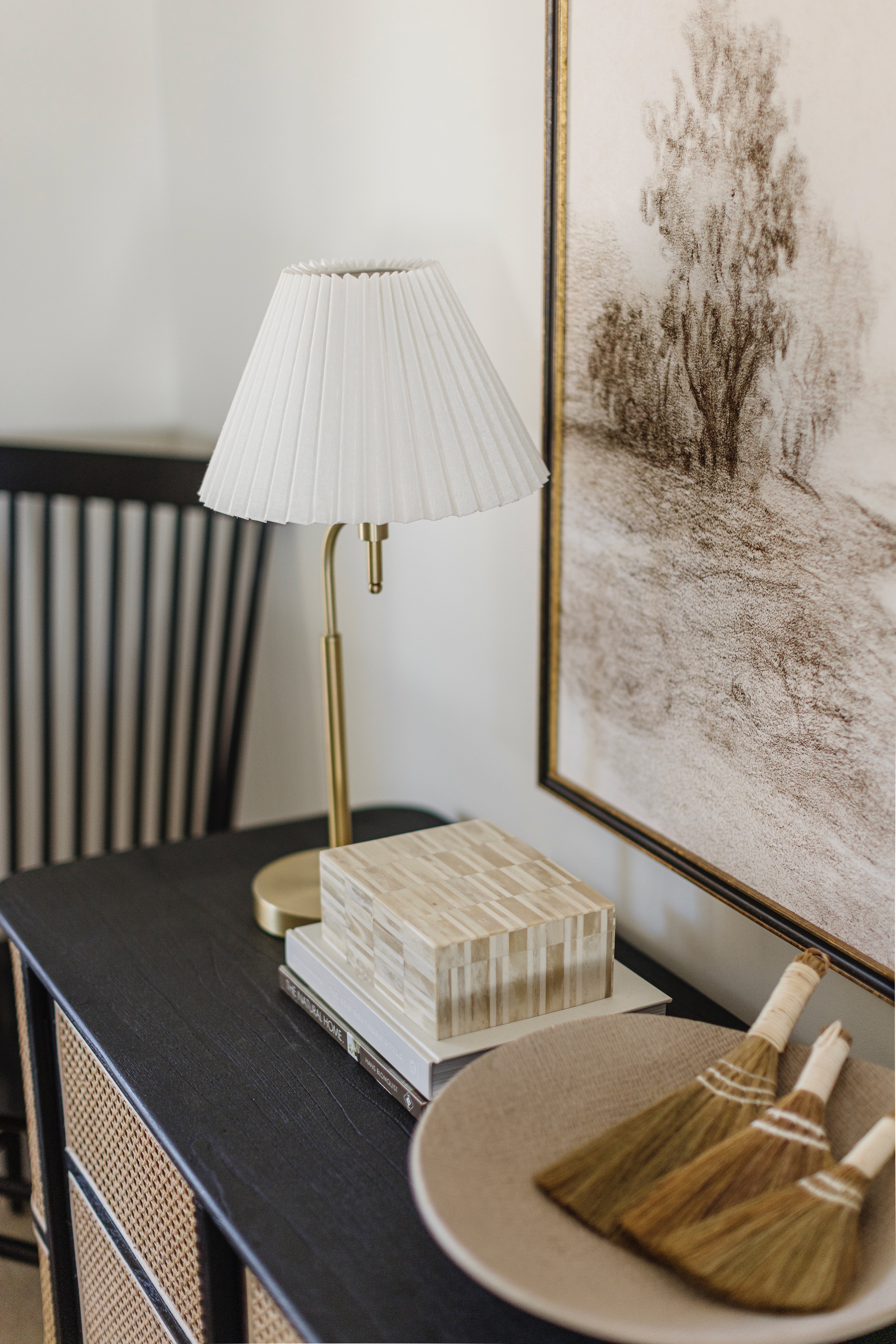
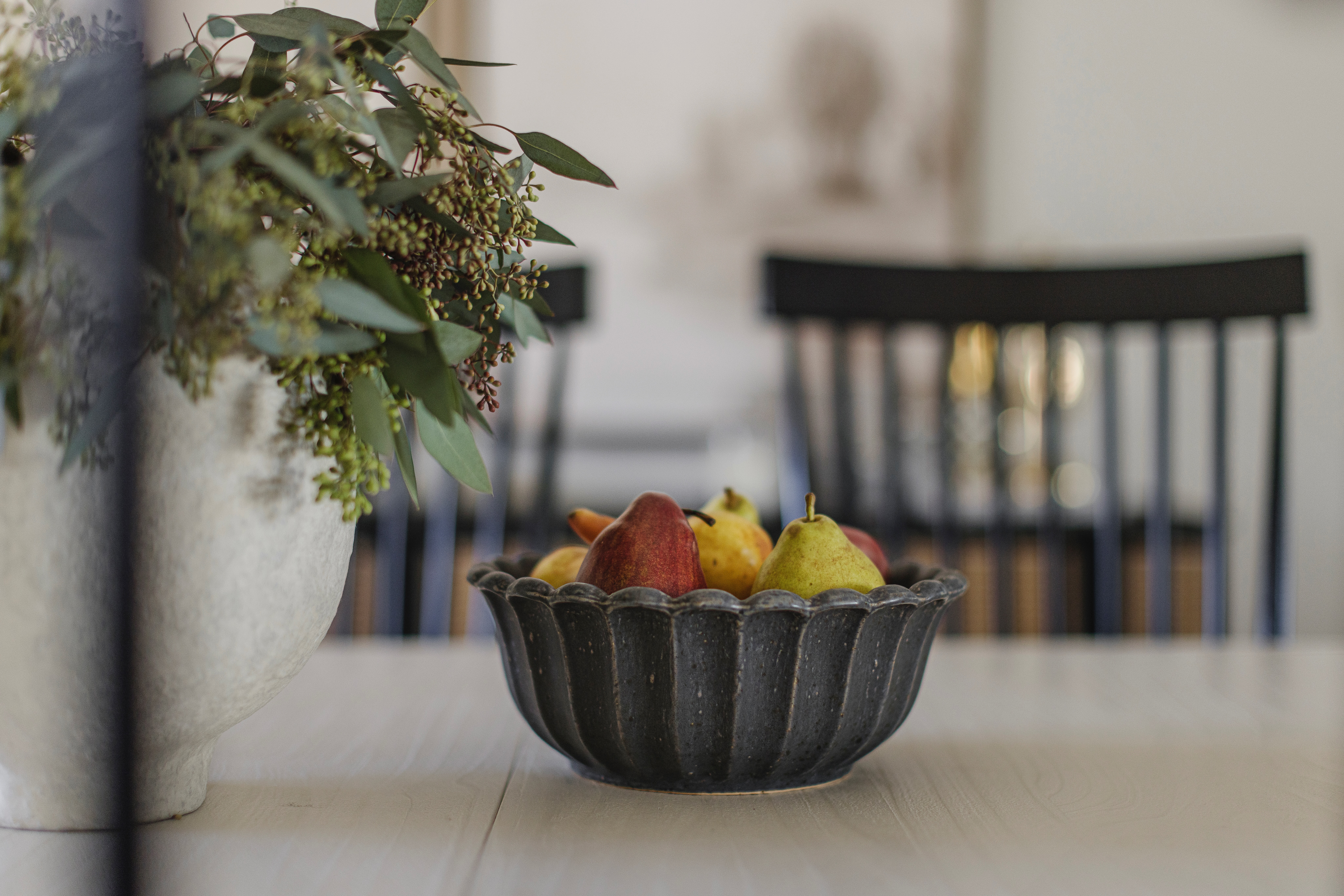
The room is anchored with a rug that I loved from our previous home. I used it in our bedroom, but I thought it would work well in the dining room. It doesn’t contrast much with the floor, but with the other pops of black in the room I like that it’s more subtle. My favorite piece in the room is the black and cane sideboard. It’s add so much texture, but it’s great for storing additional liquor and serve wear inside. The art is from Juniper Print shop again and it’s so pretty and serene. I like that it adds a softness to the space with the cream and sepia tones. And the slipcovered head chairs also help to bring an inviting coziness to the dining room as well.
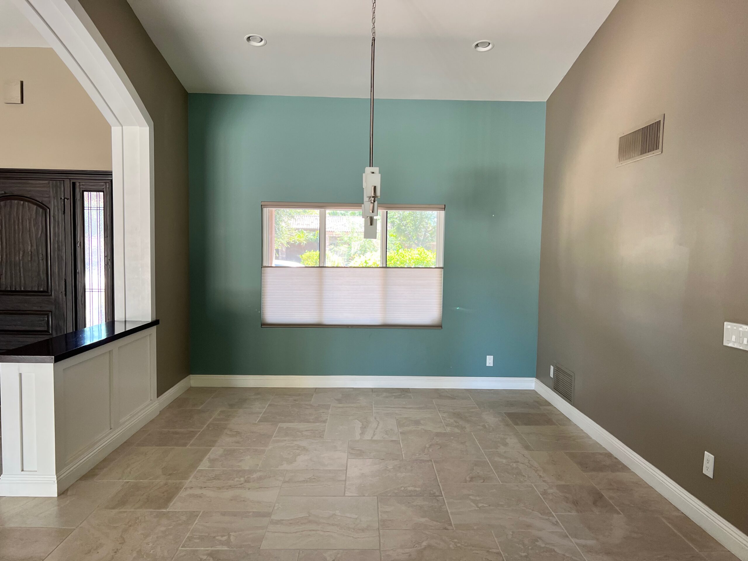 BEFORE
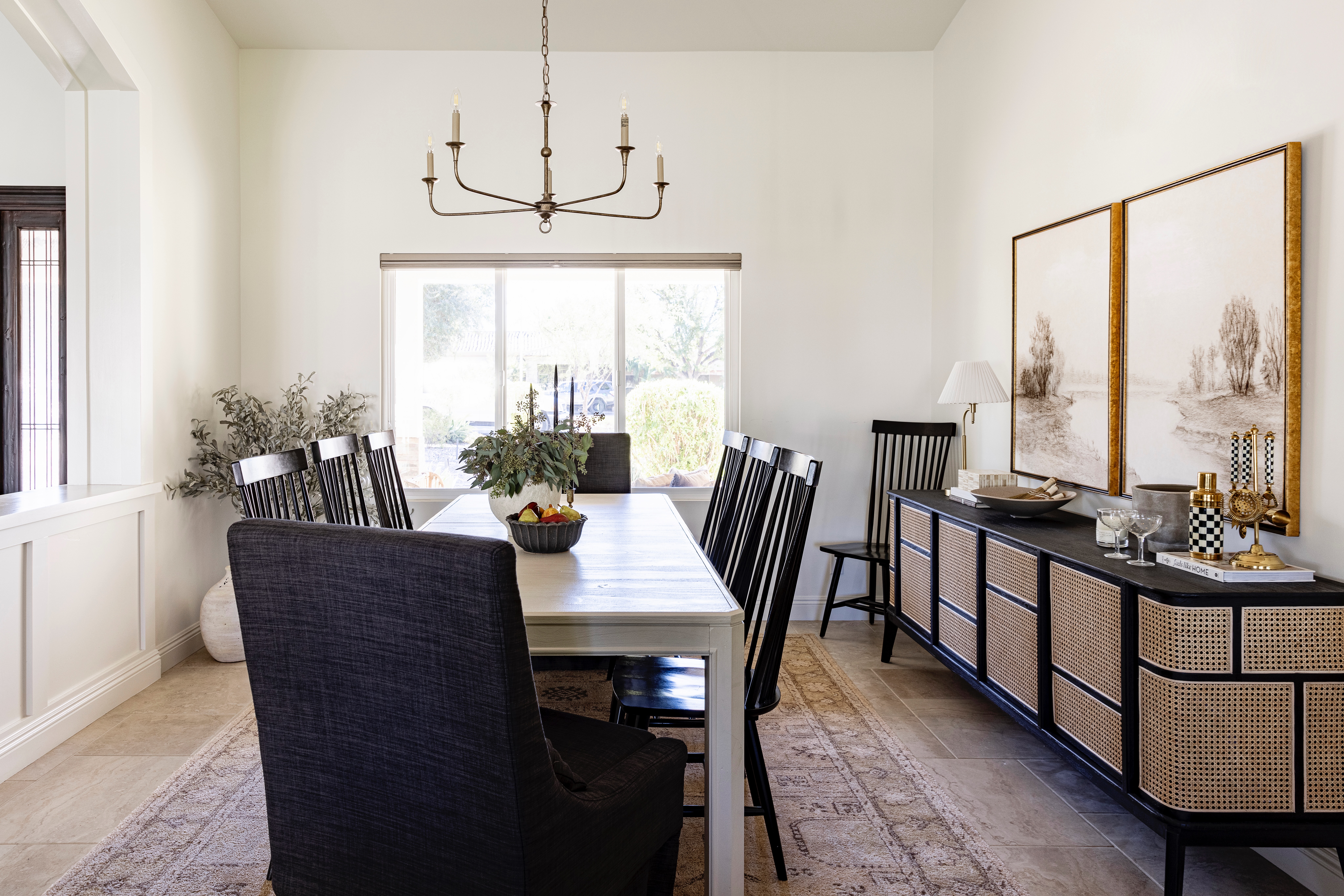 AFTER
AFTER
shop the dining room
 JavaScript is currently disabled in this browser. Reactivate it to view this content.
KITCHEN
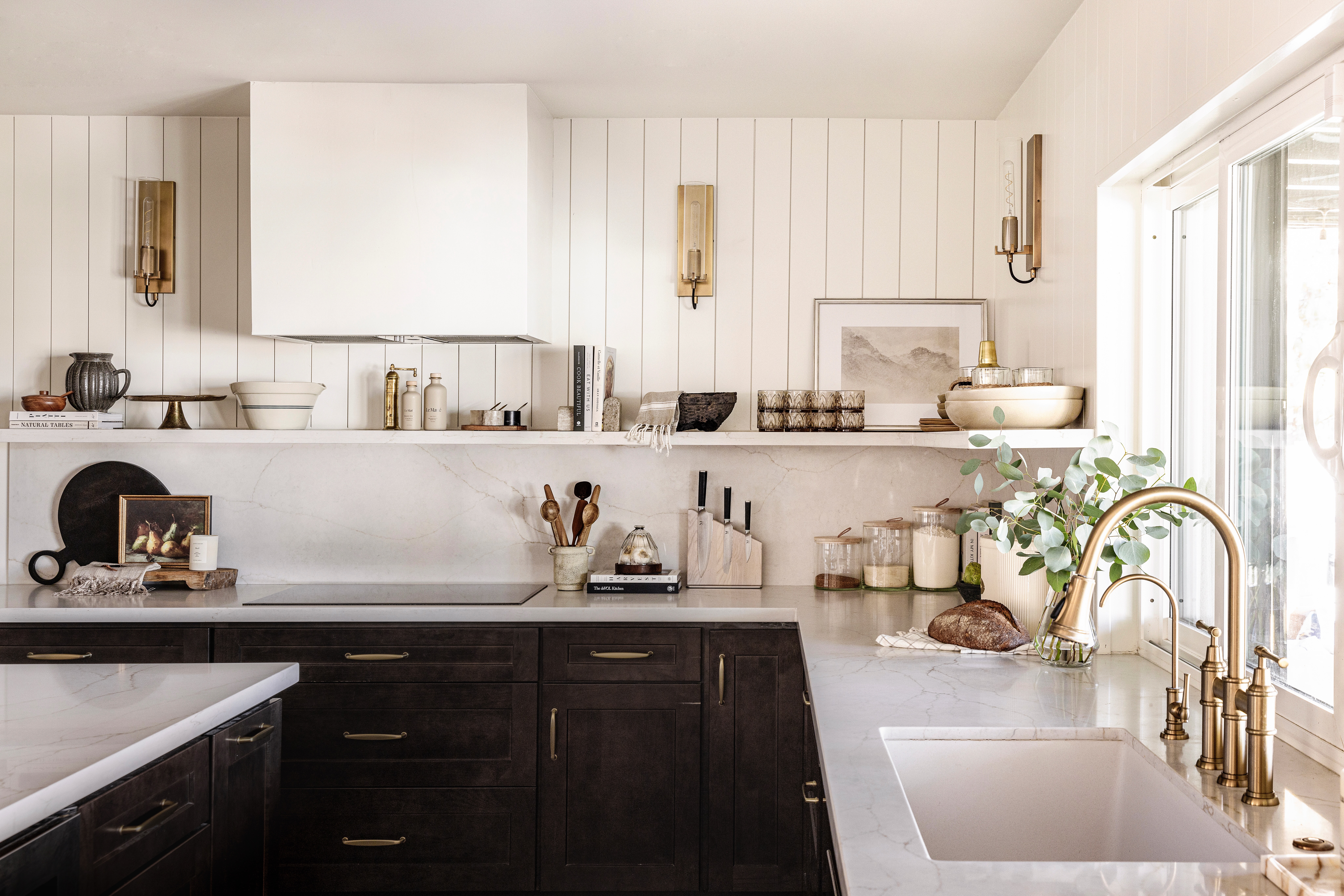
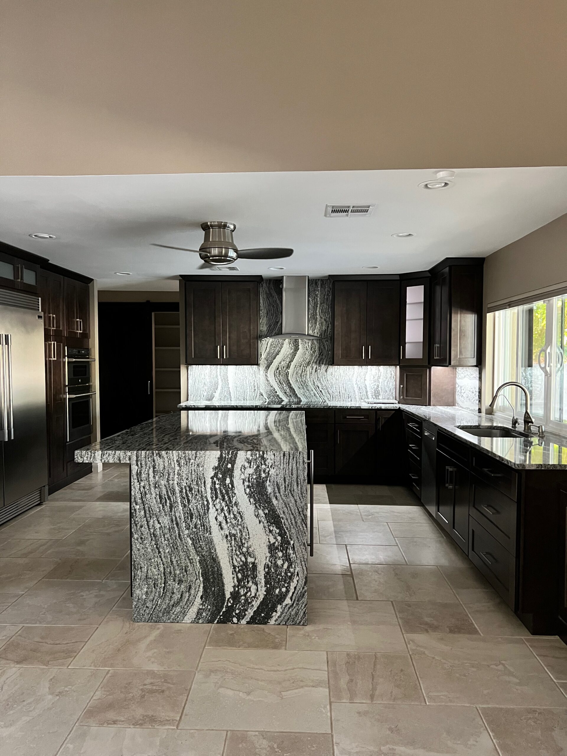
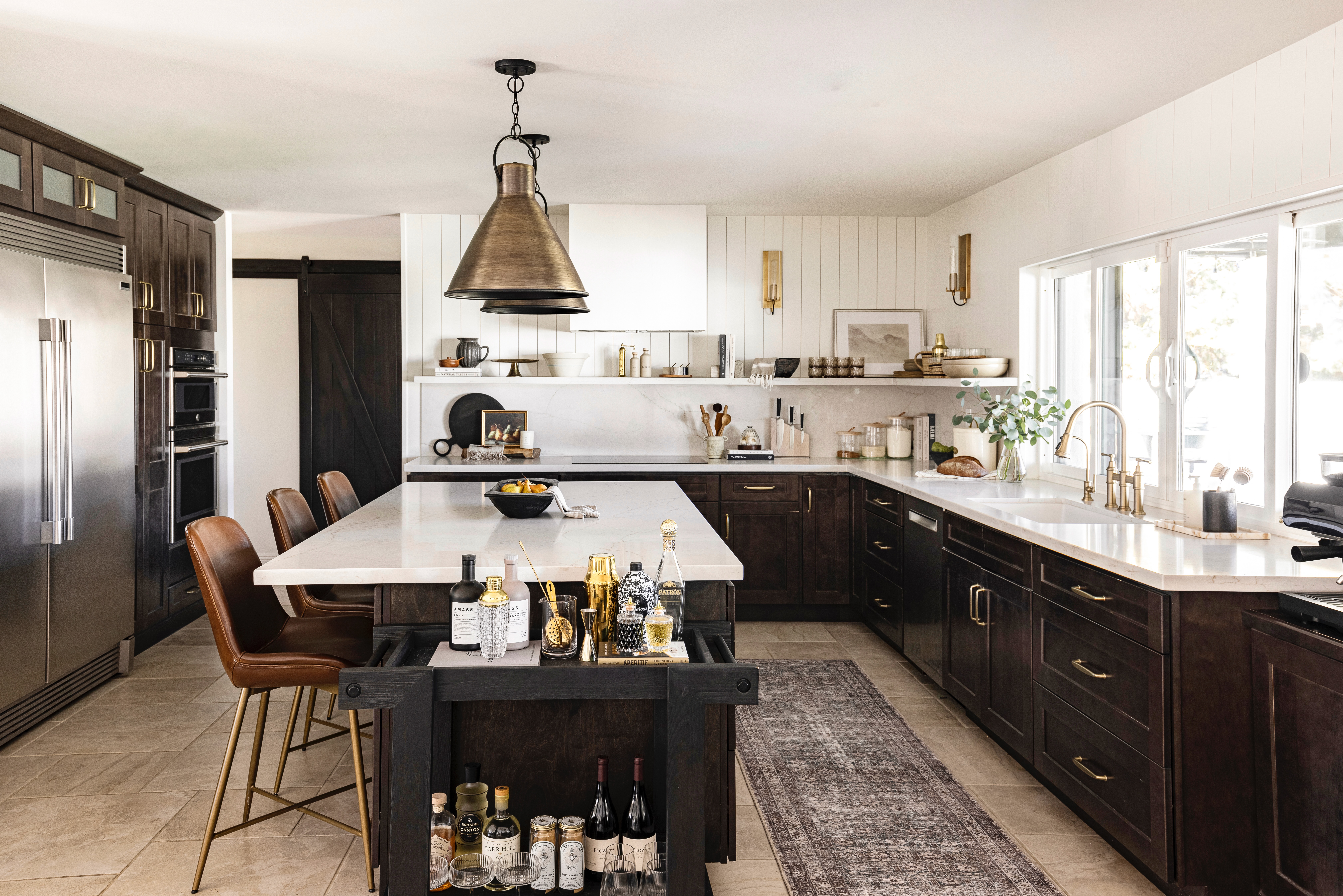
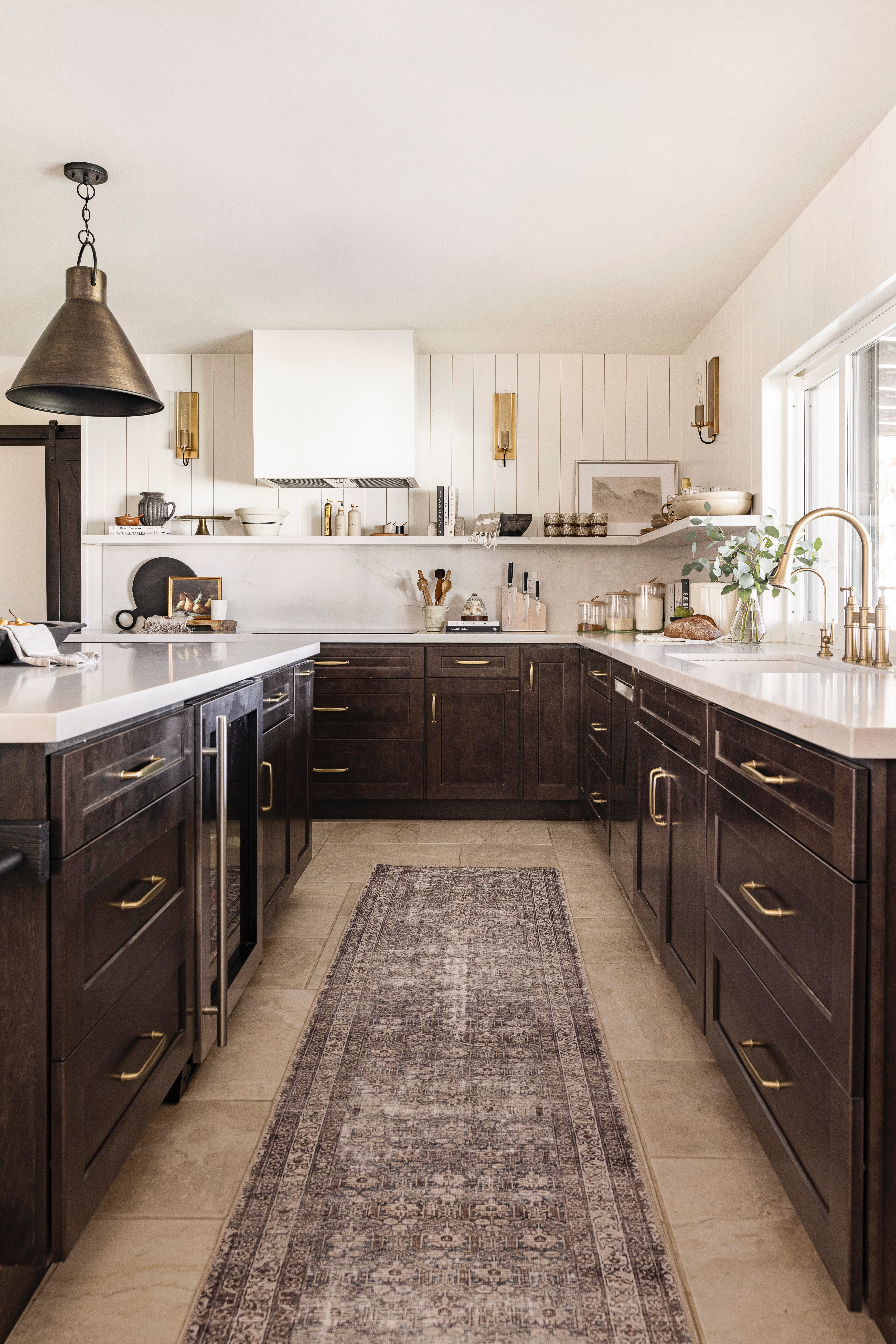
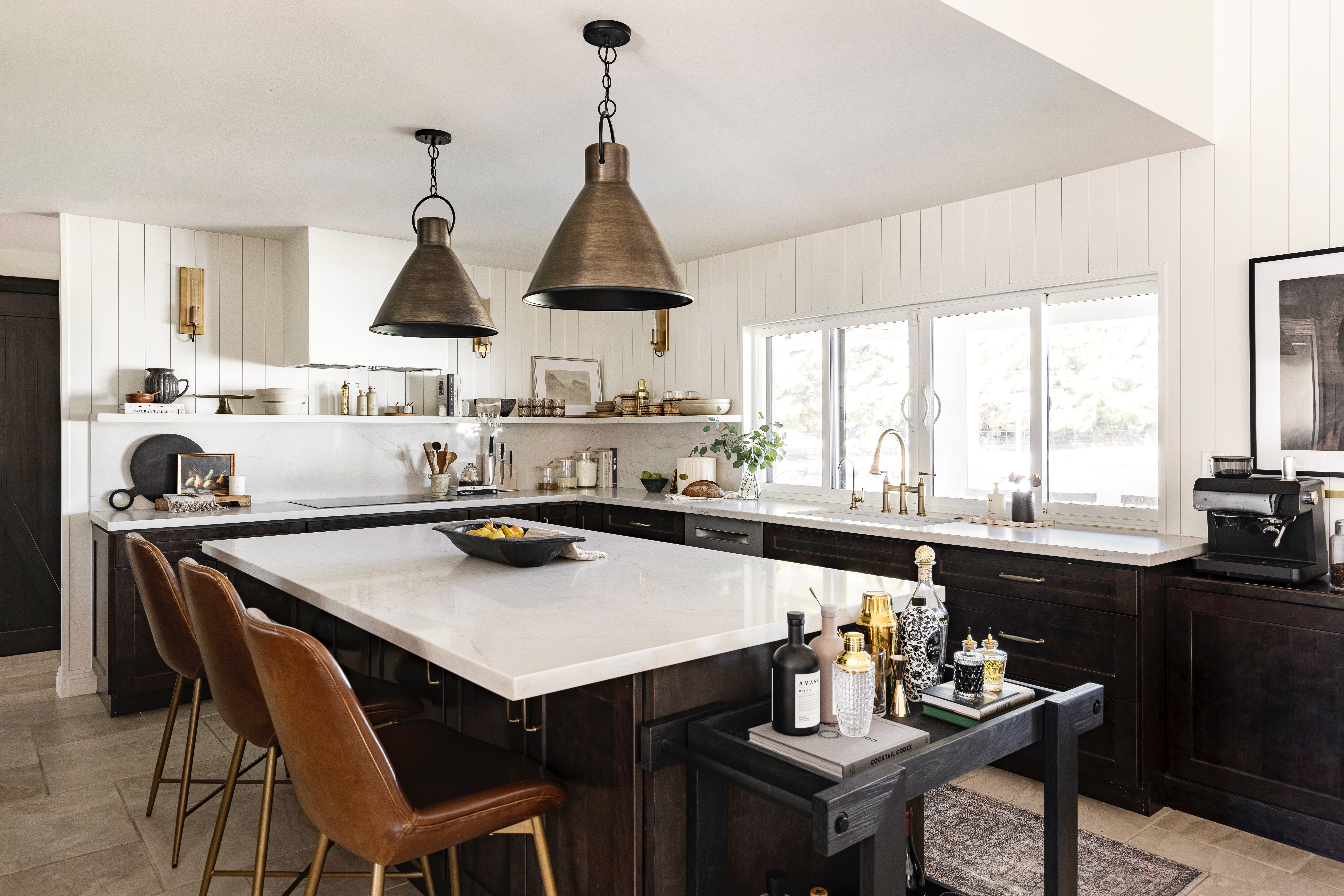
The kitchen was the largest transformation! We spend a lot of time hosting and hanging out in the kitchen and although we knew this house was only going to be our home for a little bit it was a space that I did not want to live with for 2-3 years.
To each their own and all, but you guys…this countertop and slab splash. What in the world? Like a river of granite running through it. It was not for me. The kitchen just had a modern feeling that didn’t suit our tastes at all. And the kitchen really does set the tone for the rest of the home, so we had to make a change. However, we didn’t want to spend the time or money changing out the cabinets or the floors, so we kept both!
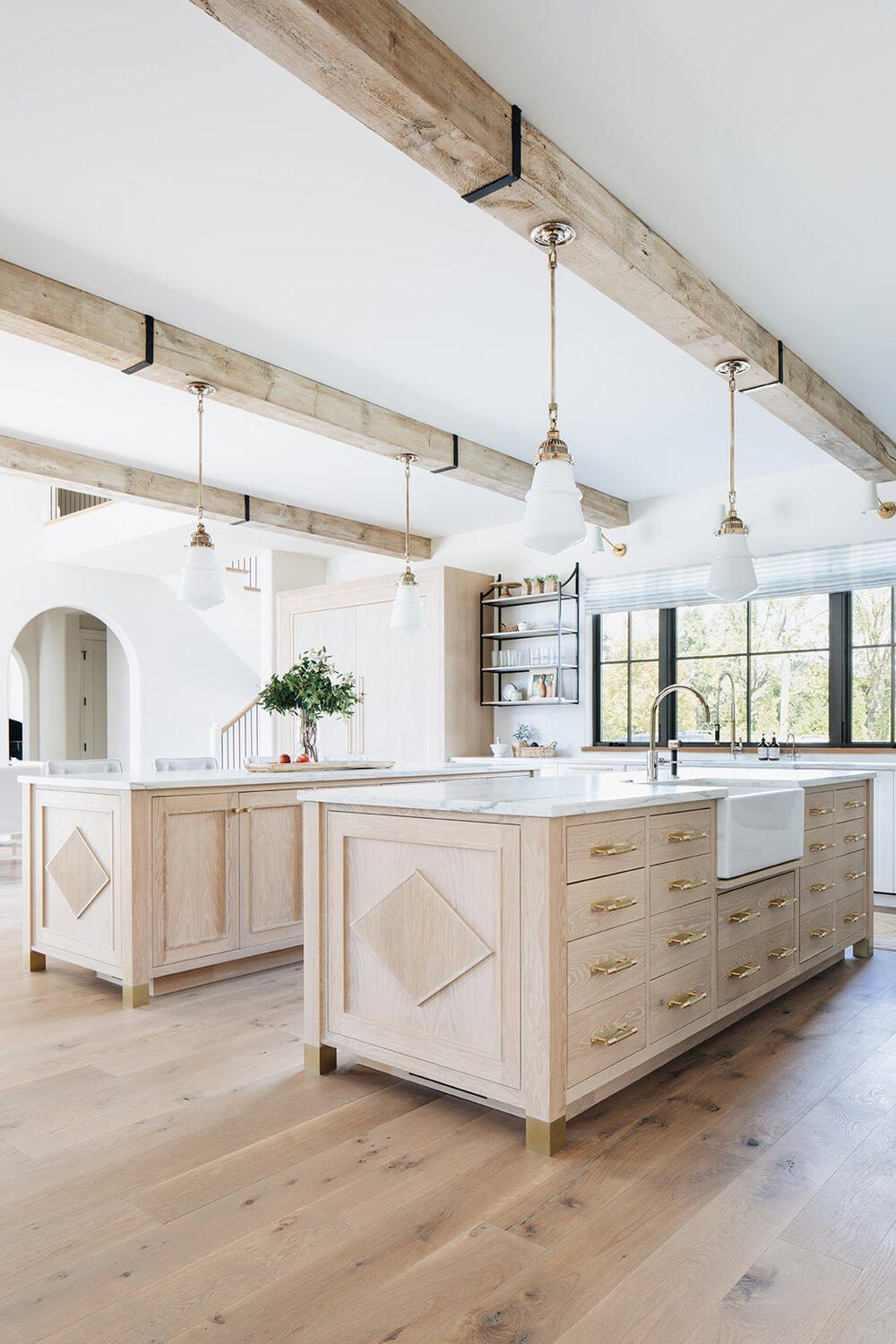
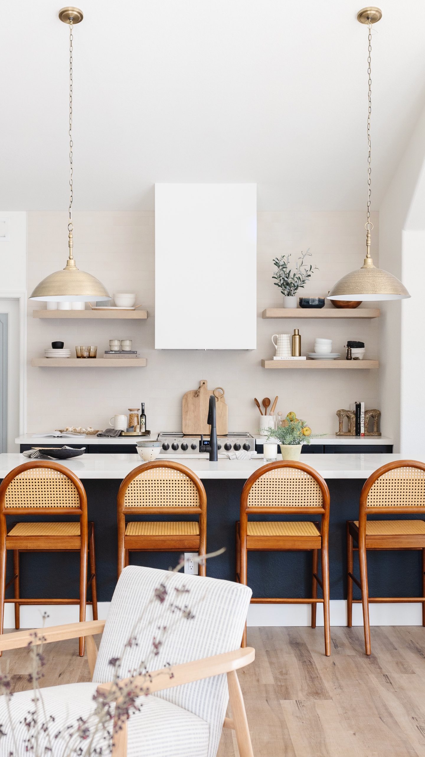
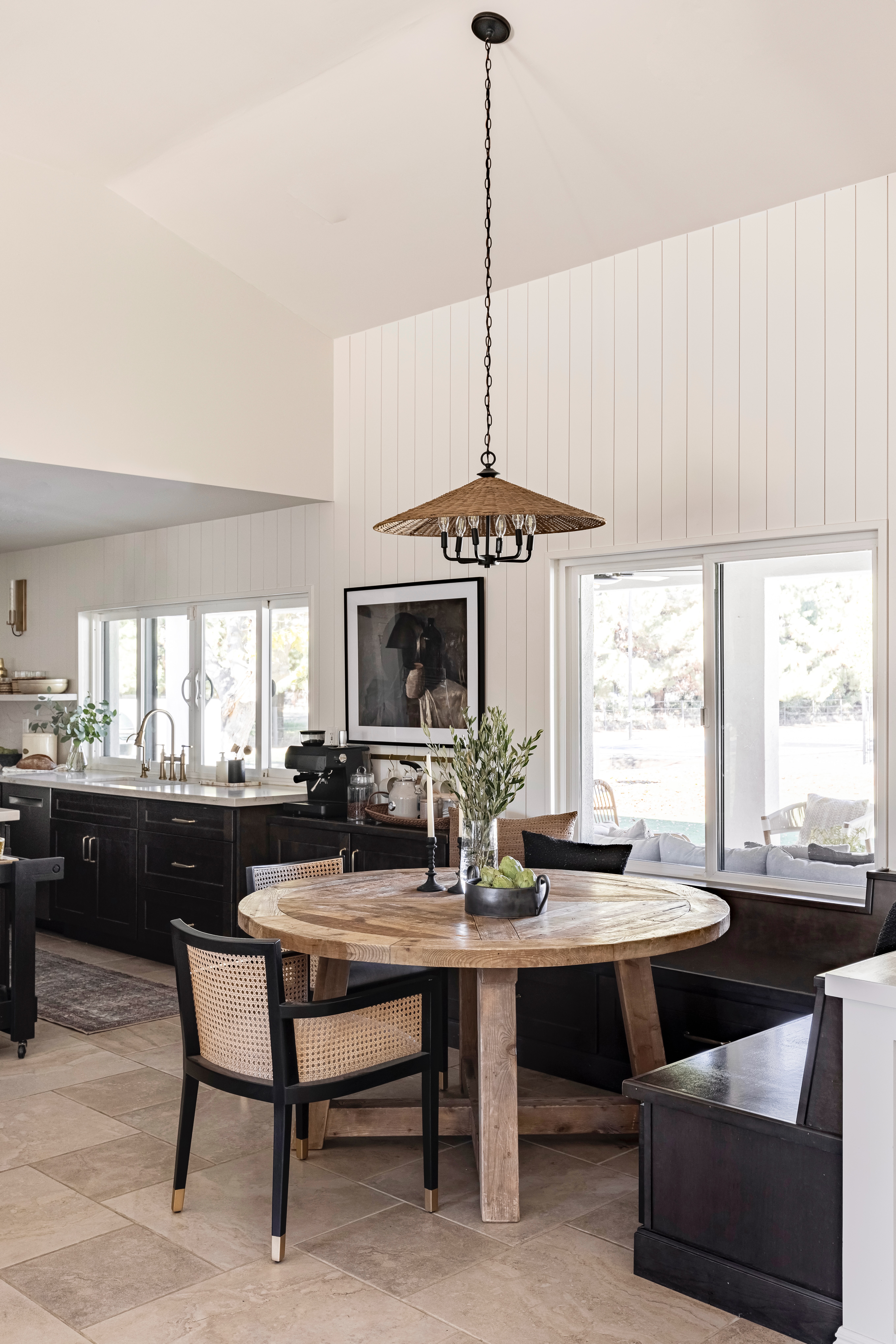
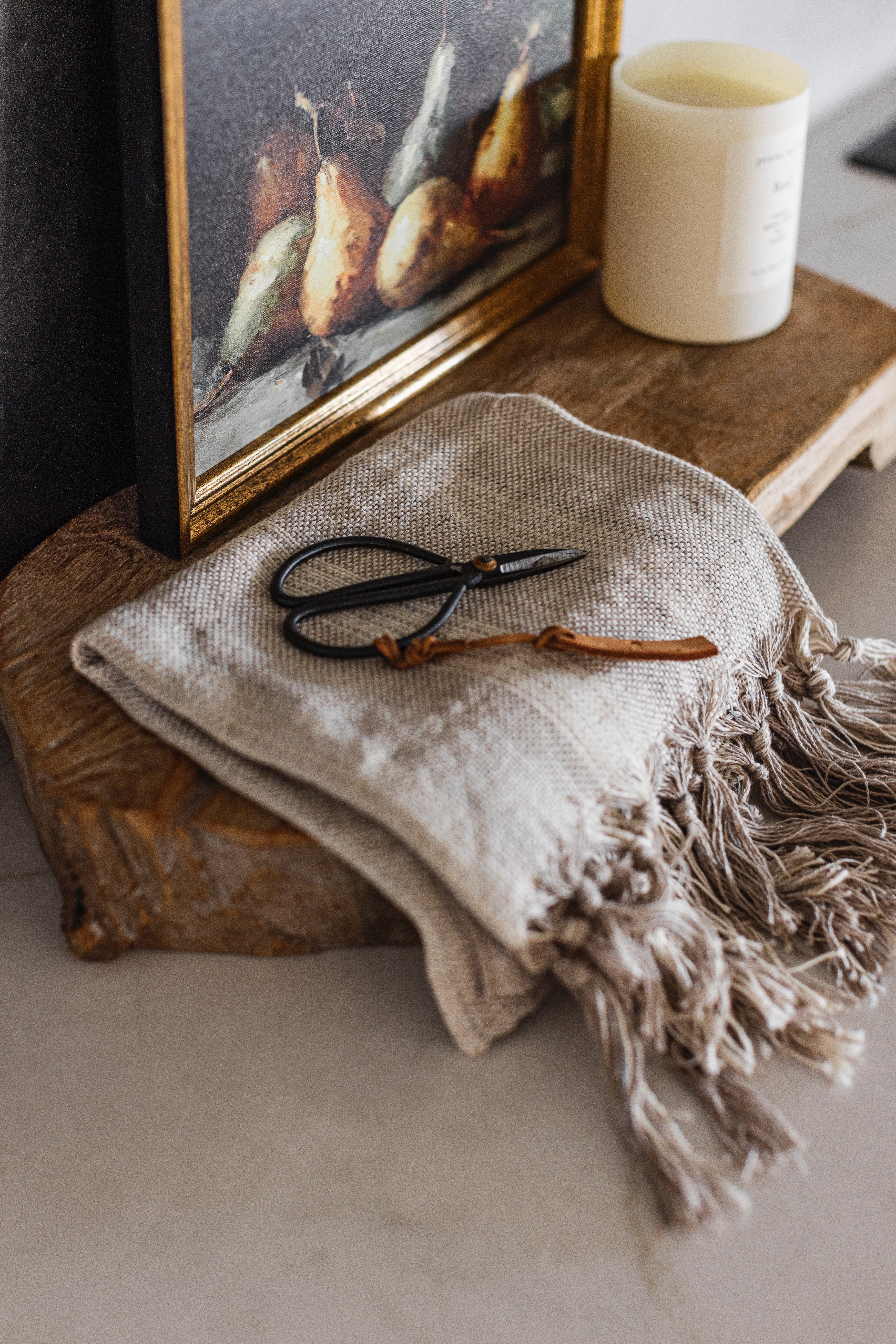
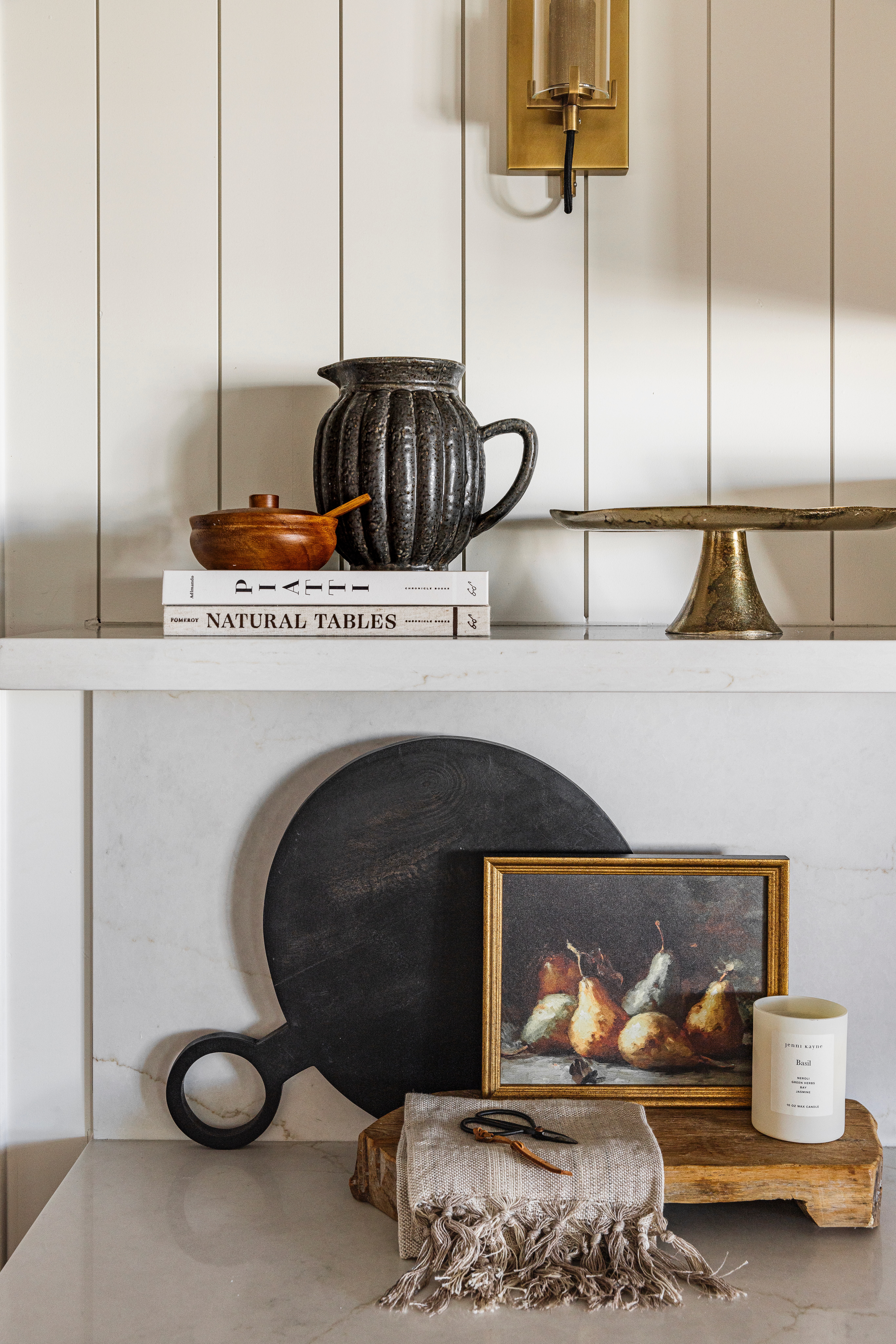
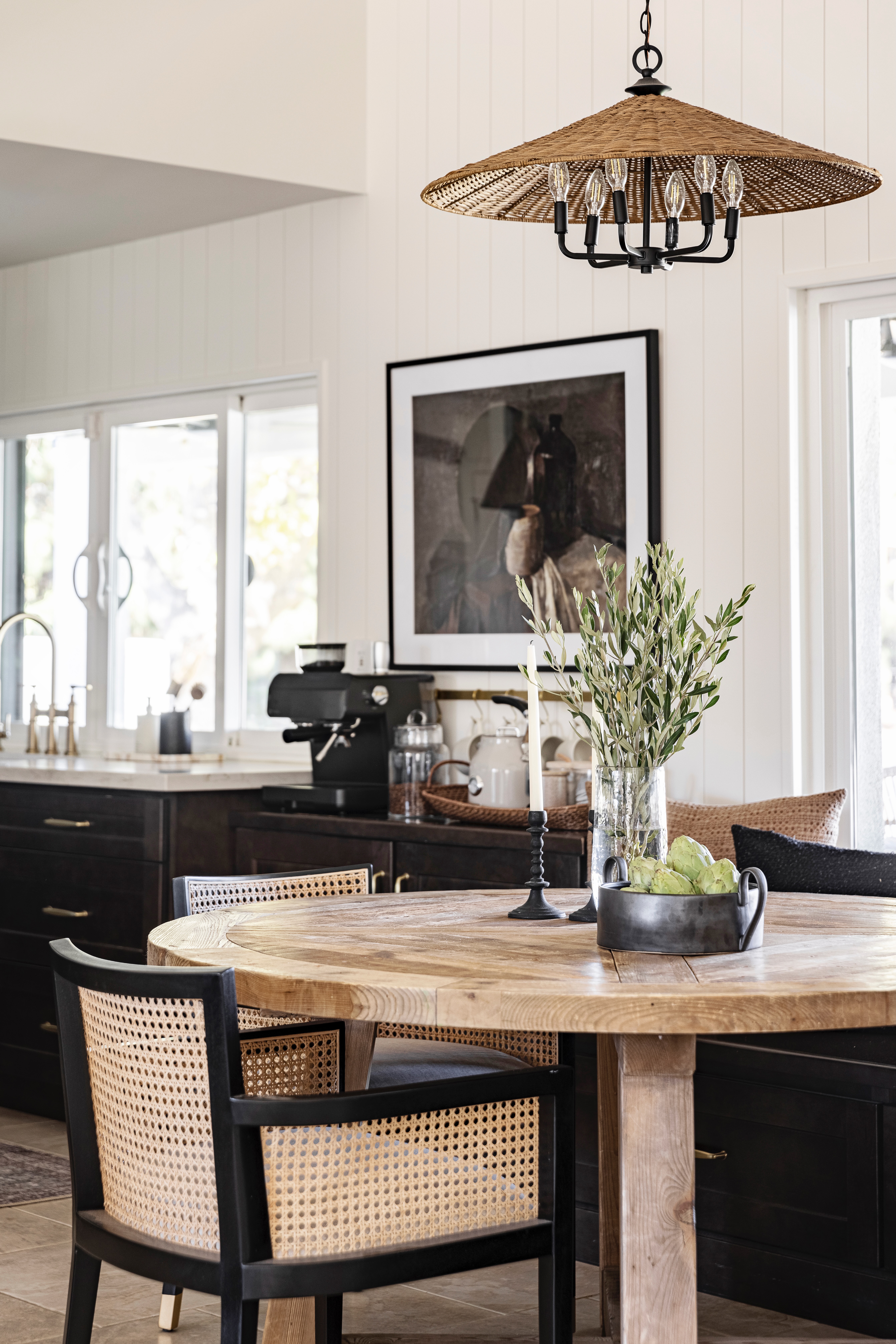
But in order to make sure that the kitchen felt light and bright, we chose to remove all of the upper cabinets, as well as the countertops and slab splash. We have so much storage in the kitchen with the pantry, island cabinetry and more. But we did add a 12 in deep quartz shelf to keep some everyday items accessible and also for me to style. And I am obsessed with how it turned out! We also added a new drywall range hood, vertical paneling, sconces, pendant lights and new cabinet hardware. Honestly, it feels like a whole new kitchen!
 BEFORE
 AFTER
AFTER
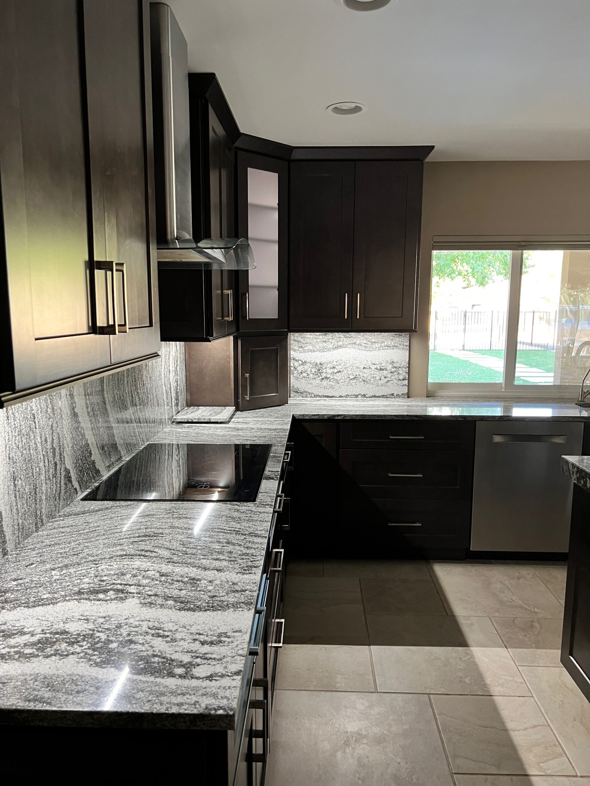 BEFORE
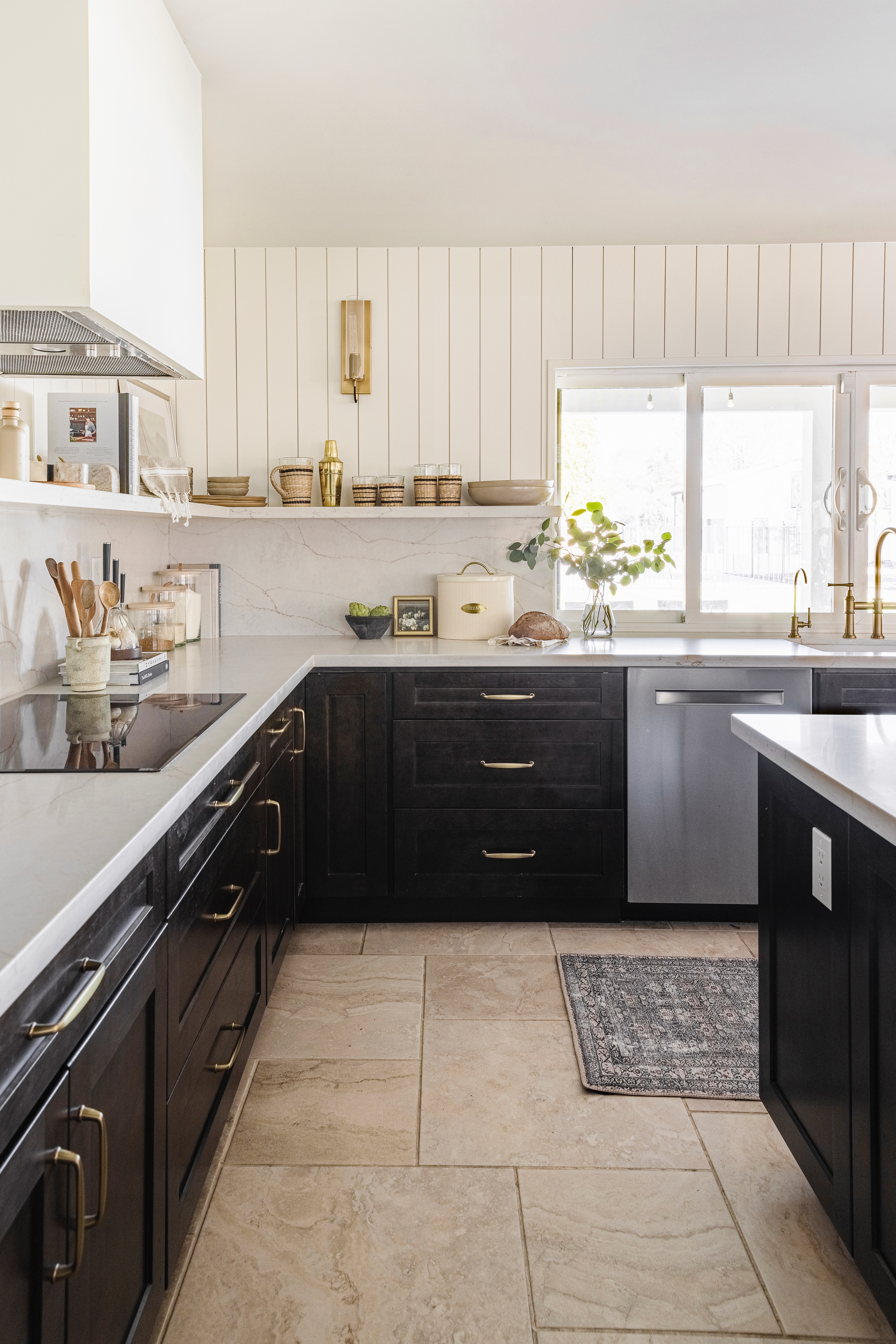 AFTER
AFTER
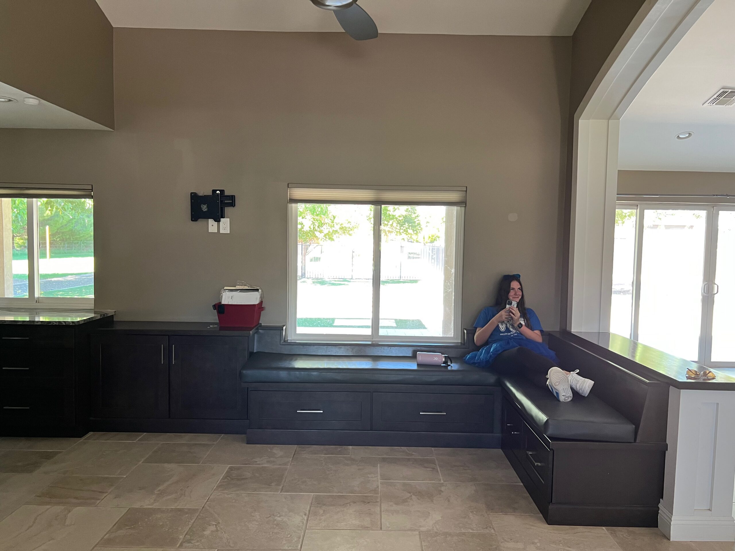 BEFORE
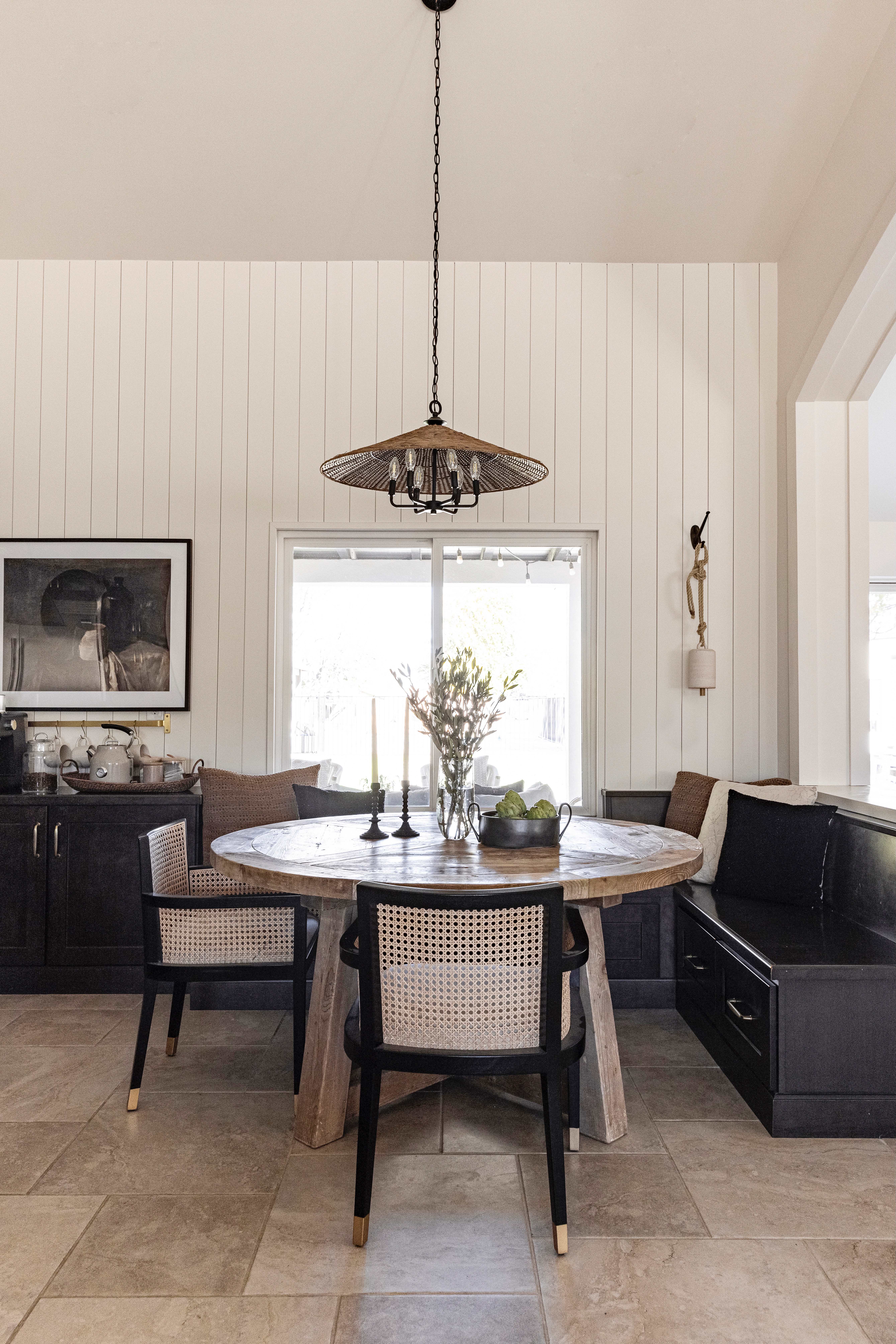 AFTER
AFTER
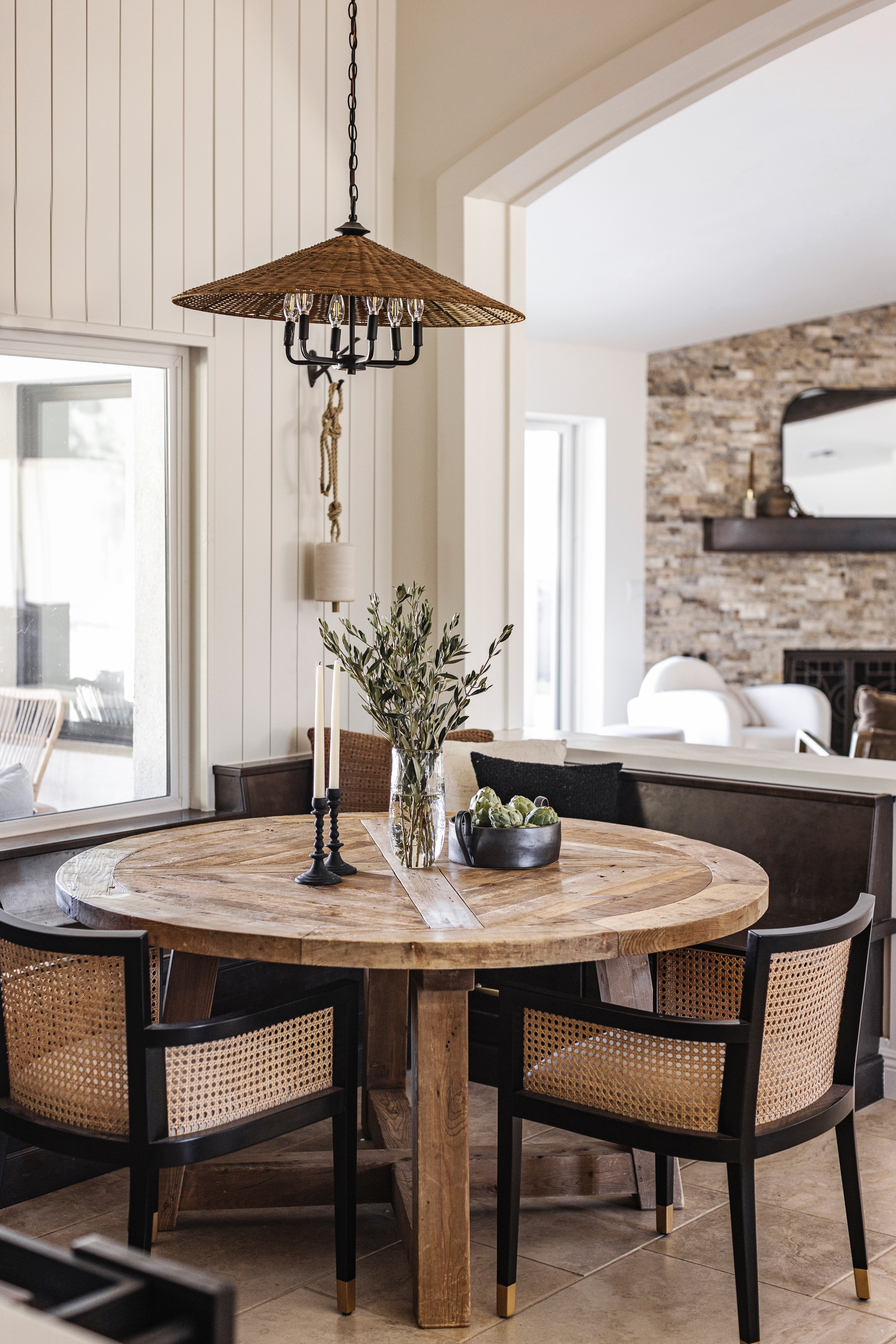
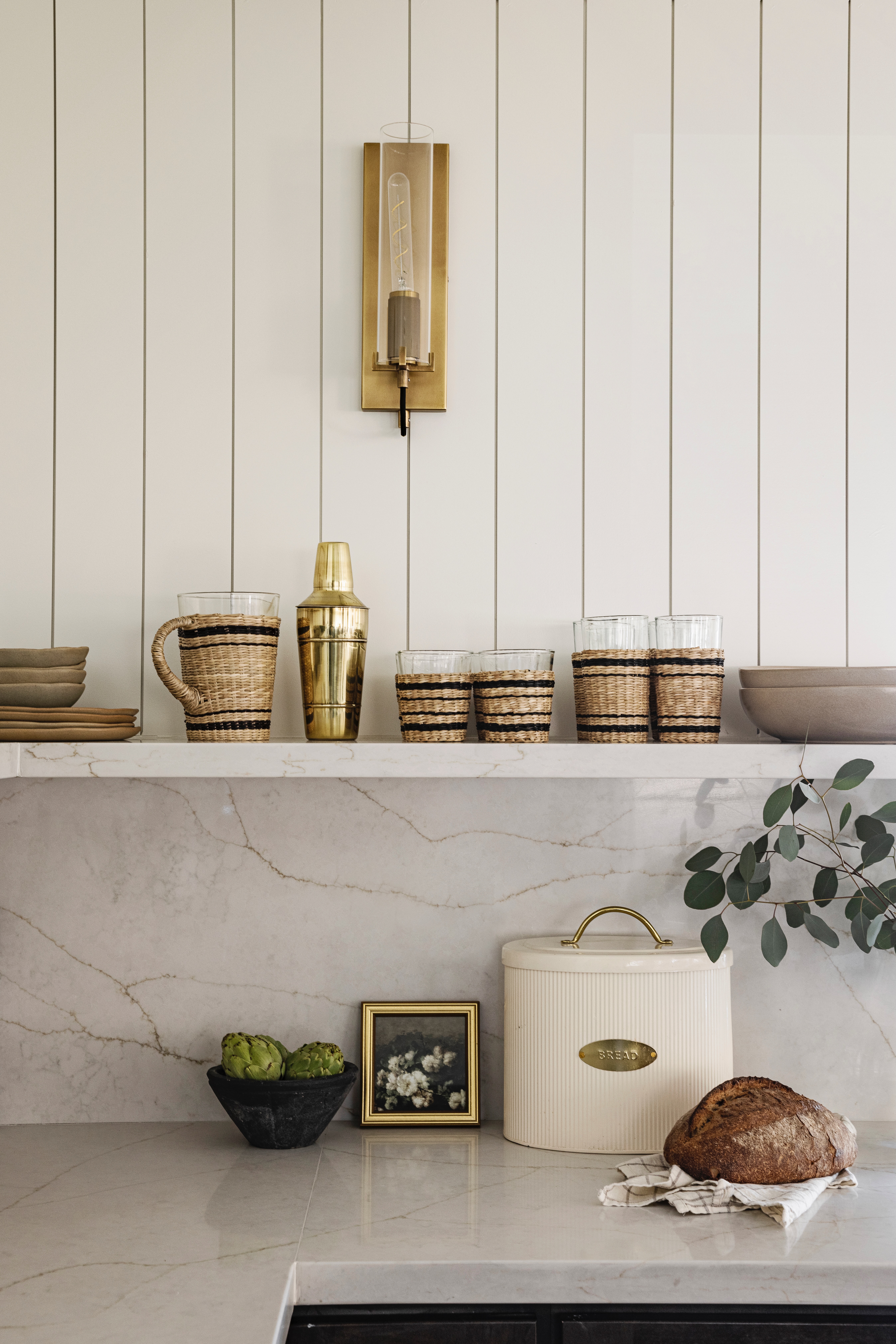
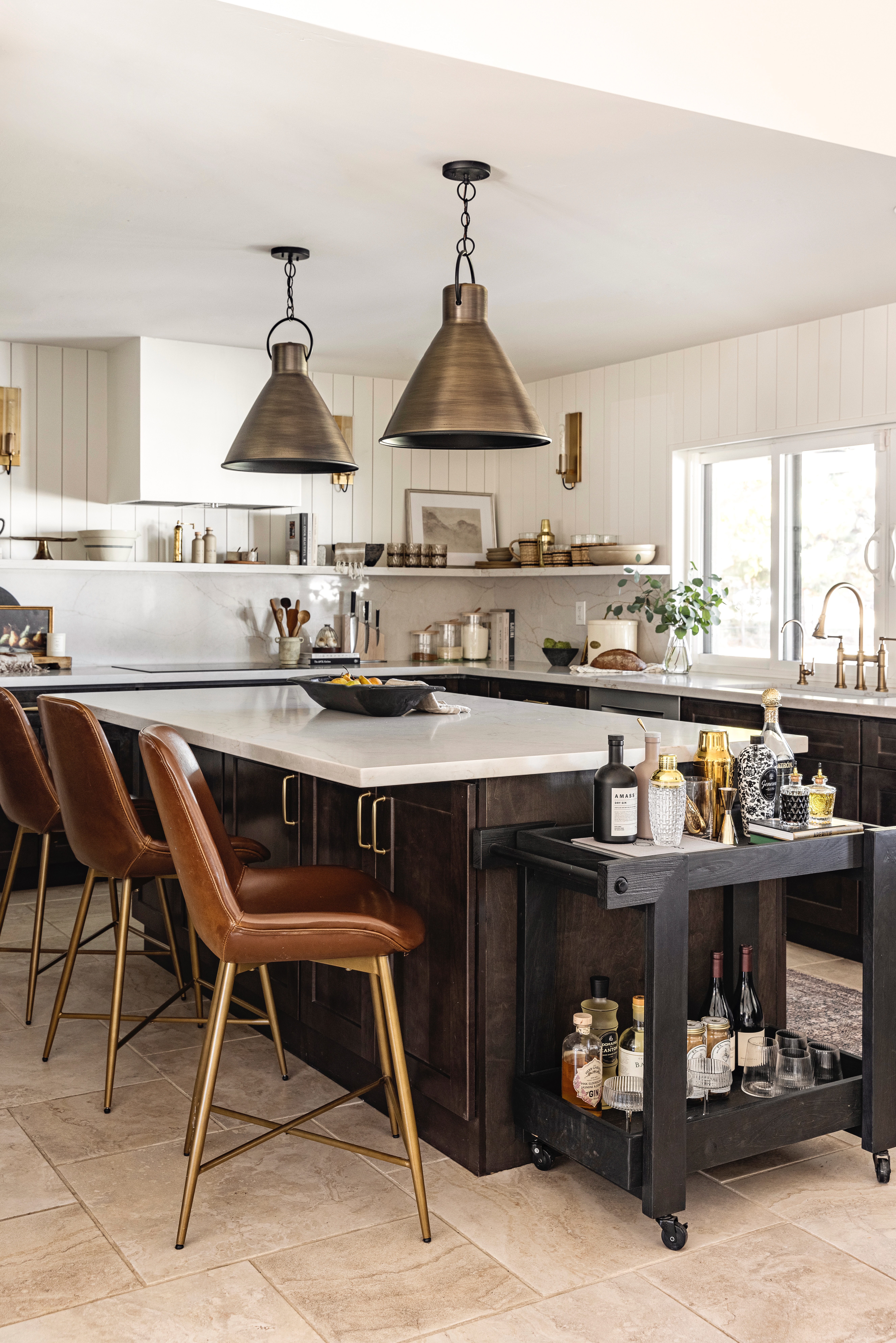

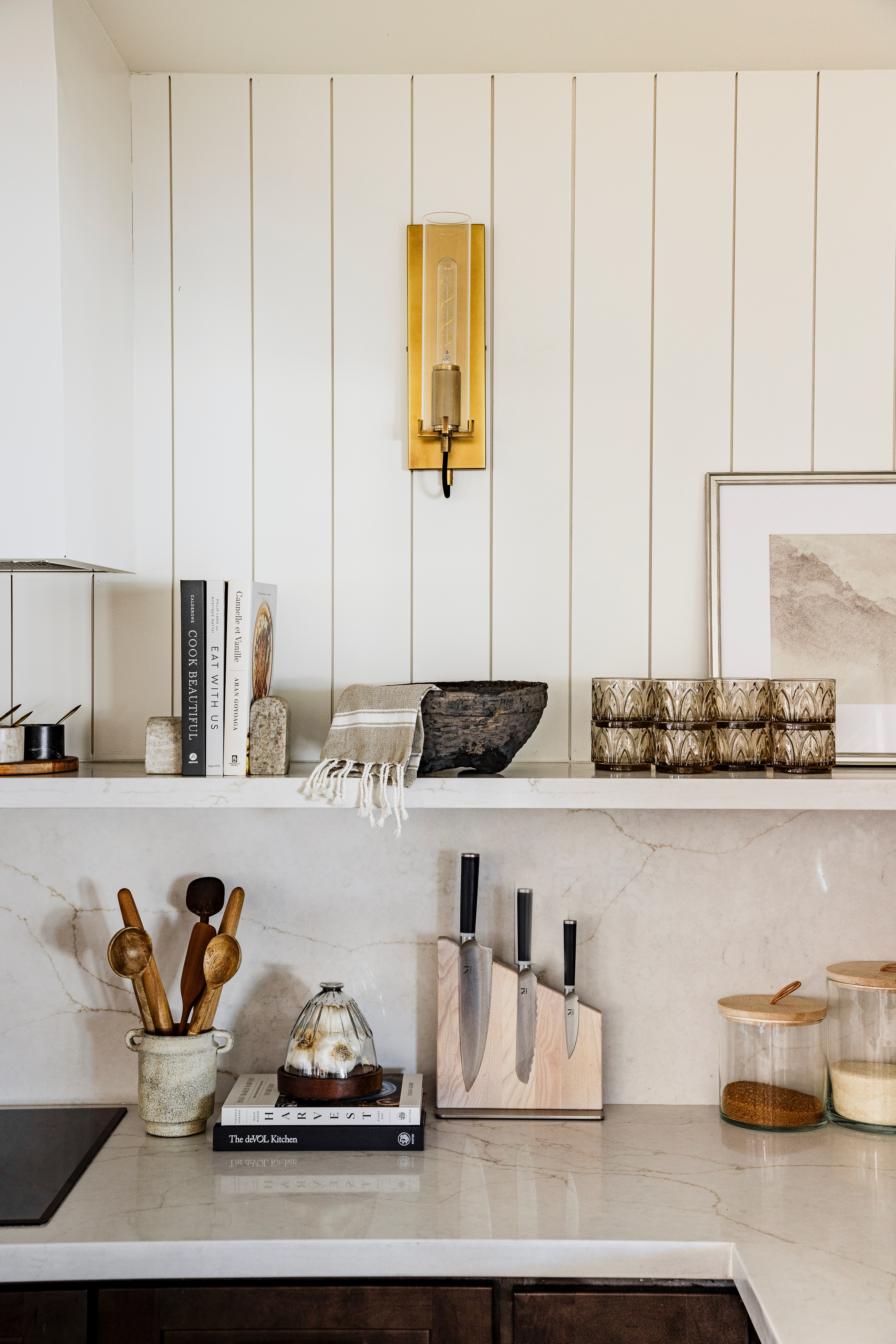
shop the kitchen
 JavaScript is currently disabled in this browser. Reactivate it to view this content.
main bedroom
Our bedroom was the other area that got a little overhaul. I could not rest peacefully with the flooring on the wall. Haha! I love a wall treatment, but it for sure is not this. It was dark and had way too much variation. Plus, it was shiny. No, thanks!
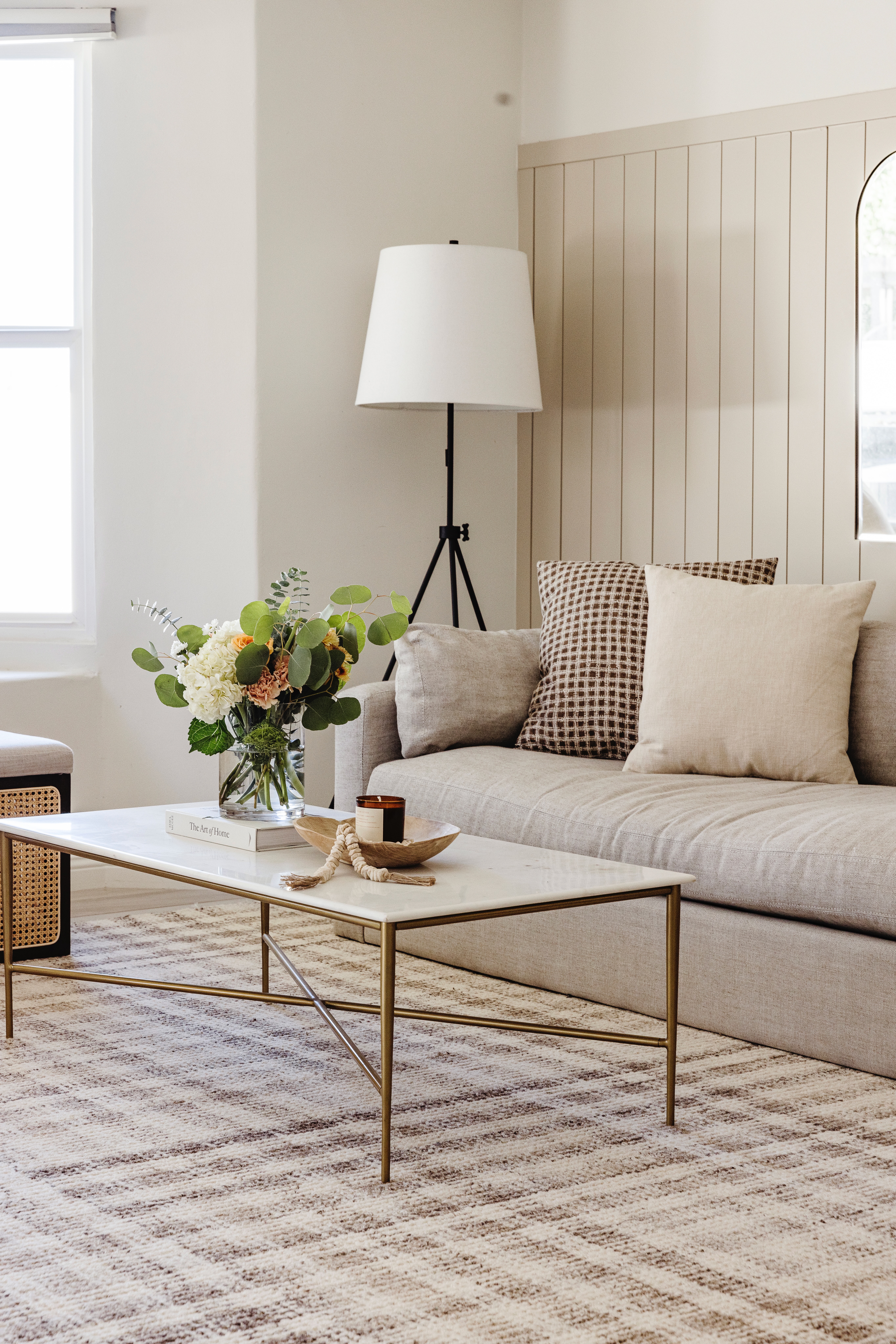
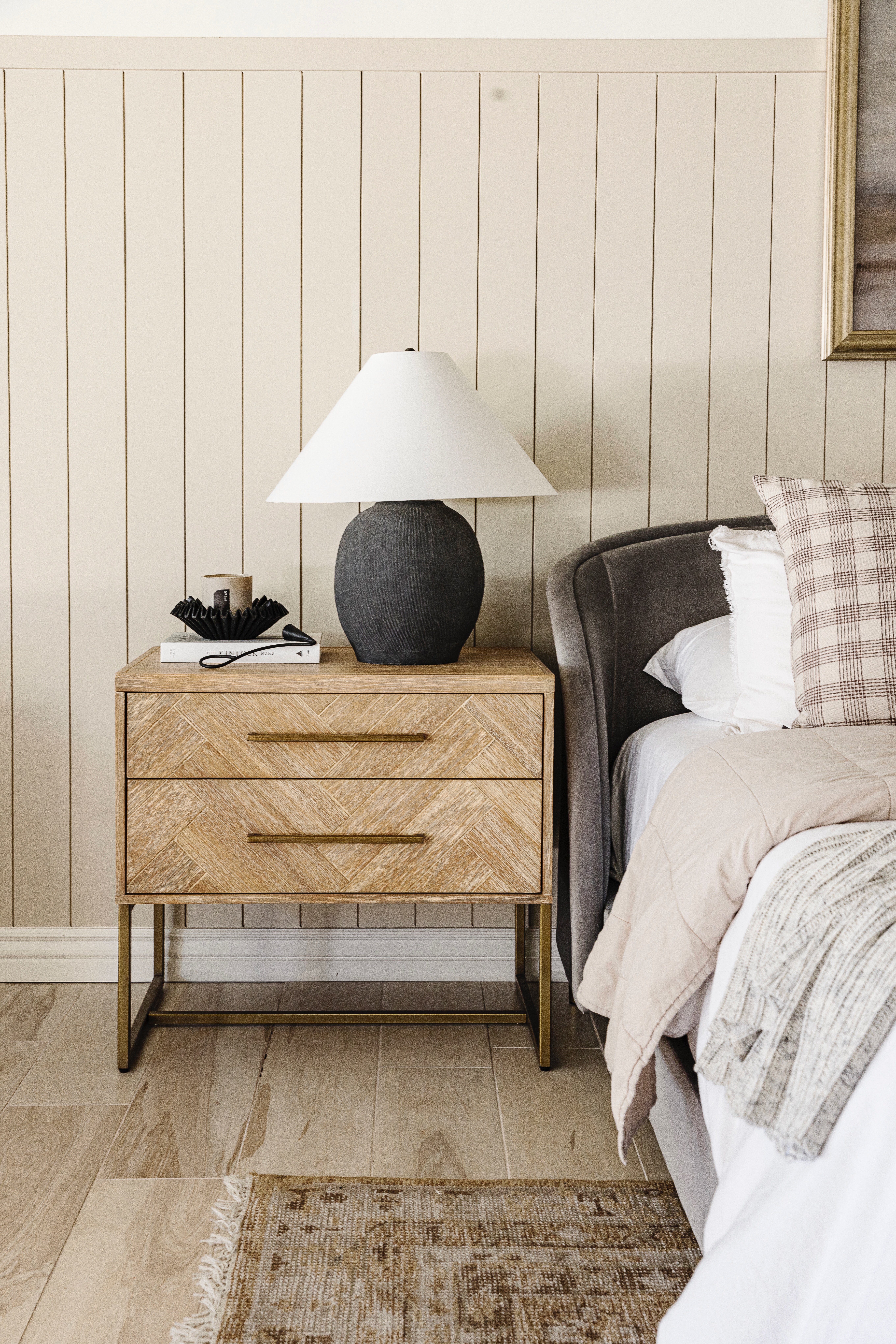
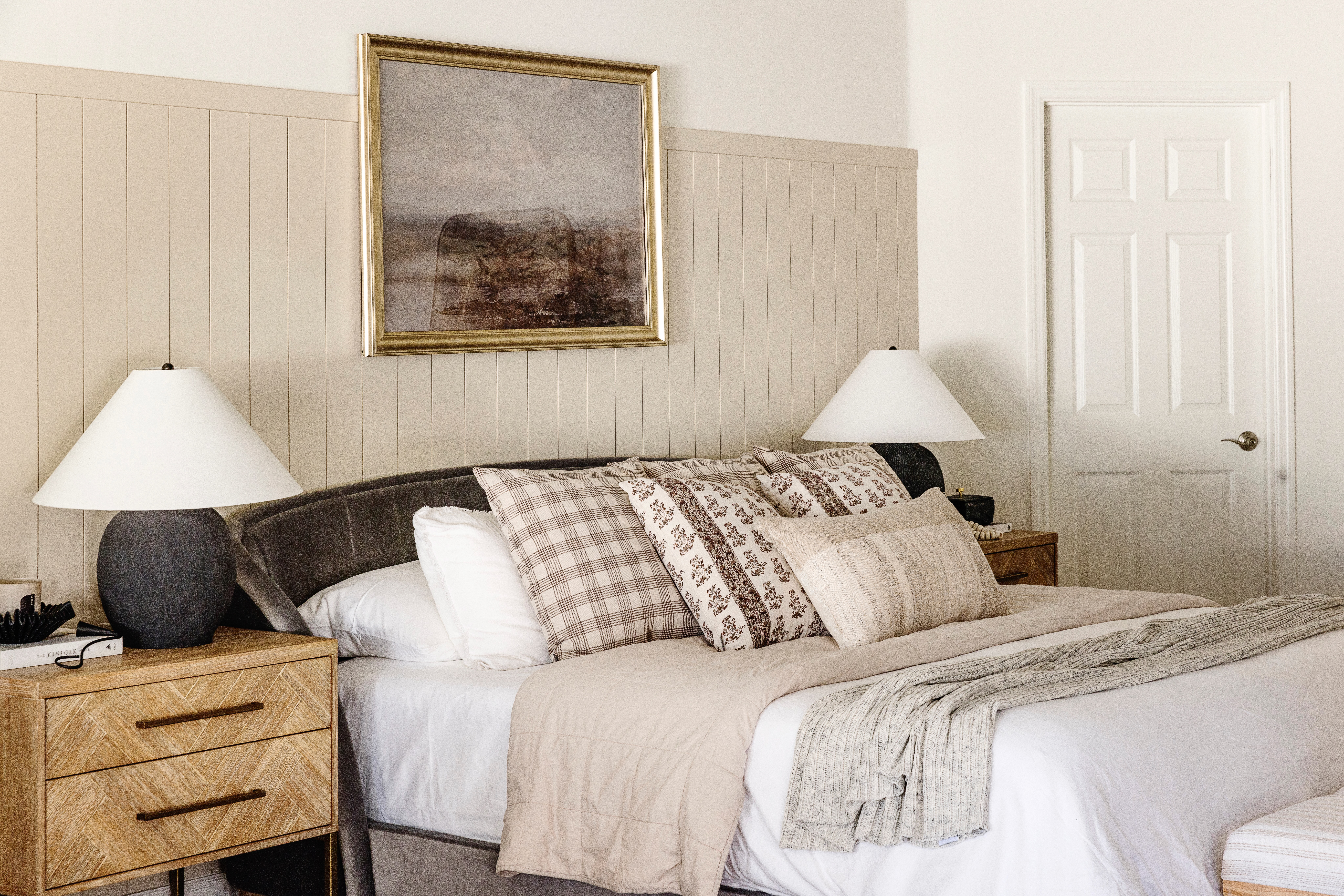
Once we removed the floor from the wall, we added vertical paneling part way up the wall and painted it Accessible Beige by Sherwin Williams. It’s warm and adds a layer of texture to the room.
There are two distinct spaces in our bedroom – our bed area and our sitting area. Area rugs are a must for each space to feel like it’s own. Both rugs are from Mcgee & Co. Since the bed space and the sitting room are side by side, I wanted to choose 2 rugs that complimented each other in color, but had different patterns to designate each space.
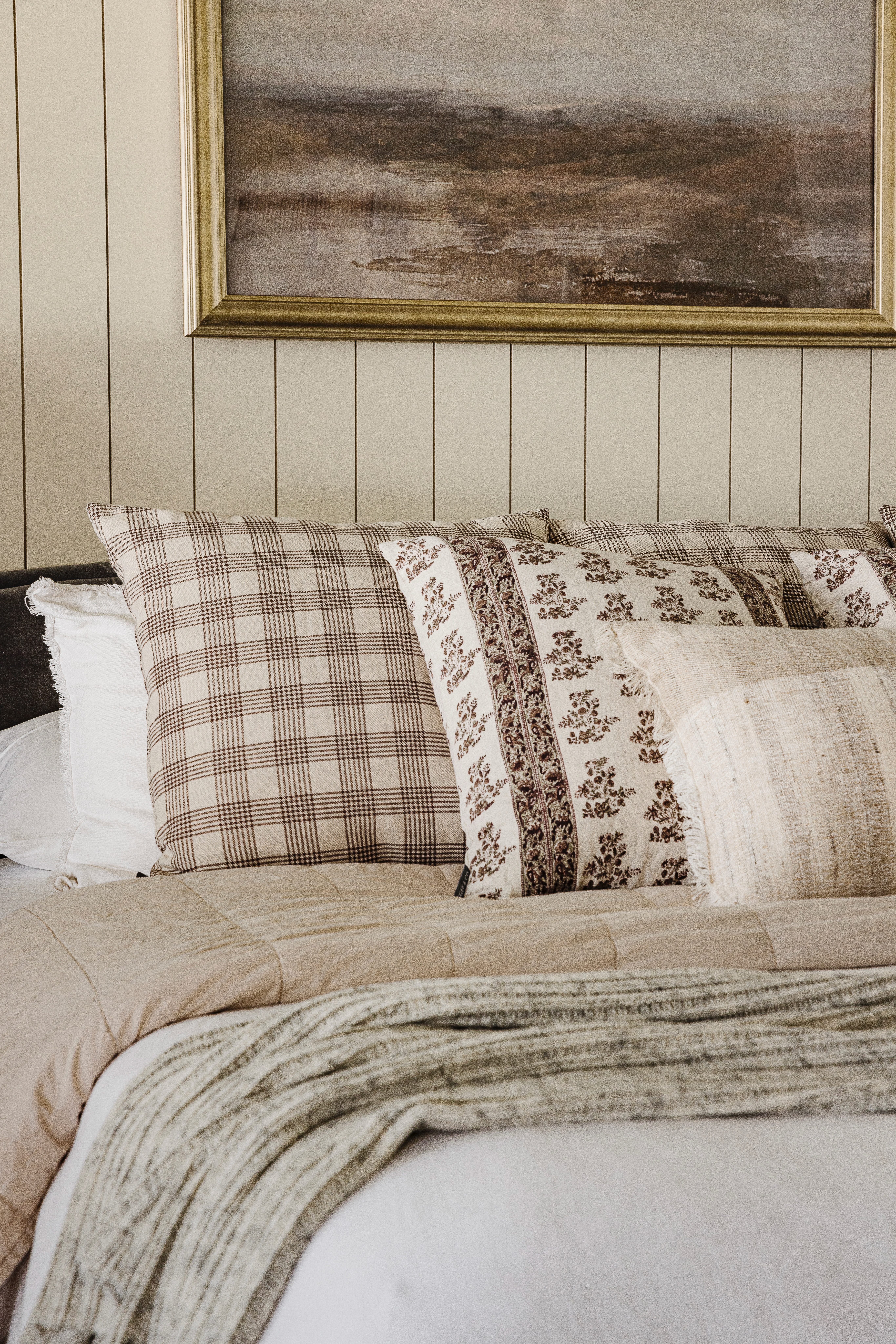
I love this bed. It has a curved back and feels like a comfy chair in headboard form. And if you know me at all, you know I love pillows! So the bed is layered with plenty of throw pillows in mixture of patterns. I really like mixing plaid and stripes with a floral print. These nightstands have been with me for a few houses and I still really love them. I added the black lamps for some contrast and a few other accessories to make them look super cute.
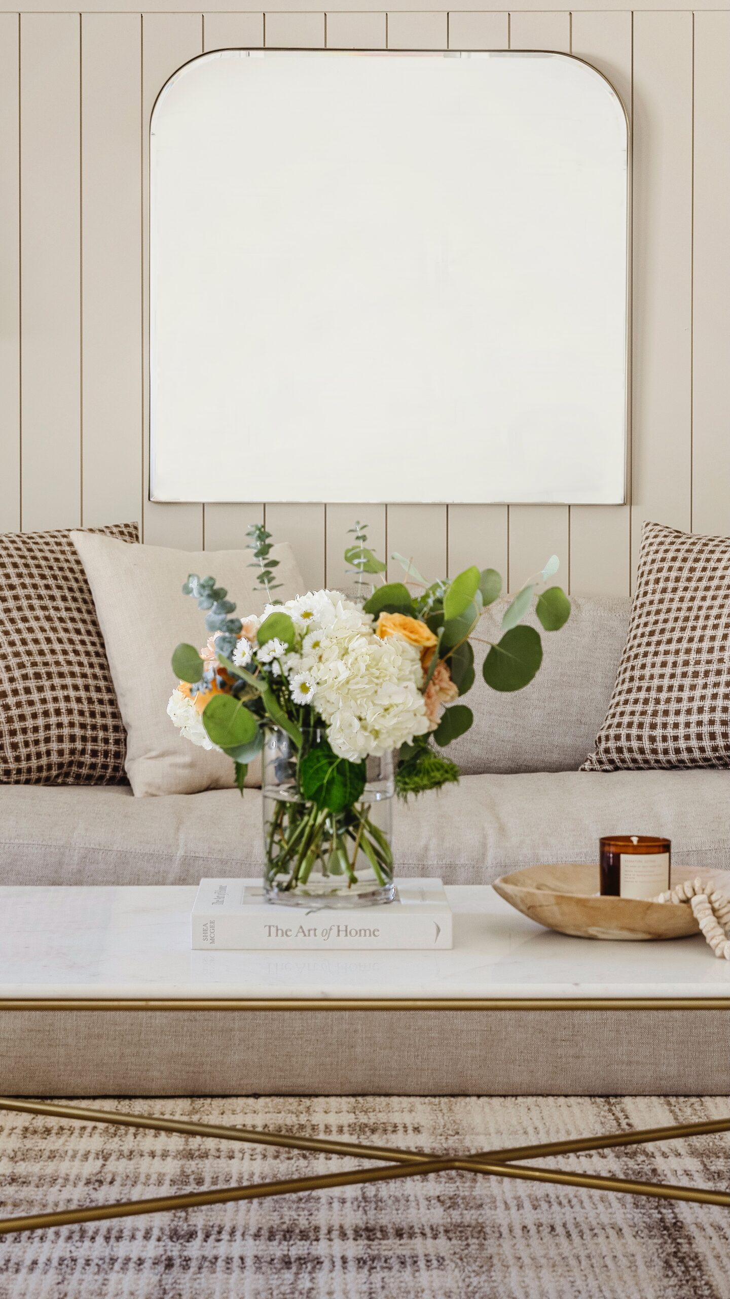
In the sitting area, you will find me working from this sofa and it’s super comfortable. I like that the marble coffee table adds a level of sophistication to this cozy space.
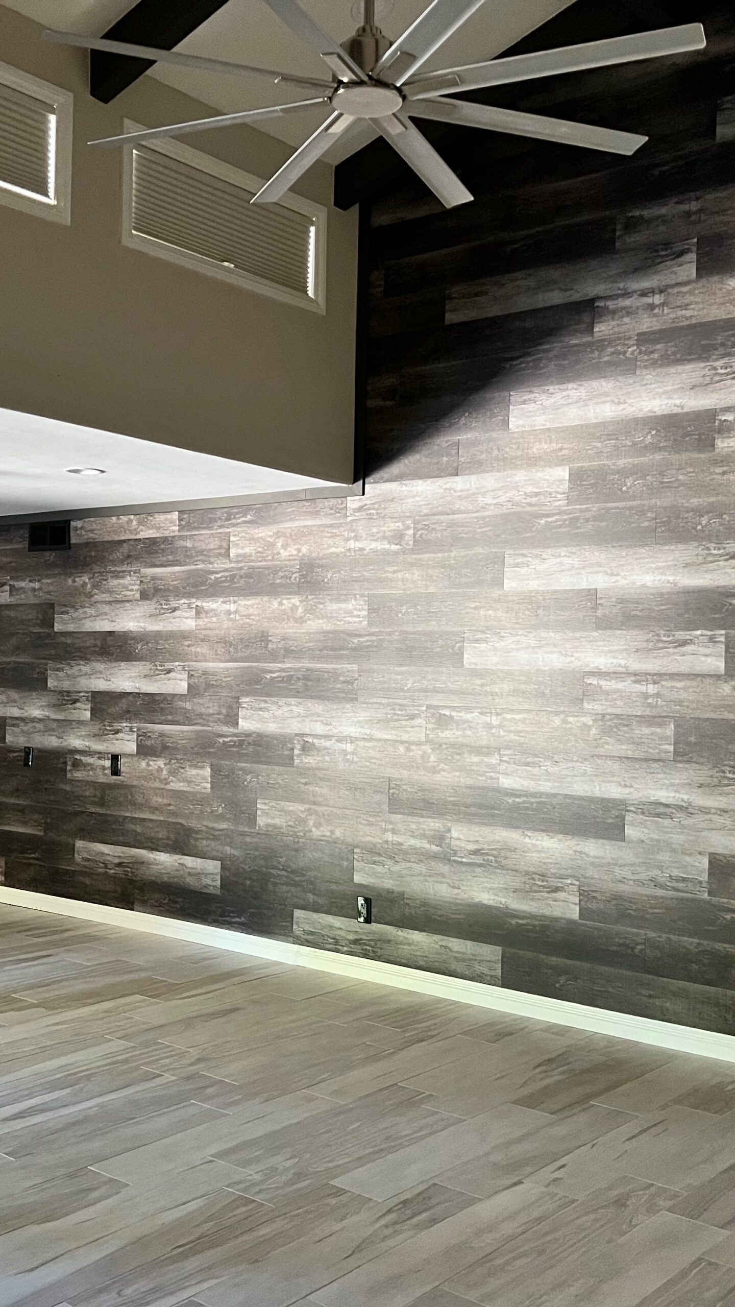 BEFORE
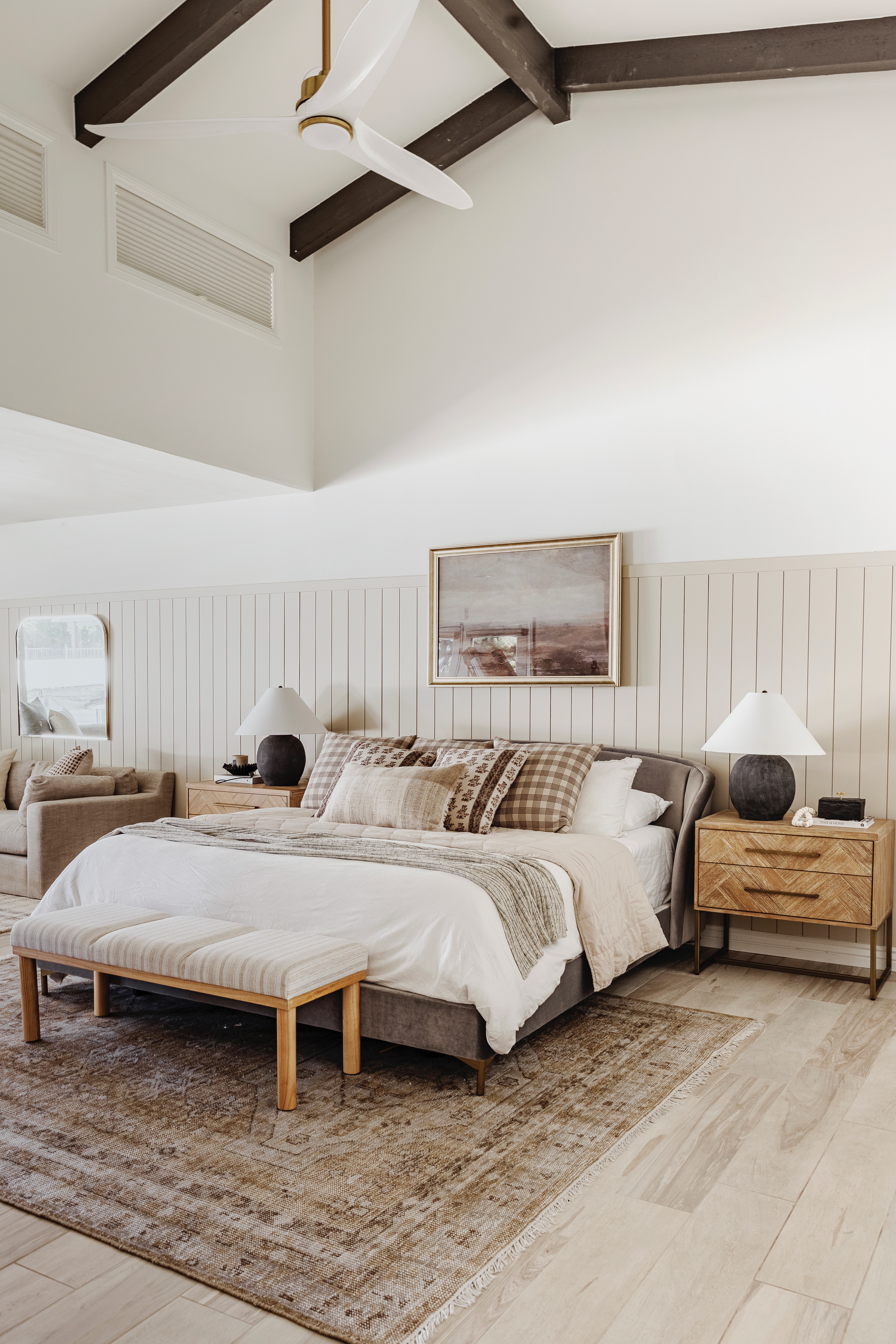 AFTER
AFTER
shop the main bedroom
 JavaScript is currently disabled in this browser. Reactivate it to view this content.
I hope you enjoyed this reveal and these before and afters. I love sharing these projects with you and if you love it too, let me know in the comments!
read post
Browse the blog posts
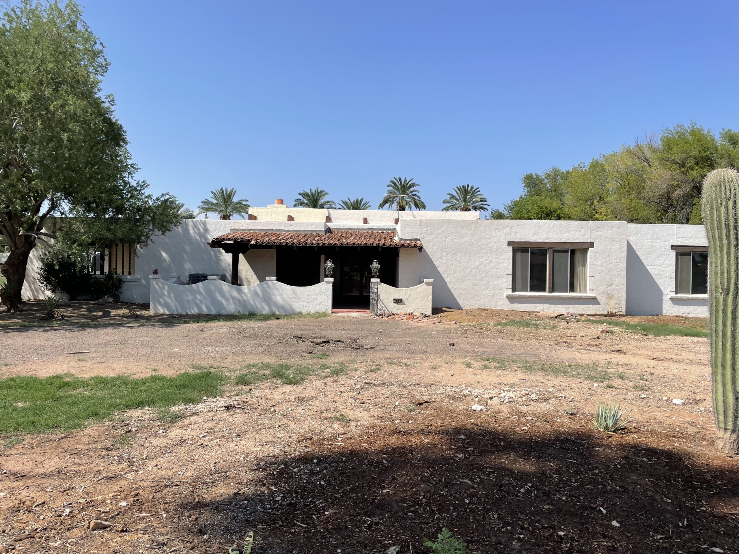
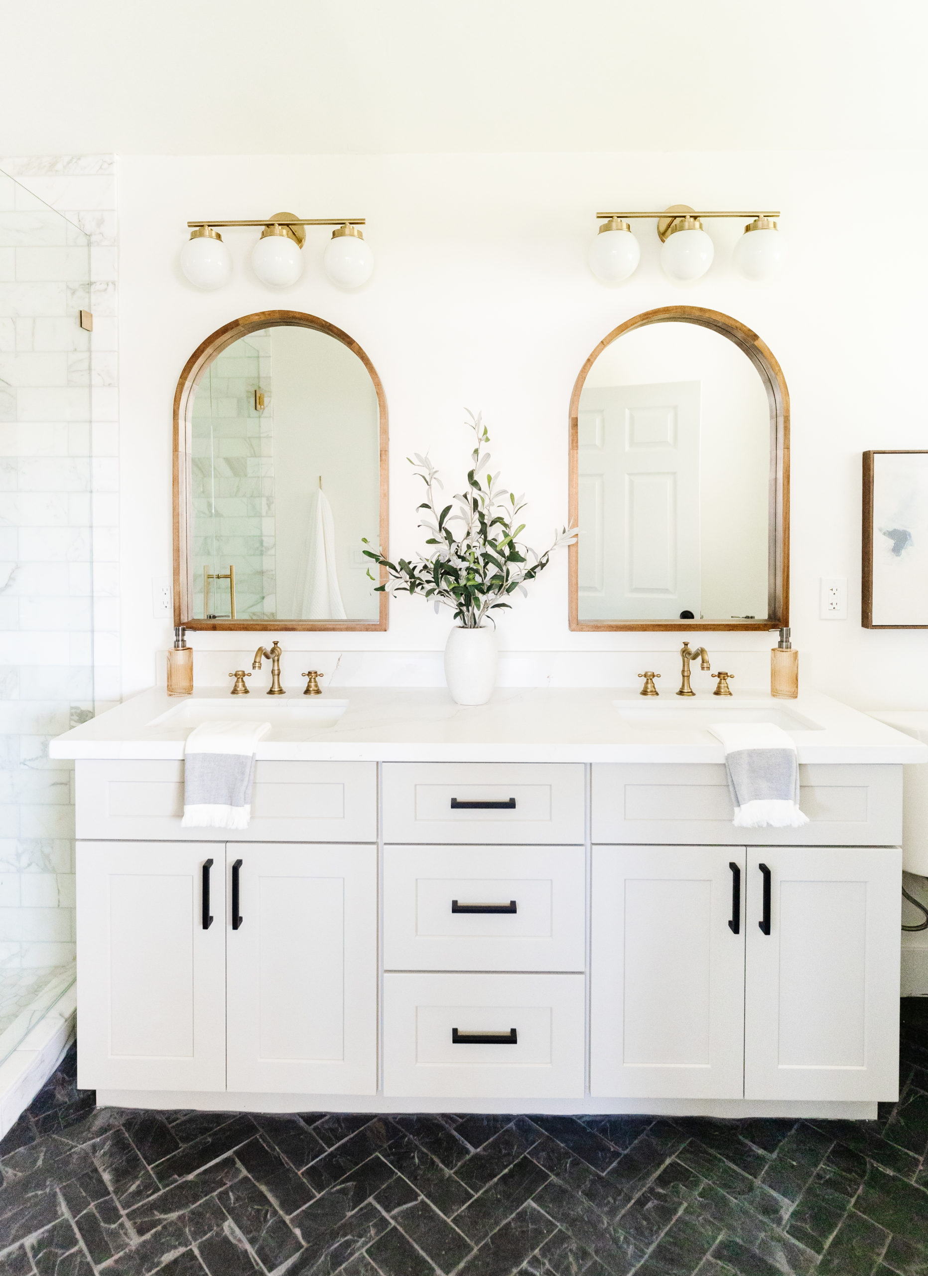
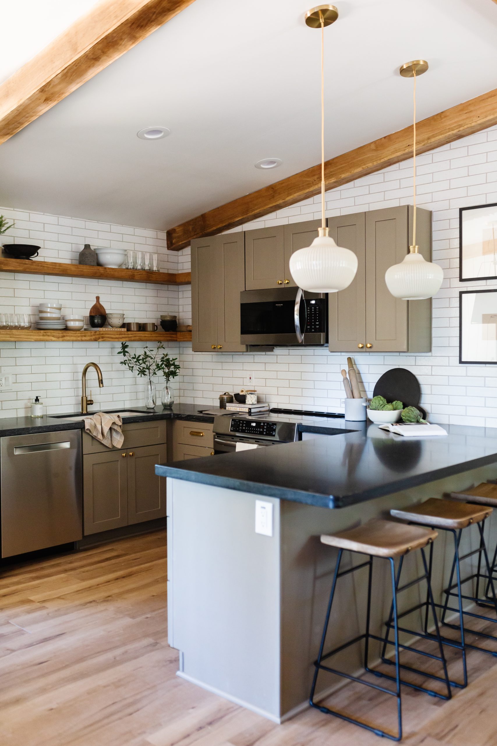
A new vacation rental up north! https://blissfuldesignstudio.com/pine-cabin-making-some-progress/Some of you may know that we have multiple vacation rental properties in Scottsdale, AZ. You can see those here! We do have one other vacation rental that is in Pine, AZ (hopefully two soon!). You can see the last post I did about our cabin in Pine here. […]

Brittany Krupnik is a real estate investor, designer and home stager. She creates spaces where life can be enjoyed - whether that is reimagining a space and bringing it back to life through flipping, helping someone envision themselves and the life they can have in a new home through staging or designing a vacation rental that serves as the backdrop for families and friends to create memories.
Brittany has staged over 500 homes and designed over 250 homes. When she is not designing, you can find her reading, traveling or trying out a new restaurant. She lives in Tempe, Arizona with her husband and 3 kids.
I'm Brittany — real estate investor, designer & home stager.
Meet the designer
Learn best practices for choosing a neutral paint color!
Neutral Paint Guide
ALMOST THERE!
tell me!
Learn best practices for choosing a neutral paint color!
Wondering what color is right for your room? Get our neutral paint color guide!
Browse the entire shop of favorites!
CURRENTLY LOVING
products we are
SHOP BLISSFUL
